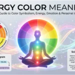
Colors communicate before words do. A red warning sign can feel urgent, a blue room may seem calm, and a white outfit can suggest purity in one setting but mourning in another. These reactions are part of what people often call color meaning theory—the study of how colors become connected with emotions, ideas, behaviors, symbols, and cultural experiences.
However, color meaning is not a simple dictionary. Research shows that people form systematic color-emotion associations, but those associations are influenced by hue, lightness, saturation, experience, language, and culture. A large review of 128 years of research found consistent relationships between many colors and emotional concepts, while also showing that color meanings are rarely one-to-one.
That distinction matters. Color can influence perception and communication, but it does not automatically control how someone feels or behaves. The same shade can communicate confidence in a logo, sadness in artwork, or celebration in clothing depending on its context.
Quick Answer: Color meaning theory explains how colors become associated with emotions, symbolism, cultural ideas, personality impressions, and visual communication.
Red is often linked with energy and strong emotion, blue with calmness and trust, green with nature and renewal, yellow with happiness and attention, purple with power and imagination, white with cleanliness or purity, black with sophistication or mourning, and orange with warmth and enthusiasm. These meanings are tendencies rather than universal rules.
What Is Color Meaning Theory?
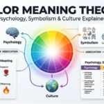
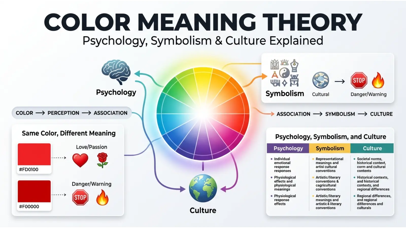
Color meaning theory is a broad way of understanding how people interpret colors beyond their physical appearance. It brings together ideas from color psychology, symbolism, visual communication, cultural studies, art, design, marketing, and everyday experience.
The theory asks questions such as:
- Why does red often feel energetic or urgent?
- Why is blue frequently used to communicate calmness or reliability?
- Why can white represent purity in one culture and mourning in another?
- Why do darker colors often feel heavier than lighter versions?
- Why can the same color create different impressions in different situations?
The answers are more complicated than simply assigning one meaning to every color.
A systematic review covering 132 peer-reviewed studies and more than 42,000 participants found that color-emotion relationships are real and measurable at the association level. Yet most relationships were many-to-many, meaning one color can connect with several emotions and one emotion can be associated with several colors. Lightness, saturation, and hue also influence these relationships.
Therefore, color meaning theory is best understood as a framework for interpreting patterns rather than a fixed set of rules.
Color Meaning Theory Chart
| Color | Common Associations | Possible Positive Meaning | Possible Negative Meaning |
|---|---|---|---|
| 🔴 Red | Energy, love, danger, anger | Passion, courage, excitement | Aggression, warning, urgency |
| 🟠 Orange | Warmth, enthusiasm, creativity | Friendliness, optimism, energy | Restlessness, excessive stimulation |
| 🟡 Yellow | Joy, attention, brightness | Happiness, hope, curiosity | Caution, anxiety, instability |
| 🟢 Green | Nature, growth, balance | Renewal, health, harmony | Envy, inexperience |
| 🔵 Blue | Calm, trust, sadness | Stability, peace, reliability | Coldness, distance |
| 🟣 Purple | Imagination, power, spirituality | Creativity, luxury, wisdom | Mystery, excess, artificiality |
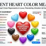
| 🩷 Pink | Affection, softness, care | Compassion, romance, playfulness | Immaturity, excessive sweetness |
| ⚫ Black | Power, sophistication, mourning | Elegance, authority, strength | Grief, fear, heaviness |
| ⚪ White | Purity, cleanliness, simplicity | Peace, freshness, clarity | Emptiness, sterility, mourning in some cultures |
| 🟤 Brown | Earth, stability, nature | Comfort, reliability, warmth | Dullness, heaviness |
| 🩶 Gray | Neutrality, restraint, seriousness | Balance, sophistication | Boredom, detachment |
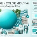
| 🩵 Turquoise | Freshness, water, openness | Calm, clarity, originality | Emotional distance |
These associations are useful starting points, not personality tests or universal laws.
Why Do Colors Have Meanings?
Color meanings develop through several overlapping processes.
First, humans repeatedly encounter colors in meaningful situations. Red appears in blood, fire, ripe fruit, warning signals, and romantic imagery. Green appears in vegetation, landscapes, and traffic signals. Blue is strongly associated with sky and water.
Second, language and culture reinforce these associations. Expressions such as “seeing red” connect color with anger, while “feeling blue” connects blue with sadness in English-speaking contexts.
Third, designers, artists, governments, religions, businesses, and media repeatedly use colors for communication. Over time, repeated exposure can make particular combinations feel familiar.
Color-emotion research supports this mixture of shared and culture-specific associations. A cross-cultural study involving participants from China, Germany, Greece, and the United Kingdom found that color-emotion patterns had both common features and meaningful cultural differences.
So, a color does not carry meaning in isolation. Meaning develops through color + context + experience + culture.
The Psychology Behind Color Meanings
Color psychology examines how colors relate to perception, emotion, attention, preference, and behavior.
One important distinction is between association and causation.
If people commonly associate blue with calmness, that does not prove that painting every room blue will automatically make everyone calm. Research into color-emotion relationships often measures what people associate with colors rather than proving that colors directly create a specific emotional state. The distinction is especially important when applying color psychology to health, education, marketing, or workplace design.
Hue
Hue refers to the basic color family, such as red, blue, green, or yellow.
Different hues tend to produce different associations because of both perceptual qualities and learned experience.
Lightness
Lightness can significantly change a color’s impression.
A pale blue may feel airy and gentle, while a deep navy blue can appear formal and authoritative. Similarly, pastel pink can feel delicate, whereas intense magenta can appear energetic and dramatic.
Research reviews have found that light and dark colors often show different emotional associations, with lighter colors tending to be associated more frequently with positive affect and darker colors with more negative affect.
Saturation
Saturation describes how vivid or muted a color appears.
A highly saturated orange can feel energetic and attention-grabbing. A muted terracotta may instead suggest warmth, earthiness, and comfort.
Consequently, saying “orange means energy” is incomplete. The exact shade matters.
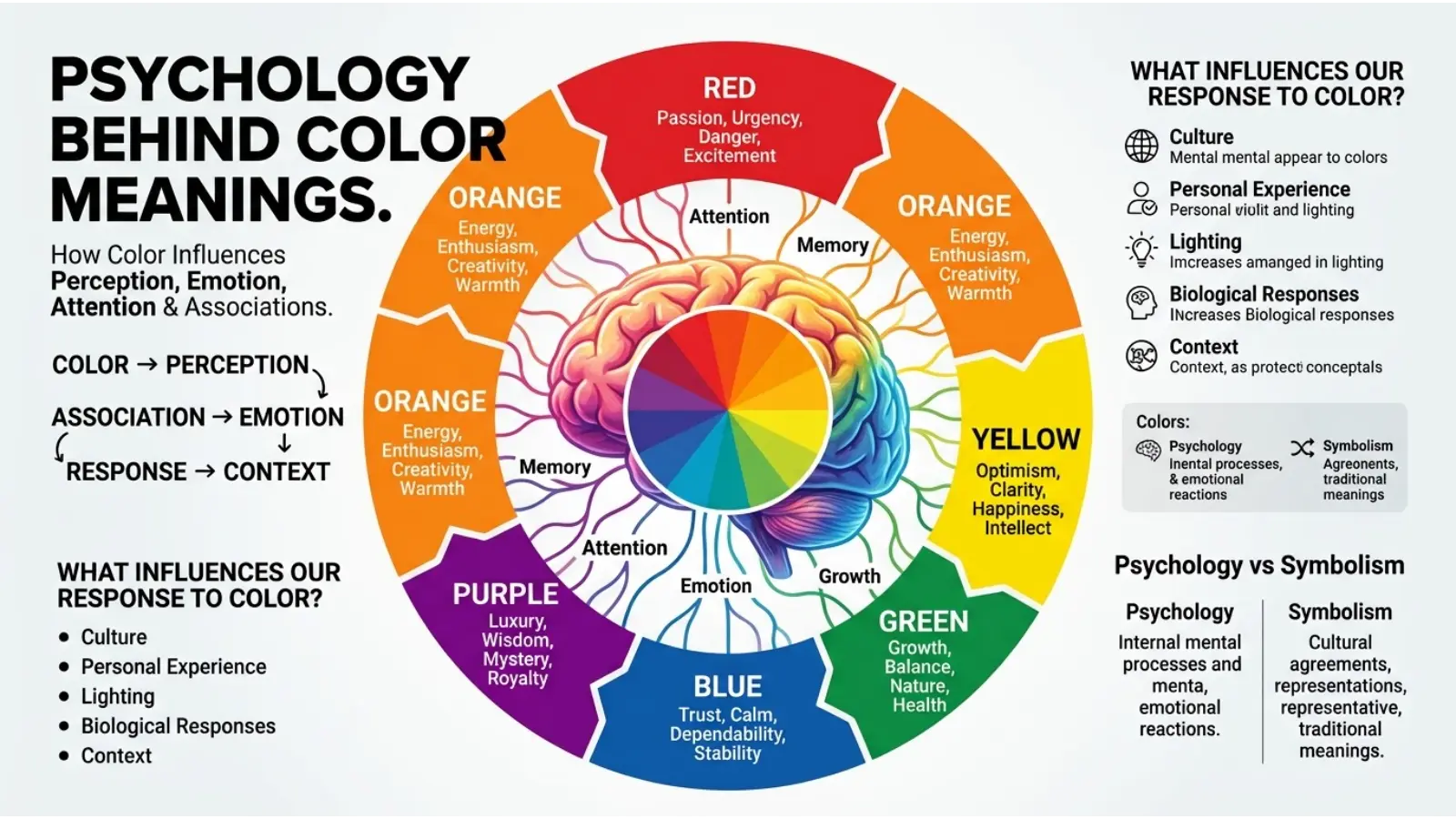
Red Color Meaning
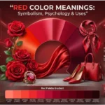
Red is one of the strongest colors in color-emotion research.
It can communicate passion, love, excitement, strength, danger, anger, urgency, and power. Its meanings can move in opposite directions because red appears in both positive and threatening situations.
Research has found particularly strong associations involving red and emotions such as love and anger.
In branding, red can attract attention and create a sense of energy. The warning systems, it can signal danger or stop. In fashion, it can create a bold and confident impression.
However, red should be used carefully in large amounts because its visual intensity can dominate surrounding elements.
Orange Color Meaning
Orange combines qualities commonly associated with red and yellow.
It often suggests warmth, enthusiasm, friendliness, creativity, and movement. Its connection with sunlight, fire, fruit, and autumn gives it a strong natural presence.
Scientific reviews have found yellow and orange to be associated with positive, higher-arousal emotions.
Orange can work particularly well when a design needs to feel energetic without the stronger intensity commonly associated with pure red.
Yellow Color Meaning
Yellow is strongly connected with brightness, sunlight, happiness, optimism, attention, and curiosity.
Because yellow is visually bright, it can be effective for highlighting information. However, intense yellow can become difficult to read when paired with low-contrast text.
Its emotional interpretation can also change with context. In some settings, yellow suggests happiness and celebration; in others, it can communicate caution.
Research consistently finds connections between yellow and positive, high-arousal emotional concepts.
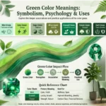
Green Color Meaning
Green commonly represents nature, growth, renewal, health, balance, and environmental awareness.
Its association with vegetation makes it especially powerful in natural and sustainability-related communication. Dark green can feel established and traditional, while bright green may appear youthful and energetic.
Green can also have less positive associations, such as envy. This shows why color meanings cannot be reduced to a single definition.
Blue Color Meaning
Blue is frequently associated with calmness, stability, trust, openness, and sadness.
Its connection with sky and water helps explain some of its widespread associations with spaciousness and calm. Blue is also common in corporate and technology branding because darker blue shades can create impressions of seriousness and reliability.
Research reviews identify blue among colors frequently associated with positive, lower-arousal emotions.
Yet blue can also communicate distance or sadness. The phrase “feeling blue” demonstrates how language can reinforce a particular emotional interpretation.
Purple Color Meaning
Purple is often associated with imagination, creativity, mystery, spirituality, luxury, and power.
Historically, some purple dyes were difficult and expensive to produce, helping particular shades become connected with status and wealth. Color symbolism has always been influenced partly by the physical availability and cost of pigments and dyes. Historical research on colors such as red demonstrates how material sources could affect cultural value and meaning.
Purple can therefore feel luxurious in one setting and mystical or imaginative in another.
Pink Color Meaning
Pink often suggests affection, softness, romance, care, playfulness, and tenderness.
Its meaning has changed considerably across time and societies, so it should not be treated as a permanently feminine color. Modern branding and fashion use many shades of pink to communicate very different personalities.
Soft pink can appear gentle and comforting, while hot pink can feel bold, youthful, energetic, and rebellious.
Black Color Meaning
Black can represent sophistication, authority, mystery, strength, seriousness, or mourning.
Fashion frequently uses black because it can create a formal and refined appearance. In photography and graphic design, black can create strong contrast and visual weight.
At the same time, black is often associated with sadness and negative emotional concepts. Research has found black among colors linked with higher-arousal negative emotions.
Context determines which interpretation becomes strongest.
White Color Meaning
White commonly suggests cleanliness, simplicity, peace, purity, and openness.
Hospitals, minimalist interiors, packaging, and formal clothing often use white to create a clean visual impression.
But white is one of the clearest examples of cultural variation. In many Western settings it is strongly associated with weddings, while in some East Asian traditions it has important connections with mourning and funerals. Cross-cultural research has documented differences in emotional associations with white, including stronger negative associations among Chinese participants in one study.
This is why cultural context should always be considered before making claims about a color’s meaning.
Brown, Gray, and Neutral Colors
Neutral colors often receive less attention than bright colors, yet they can strongly influence visual atmosphere.
Brown is commonly connected with earth, wood, warmth, reliability, and natural materials. It can make interiors feel grounded and comfortable.
Gray suggests neutrality, restraint, sophistication, technology, and seriousness. However, excessive gray can create an impression of dullness or emotional distance.
Neutral colors are particularly useful because they allow stronger accent colors to stand out without competing for attention.
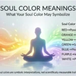
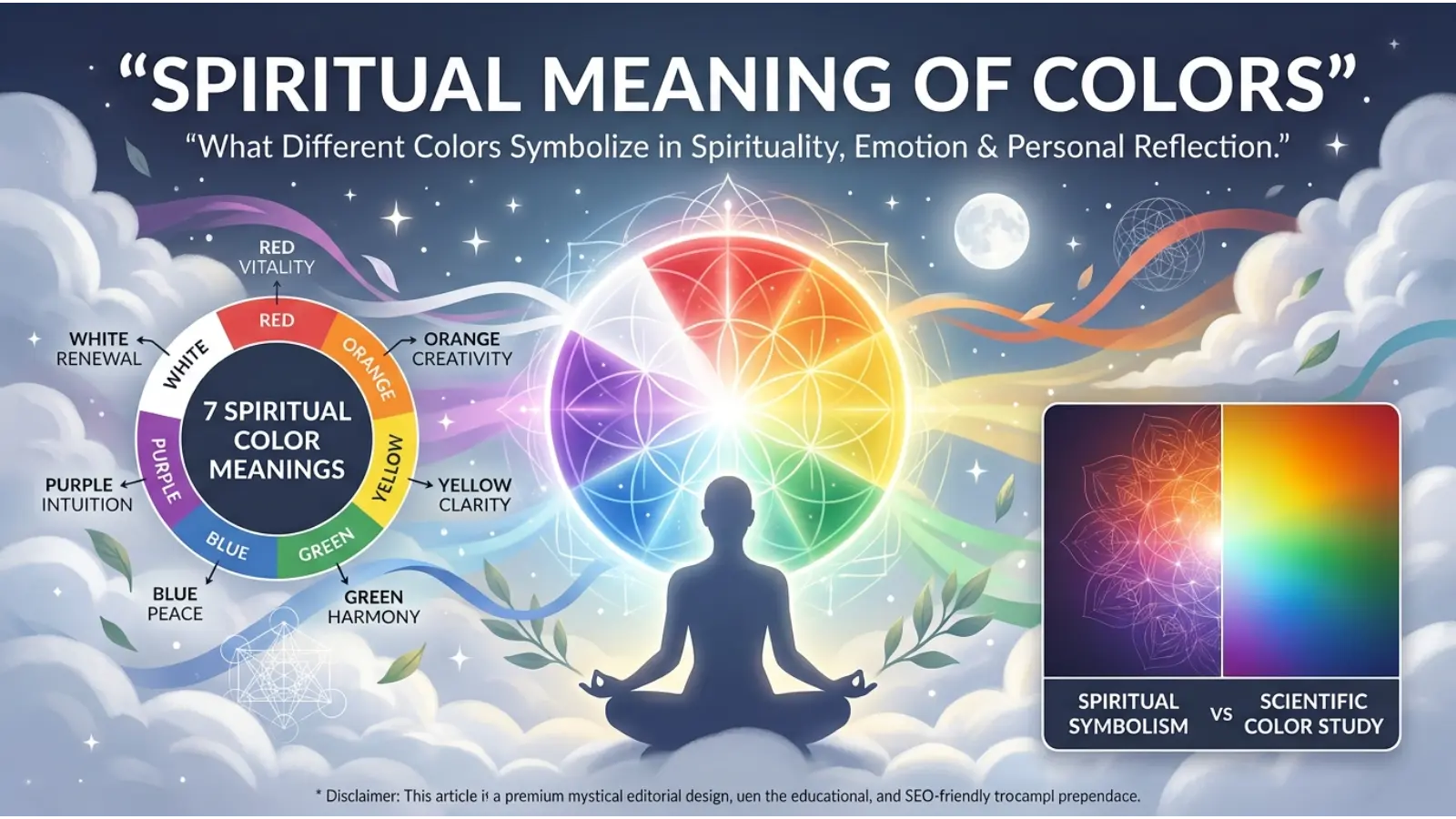
Spiritual Meaning of Colors
Color symbolism also appears in spiritual, religious, ceremonial, and personal practices.
However, there is no single universal spiritual color dictionary.
Depending on the tradition, colors may represent ideas such as:
- Red: vitality, sacrifice, passion, or power
- Orange: transformation, energy, or devotion
- Yellow: illumination, joy, or wisdom
- Green: growth, renewal, or life
- Blue: peace, protection, or transcendence
- Purple: spirituality, royalty, mystery, or contemplation
- White: purity, peace, or sacredness
- Black: mourning, mystery, discipline, or the unknown
These interpretations should be treated as symbolic traditions rather than scientific facts. Religious and spiritual meanings vary by community, historical period, denomination, and individual practice.
A color can therefore have one psychological association, another cultural meaning, and a completely different personal spiritual meaning.
Cultural Meaning of Colors
Culture is one of the most important parts of color meaning theory.
A color that represents celebration in one community may represent mourning in another. Even within a broad geographic region, meanings can differ according to religion, age, historical experience, and social setting.
Cross-cultural research shows both similarities and differences in color-emotion associations. In one study, researchers found that color-emotion relationships were partly universal while also showing country-specific patterns.
This means it is safer to say that a color is commonly associated with an idea rather than claiming that it always means that idea.
Western Contexts
Western cultures often connect:
- Red with love, danger, and excitement
- Blue with trust and calmness
- White with purity and weddings
- Black with mourning and sophistication
- Green with nature and growth
These are broad patterns rather than rules shared equally by every Western society.
Eastern Contexts
Several East Asian cultures have distinct traditions surrounding white, red, yellow, and other colors. White, for example, can carry mourning-related meanings in some East Asian contexts that differ from common Western wedding symbolism.
African and Middle Eastern Contexts
Color meanings across African and Middle Eastern societies are highly diverse. Religious traditions, national symbolism, textiles, ceremonies, political history, and local customs can all influence interpretation.
Therefore, treating an entire continent as having one color system can be misleading.
Latin American Contexts
Latin American color symbolism can also vary widely because Indigenous traditions, Catholic traditions, local festivals, national symbols, and modern global culture overlap.
The lesson is simple: culture gives color meaning a local accent.
Historical Meaning of Color
Color symbolism has changed throughout history because pigments, dyes, technology, trade, religion, and social status have changed.
Some colors were once extremely expensive because their pigments or dyes were difficult to produce. Others became common only after new synthetic pigments made them affordable.
Red provides a strong historical example. Natural red pigments were used in prehistoric art, while later civilizations developed increasingly sophisticated red colorants for clothing, painting, decoration, and ritual use.
Consequently, color meaning is partly a history of human materials and technology.
Color Preferences and Personality
People often ask whether their favorite color reveals their personality.
It can provide clues about preference, style, or self-expression, but it cannot reliably define someone’s personality.
Someone who loves black might enjoy minimalism, formal clothing, alternative fashion, photography, or simply find black practical. Another person may choose blue because it reminds them of the ocean.
Color preference is shaped by personal memories, culture, environment, fashion, age, and individual taste.
Therefore, statements such as “people who like red are always confident” should be treated as entertainment rather than established psychological diagnosis.
Color in Branding and Marketing
Brands use color because visual identity has to communicate quickly.
A customer may notice a color before reading a company name or slogan. Color can therefore help create recognition and establish a particular mood.
Red in Branding
Red can suggest energy, urgency, appetite, excitement, and boldness.
It is often useful for brands that want a lively or action-oriented personality.
Blue in Branding
Blue can suggest stability, reliability, calmness, and professionalism.
That makes it common in corporate, technology, financial, healthcare, and communication-related identities.
Green in Branding
Green works naturally for environmental, agricultural, health, organic, and sustainability-related identities.
However, companies should avoid assuming that green automatically proves a product is environmentally responsible. The message needs to be supported by actual practices.
Purple in Branding
Purple can communicate creativity, imagination, luxury, or individuality.
It can work particularly well for beauty, entertainment, creative, and premium products.
Black and White in Branding
Black and white create strong visual contrast.
The b
The Black can provide sophistication and authority, while white can provide simplicity and visual breathing room. Together they can create a modern, minimalist identity.
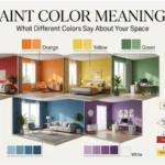
Color in Interior Design
Interior color changes the visual character of a room, but lighting and surrounding materials matter just as much as the paint itself.
A blue wall facing cool daylight can look very different from the same blue under warm artificial lighting.
Living Room
Warm neutrals, muted greens, soft blues, and earthy tones can create comfortable environments. Strong accent colors can add personality without overwhelming the entire room.
Bedroom
Softer and less saturated colors often create a quieter visual environment. Deep colors can also work well when the goal is a dramatic or cozy atmosphere.
Office
Blue, green, neutral, and restrained warm colors can create different impressions of professionalism and energy. The best choice depends on the room’s lighting and purpose.
Kitchen
Warm colors can make kitchens feel lively and social, while neutral palettes create a cleaner and more timeless appearance.
Lighting
Lighting can dramatically alter perceived color.
Warm bulbs can make whites and neutrals appear creamier or warmer. Cool lighting can make some surfaces appear bluer or sharper.
Always test paint samples under the actual lighting conditions before choosing a final color.
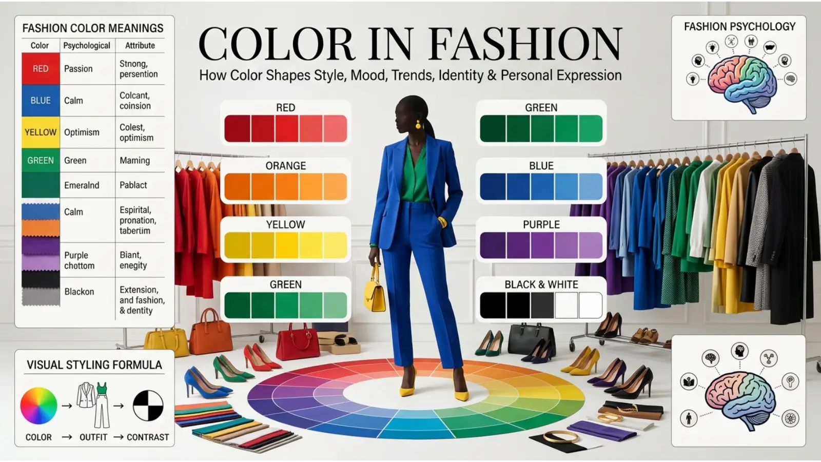
Color in Fashion
Fashion turns color into a form of visual communication.
A person may choose black for formality, red for impact, white for simplicity, green for a natural look, or bright colors simply because they enjoy them.
Color also interacts with:
- Skin undertones
- Fabric texture
- Lighting
- Season
- Occasion
- Accessories
- Cultural expectations
- Personal style
A bright color can look casual in a cotton shirt but formal in a structured evening garment. Therefore, the material and design can change the meaning of the same hue.
Color Combinations and Their Meanings
Colors rarely appear alone. Their neighbors can change how they are perceived.
Blue + White
This combination often feels clean, calm, open, and professional.
Green + Brown
These colors reinforce natural and earthy associations.
Black + Gold
The contrast can create a luxurious, dramatic, and premium appearance.
Purple + Gold
This pairing often emphasizes richness, ceremony, creativity, or luxury.
Red + Black
The combination creates strong visual contrast and can feel powerful, dramatic, or intense.
Yellow + Blue
The contrast between warm yellow and cool blue creates a lively and highly visible combination.
The important principle is that color meaning is relational. A color can look softer, stronger, warmer, or cooler depending on what surrounds it.
Why Context Changes Color Meaning
Imagine a red object in three places.
A red rose can suggest romance.
A red traffic signal communicates a command to stop.
The red sports uniform can communicate energy and team identity.
The physical color has not changed. The surrounding context has.
This is one of the most important lessons in color meaning theory: meaning comes from the relationship between color and situation.
How Age Can Affect Color Interpretation
Color preferences and associations can change with age.
Children may prefer highly saturated, bright colors, while adults may develop more specific preferences influenced by fashion, work, culture, and personal experiences.
Age also changes the environments in which people encounter color. A teenager may experience color mainly through clothing, games, social media, and entertainment, while an adult may encounter it through workplace design, home decoration, packaging, and professional branding.
Color in Art and Photography
Artists use color to guide attention, establish atmosphere, create contrast, and communicate symbolic ideas.
A painter may use cool colors to create distance or warm colors to create visual intensity. A photographer can manipulate white balance to make an image feel warmer or cooler.
Color grading in film works similarly.
These techniques do not guarantee one emotional response. Instead, they provide visual cues that interact with story, lighting, composition, and personal experience.
Common Misconceptions About Color Meaning
“Every color has one universal meaning.”
It does not.
Research shows recurring patterns, but color associations can differ by culture and context.
“Color psychology can predict personality.”
There is no reliable basis for using someone’s favorite color as a complete personality diagnosis.
“A color automatically changes someone’s mood.”
That claim is too strong.
Many studies examine associations rather than proving that a particular color will produce the same emotional response in every person.
“Dark colors are always negative.”
Not necessarily.
Dark colors can communicate elegance, authority, depth, mystery, luxury, or seriousness.
“Bright colors are always happy.”
Brightness can attract attention and create energy, but a bright color can also signal danger, warning, or overstimulation depending on the context.
Real-World Applications of Color Meaning Theory
Color meaning theory has practical value because people encounter color almost everywhere.
Web design: Color helps organize information, establish hierarchy, and guide attention.
Packaging: Color can communicate product personality before customers read the label.
Advertising: Contrasting colors can attract attention and emphasize important information.
Interior design: Color helps establish the visual atmosphere of a space.
Fashion: Clothing colors contribute to personal style and social impressions.
Art: Color can communicate mood, symbolism, depth, and contrast.
Photography: Color grading can alter atmosphere and visual storytelling.
Sports: Team colors help establish identity and recognition.
Entertainment: Film, games, and animation use color to build worlds and reinforce themes.
Everyday communication: Traffic lights, warning signs, maps, labels, and interfaces depend on learned color conventions.
The strongest applications do not rely on color alone. They combine color with words, shapes, contrast, typography, symbols, and context.
A Better Way to Use Color Meaning
Instead of asking, “What does this color mean?” ask four questions:
What does the color commonly suggest?
This identifies broad emotional or symbolic associations.
Where is the color being used?
A bedroom, logo, wedding dress, warning sign, and painting all create different expectations.
Who is seeing it?
Culture, age, personal experience, and familiarity can influence interpretation.
What other colors surround it?
Color combinations can completely change the visual impression.
This approach produces a more accurate understanding than memorizing a list of color definitions.
Frequently Asked Questions
What is color meaning theory?
Color meaning theory explores how colors become associated with emotions, symbols, cultural ideas, personality impressions, and visual communication. It combines insights from psychology, culture, design, art, and symbolism.
What color represents happiness?
Yellow is commonly associated with happiness, joy, brightness, and optimism. Orange can also suggest enthusiasm and positive energy. However, emotional associations vary by context and culture.
What color represents trust?
Blue is frequently associated with trust, stability, reliability, and calmness, which helps explain its popularity in many professional and corporate designs.
What color represents love?
Red and pink are commonly associated with love and affection. Red tends to communicate stronger passion and intensity, while pink often creates a softer impression.
What color represents growth?
Green is strongly associated with growth, plants, renewal, nature, and health. These connections are reinforced by everyday experiences with vegetation.
Why do colors have different meanings in different cultures?
Colors become connected with local traditions, religion, ceremonies, language, history, clothing, politics, and everyday experiences. As a result, the same color can communicate different ideas in different cultural settings.
Can colors affect emotions?
Colors are reliably associated with emotions in psychological research, but association is not the same as direct emotional control. A person’s response can depend on context, culture, lightness, saturation, experience, and the situation in which the color appears.
Does my favorite color reveal my personality?
Not reliably. A favorite color can reflect personal taste or experiences, but it cannot provide a complete or scientifically dependable personality profile.
Why does lighting change color meaning?
Lighting changes how hue, brightness, saturation, and contrast are perceived. A color can therefore look warmer, cooler, softer, darker, or more vivid under different light sources.
Is color psychology scientifically proven?
Research supports systematic color-emotion associations, but many popular claims about color psychology are stronger than the evidence allows. Modern research suggests that color associations are meaningful while also being complex, contextual, and partly culture-specific.
Conclusion
Color meaning theory is more than a list of definitions. It is a way of understanding how visual color interacts with emotion, symbolism, culture, history, design, and personal experience.
Red can communicate passion or danger. Blue can suggest calmness or sadness. Green can represent nature and renewal. Purple can evoke creativity or luxury. White can suggest purity in one setting and mourning in another. Black can communicate elegance, authority, or grief.
The deeper lesson is that color meaning is flexible. Research reveals recurring patterns, but those patterns are not absolute rules. Cultural traditions, lightness, saturation, surrounding colors, personal memories, and the situation all contribute to what a color communicates.
That makes color one of the most useful forms of visual communication. Once you understand the theory behind it, you can make more thoughtful choices in branding, fashion, interior design, art, photography, digital design, and everyday life.

Emma Wilson is a dedicated comparison writer and product researcher at ColorMystiic.com. She specializes in creating unbiased product comparisons, detailed reviews, and helpful buying guides. Her goal is to help readers make smarter purchasing decisions with confidence.