Colors communicate ideas before we say a word. A red rose can suggest love, a white dress may represent purity, and a blue room can create a sense of calm. Yet color symbolism is not universal. The same shade can represent celebration in one culture and mourning in another. Personal experience, religion, history, fashion, nature, and social traditions all shape the way people understand color.That is why symbolic color meanings are more interesting than a simple list of “good” and “bad” colors. A color can carry several meanings at once, and its meaning can change depending on where, how, and why it is used.
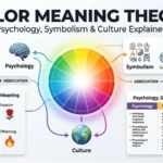
Psychology also adds another layer because colors can influence attention, emotional associations, and visual perception without determining how every person will feel.
This guide explores the symbolism of major colors, their psychological associations, cultural meanings, spiritual interpretations, historical uses, and practical applications in design, branding, fashion, art, and everyday life.
Quick Answer: What Do Colors Symbolize?
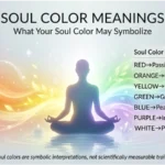
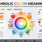
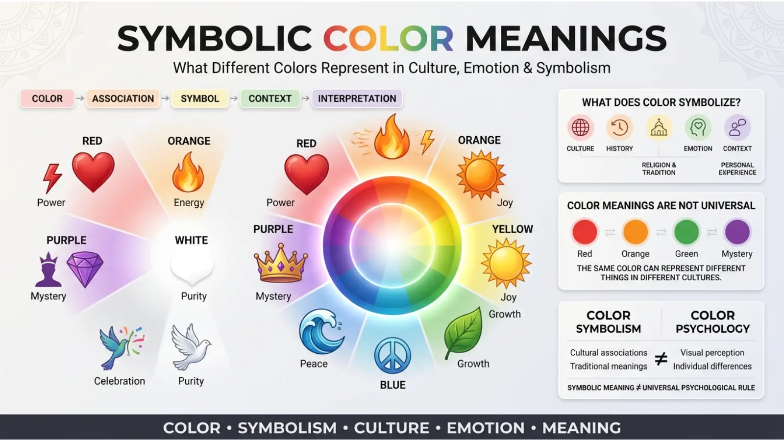
Symbolic color meanings describe the ideas, emotions, values, and cultural messages people associate with different colors. Common associations include red with passion and danger, blue with calm and trust, green with nature and growth, yellow with happiness and attention, purple with royalty and spirituality, orange with energy, pink with affection, black with power or mourning, and white with purity or simplicity. However, these meanings vary by culture, context, shade, and personal experience.
A Symbolic color meanings Chart
| Color | Common Symbolic Meanings | Possible Negative Associations |
|---|---|---|
| 🔴 Red | Love, passion, energy, courage | Anger, danger, aggression |
| 🟠 Orange | Creativity, warmth, enthusiasm | Impulsiveness, excess |
| 🟡 Yellow | Happiness, optimism, attention | Caution, jealousy |
| 🟢 Green | Nature, growth, renewal | Envy, inexperience |
| 🔵 Blue | Calm, trust, stability | Sadness, distance |
| 🟣 Purple | Royalty, mystery, spirituality | Excess, artificiality |
| 🩷 Pink | Affection, tenderness, playfulness | Immaturity, delicacy |
| ⚫ Black | Power, elegance, mystery | Mourning, fear |
| ⚪ White | Purity, peace, simplicity | Emptiness, sterility |
| 🟤 Brown | Earth, reliability, comfort | Dullness, heaviness |
| 🩶 Gray | Neutrality, balance, sophistication | Uncertainty, dullness |
| 🩵 Turquoise | Freshness, communication, calm | Emotional distance |
| 🩵 Teal | Balance, clarity, renewal | Coldness when overused |
| 🟡 Gold | Achievement, wealth, prestige | Excess, extravagance |
| 🩶 Silver | Modernity, technology, refinement | Coldness, detachment |
What Is Symbolic color meanings?
Color symbolism is the use of color to communicate an idea beyond its physical appearance. Writers, artists, designers, religious traditions, governments, businesses, and communities have used colors to create associations for centuries.
For example, a green traffic signal does more than display a particular wavelength of light. Within a specific traffic system, green communicates permission to proceed. Likewise, a black suit can communicate formality in one setting, while black clothing may be associated with mourning in another.
Therefore, color symbolism comes from both shared conventions and human interpretation. Some associations are widespread, but none should automatically be treated as universal rules.
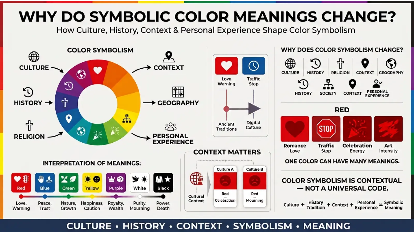
Why Do Symbolic Color Meanings Change?
Context plays a major role. A red heart, red warning sign, and red sports jersey can all create different associations despite using the same basic color.
Culture matters too. Religious traditions, national customs, ceremonies, historical events, and local practices can give a color a special meaning. Even within one country, different generations may interpret the same shade differently.
Shade and intensity also influence perception. A soft pastel blue can feel very different from a deep navy blue. Bright yellow demands more visual attention than a muted ochre. Consequently, talking about “blue” or “green” as if every variation has exactly the same meaning can oversimplify color symbolism.
Red Symbolism: Passion, Love, and Energy
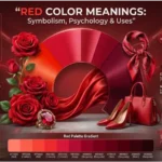
Red is one of the most visually powerful colors. It is commonly associated with love, passion, courage, energy, heat, urgency, and danger.
Because red can attract attention strongly, designers often use it when something needs to stand out. Warning signs, emergency equipment, sale graphics, and sports uniforms may use red for visibility and emphasis.
At the emotional level, red can represent intense feelings. A red rose often communicates romantic love, while a red heart is widely recognized as an affectionate symbol.
However, red also has a darker side. Blood, fire, danger, anger, and aggression can all contribute to negative associations.
Red in Culture and Tradition
Red carries important meanings in many cultures, although those meanings differ. In several East Asian traditions, red has been connected with celebration, prosperity, good fortune, and festive occasions. In Western contexts, it frequently appears in romantic symbolism, holiday decorations, warnings, and political or institutional imagery.
The meaning therefore depends heavily on the cultural setting.
Orange Symbolism: Creativity, Warmth, and Enthusiasm
Orange sits between red and yellow, combining some of the visual energy associated with both. It commonly suggests warmth, enthusiasm, creativity, friendliness, movement, and optimism.
Because orange resembles fire, sunsets, autumn leaves, and ripe fruit, it can also feel natural and energetic at the same time.
In design, orange often works well when a brand wants to appear approachable rather than formal. Bright orange can feel playful, while burnt orange can create a more mature and earthy atmosphere.
Too much intense orange, however, can become visually overwhelming. For that reason, designers often balance it with neutral colors.
Yellow Symbolism: Happiness, Optimism, and Attention
Yellow is strongly associated with sunlight, happiness, optimism, warmth, and energy. It is also highly noticeable, which helps explain its use in warning signs and attention-focused visual systems.
Soft yellow can create a warm and welcoming atmosphere. Bright yellow, on the other hand, can feel energetic and demanding.
Yellow does not always have a positive meaning. Depending on the culture and context, it can also symbolize caution, jealousy, sickness, or deceit. These meanings demonstrate why a color cannot be interpreted without considering its surroundings.
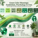
Green Symbolism: Nature, Growth, and Renewal
Green has an obvious connection with vegetation, forests, leaves, and new growth. As a result, it commonly represents nature, renewal, health, balance, freshness, and growth.
Environmental organizations frequently use green because the color provides an immediate visual connection to the natural world. Businesses in food, wellness, agriculture, and sustainability may also use green to communicate related ideas.
There is another long-standing association: envy. Expressions such as “green with envy” show how the same color can represent an unpleasant emotion as well as natural growth.
Green in Everyday Design
Light greens can create a fresh appearance, while darker greens often feel more established and grounded. Olive and sage greens can provide an earthy atmosphere without the intensity of bright green.
Blue Symbolism: Calm, Trust, and Stability
Blue is frequently associated with calmness, trust, reliability, stability, communication, and depth.
Its connection with sky and water may contribute to some of these associations. Clear skies and calm water can create visual impressions of openness and tranquility.
Businesses often choose blue for professional identities because it can communicate seriousness and reliability. Technology, financial, healthcare, and corporate brands have historically made extensive use of blue, although color alone does not create consumer trust.
Blue can also symbolize sadness. The phrase “feeling blue” demonstrates this emotional association in English-speaking culture.
Purple Symbolism: Royalty, Mystery, and Spirituality
Purple has a long association with royalty, prestige, luxury, mystery, imagination, and spirituality.
Historically, some purple dyes were difficult and expensive to produce, helping establish associations between purple and wealth or status. Over time, purple also became connected with artistic expression and mystical themes.
Light purple shades such as lavender tend to feel softer and more delicate. Deep purple can appear dramatic, luxurious, or mysterious.
Because purple has several cultural and historical meanings, it works especially well when the desired message involves imagination, ceremony, creativity, or distinction.
Pink Symbolism: Affection, Tenderness, and Playfulness
Pink is commonly linked with affection, tenderness, romance, sweetness, compassion, and playfulness.
Its associations have changed over time. Modern Western culture often connects pink with femininity, although that connection is cultural rather than an inherent property of the color.
Different shades produce different impressions. Pale pink may feel gentle and peaceful, while vivid magenta can appear energetic, expressive, and unconventional.
Consequently, pink should not automatically be treated as childish or feminine. Its meaning depends greatly on shade, audience, and design context.
Black Symbolism: Power, Elegance, and Mystery
Black is one of the most versatile symbolic colors. It can represent power, sophistication, authority, mystery, seriousness, formality, and rebellion.
Fashion frequently uses black because it can create a clean, formal appearance. In photography and graphic design, black can add contrast and visual weight.
At the same time, black has strong associations with death and mourning in many cultures. It can also communicate fear, secrecy, or darkness.
This contrast makes black particularly useful in storytelling. A character dressed entirely in black may be portrayed as powerful, mysterious, elegant, threatening, or simply practical depending on the surrounding narrative.
White Symbolism: Purity, Peace, and Simplicity
The White is commonly associated with purity, cleanliness, peace, innocence, simplicity, and new beginnings.
White spaces can appear open because the color reflects a large amount of visible light. Interior designers may therefore use white to create a sense of spaciousness.
Yet white does not mean purity everywhere. This is an important example of cultural variation.
In modern branding, white often communicates minimalism. Its effect depends strongly on the colors, materials, typography, and imagery placed around it.
Brown Symbolism: Earth, Comfort, and Reliability
Brown is closely connected with soil, wood, leather, coffee, and other natural materials. It often symbolizes earthiness, reliability, comfort, simplicity, and stability.
Because of these associations, brown can work well for brands emphasizing craftsmanship, outdoor experiences, natural materials, or traditional production.
However, excessive brown can feel heavy or dated. Combining it with cream, green, blue, or warm neutrals can create a more balanced visual system.
Gray Symbolism: Neutrality and Sophistication
Gray occupies a middle position between black and white. It commonly communicates neutrality, restraint, balance, professionalism, and sophistication.
Modern technology, architecture, automotive design, and corporate graphics often use gray because it can provide a polished background without demanding attention.
Its weakness is that large amounts of gray can feel cold or lifeless. Warmer gray tones can solve this problem by adding subtle brown or beige undertones.
Gold Symbolism: Achievement and Prestige
Gold is strongly connected with wealth, achievement, prestige, celebration, success, and high value.
Its symbolism comes partly from the material itself. Gold has been valued as a precious metal across many societies, so its visual representation naturally carries associations with rarity and status.
Gold works particularly well as an accent. When used excessively, however, it may communicate extravagance rather than refinement.
Silver Symbolism: Modernity and Technology
Silver often suggests technology, modernity, precision, sophistication, and refinement. Its metallic appearance makes it particularly common in products associated with machinery, electronics, vehicles, and futuristic design.
Unlike gold, silver tends to communicate a cooler form of prestige. It can feel clean and contemporary rather than traditional or ceremonial.
The Psychology Behind Symbolic color meanings
Color psychology examines how color can affect perception, behavior, attention, and emotional experience. However, popular claims about color psychology often go further than the evidence supports.
A color does not force everyone to experience one specific emotion. Instead, responses can depend on context, learned associations, brightness, saturation, surrounding colors, culture, and individual experience.
For instance, a bright red object may attract attention, but whether someone interprets that attention as excitement, danger, love, or aggression depends on what the object represents.
Color, Attention, and Visual Hierarchy
One practical effect designers can use is contrast. A strongly contrasting color can attract attention because it stands apart from surrounding elements.
That does not mean the color has a universal emotional effect. Rather, its visual difference makes it easier to notice.
This distinction is important when using color professionally: visibility and symbolism are related, but they are not the same thing.
Spiritual Meaning of Colors
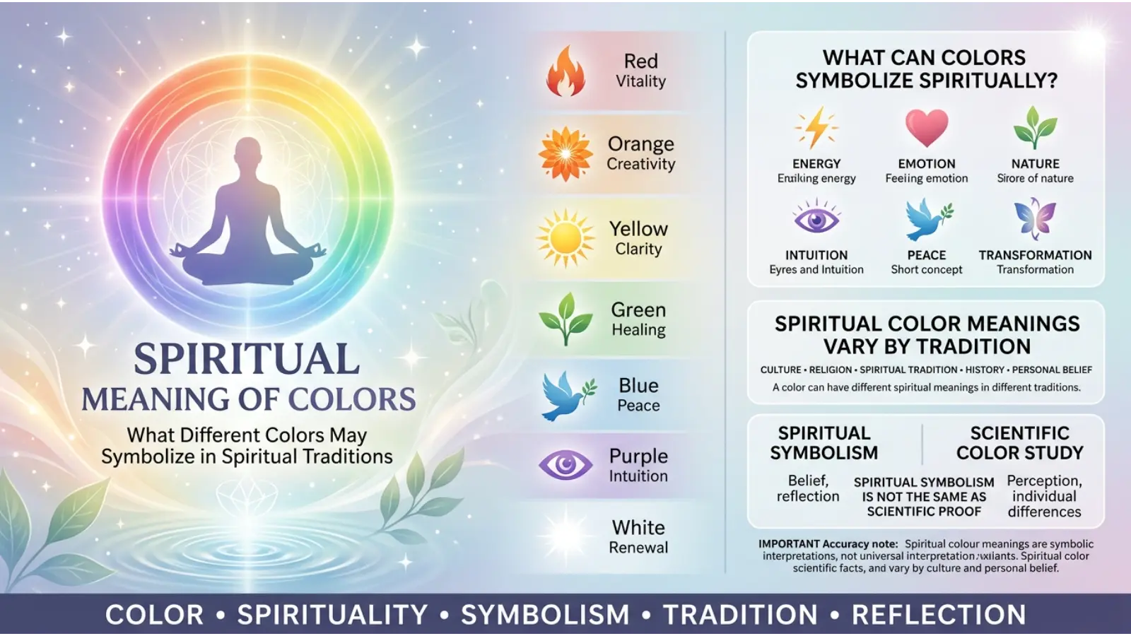
Colors frequently appear in spiritual practices, ceremonies, artwork, meditation systems, and religious symbolism. However, there is no single universal spiritual color dictionary.
Red may represent life force or sacrifice in some traditions. White can represent purity or sacredness in certain religious contexts. Green can symbolize renewal or paradise in particular traditions. Purple may be connected with spirituality, ceremony, or transformation.
Color symbolism can also be personally meaningful. Someone may associate blue with prayer because of an experience from childhood, even if that interpretation is not shared by another person.
Cultural Differences in Symbolic color meanings
Culture is one of the strongest reasons color meanings cannot be treated as universal.
Western Cultural Associations
In many Western settings, white is frequently associated with weddings, cleanliness, and simplicity, while black is commonly associated with formal clothing and mourning.
Red has strong associations with romance, warning, and urgency.
East Asian Traditions
Color symbolism across East Asia is diverse and cannot be reduced to one system. Red has important associations with celebration and good fortune in several Chinese cultural contexts, while white has historically been associated with mourning in Chinese funerary traditions.
Middle Eastern Contexts
Color meanings vary substantially across Middle Eastern societies and religious contexts. Green, for example, can have important historical and religious associations in Islamic cultures, but its meaning still depends on the specific context.
African Cultures
Africa contains hundreds of cultures and languages, so there is no single “African meaning” for any color. Ceremonial clothing, national flags, beadwork, art, and local traditions can assign colors very different meanings.
Latin American Cultures
Color symbolism throughout Latin America also varies by country and tradition
The safest approach is to study the specific culture rather than assigning one meaning to an entire region.
Historical Symbolic color meanings
Color symbolism has changed because the availability and cost of pigments changed.
Purple provides a famous example. Some historical purple dyes were difficult to produce, making certain purple textiles expensive and contributing to associations with elite status.
Red also gained importance through valuable pigments and dyes used in art, clothing, manuscripts, and ceremonial objects.
Blue developed different associations as pigment technology improved and certain blue materials became more accessible.
Therefore, color symbolism is partly a story about materials, technology, economics, and social status, not just psychology.
Personality Associations With Color Preferences
People often ask what their favorite color says about their personality.
Someone who prefers blue is not automatically calm. Someone who likes red is not necessarily aggressive. A preference may reflect fashion, memories, cultural background, current trends, or simply visual taste.
Color can contribute to self-expression, though. People may deliberately choose particular colors to create a desired impression through clothing, room decoration, artwork, or personal branding.
The useful question is therefore not “What personality does this color prove?” but rather “What impression might this color communicate in this situation?”
Color in Branding and Marketing
Brands use color as part of a broader visual identity. A logo’s color works alongside typography, shape, photography, language, packaging, and customer experience.
Blue can communicate a professional or dependable appearance. Green can reinforce environmental or natural themes. Red can create energy and visibility. Purple can suggest creativity or premium positioning.
However, color does not guarantee consumer behavior. A successful brand color works because it fits the complete identity and the expectations of its audience.
Choosing a Brand Color
Before selecting a color, consider:
- What emotion or idea should the brand communicate?
- Who is the intended audience?
- What colors dominate the industry?
- Will the color remain recognizable across screens and print?
- Does it work with accessible text contrast?
- Does it still communicate the intended message in different cultures?
A strong choice is usually one that supports the brand’s message rather than simply following a popular color trend.
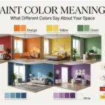
Color in Interior Design
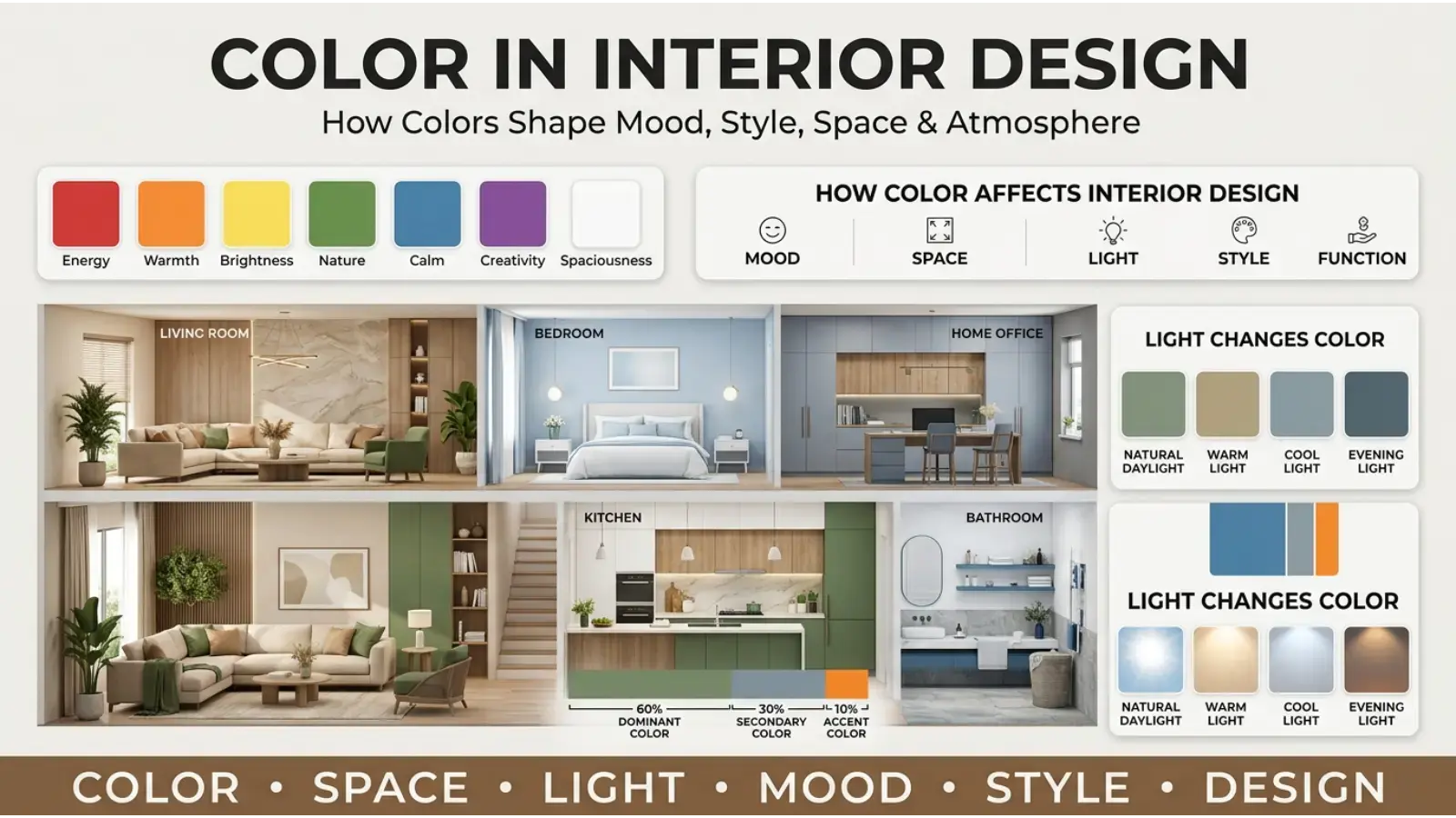
Color can dramatically change the visual character of a room.
Living Room
Warm neutrals, muted greens, soft blues, and earthy browns can create different forms of comfort. Darker colors can add visual depth, while lighter colors may make a room appear more open.
Bedroom
Soft blues, greens, lavender, warm beige, and muted neutral shades are often chosen for bedrooms because they create quieter visual environments.
Office
Blue, gray, green, beige, and natural wood tones can create professional settings. Accent colors can then add energy without dominating the entire room.
Kitchen
White can produce a clean appearance, while wood tones, green, blue, terracotta, or yellow can introduce warmth and personality.
Lighting changes everything. A paint color that looks cool under daylight can appear warmer under artificial lighting. Therefore, test paint samples at different times of day before making a final decision.
Color in Fashion
Clothing color can influence the impression an outfit creates, but the effect depends on fabric, cut, pattern, styling, and occasion.
Black can create a formal or polished appearance. Navy can feel professional. White can appear clean and simple. Red can become a strong focal point. Green and brown often work well with natural or earthy styles.
Seasonal associations can influence choices too. Pastels are often used in spring fashion, while darker earth tones frequently appear in autumn collections.
Still, there are no strict rules. Fashion is also a form of personal expression.
Practical Color Combinations
Good color combinations depend on contrast, harmony, saturation, and purpose.
| Combination | Visual Character | Useful Applications |
|---|---|---|
| 🔵 Blue + ⚪ White | Clean and calm | Websites, healthcare, offices |
| 🟢 Green + 🤍 Cream | Natural and warm | Wellness, interiors |
| 🟣 Purple + 🩶 Gray | Modern and refined | Branding, fashion |
| 🔴 Red + ⚫ Black | Bold and dramatic | Entertainment, sports |
| 🟠 Orange + 🔵 Navy | Energetic and balanced | Marketing, sports |
| 🟡 Yellow + 🩶 Gray | Bright with restraint | Modern interiors, graphics |
| 🟤 Brown + 🟢 Sage | Earthy and relaxed | Home décor, natural brands |
| 🩷 Pink + 🟣 Purple | Expressive and playful | Fashion, creative projects |
A beautiful color palette is not useful if readers cannot comfortably read the content.
How Lighting Changes Color Meaning
Lighting can change both the appearance and emotional impression of a color.
Warm lighting can make neutral surfaces look more yellow, beige, or orange. Cool lighting can make them appear bluer or more gray.
Digital screens introduce another variable. The same color can look different on a phone, laptop, television, or printed page because displays and materials reproduce color differently.
Color Symbolism in Art and Photography
Artists use color to direct attention, establish atmosphere, create contrast, and communicate themes.
A filmmaker might surround a scene with blue tones to create a quiet or isolated mood. A photographer may use warm orange light to create intimacy. A painter can place a small area of red against muted surroundings to make it visually dominant.
These choices are artistic strategies rather than universal emotional formulas.
Context also matters. A red object in an otherwise gray image becomes meaningful partly because of its contrast. The symbolism comes from the color and the way the artist positions it.
Color Symbolism in Everyday Life
You encounter symbolic colors constantly:
- Traffic signals use standardized colors to communicate instructions.
- Warning signs often use high-visibility combinations.
- Sports uniforms create team identity.
- School colors build group recognition.
- Packaging helps products stand out.
- Websites use color to establish hierarchy and brand identity.
- Interior spaces use color to shape atmosphere.
- Clothing communicates style and occasion.
- Art and photography use color to guide attention.
- Flags use colors to represent national or cultural ideas.
These examples show that color meaning is often learned through repeated social experience.
Common Misconceptions About Color Meanings
Myth 1: Every Color Has One Universal Meaning
It does not. Color meanings vary by culture, context, shade, history, and personal experience.
Myth 2: Your Favorite Color Reveals Your Personality
A color preference cannot reliably diagnose personality. It can be one form of self-expression, but it is not a complete psychological profile.
Myth 3: Color Psychology Works the Same for Everyone
Human responses to color are influenced by many factors. Research can identify patterns, but individual reactions still vary.
Myth 4: Dark Colors Are Always Negative
Black, navy, charcoal, and other dark shades can communicate elegance, authority, calmness, sophistication, or seriousness.
Myth 5: Bright Colors Are Always Happy
Brightness can attract attention and create energy, but context determines whether that energy feels cheerful, urgent, overwhelming, or aggressive.
How to Use Symbolic Color Meanings Wisely
Start with the purpose of the color rather than the color itself.
If you are designing a website, ask what visitors need to understand first. If you are decorating a room, consider lighting and the atmosphere you want. You are choosing clothing, think about the occasion and the impression you want to create.
Then consider cultural expectations.
Finally, test the result with real people when the decision matters. A color theory chart can provide ideas, but actual audience feedback can reveal associations you did not anticipate.
Frequently Asked Questions
What are symbolic color meanings?
Symbolic color meanings are ideas or emotions that people associate with particular colors. These associations develop through culture, history, nature, social conventions, personal experiences, and visual context.
What color symbolizes love?
Red is one of the most widely recognized colors associated with romantic love and passion. Pink can also represent affection, tenderness, and romance.
What color symbolizes peace?
White is commonly associated with peace, while blue can suggest calmness and tranquility. The exact meaning depends on the cultural and visual context.
What color symbolizes growth?
Green is strongly associated with growth because of its connection with plants, nature, renewal, and new life.
What color symbolizes power?
Black, red, purple, and gold can all communicate power in different contexts. Black may suggest authority, purple can suggest status, red can express force or intensity, and gold can represent prestige.
What color represents spirituality?
Purple is often associated with spirituality and mystery, while other colors can have spiritual meanings within specific religious or cultural traditions. There is no universal spiritual color system.
Does color affect emotions?
Color can influence perception, attention, and emotional associations, but responses are not identical for everyone. Context, culture, lighting, saturation, and personal experience all matter.
Why do different cultures have different color meanings?
Colors become meaningful through traditions, religious practices, historical events, ceremonies, language, clothing, and social conventions. Since these experiences differ between societies, color symbolism also differs.
Can colors influence buying decisions?
Color is one element of visual communication and can influence attention and brand perception. However, purchasing decisions also depend on price, product quality, reputation, messaging, personal preference, and many other factors.
Can I use color symbolism in my own design?
Yes. Color symbolism can help establish an intended mood or message. Use it together with contrast, typography, imagery, accessibility, cultural awareness, and the specific needs of your audience.
Final Thoughts
Symbolic color meanings are not fixed rules written into the colors themselves. They are relationships people build between visual experiences and ideas. Red can suggest love or danger. Green can communicate nature or envy. Black can represent elegance or mourning. White can suggest peace or carry very different meanings in another cultural setting.
That flexibility is what makes color so useful.
When choosing a color for a room, outfit, logo, photograph, artwork, or website, consider the complete context instead of relying on a single symbolism chart. Look at the shade, lighting, surrounding colors, audience, cultural setting, and purpose. Used thoughtfully, color becomes more than decoration—it becomes a quiet visual language that helps people understand what they are seeing and how it is meant to feel.

Emma Wilson is a dedicated comparison writer and product researcher at ColorMystiic.com. She specializes in creating unbiased product comparisons, detailed reviews, and helpful buying guides. Her goal is to help readers make smarter purchasing decisions with confidence.