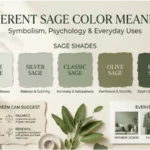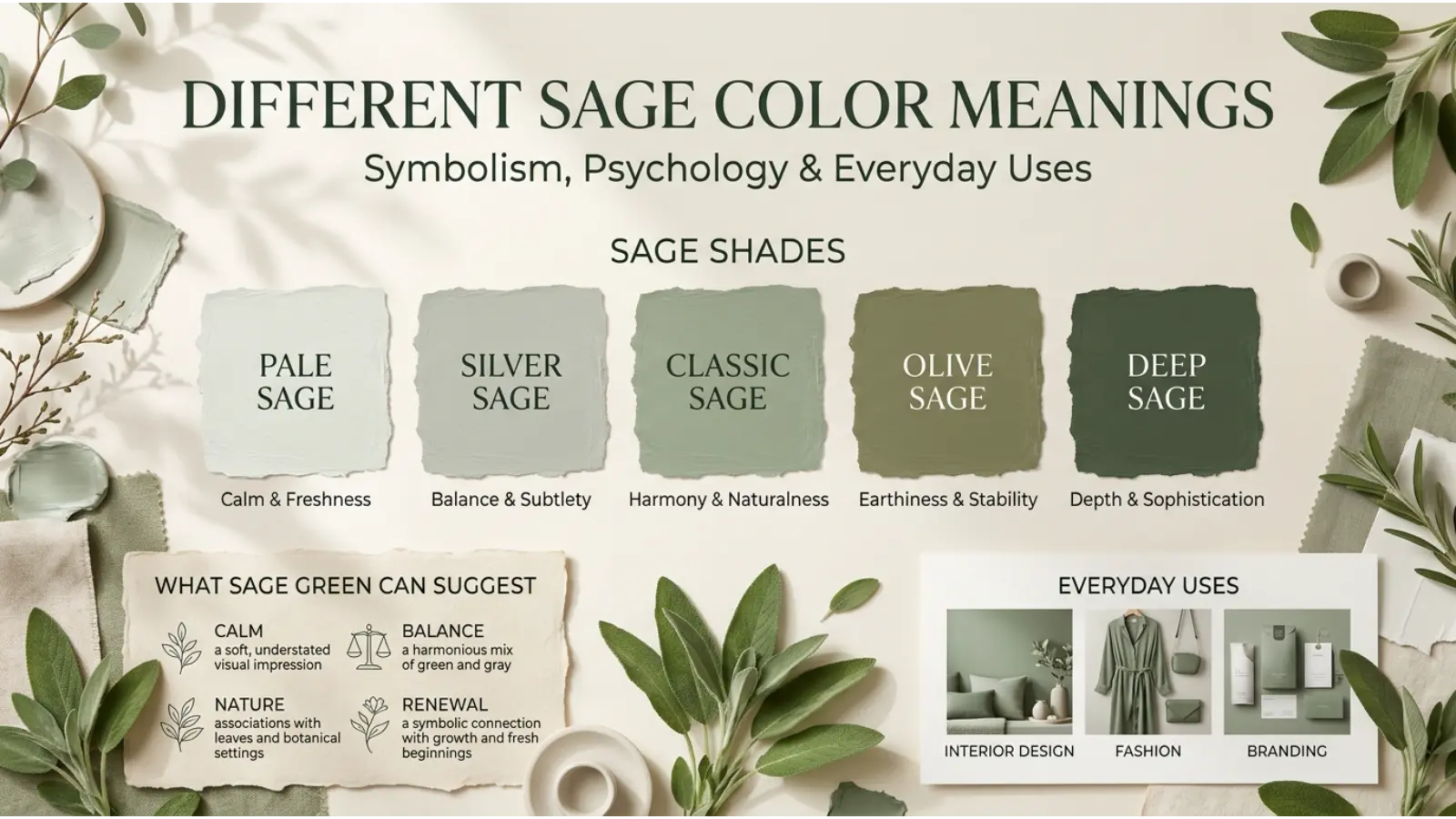
Different Sage Color Meanings is a soft, muted color inspired by the silvery green leaves of the sage plant. It combines the freshness of green with a gentle gray undertone, creating a natural appearance that feels calm, balanced, and timeless. However, not every shade of sage communicates the same message. Light sage can feel airy and peaceful, while darker sage often looks more grounded and sophisticated.
People search for different sage color meanings to understand how each shade relates to emotions, nature, spirituality, fashion, and interior design. The answer depends on the exact shade, its surroundings, the lighting, and the cultural context. Therefore, understanding these differences can help you choose the right sage color for your home, clothing, artwork, or brand.
This guide explores the symbolism of sage shades, their psychological associations, and practical ways to use them effectively.
Quick Answer: Different sage color meanings depend on the shade. Light sage often represents freshness and peace, gray sage suggests balance and subtlety, classic sage symbolizes nature and renewal, and dark sage communicates stability and maturity. These are common design associations rather than universal rules.
What Do Different Sage Colors Mean?
Sage is not one exact color. Instead, it describes a family of muted green shades that usually contain gray, creating a softer appearance than bright or saturated green.
Because the balance of green and gray changes from shade to shade, each version can create a different visual impression. For example, a pale sage wall may feel open and relaxing, whereas a deep sage cabinet can add weight and character to a room.
A Colorful Chart of Sage Color Meanings
| Sage color | Visual appearance | Common symbolic association | Best uses |
|---|---|---|---|
| 🟢 Light sage | Pale, airy green | Peace, freshness, new beginnings | Bedrooms, nurseries, spring outfits |
| 🩶 Gray sage | Green mixed with noticeable gray | Balance, restraint, sophistication | Modern interiors, offices, minimalist branding |
| 🌿 Classic sage | Soft, natural green | Growth, harmony, connection to nature | Living rooms, gardens, everyday fashion |
| 🌲 Dark sage | Deep, subdued green | Stability, maturity, groundedness | Cabinets, coats, furniture, premium packaging |
| 🫒 Olive sage | Earthy green with yellow or brown undertones | Practicality, endurance, natural warmth | Rustic interiors, outdoor clothing |
| 🌫️ Silver sage | Cool green with a silvery cast | Quiet elegance, reflection, subtlety | Bathrooms, decorative accents, contemporary spaces |
| 🌱 Warm sage | Green with beige or yellow undertones | Comfort, approachability, natural simplicity | Kitchens, living spaces, casual clothing |
| ❄️ Cool sage | Green with blue-gray undertones | Composure, clarity, cool elegance | Bathrooms, modern offices, tailored clothing |
These descriptions are useful starting points. Nevertheless, paint manufacturers and designers may use different names for similar shades, so the actual color matters more than the label.
The Symbolism Behind Sage Green
Sage green draws much of its symbolism from nature. Green is commonly associated with plants, growth, and renewal, while gray can soften that energy and give a color a more restrained appearance.
Together, these qualities help explain why sage often appears in spaces designed for rest, reflection, and everyday comfort.
Peace and Calmness
Sage’s muted appearance can create a quieter visual impression than bright green. As a result, designers often choose it for bedrooms, reading corners, and wellness spaces.
However, sage does not automatically make someone feel calm. Personal experience, lighting, surrounding colors, and individual preferences also influence emotional responses.
Growth and Renewal
Green is closely connected with living plants and seasonal growth. Therefore, sage can suggest fresh starts, personal development, and a return to natural surroundings.
For instance, a sage-green journal may suit a wellness routine, while sage packaging can help a plant-based product communicate a natural identity.
Balance and Harmony
The gray undertones in sage reduce the intensity of its green appearance. Consequently, sage often works as a visual bridge between stronger colors and neutral shades.
This makes it useful in rooms or designs where several elements need to feel connected without competing for attention.
Wisdom and Maturity
Some people interpret sage as a thoughtful, mature color because it looks restrained rather than flashy. Darker sage can strengthen this impression, particularly when paired with wood, charcoal, or warm metallic details.
These associations are symbolic rather than fixed meanings. A color alone cannot prove that a person or product is wise or trustworthy.
Negative Associations of Sage
Although sage is often used positively, it can also create less desirable impressions in certain settings.
- Dullness: Too much gray can make sage appear lifeless.
- Coldness: Blue-gray sage may feel chilly in a poorly lit room.
- Old-fashioned style: Certain combinations can resemble dated institutional or vintage interiors.
- Low energy: A room dominated by muted colors may feel less lively to someone who prefers bright surroundings.
Fortunately, these effects can be adjusted with warmer lighting, contrasting textures, brighter accents, and a more balanced color palette.
Psychology of Different Sage Color Meanings
Color psychology examines how colors relate to perception, emotion, and behavior. However, color responses depend heavily on context, and no single shade produces the same reaction in everyone.
Sage is especially interesting because it combines green’s associations with nature and gray’s subdued visual quality.
How Light Sage Influences Perception
Light sage often looks gentle and spacious. Because it reflects more light than darker greens, it can help a small room feel less visually heavy.
In addition, its soft appearance can suit spaces intended for rest, study, or quiet conversation. Nevertheless, a pale sage room may look washed out when its walls, furniture, and decorations all have similar brightness.
Why Gray Sage Feels More Subtle
Gray sage contains less obvious green intensity than a more saturated shade. Therefore, it often blends easily with neutral colors and contemporary materials.
Designers may use it when they want color without a bold visual statement. In an office, for example, gray sage can add character while remaining less attention-grabbing than vivid lime green.
Why Dark Sage Looks Grounded
Dark sage has more visual weight. It can make furniture look substantial, create contrast against pale walls, and establish a stronger connection with natural materials.
However, dark sage may make a small or poorly lit space feel enclosed if used on every surface. Using it on a feature wall, cabinet, or accent chair can provide depth without overwhelming the room.
What Research Can and Cannot Tell Us
Research on color perception suggests that colors can influence impressions, and green is often linked with nature because of its familiar presence in plants and landscapes. Yet emotional responses are shaped by learning, culture, surroundings, and personal experience.
There is no strong basis for claiming that every sage shade produces a specific psychological effect or that sage can independently treat anxiety, improve health, or guarantee better concentration.
The practical lesson is simple: use sage to create a visual atmosphere that supports your goal, then evaluate the result in the actual setting.
Spiritual Meaning of Different Sage Color Meanings
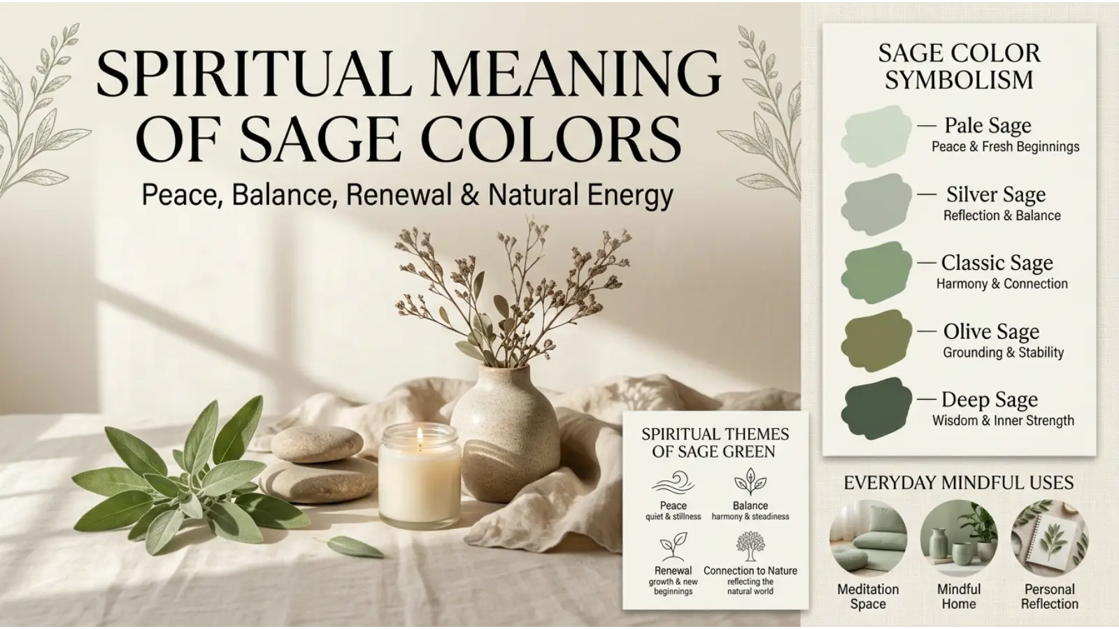
In modern spiritual and wellness settings, sage green is sometimes associated with balance, renewal, grounding, and harmony. Its connection with plant life can also make it a symbol of natural growth and a fresh beginning.
However, these interpretations are not universal religious teachings. They vary across spiritual communities, personal beliefs, and cultural traditions.
Light Sage: Renewal and Hope
Light sage can symbolize a gentle beginning or a willingness to grow. Some people use it in meditation spaces, personal journals, or artwork intended to represent emotional renewal.
Its pale appearance supports a visual theme of openness rather than intensity.
Gray Sage: Reflection and Balance
Gray sage can serve as a personal symbol of moderation and thoughtful decision-making. Its restrained appearance may suit reflective artwork or spaces intended for journaling and quiet activities.
Still, the color itself does not provide spiritual protection or guarantee inner peace.
Dark Sage: Grounding and Stability
Dark sage can represent a strong connection to the earth, especially when combined with natural wood, stone, or plant imagery.
For someone creating a personal meditation corner, this shade may help express a preference for grounded, nature-inspired surroundings.
Does Sage Green Have a Religious Meaning?
Sage green does not have one universal religious meaning. Its significance depends on the tradition, the specific ritual or artwork, and the beliefs of the people using it.
It is better to distinguish modern color symbolism from documented religious practices rather than assume that every spiritual interpretation applies across cultures.
Cultural and Historical Different Sage Color Meanings
The meaning of sage green changes across places and periods. Although green has a long history in art, clothing, decoration, and symbolic systems, the exact shade now called sage green does not have one consistent historical meaning.
Sage Green in Western Design
In contemporary Western interiors, sage is commonly used for its natural, muted appearance. It suits farmhouse, cottage, Scandinavian-inspired, traditional, and modern styles.
Its popularity in these settings reflects current design preferences rather than a single inherited cultural rule.
Sage Green in East Asian-Inspired Interiors
Soft greens can appear in interiors inspired by gardens, landscapes, and natural materials. When used with wood, stone, paper-like textures, or restrained decoration, sage can contribute to a quiet, nature-oriented aesthetic.
However, East Asian cultures are diverse. Sage green should not be presented as having one shared meaning across China, Japan, Korea, or other regions.
Sage Green in Middle Eastern and African Design
Green has important meanings in some religious, national, artistic, and cultural contexts across the Middle East and Africa. Yet these meanings vary substantially by community and setting.
It would be inaccurate to assume that sage green carries the same significance as every other green shade in these traditions. Local patterns, materials, religious context, and established color conventions matter.
Sage Green in Latin American and Indigenous Art
Green can appear in landscapes, textiles, ceramics, and other artistic traditions throughout Latin America and Indigenous communities. Nevertheless, specific meanings depend on the people, materials, and practices involved.
Sage green is a modern color label, so its use should not automatically be treated as an established traditional symbol.
How Sage Green’s Historical Role Has Changed
Muted greens have been used in clothing, decorative arts, painted surfaces, and furnishings across different periods. Their exact appearance depended on available pigments, dyes, production methods, and changing tastes.
Today, sage green is especially visible in contemporary home decoration, fashion collections, and nature-inspired branding. Its current popularity does not mean that all historical societies understood it in the same way.
Personality Associations: What Does Loving Sage Green Suggest?
People sometimes connect color preferences with personality. Because sage is muted and nature-inspired, it is often associated with people who appreciate simplicity, balance, and understated style.
However, your favorite color cannot reliably determine your personality. These associations are cultural impressions, not psychological diagnoses.
People Who Prefer Light Sage
Light sage may appeal to people who enjoy soft colors, airy spaces, and a gentle visual style. It can communicate an impression of openness, freshness, and simplicity.
For example, someone might choose light sage clothing because it feels versatile and easy to coordinate rather than because of any particular personality trait.
People Who Prefer Gray Sage
Gray sage may appeal to those who prefer subtle design over bold statements. Its neutral quality makes it useful for people who enjoy minimalist interiors, understated clothing, and balanced color palettes.
Nevertheless, a preference for gray sage does not prove that someone is reserved, analytical, or introverted.
People Who Prefer Dark Sage
Dark sage often suits people who enjoy earthy colors with more depth. It can create an impression of confidence, maturity, and practicality, particularly when paired with dark wood or structured clothing.
In fashion, for example, a dark sage jacket can look distinctive without the intensity of bright green.
What Your Sage Color Preference Might Say
| Your preferred shade | Possible style association | A practical way to use it |
|---|---|---|
| 🟢 Light sage | Fresh and gentle | Bedding, casual outfits, stationery |
| 🩶 Gray sage | Subtle and modern | Office decor, minimalist clothing |
| 🌿 Classic sage | Natural and balanced | Living rooms, everyday accessories |
| 🌲 Dark sage | Grounded and refined | Coats, cabinets, formal-casual outfits |
| 🫒 Olive sage | Earthy and practical | Outdoor clothing, rustic decor |
| 🌫️ Silver sage | Cool and elegant | Bathrooms, jewelry, modern accents |
Treat these descriptions as style inspiration, not as fixed labels for yourself or anyone else.
Sage Green in Branding and Marketing
Businesses often use muted greens to communicate a connection with nature, simplicity, or a considered approach to design. Sage is particularly useful when a brand wants to look natural without relying on the strong, bright appearance of traditional green.
However, color alone cannot establish trust or prove that a product is sustainable. The product, packaging, messaging, and business practices must support the impression the brand creates.
Why Businesses Choose Sage Green
Natural and plant-inspired products: Sage can suit gardening supplies, botanical skincare, plant-based goods, and nature-focused products because it resembles foliage.
Wellness and self-care: Its muted appearance works well with packaging intended to feel gentle, understated, or relaxing.
Premium products: Dark sage paired with cream, charcoal, or restrained metallic accents can create a refined visual identity.
Home and lifestyle brands: Sage can communicate a calm, practical aesthetic that fits furniture, bedding, ceramics, and home accessories.
Environmentally focused businesses: Sage may help communicate a nature-related message. However, genuine environmental claims require evidence rather than green packaging alone.
Practical Branding Advice
First, choose a shade that fits your product and target audience. Next, test it on actual packaging, mobile screens, and printed materials because colors can appear different across surfaces.
Additionally, check text contrast before using sage as a background. Light gray-green may not provide enough contrast for small white text, particularly for customers with low vision.
Finally, consider how the color looks beside competitor products. A distinctive combination of sage, typography, and supporting colors may create a stronger identity than using sage alone.
Different Sage Color Meanings in Interior Design
Sage green is popular in interiors because it can work as a soft neutral while still introducing color. Unlike plain white or beige, it provides a visible connection to green without demanding as much attention as a saturated shade.
Furthermore, sage can work with traditional furniture, modern finishes, natural wood, and many types of fabric.
Sage Green in the Living Room
<AsyncImage query=”warm inviting living room sage green walls beige sofa natural oak furniture soft daylight” aspectRatio=”16:9″ width=”100%”/>
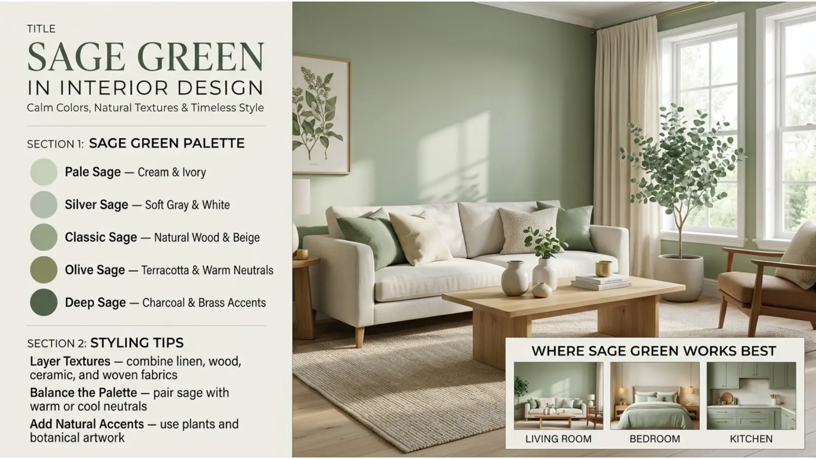
Classic sage and warm sage are particularly versatile in living rooms. They work well with cream sofas, oak furniture, woven baskets, and natural-fiber rugs.
For a balanced result, use sage on the walls and allow the furniture to introduce contrast. Alternatively, keep the walls neutral and add sage through curtains, cushions, or an accent chair.
If your living room receives little daylight, test the paint first. Gray-heavy sage can look cooler and darker than expected in a north-facing or shaded room.
Sage Green in the Bedroom
<AsyncImage query=”peaceful bedroom muted light sage green walls ivory bedding natural wood bedside table” aspectRatio=”16:9″ width=”100%”/>
Light sage can give a bedroom a gentle, fresh appearance. Pair it with ivory bedding, natural wood, and soft fabrics to create a coordinated space.
Meanwhile, darker sage can work behind the bed as an accent wall. This adds depth without requiring every wall to be dark.
For a cohesive look, repeat the same shade in one or two smaller details, such as a cushion or bedside accessory.
Sage Green in the Kitchen
<AsyncImage query=”modern sage green kitchen cabinets white quartz countertop brass handles natural oak details” aspectRatio=”16:9″ width=”100%”/>
Sage cabinets can add color without making a kitchen feel overly bright. In addition, they pair naturally with white countertops, wooden shelves, stone textures, and brushed-metal hardware.
Warm sage often suits traditional or farmhouse kitchens, whereas gray sage can complement modern cabinets and simple surfaces.
However, check cabinet samples under both daylight and evening lighting before making a final decision. Artificial light can shift a muted green toward yellow, gray, or blue.
Sage Green in the Office
Gray sage and classic sage can introduce color into a workspace without creating a visually dominant feature.
Consider using sage on a single wall, a desk accessory, or a storage unit. Then balance it with neutral furniture and adequate task lighting.
Although some people find nature-inspired surroundings pleasant, sage should not be treated as a guaranteed way to improve productivity or concentration.
How Lighting Changes Sage Green
Lighting is one of the most important factors when selecting sage paint or fabric.
| Lighting condition | How sage may appear | Decorating suggestion |
|---|---|---|
| ☀️ Direct daylight | Brighter and greener | Use medium or darker shades if the room feels washed out |
| 🌤️ Indirect daylight | Soft and balanced | A good setting for testing most sage shades |
| 💡 Warm white bulbs | Warmer, sometimes more yellow | Pair with cream, beige, or natural wood |
| ❄️ Cool white bulbs | Grayer or bluer | Add warmer fabrics and natural materials |
| 🌙 Dim evening light | Darker and less distinct | Choose lighter sage or improve lighting |
These effects depend on the actual bulb, the paint, surrounding colors, and the direction of the light. Therefore, paint a sample on more than one wall and observe it at different times of day.
Different Sage Color Meanings in Fashion
Sage green offers a middle ground between a neutral and a statement color. It can make an outfit feel softer than black or navy while remaining more understated than bright green.
Moreover, its muted appearance makes it easy to combine with many wardrobe basics.
Light Sage Clothing
Light sage works well in spring and summer outfits because it can look fresh and airy. It pairs with white shirts, cream trousers, light denim, and beige footwear.
For example, a light sage blouse with ivory trousers creates a soft combination suitable for casual offices, lunches, and daytime events.
Dark Sage Clothing
Dark sage is useful for autumn and winter because it works naturally with heavier fabrics, leather accessories, and deeper neutral colors.
A dark sage jacket, for instance, can pair with black jeans and brown boots. Alternatively, combine it with cream knitwear for a softer contrast.
Sage Green in Professional Clothing
Sage can provide a subtle alternative to navy, black, or gray in professional settings. A sage shirt, blouse, blazer, or accessory can add personality without making the outfit excessively bright.
Nevertheless, the appropriate choice depends on the workplace. In a formal environment, use sage as an accent or select a darker, more restrained shade.
Sage Green Accessories
If you prefer neutral clothing, sage accessories offer an easy way to experiment with color.
- Bags: Sage works with beige, cream, black, and brown outfits.
- Shoes: Muted sage sneakers complement denim and white clothing.
- Scarves: Light sage can soften darker coats.
- Jewelry: Sage-colored stones and enamel can look elegant beside silver or gold.
- Hats: Dark sage offers an earthy alternative to black or navy.
Sage Green and Skin Undertones
Sage is not limited to one skin tone. However, different versions can create different visual effects beside the face.
Warmer sage shades may complement clothing palettes built around golden, earthy colors, while cooler sage shades may suit outfits featuring blue-gray, silver, or crisp white.
If a shade makes your face look dull under natural light, try a slightly warmer or deeper version. Personal preference and the full outfit matter more than rigid color rules.
Best Color Combinations for Different Sage Color Meanings
Sage becomes more versatile when paired with colors that either support its natural appearance or provide contrast.
The best combination depends on whether you want a soft, earthy, modern, or dramatic result.
A Colorful Sage Green Combination Chart
| Combination | Overall effect | Best application |
|---|---|---|
| 🌿 Sage + Cream | Soft and inviting | Bedrooms, packaging, wedding decor |
| 🌿 Sage + Beige | Warm and natural | Living rooms, casual clothing |
| 🌿 Sage + White | Fresh and clean | Kitchens, bathrooms, websites |
| 🌿 Sage + Charcoal | Modern and dramatic | Offices, fashion, branding |
| 🌿 Sage + Terracotta | Earthy and expressive | Art, interiors, autumn outfits |
| 🌿 Sage + Dusty Pink | Gentle and romantic | Bedrooms, floral arrangements |
| 🌿 Sage + Navy Blue | Balanced and structured | Workwear, study rooms, branding |
| 🌿 Sage + Mustard | Warm and lively | Cushions, artwork, accessories |
| 🌿 Sage + Chocolate Brown | Rich and grounded | Furniture, coats, rustic interiors |
| 🌿 Sage + Lavender | Soft and distinctive | Spring clothing, creative spaces |
Sage and Cream
Cream adds warmth to sage while keeping the overall palette light. Consequently, this combination works particularly well for bedrooms, living rooms, and botanical packaging.
Use sage as the main color and cream for larger contrasting surfaces or text backgrounds.
Sage and Terracotta
Terracotta introduces an earthy red-orange contrast. Because it is warmer and more saturated than sage, it prevents a natural palette from looking too uniform.
Try sage walls with terracotta cushions, ceramic pots, or artwork.
Sage and Dusty Pink
Dusty pink adds softness without the intensity of bright pink. Together, these colors can create a romantic appearance suitable for floral designs, bedrooms, and spring fashion.
For a more balanced palette, include cream or warm white as a third color.
Sage and Navy Blue
Navy introduces depth and structure. Meanwhile, sage keeps the combination from looking too dark or formal.
This pairing works well for professional clothing, study spaces, and brands that want a natural yet polished appearance.
Sage and Charcoal
Charcoal provides strong contrast and makes sage appear more distinctive. However, too much charcoal can make a room feel heavy.
Use charcoal for furniture, frames, or small design details while allowing sage and lighter neutrals to occupy more space.
Different Sage Color Meanings in Art and Photography
Artists and photographers use sage for its muted appearance, natural associations, and ability to support other colors without competing for attention.
Nevertheless, its role depends on composition, lighting, texture, and the subject of the image.
Sage in Painting and Illustration
In landscape paintings, sage can help depict foliage, distant vegetation, dry grasses, and subdued natural environments.
Artists can also use sage to balance brighter colors. For example, a vivid red flower may stand out more clearly against a muted sage background than against a similarly bright green.
Sage in Photography
Sage can support lifestyle photography, botanical images, product shots, and interior photography.
Photographers may use sage backgrounds to make cream packaging, wooden objects, flowers, or neutral clothing stand out. However, the final appearance depends on white balance, light quality, and the display used to view the image.
Sage in Digital Design
In websites and digital artwork, sage can create a softer alternative to pure white, vivid green, or cool gray.
A sage background may work well for a wellness blog, gardening publication, or home-design website. For readability, pair it with sufficiently dark text and test contrast across different screens.
Real-World Uses of Different Sage Shades
Sage is useful beyond decoration and clothing. Its muted appearance can help establish a consistent visual identity across many everyday applications.
| Area | Useful sage shade | Practical example |
|---|---|---|
| 🏠 Home decoration | Classic sage | Walls, curtains, cushions |
| 💼 Business | Gray sage | Presentation templates, office materials |
| 📦 Packaging | Light or dark sage | Botanical products, gift boxes |
| 🎨 Art | Classic or silver sage | Landscapes, illustrations |
| 📷 Photography | Gray sage | Product backdrops, portraits |
| 👕 Fashion | Olive or dark sage | Jackets, trousers, bags |
| 🌸 Events | Light sage | Table settings, floral displays |
| 🏅 Sports and outdoor activities | Olive sage | Outdoor clothing and equipment |
| 🎬 Entertainment | Dark or gray sage | Costume palettes, production design |
These are practical design suggestions rather than universal conventions. A sports team, for example, may choose sage because it fits its identity, even though brighter colors could be more visible in some settings.
Common Misconceptions About Sage Color Meanings
Sage is often described using words such as peaceful, natural, and balanced. However, these descriptions need context.
Myth 1: Every Sage Shade Has the Same Meaning
Reality: Light sage, gray sage, and dark sage can create different impressions because their brightness, undertones, and contrast vary.
Myth 2: Sage Green Always Makes People Feel Relaxed
Reality: Some people enjoy muted greens, while others find them dull or cold. Emotional responses depend on personal experience, surroundings, and individual preference.
Myth 3: Sage Green Is Always a Warm Color
Reality: Some sage shades have yellow or beige undertones, while others lean toward blue and gray. Therefore, sage can appear warm or cool depending on its formulation and surroundings.
Myth 4: Sage Green Proves That a Product Is Eco-Friendly
Reality: Color can suggest a connection with nature, but it cannot establish a product’s environmental impact. Look for credible evidence about materials, manufacturing, and business practices.
Myth 5: Sage Green Has One Universal Spiritual Meaning
Reality: Spiritual interpretations differ across individuals and traditions. Modern associations with grounding or renewal should not be presented as universal religious facts.
Myth 6: People Who Love Sage Green Have a Specific Personality
Reality: Color preferences may reflect taste, fashion trends, practical needs, or personal experiences. They do not reliably determine character or behavior.
Frequently Asked Questions
1. What do different sage color meanings represent?
Different sage shades are commonly associated with peace, nature, balance, renewal, and understated elegance. Light sage can suggest freshness, while dark sage may appear more grounded. However, these are symbolic associations rather than universal meanings.
2. What is the spiritual meaning of sage green?
In modern spiritual settings, sage green may symbolize grounding, renewal, harmony, and a connection with nature. Nevertheless, interpretations vary, and these associations should not be treated as universal religious teachings.
3. What is the difference between light sage and dark sage?
Light sage looks pale, airy, and gentle, while dark sage appears deeper and more substantial. Light sage often suits bedrooms and spring clothing, whereas dark sage works well for cabinets, coats, and dramatic accents.
4. What does gray sage symbolize?
Gray sage is often associated with restraint, balance, subtlety, and contemporary style. Its gray undertones reduce the intensity of green, making it useful in minimalist interiors, professional clothing, and understated branding.
5. Is sage green a warm or cool color?
Sage can be either warm or cool. Yellow and beige undertones make it appear warmer, while blue and gray undertones create a cooler appearance. Always evaluate the actual shade under your intended lighting.
6. What colors go best with sage green?
Cream, beige, white, terracotta, dusty pink, navy blue, charcoal, and brown all work well with sage. Choose cream and beige for a softer look, terracotta for an earthy contrast, or charcoal for a more dramatic result.
7. Why is sage green popular in interior design?
Sage offers a way to introduce color without using a highly saturated shade. It pairs well with natural wood, stone, neutral fabrics, and many furniture styles. Additionally, it can work across traditional, rustic, and modern interiors.
8. What does sage green mean in fashion?
In fashion, sage often communicates an understated, natural, and versatile style. It can work in casual outfits, professional clothing, and accessories. The impression changes with the shade, fabric, fit, and other colors in the outfit.
9. Is sage green a good color for branding?
Sage can be useful for botanical, home, wellness, and lifestyle brands because it supports a natural, muted visual identity. However, successful branding also requires clear messaging, readable design, and a product that supports the brand’s claims.
10. Does sage green have a negative meaning?
Sage can appear dull, cold, or old-fashioned in certain combinations. These impressions are not fixed meanings. Better lighting, warmer accents, contrasting textures, and a more suitable shade can change the overall effect.
Conclusion
Different sage color meanings show how small changes in a color can create noticeably different impressions. Light sage often feels fresh and gentle, gray sage looks subtle and modern, classic sage reflects a natural aesthetic, and dark sage adds depth and visual weight.
These meanings are useful when choosing paint, clothing, packaging, or artwork. However, the best shade depends on the setting, the lighting, the surrounding colors, and the message you want to communicate.
Rather than treating sage as a color with one fixed meaning, think of it as a flexible design tool. By comparing its shades and testing different combinations, you can find a version that fits your personal style and practical needs.
Add exact sage shade examplesReduce repeated color psychology caveats

Emma Wilson is a dedicated comparison writer and product researcher at ColorMystiic.com. She specializes in creating unbiased product comparisons, detailed reviews, and helpful buying guides. Her goal is to help readers make smarter purchasing decisions with confidence.