The color of written text can change how a message feels before a reader has even finished the first sentence. A black heading may feel serious and professional, while the same words in bright red can appear urgent, emotional, or demanding. Blue text can suggest calmness or reliability, whereas green may bring associations with nature, health, or growth.That is why font color meanings matter in websites, logos, presentations, advertisements, packaging, social media graphics, documents, and everyday communication.
However, a font color does not have one universal meaning. Its effect depends on the shade, background, surrounding colors, culture, purpose, typography, and context.
This guide explains the symbolism and psychology behind common font colors, along with practical advice for branding, web design, accessibility, marketing, fashion, and everyday use.
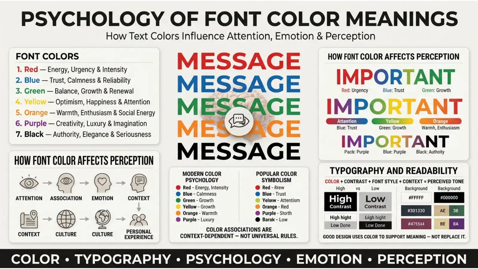
Quick Answer: What Do Font Colors Mean?
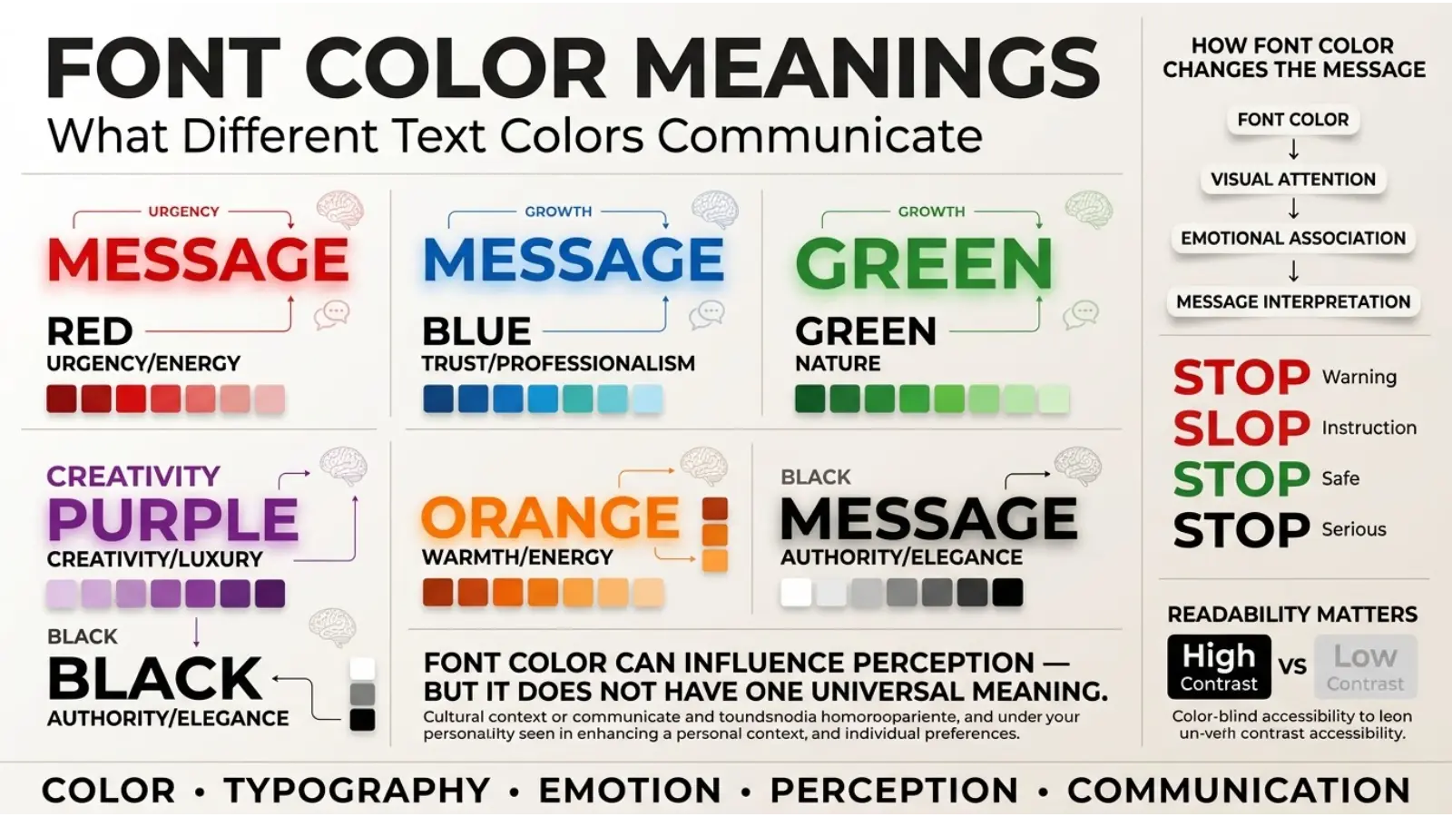
Font colors can influence how readers perceive information, but they do not have fixed meanings. Black often communicates authority and formality, blue can suggest trust and calm, red can signal urgency or strong emotion, green can suggest nature and growth, purple can imply creativity or luxury, yellow can feel energetic and optimistic, orange can appear friendly and active, white can suggest simplicity, and gray can communicate neutrality.
The exact impression changes with the shade, background, culture, and purpose of the text.
Font Color Meaning Chart
| Font Color | Common Associations | Useful For | Possible Negative Impression |
|---|---|---|---|
| ⚫ Black | Authority, elegance, seriousness | Formal text, luxury, headlines | Heavy, severe |
| 🔵 Blue | Trust, calm, stability | Business, technology, links | Cold, distant |
| 🔴 Red | Energy, urgency, passion | Alerts, promotions, calls to action | Aggressive, alarming |
| 🟢 Green | Nature, growth, health | Environmental, financial, wellness themes | Inexperience in some contexts |
| 🟣 Purple | Creativity, luxury, imagination | Beauty, creative brands, premium design | Artificial or overly dramatic |
| 🟡 Yellow | Optimism, energy, attention | Highlights, playful designs | Hard to read, caution |
| 🟠 Orange | Warmth, friendliness, enthusiasm | Calls to action, youth brands | Informal or loud |
| ⚪ White | Simplicity, cleanliness, openness | Dark backgrounds, minimalist design | Low visibility |
| 🩷 Pink | Softness, affection, playfulness | Beauty, lifestyle, expressive designs | Can feel stereotyped |
| 🟤 Brown | Earthiness, reliability, warmth | Food, nature, traditional brands | Dullness |
| 🩶 Gray | Neutrality, balance, sophistication | Professional interfaces, secondary text | Boring or lifeless |
Why Font Color Meanings Changes Perception
People do not read text as isolated words. Instead, they process the words together with visual signals such as size, spacing, shape, contrast, and color.
Consequently, the same sentence can create different impressions when its color changes.
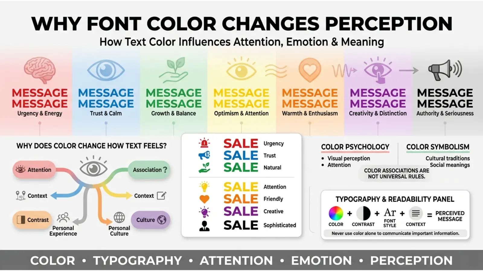
Consider the phrase “Limited Time Offer.” In black, it may look like ordinary information. In red, it immediately feels more urgent. The gold, it can appear more premium. In green, it may suggest savings or a positive opportunity.
Color does not magically create an emotion, however. Rather, it contributes to the overall visual message.
Context matters just as much. A red word on a medical website can indicate a warning, while red lettering on a restaurant menu may simply create energy and appetite-related associations.
Black Font Meaning
Black is one of the most widely used text colors because it provides strong contrast against light backgrounds. Beyond readability, it commonly communicates seriousness, authority, sophistication, and simplicity.
In professional writing, black text often creates a straightforward and dependable appearance. Newspapers, legal documents, academic materials, and business reports traditionally rely heavily on dark text for this reason.
Positive Associations of Black Text
Black lettering can suggest:
- Authority
- Professionalism
- Elegance
- Power
- Simplicity
- Formality
- Confidence
However, large amounts of heavy black typography can also feel severe or visually dense. Therefore, designers often combine black with lighter colors to create hierarchy and breathing room.
Blue Font Meaning
Blue is frequently associated with trust, stability, calmness, and professionalism. For that reason, blue typography appears often in corporate websites, technology interfaces, financial services, educational platforms, and business communications.
Blue also has a practical advantage online: readers have become accustomed to seeing blue text as a signal for clickable links.
What Different Blues Communicate
Light blue can feel open, calm, youthful, and airy.
Medium blue often feels dependable and balanced.
Dark blue can communicate authority, experience, and professionalism.
Nevertheless, excessive blue can make a design feel cold or distant. Therefore, warm accent colors can help create visual balance.
Red Font Meaning
Red is visually powerful and tends to attract attention. Consequently, red text is commonly used for warnings, errors, urgent messages, discounts, important notices, and strong calls to action.
It can symbolize:
- Passion
- Energy
- Danger
- Urgency
- Love
- Excitement
- Power
- Anger
The meaning depends strongly on context. A red error message tells the reader something is wrong, while red typography in a Valentine’s Day design can communicate romance.
Because red demands attention, it should usually be used strategically rather than covering entire paragraphs.
Green Font Meaning
Green typography commonly connects with nature, renewal, health, growth, freshness, and environmental themes.
For example, a sustainability website may use green headings because the color reinforces its connection with plants and the natural world. Financial designs can also use green because of cultural associations with money and prosperity, particularly in the United States.
Green has many shades, though.
Mint green can feel fresh and gentle.
Forest green can appear natural, traditional, and established.
Emerald green may suggest richness and sophistication.
Neon green feels energetic, youthful, and attention-grabbing.
Thus, simply calling green a “nature color” misses much of its visual range.
Purple Font Meaning
Purple often carries associations with creativity, imagination, mystery, spirituality, luxury, and individuality.
Historically, certain purple dyes were difficult and expensive to produce, which contributed to associations between purple and status in some cultures and historical periods. Modern uses, however, vary considerably.
Purple typography can work particularly well for:
- Creative brands
- Beauty products
- Entertainment
- Fantasy themes
- Spiritual content
- Premium products
- Artistic projects
Dark purple can feel sophisticated, while lavender usually creates a softer and more delicate impression.
Yellow Font Meaning
Yellow is bright, energetic, and highly noticeable. It can communicate optimism, happiness, warmth, playfulness, and attention.
However, yellow typography presents a major practical challenge: readability.
Bright yellow text on white can have poor contrast and become difficult to read. Therefore, designers often place yellow lettering on a dark background or use a deeper golden shade.
Yellow can also carry meanings of caution. That association appears in warning signs, road markings, and safety systems.
So yellow can represent both cheerful energy and caution depending on context.
Orange Font Meaning
Orange combines some of the visual warmth of red and yellow. As a result, it often feels energetic, friendly, enthusiastic, and approachable.
Orange typography can work especially well in:
- Food branding
- Sports graphics
- Children’s designs
- Technology startups
- Promotional materials
- Social media graphics
- Calls to action
Bright orange can feel youthful and energetic, whereas burnt orange can appear warmer, more traditional, and autumn-inspired.
White Font Meaning
White lettering commonly communicates simplicity, cleanliness, openness, peace, and minimalism.
It is especially effective when placed against a dark background. For instance, white text on black can create a dramatic and elegant appearance, while white text on navy blue can feel polished and professional.
The problem is contrast. White text on a pale background may become nearly invisible.
Therefore, the symbolic meaning of white is only useful if the text remains readable.
Pink Font Meaning
Pink typography can communicate affection, softness, playfulness, romance, compassion, or youthful energy.
Light pink often feels gentle and delicate, while hot pink is much more energetic and expressive.
Pink is frequently used in beauty, fashion, lifestyle, romance, and creative branding. However, designers should avoid assuming that everyone interprets pink in the same way. Cultural expectations and personal experiences influence color perception.
Brown Font Meaning
Brown is closely connected with earth, wood, coffee, soil, warmth, and natural materials.
As a font color, it can create a grounded and traditional appearance. It is therefore useful for food brands, handmade products, outdoor businesses, craft designs, and rustic themes.
Dark brown can sometimes substitute for black when a designer wants a softer, warmer appearance.
Gray Font Meaning
Gray represents neutrality, balance, restraint, and sophistication.
It is particularly useful for secondary text because it can establish a visual hierarchy without competing with the main message.
For example, a website might use black for headlines, dark gray for body text, and lighter gray for supporting information.
Still, very light gray text can become difficult to read. A stylish appearance should never take priority over accessibility.
Gold and Metallic Font Meaning
The Gold typography often suggests luxury, achievement, wealth, prestige, celebration, or premium quality.
Gold is particularly effective when used as an accent rather than for long paragraphs. It can highlight a product name, award, invitation, certificate, or premium feature.
Metallic effects also change how gold is perceived. A flat mustard yellow is not visually equivalent to reflective metallic gold.
Consequently, “gold” is partly a color choice and partly a rendering effect.
Psychology of Font Color Meanings
Color psychology explores how color can affect perception, emotion, attention, and behavior. However, claims about color should be treated carefully.
There is no universal rule stating that every person experiences red as excitement or blue as trust. Human responses depend on context, learned associations, culture, personal experience, and the visual environment.
Research in environmental and design psychology does support the idea that color can influence responses under certain conditions. At the same time, individual and cultural differences make simple one-color explanations unreliable.
That distinction is especially important for websites and advertising.
Instead of saying:
“Blue always creates trust.”
A more accurate explanation is:
“Blue is commonly associated with trust and stability in many modern design contexts.”
That small difference makes the claim more defensible.
Font Color Meanings and Emotional Meaning
Font color can influence the emotional tone of a message because readers interpret visual information alongside language.
For example:
“Congratulations!” in gold may feel celebratory and premium.
“Warning” in red feels urgent.
“Welcome” in green may feel fresh and positive.
“Important Information” in dark blue can appear serious and organized.
The words remain identical in meaning, but the visual framing changes the reader’s first impression.
Font Color Meanings in Branding and Marketing
Brands rarely choose text colors randomly. Typography color can become part of a visual identity and help customers recognize a business across websites, packaging, advertisements, and social platforms.
A technology company might use blue typography to create a dependable, modern appearance. A children’s brand may use brighter colors to create energy and playfulness. A luxury company might use black, white, gold, or restrained neutral tones.
However, color alone does not build a successful brand.
Logo shape, typography, imagery, spacing, product quality, messaging, and customer experience all contribute to brand perception.
Font Color for Calls to Action
Calls to action such as Buy Now, Learn More, Subscribe, or Get Started often use contrasting colors so they stand apart from surrounding content.
Red, orange, green, and blue can all work.
The best choice depends on the complete design rather than a universal psychological rule.
For instance, if the entire website already uses red, a red button may not stand out. A contrasting color could create stronger visual hierarchy.
Font Color Meanings in Website Design
Web typography requires two goals at the same time: meaning and readability.
A beautiful color combination becomes ineffective if users cannot comfortably read the content.
Body Text
Dark text on a light background remains one of the safest choices for long-form reading.
Pure black is not always necessary. Very dark gray can provide a softer appearance while maintaining strong contrast.
Headings
Headings can use brand colors because they need to establish hierarchy and attract attention.
For example:
Dark blue heading → professional
Purple heading → creative
Green heading → natural or health-related
Orange heading → energetic
The surrounding design determines whether those impressions actually work.
Links
Colored links should be visually distinguishable from ordinary text. Underlines or other visual indicators can provide additional clarity, particularly for users with color-vision differences.
Font Color Meanings and Accessibility
Accessibility is one of the most important practical parts of font color selection.
A color may look attractive on a designer’s screen but become difficult to read for someone with low vision or color-vision deficiency.
Therefore, designers should check text-to-background contrast, not simply choose colors that look attractive together.
Avoid relying on color alone to communicate meaning.
For example, an error should not be indicated only by red text. Adding an icon and a clear message provides another way to understand the information.
Likewise, links should not depend only on a color difference from ordinary text.
Font Color Meanings in Documents and Education
Teachers, students, and writers often use colored text to organize information.
For example:
- 🔴 Red can highlight warnings or mistakes.
- 🔵 Blue can identify key concepts.
- 🟢 Green can mark completed work.
- 🟡 Yellow can highlight important passages.
- 🟣 Purple can distinguish examples or special notes.
However, using too many colors can make a page harder to scan. A simple system with two or three main text colors is often easier to understand.
Color should support organization, not replace it.
Font Color Meanings in Social Media Graphics
Social media designs compete for attention in crowded feeds. Consequently, font color becomes an important part of visual hierarchy.
High-contrast text can help a headline remain visible on a small screen. Bright colors can create energy, while muted colors can create a calmer editorial appearance.
Still, readability matters more than decoration.
A dramatic gradient may look impressive at full size but become unreadable when the graphic is viewed as a small thumbnail.
Font Color in Interior and Decorative Design
Although font colors are mainly associated with digital and printed text, lettering also appears in interior spaces.
Wall signs, neon lettering, artwork, restaurant menus, room signs, and decorative quotes all use color to create atmosphere.
Warm-colored lettering can create an inviting feeling, while cool-colored lettering can appear cleaner and calmer.
Lighting changes everything, however. A sign that looks deep blue under daylight may appear different under warm indoor lighting.
Therefore, designers should evaluate decorative typography in the actual lighting where it will be displayed.
Font Color in Art and Photography
Artists often use text color as part of composition rather than simply for readability.
A red word can become the focal point of an otherwise neutral image. A pale blue phrase can blend into a sky-themed composition. Gold lettering can introduce a sense of value or ceremony.
Photography also changes perceived color. Shadows, reflections, exposure, white balance, and surrounding colors can make the same font appear different.
As a result, font color should be judged within the complete image.
Font Color in Fashion and Print
Text appears on clothing, accessories, posters, packaging, and printed materials. In these situations, font color becomes part of the style.
Black lettering on white often creates a timeless appearance.
White lettering on black can feel bold and modern.
Gold lettering may create a premium impression.
Bright multicolor lettering can appear playful or youthful.
The material itself also matters. Embroidery, screen printing, metallic foil, and digital printing produce different visual results.
How Background Color Changes Font Meaning
A font color never exists alone.
For example, white text can look:
- Elegant on black
- Fresh on green
- Calm on blue
- Dramatic on red
- Soft on lavender
Similarly, black text can look:
- Formal on white
- Warm on cream
- Modern on pale gray
- Heavy against a dark background
Therefore, asking “What does this font color mean?” without considering the background gives only part of the answer.
How Lighting Changes Font Color
Lighting can alter perceived color dramatically.
Warm light can make some colors appear more yellow or orange. Cool lighting can make colors appear bluer. Screen brightness can also affect how digital colors appear.
This matters when selecting colors for:
- Websites
- Retail signs
- Event invitations
- Restaurant menus
- Interior lettering
- Product packaging
- Digital advertisements
A color should ideally be tested under the conditions in which people will actually see it.
Font Color and Culture
Color meanings are not universal.
A color associated with celebration in one culture may have a different association elsewhere. Religious traditions, national history, ceremonies, clothing customs, political symbols, and local design traditions can all affect interpretation.
For that reason, global brands should research the cultural context of their target audience instead of assuming that one color communicates the same message everywhere.
Even within the same country, age groups and communities may interpret colors differently.
Font Color and Personality
People sometimes associate color preferences with personality traits. Someone who loves purple may be described as creative, while someone who prefers black may be described as confident or independent.
These descriptions can be fun as symbolic interpretations, but they should not be treated as personality tests.
A person’s preferred color does not reliably determine their personality.
Preference can instead reflect fashion, memories, culture, current trends, practical needs, or simple visual taste.
Common Misconceptions About Font Color Meanings
“Every color has one universal meaning.”
It does not. Meaning changes with context, culture, shade, and use.
“Red always means danger.”
Red can indicate danger, but it can also represent love, celebration, energy, excitement, or importance.
“Blue automatically creates trust.”
Blue is frequently used to communicate stability and professionalism, but trust depends on many factors beyond color.
“Bright colors are always easier to notice.”
Brightness can attract attention, but contrast is equally important. A bright color with poor contrast may still be difficult to read.
“Color psychology works the same for everyone.”
Individual experience and cultural background can change color perception.
“The most attractive font color is the best choice.”
Not necessarily. A color can look beautiful while failing accessibility or readability requirements.
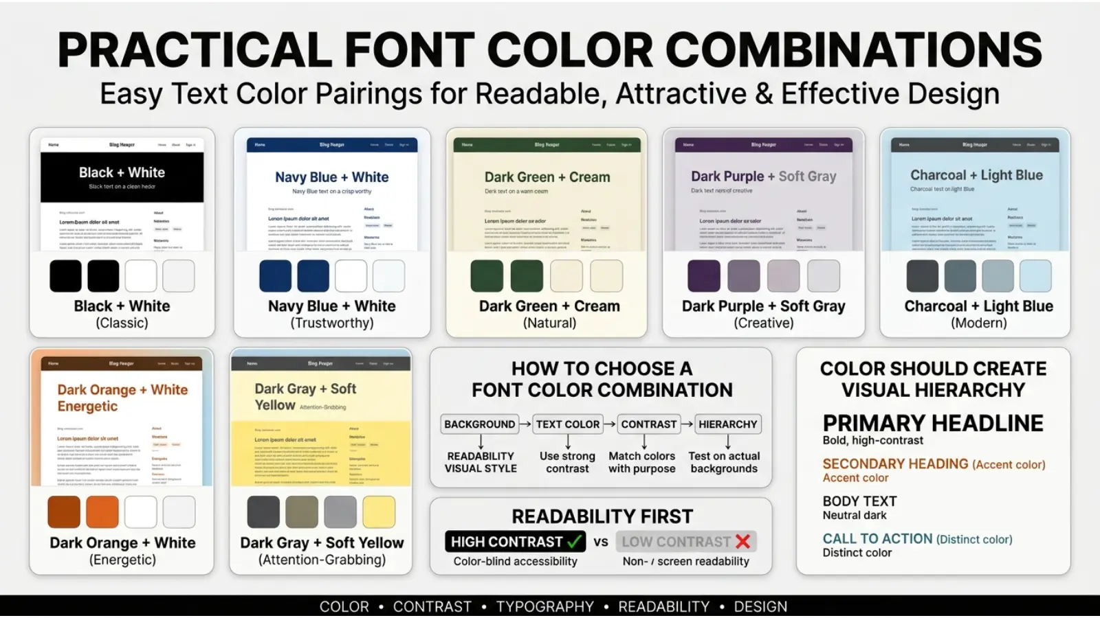
Practical Font Color Combinations
Black + White
This classic combination creates strong contrast and works well for professional and minimalist designs.
Navy + White
Navy typography can create a polished, dependable appearance while maintaining a softer feel than pure black.
Green + Cream
This combination works naturally for environmental, organic, botanical, and wellness-inspired designs.
Purple + White
Purple lettering on white can create a creative and elegant appearance.
Orange + Dark Gray
Orange provides energy while dark gray provides visual stability.
Gold + Black
This combination is commonly associated with premium or formal presentation, especially when gold is used sparingly.
White + Dark Blue
White typography on dark blue can create a clean, modern, and professional appearance.
Choosing the Right Font Color
Start with the purpose of the message rather than the color itself.
Ask:
- What should the reader notice first?
- Is the message formal, playful, urgent, calm, or premium?
- Who will read it?
- What background will the text appear on?
- Does the text have enough contrast?
- Does the color fit the brand?
- Could someone understand the message without seeing the color?
- Does the color work in different lighting conditions?
- Does the cultural context change its meaning?
- Does the color remain readable on mobile devices?
These questions produce better results than choosing a color based on symbolism alone.
A Simple Font Color Selection Guide
| Goal | Colors to Consider | Why |
|---|---|---|
| Professional | Black, navy, dark gray | Structured and restrained |
| Trust-focused | Blue, navy | Commonly associated with stability |
| Urgent | Red, orange | Strong visual attention |
| Natural | Green, brown | Connections with nature |
| Luxury | Black, gold, deep purple | Premium visual associations |
| Creative | Purple, pink, orange | Expressive and distinctive |
| Minimalist | Black, white, gray | Clean visual hierarchy |
| Friendly | Orange, warm yellow, soft green | Warm and approachable |
| Calm | Blue, muted green, lavender | Cool and softer visual tone |
| Youthful | Orange, pink, bright blue | Energetic and expressive |
The Most Important Rule: Meaning Comes From Context
A color does not communicate by itself.
Imagine the word “STOP.”
In red, it strongly reinforces the meaning of the word.
Now imagine “SALE.”
Red can make the message feel urgent and promotional.
Change the word to “LOVE.”
The same red now has a romantic association.
This simple example shows why color symbolism cannot be separated from language and context.
Typography, size, background, imagery, spacing, culture, and purpose all work together.
Frequently Asked Questions
What are the most common font color meanings?
Black commonly suggests authority and formality, blue suggests stability and calm, red suggests energy or urgency, green suggests nature and growth, purple suggests creativity or luxury, and yellow suggests optimism or attention.
What does blue font mean?
Blue font often creates associations with trust, stability, calmness, professionalism, and technology. Its exact effect depends on the shade and context.
What does red font mean?
Red font can communicate urgency, danger, passion, energy, love, or importance. The surrounding message determines which interpretation is most likely.
What does green font mean?
Green typography often suggests nature, health, freshness, growth, renewal, or financial themes. Different shades can create very different impressions.
What does purple font mean?
Purple font is often associated with creativity, imagination, luxury, mystery, and spirituality. Lavender tends to appear softer than dark purple.
What does black font symbolize?
Black text commonly communicates authority, seriousness, elegance, professionalism, and simplicity. It is also widely used because it can provide strong contrast on light backgrounds.
What font color is best for readability?
Dark text on a light background is generally a reliable choice for long-form reading. The key factor is sufficient contrast between the text and background.
Can font color affect emotions?
Color can contribute to emotional and perceptual responses, but it does not control emotions in a predictable way. Context, culture, personal experience, and design all influence the response.
Do font color meanings differ by culture?
Yes. Color symbolism varies across cultures and can be shaped by religion, history, ceremonies, traditions, and social conventions.
Does font color reveal personality?
No. Color preferences may be associated with symbolic personality descriptions, but a preferred font or color does not reliably determine someone’s personality.
Conclusion
Understanding font color meanings is useful because text is more than words on a page. Color helps establish hierarchy, attract attention, create mood, reinforce a brand, and shape the visual character of a message.
Black can provide authority and clarity. Blue can create a calm, dependable appearance. Red can demand attention. Green can connect a message with nature or growth. Purple can add creativity or luxury, while yellow and orange can bring energy and warmth.
Even so, no color has a single universal definition. Meaning changes with shade, contrast, typography, background, lighting, culture, and purpose.
The most effective designers therefore use color as part of a larger visual system. They consider symbolism, but they also test readability, accessibility, audience expectations, and real-world conditions. When those elements work together, font color becomes more than decoration—it becomes a useful part of communication.

Emma Wilson is a dedicated comparison writer and product researcher at ColorMystiic.com. She specializes in creating unbiased product comparisons, detailed reviews, and helpful buying guides. Her goal is to help readers make smarter purchasing decisions with confidence.