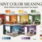
Choosing a paint color is about more than making a room look attractive. The colors on your walls can change how a space feels, influence the atmosphere, and communicate a certain style. That is why people often search for paint color meanings before choosing a shade for a bedroom, living room, office, or front door.
Blue may feel calm, green can suggest nature, yellow can create a cheerful impression, while deep red may feel energetic and dramatic. However, color meaning is never completely fixed. Lighting, culture, room size, personal experience, and the colors surrounding a shade can all change how it is perceived.
This guide explores the symbolism, psychology, practical uses, cultural associations, and design effects of popular paint colors.
Quick Answer: What Do Paint Colors Mean?
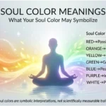
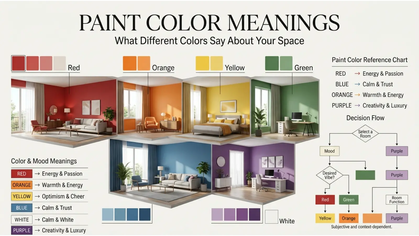
Paint colors can create different emotional and visual impressions. Blue is commonly associated with calm and trust, green with nature and renewal, yellow with optimism and energy, red with passion and intensity, purple with creativity and luxury, white with simplicity and cleanliness, black with sophistication and power, and orange with warmth and enthusiasm.
These associations are tendencies rather than universal rules. The exact effect depends on the shade, lighting, room, culture, and personal experience.
Why Paint Color Meanings Matter
Walls occupy a large visual area, so their color can strongly influence the character of a room. A pale blue bedroom, for example, can create a quieter impression than a saturated red room. Likewise, a warm cream can make a space feel softer than a bright white.
Color also interacts with light. Natural sunlight can make some paints appear warmer or brighter, while artificial lighting can change how undertones are perceived. Consequently, the same paint may look noticeably different in the morning, afternoon, and evening.
Paint color meanings are therefore best understood as visual and cultural associations, not strict psychological rules. Color can influence perception, but it does not automatically determine someone’s mood, personality, or behavior.
Paint Color Meaning Chart
| Paint Color | Common Associations | Typical Feeling | Popular Uses |
|---|---|---|---|
| 🔵 Blue | Calm, trust, stability | Peaceful | Bedrooms, bathrooms, offices |
| 🟢 Green | Nature, renewal, balance | Fresh | Living rooms, kitchens, bedrooms |
| 🟡 Yellow | Optimism, warmth, energy | Cheerful | Kitchens, dining rooms, accents |
| 🔴 Red | Passion, power, excitement | Energetic | Dining rooms, accents, doors |
| 🟣 Purple | Creativity, luxury, mystery | Sophisticated | Bedrooms, feature walls |
| 🟠 Orange | Warmth, enthusiasm, friendliness | Inviting | Dining spaces, playrooms |
| ⚪ White | Cleanliness, simplicity, openness | Airy | Almost any room |
| ⚫ Black | Power, elegance, drama | Bold | Accents, doors, modern interiors |
| 🩷 Pink | Softness, affection, playfulness | Gentle | Bedrooms, nurseries, accents |
| 🩶 Gray | Balance, neutrality, sophistication | Calm | Offices, living rooms |
| 🤎 Brown | Earth, comfort, reliability | Grounded | Living rooms, studies |
| 🩵 Teal | Freshness, confidence, creativity | Relaxed | Bathrooms, offices, accents |
Blue Paint Meaning
Blue is one of the most widely used colors in interior design because it often creates an impression of calm, order, and stability. Light blue can feel airy and peaceful, while navy blue creates a deeper and more formal atmosphere.
In bedrooms, softer blues can support a restful visual environment. In bathrooms, blue can reinforce associations with water and freshness. Darker blue can also work well in offices because it gives walls a serious, structured appearance.
However, too much cool blue can sometimes make a room feel cold, particularly when the space receives little natural sunlight. Warm wood, cream textiles, brass accents, or soft lighting can balance that effect.
Green Paint Meaning
Green is strongly connected with vegetation, forests, gardens, and the natural world. Because of these associations, green paint often brings a fresh and grounded character to interiors.
Soft sage and muted olive shades are popular when a relaxed, natural appearance is desired. Deeper forest greens can create a dramatic and sophisticated room, especially when paired with natural wood.
Green can work particularly well in living rooms, bedrooms, home offices, and kitchens. Its success often comes from its flexibility: a green wall can feel earthy, modern, traditional, or luxurious depending on the exact shade and surrounding materials.
Yellow Paint Meaning
Yellow commonly suggests sunlight, warmth, optimism, and energy. Pale yellow can brighten a darker room, whereas strong yellow creates a much more noticeable visual statement.
Yellow can be effective in kitchens, breakfast areas, hallways, and creative spaces. Nevertheless, highly saturated yellow may feel intense when used across every wall. Softer butter, cream, straw, or muted golden shades can provide warmth without overwhelming the room.
The undertone matters greatly. A yellow with warm orange undertones feels different from a pale yellow with green undertones. Therefore, samples should always be viewed under the room’s actual lighting.
Red Paint Meaning
Red is visually powerful and is often associated with passion, excitement, confidence, warmth, and energy. As a paint color, it can make a room feel dramatic and intimate.
Rather than covering every wall in a bright red, many designers use red on a feature wall, door, alcove, or architectural detail. Deeper shades such as burgundy, brick, and wine can provide richness while feeling less visually sharp than vivid primary red.
Red can be especially effective in dining areas and social spaces.
Purple Paint Meaning
Purple has long carried associations with creativity, imagination, mystery, and luxury. The meaning changes considerably with the shade.
Lavender tends to feel soft and delicate, while plum and aubergine create a richer and more dramatic atmosphere. Deep purple can become especially elegant when combined with cream, warm gray, metallic details, or natural wood.
Purple works well as an accent color when a room needs personality without relying on bright primary colors. It can also suit bedrooms, reading areas, creative studios, and sophisticated feature walls.
Orange Paint Meaning
Orange combines the warmth of red and the brightness associated with yellow. It can therefore create an energetic, friendly, and welcoming impression.
Soft terracotta and burnt orange are particularly useful in modern interiors because their earthy undertones make them easier to live with than extremely bright orange. These shades can complement wood, leather, cream, beige, and muted green.
Orange is often suitable for dining rooms, creative spaces, entryways, and areas designed for conversation. A small amount can add warmth without dominating the entire interior.
White Paint Meaning
White is commonly associated with cleanliness, simplicity, openness, and freshness. It can make walls appear brighter and help a small room feel more spacious.
Still, white is not a single visual experience. Warm whites contain yellow, beige, or cream undertones, while cool whites may lean toward blue or gray.
Warm white can make a traditional or cozy room feel comfortable. Cool white can create a cleaner, more contemporary appearance. Consequently, choosing the right white requires attention to flooring, furniture, natural light, and nearby colors.
Black Paint Meaning
Black often represents sophistication, strength, authority, mystery, and drama. In interior design, it can produce a striking effect when used thoughtfully.
A black accent wall can give a room depth, while black doors, trim, shelving, or built-in furniture can create strong architectural contrast. Matte black usually produces a softer and more modern appearance than highly glossy finishes.
Because black absorbs visual attention, it can make a room feel smaller when used excessively. However, balanced with light walls, reflective surfaces, warm wood, or good lighting, it can look remarkably elegant.
Pink Paint Meaning
Pink is often connected with affection, softness, playfulness, and warmth. Its effect depends heavily on saturation and undertone.
Dusty rose and muted blush can appear sophisticated and work well in adult bedrooms or living spaces. Brighter pinks create a more energetic and youthful impression.
Pink does not have to be limited to traditionally feminine spaces. When paired with charcoal, brown, olive, navy, or warm white, it can become contemporary and balanced.
Gray Paint Meaning
Gray is a flexible neutral associated with balance, restraint, sophistication, and modernity. It can provide a quiet background for colorful furniture and artwork.
Light gray can make a room feel clean and understated, whereas charcoal creates a stronger architectural statement. However, gray can sometimes appear dull or cold when used in a poorly lit room.
Warm gray, often called greige when it contains noticeable beige undertones, can provide more warmth while retaining the versatility of a neutral.
Brown Paint Meaning
Brown connects strongly with earth, wood, soil, leather, and other natural materials. As a result, brown paint often creates a grounded and comfortable atmosphere.
Chocolate, coffee, walnut, caramel, and clay-inspired shades can add depth to living rooms, studies, dining spaces, and bedrooms.
Brown generally works particularly well with cream, beige, muted green, terracotta, and natural wood. The combination can create a room that feels established rather than overly decorated.
Teal Paint Meaning
Teal sits between blue and green, giving it a distinctive balance of coolness and vibrancy. It can suggest freshness, confidence, creativity, and sophistication.
Pale teal can feel relaxed, while deep teal can become dramatic and luxurious. It works particularly well as a feature-wall color, especially when paired with warm wood, brass, cream, or neutral gray.
Because teal has both blue and green qualities, its appearance can shift noticeably under different lighting conditions.
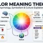
Psychology of Paint Color Meanings
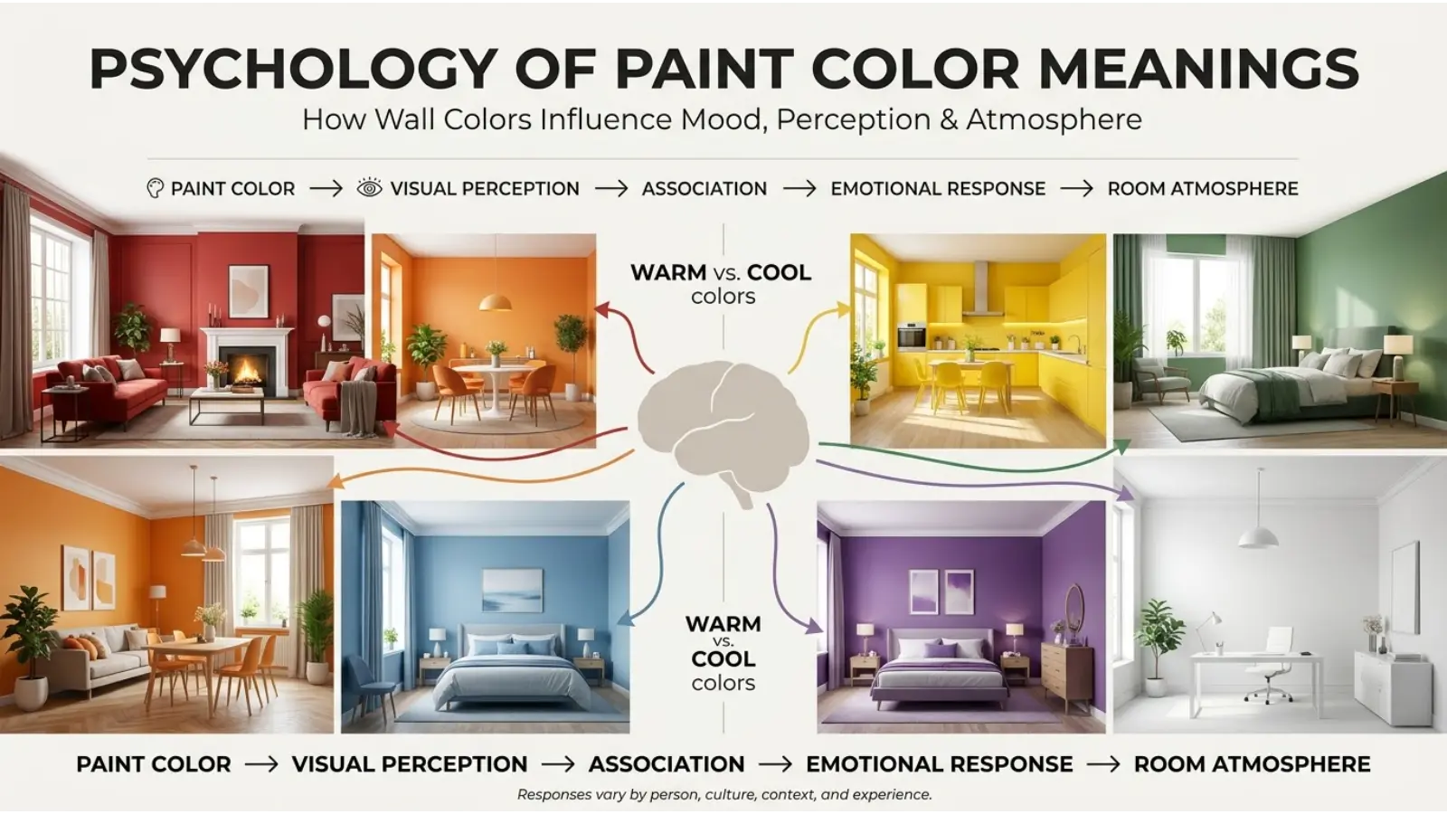
Color psychology is useful, but it needs to be treated carefully. People do not respond to colors in exactly the same way, and research does not support simple rules such as “one color always creates one emotion.”
Instead, color perception develops through several influences. Visual properties such as brightness, saturation, and temperature matter. So do learned associations, surroundings, culture, personal memories, and the purpose of a space.
For example, a dark red wall may feel luxurious in a restaurant but aggressive or overwhelming in a small bedroom. The color has not changed, but its context has.
Saturation Changes the Message
Highly saturated colors attract more visual attention. Muted versions are usually quieter and easier to combine with other interior elements.
A bright orange and a muted terracotta may technically belong to the same color family, yet they communicate very different design moods.
Lightness Changes the Atmosphere
Lighter colors often make surfaces appear more open and visually expansive. Darker colors can create depth and intimacy.
This does not mean dark paint is automatically unsuitable for small rooms. A dark shade can actually create a dramatic, enveloping atmosphere when the room has appropriate lighting and furnishings.
Warm and Cool Colors
Warm colors generally include reds, oranges, yellows, and many warm neutrals. Cool colors usually include blues, greens, and blue-based grays.
Warm colors can make a room feel inviting and energetic. Cool colors can produce a calmer or fresher visual impression. Neutral colors sit between these effects and provide flexibility.
How Lighting Changes Paint Color
Never choose a paint color from a small online image alone. Lighting can dramatically alter its appearance.
Natural northern or southern exposure, artificial bulbs, window size, flooring, and surrounding surfaces all affect what you see.
A practical approach is to test a large sample on several walls. Observe it during daylight, under evening lighting, and beside the furniture that will remain in the room.
This simple step can prevent an expensive repaint.
Paint Colors for Different Rooms
Bedroom
Bedrooms often benefit from softer colors such as muted blue, sage green, lavender, warm white, dusty rose, or gentle gray.
The goal is usually visual comfort rather than maximum stimulation. Deep colors can also work beautifully when the desired atmosphere is cozy and intimate.
Living Room
Living rooms provide more freedom. Green, beige, blue, gray, terracotta, cream, and brown can all work depending on the furniture and architecture.
A neutral wall can allow artwork and furniture to stand out, while a stronger feature color can become the main visual focus.
Kitchen
White, cream, sage, blue, warm gray, yellow, and muted green are common choices for kitchens. Warmer shades can make the space feel welcoming, while clean neutrals can emphasize a fresh appearance.
Cabinet color should be considered alongside wall paint. Two attractive colors can compete if their undertones clash.
Home Office
Blue, green, gray, beige, and muted teal can provide a professional visual background. Stronger colors may be useful as accents if the room needs more energy.
Since screens already provide substantial visual stimulation, extremely bright wall colors may not always be the best choice for a workspace.
Bathroom
Blue and green naturally connect with water and nature, while white and soft gray create a clean appearance. Teal can add personality without requiring a large amount of decoration.
Small bathrooms can handle dark colors surprisingly well, particularly when mirrors and lighting provide contrast.
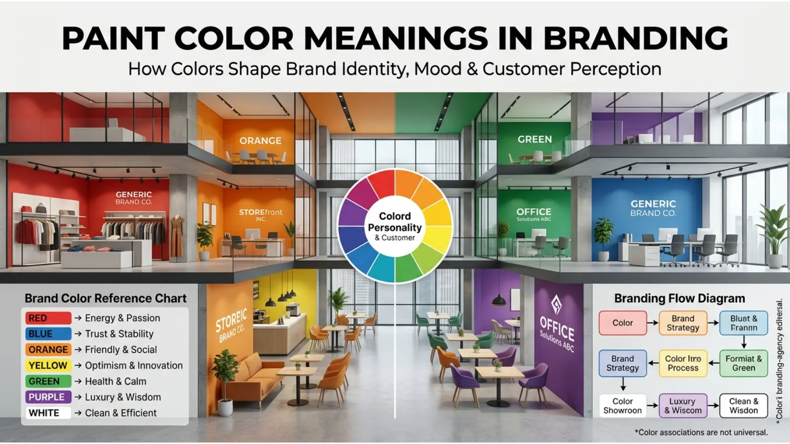
Paint Color Meanings in Branding
Paint color meanings also matter outside residential interiors. Businesses use color to create recognizable environments and communicate an intended identity.
Blue is often selected when stability and trust are important. Green can support themes involving nature, health, sustainability, or growth. Red can create urgency and energy. Purple can suggest creativity or premium positioning.
However, a color does not automatically make a brand trustworthy, luxurious, youthful, or environmentally responsible. Typography, imagery, materials, messaging, product quality, and cultural expectations all contribute to the final impression.
For physical businesses, wall color can reinforce the experience customers already associate with the brand.
Cultural Differences in Color Meaning
Color symbolism is not universal.
White, for example, has strong associations with purity and simplicity in many Western contexts, but white can also carry mourning-related meanings in some East Asian traditions. Red may symbolize celebration and good fortune in parts of Asia, while it can also represent danger, passion, or warning in other contexts.
Green can represent nature and renewal, but its religious and political meanings vary across regions. Purple has historical associations with royalty in several Western traditions, although its significance differs across cultures.
Therefore, anyone selecting paint for a public space, international business, cultural center, or hospitality environment should consider the audience rather than relying on a single universal color chart.
Paint Color and Personality
People often associate favorite colors with personality traits. Someone who prefers navy might be described as dependable, while someone attracted to bright yellow might be viewed as cheerful.A person’s favorite paint color does not reliably reveal their character.
Personal preference can instead reflect memories, trends, cultural experiences, fashion, architecture, or simply what looks attractive in a particular room.
Best Paint Color Combinations
Color combinations become easier when you consider both hue and undertone.
| Main Paint | Colors That Pair Well | Overall Effect |
|---|---|---|
| Blue | White, cream, wood, gray | Calm and clean |
| Green | Beige, brown, cream, brass | Natural and grounded |
| Yellow | White, navy, gray, wood | Bright and welcoming |
| Red | Cream, charcoal, beige | Dramatic and warm |
| Purple | Cream, gray, gold tones | Elegant and creative |
| Orange | Cream, brown, olive | Warm and earthy |
| White | Almost any color | Flexible and bright |
| Black | White, wood, gray, metallics | Modern and dramatic |
| Pink | Navy, brown, olive, gray | Soft yet contemporary |
| Teal | Cream, wood, brass, gray | Fresh and sophisticated |
The key is balance. If the wall is highly saturated, furniture and accessories can remain quieter. Conversely, a neutral wall can provide room for stronger artwork and furnishings.
Common Misconceptions About Paint Color Meanings
“Blue Always Makes People Calm”
Blue is often associated with calmness, but the effect is not guaranteed. A very bright or highly saturated blue can feel energetic rather than peaceful.
“Dark Colors Always Make Rooms Smaller”
Dark colors can visually reduce the sense of openness, but they can also add depth and sophistication. Lighting, ceiling height, mirrors, and furniture placement matter too.
“White Always Makes a Room Look Bigger”
White can create an open appearance, but a poorly lit white room may feel flat or cold. Warm whites can sometimes create a more comfortable result.
“Color Psychology Works the Same for Everyone”
It does not. Culture, context, personal memories, age, trends, and individual preference all influence color perception.
“One Paint Color Has One Meaning”
Most colors have several possible meanings. A color can communicate warmth in one setting and warning in another.
Practical Tips for Choosing Paint
Start by deciding how you want the room to feel rather than choosing a color from a chart alone. Calm, energetic, cozy, sophisticated, natural, bright, and dramatic are useful starting points.
Next, examine the room’s existing elements. Flooring, furniture, curtains, countertops, cabinets, and artwork all contain colors that can influence your choice.
Then check the undertone. Two beige paints may look completely different because one contains pink undertones and another contains yellow or gray.
Finally, test the paint before committing. Look at a large sample at different times of day and under the lighting you actually use.
Paint Color Meanings in Everyday Life
Paint affects more than decoration. It can help establish the identity of a home, make a workspace feel organized, give a restaurant a particular atmosphere, or turn an ordinary hallway into a memorable feature.
Artists also use wall color as part of the visual environment around their work. Photographers and content creators may consider wall colors when designing backgrounds because different shades can affect skin tones, shadows, and the overall appearance of an image.
Even small areas can benefit from intentional color choices. A painted front door, reading corner, bookshelf, ceiling, or architectural feature can introduce color without requiring an entire room makeover.
Frequently Asked Questions
What is the most calming paint color?
Soft blue, muted green, and gentle neutral shades are commonly chosen for calm interiors. The final effect depends on lighting, saturation, and personal preference.
What paint color represents happiness?
Yellow is commonly associated with happiness, optimism, and sunlight. Warm peach and certain orange shades can also create a cheerful atmosphere.
What paint color represents peace?
Soft blue, pale green, white, and gentle neutral shades are often associated with peace and visual quietness.
What paint color represents luxury?
Deep purple, charcoal, black, rich green, navy, and certain warm neutrals can create a luxurious impression when combined with suitable materials and lighting.
What color makes a room feel warmer?
Warm whites, beige, cream, terracotta, muted orange, warm yellow, and earthy brown can make a room appear warmer.
What color makes a small room look bigger?
Light shades such as white, cream, pale blue, soft green, and light gray can create a more open visual effect, especially when paired with good lighting.
What paint color is best for a bedroom?
There is no single best bedroom color. Soft blue, sage green, lavender, warm white, muted pink, and gentle gray are popular choices because they can create a comfortable visual atmosphere.
Does paint color affect mood?
Color can influence visual and emotional perception, but its effect varies between people and situations. Room lighting, context, culture, and personal experience also play important roles.
Why does the same paint look different in different rooms?
Lighting, window direction, bulb temperature, surrounding colors, flooring, and nearby furniture can change how a paint color appears.
Can paint color change how big a room feels?
Yes. Light colors can create a more open appearance, while darker shades can add depth and intimacy. However, room size is only one factor; lighting and design also influence spatial perception.
Final Thoughts on Paint Color Meanings
Paint color meanings are useful when they help you make a more intentional design choice, but they should never be treated as rigid rules. A color can feel peaceful, energetic, elegant, natural, playful, or dramatic depending on its shade and surroundings.
The most successful paint choice considers the entire environment: light, room function, furniture, materials, culture, and personal taste. Instead of asking which color is universally “best,” ask what visual experience you want to create.
Once you understand those differences, paint becomes more than a finishing material. It becomes a simple way to shape the character and atmosphere of an everyday space.

Emma Wilson is a dedicated comparison writer and product researcher at ColorMystiic.com. She specializes in creating unbiased product comparisons, detailed reviews, and helpful buying guides. Her goal is to help readers make smarter purchasing decisions with confidence.