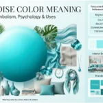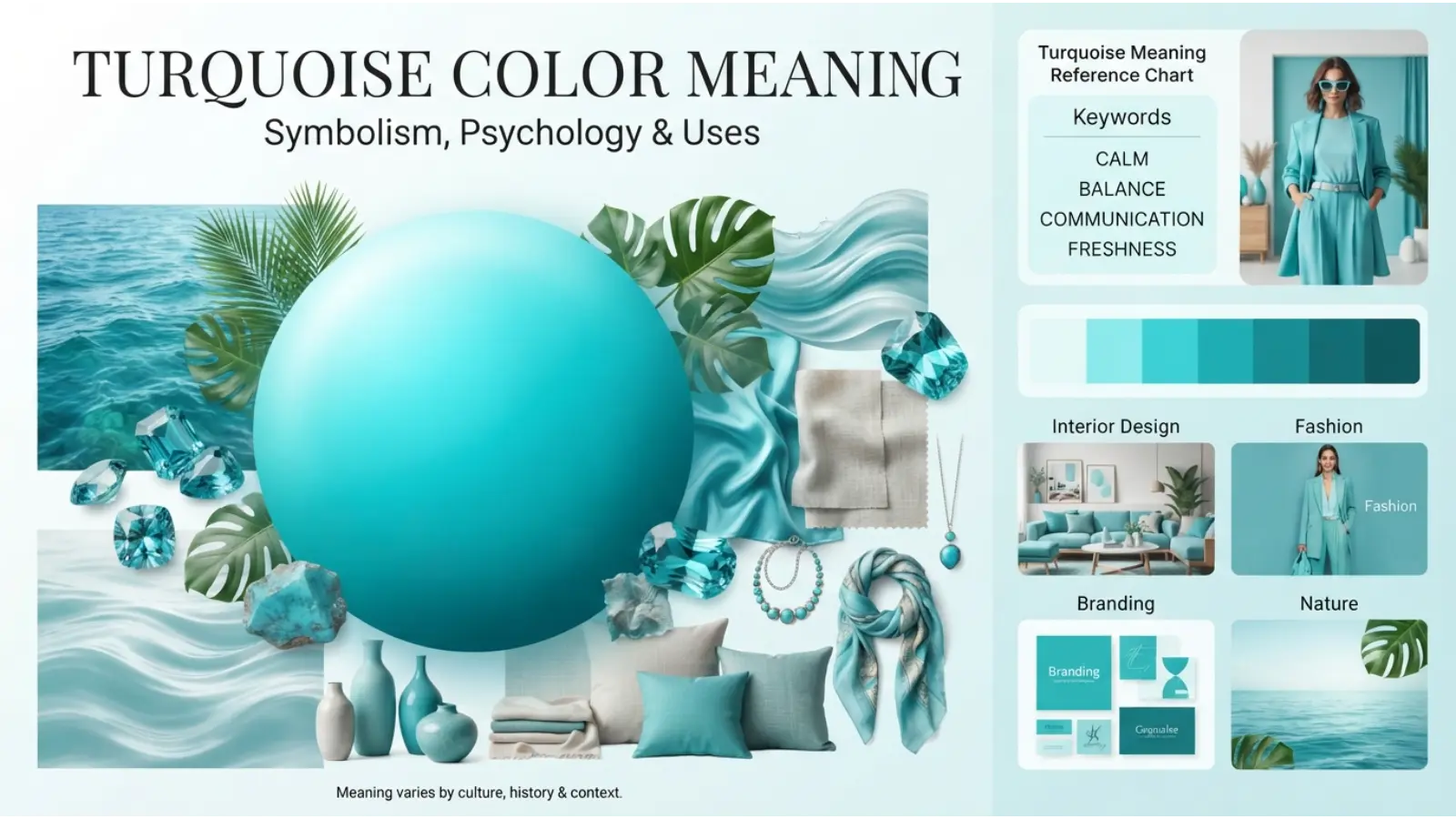
Turquoise sits between blue and green, combining the calm character of blue with the fresh energy of green. Its appearance can range from pale aqua and soft seafoam to bright blue-green and deeper mineral shades. Because of this range, turquoise color meanings are not limited to one simple idea. The color can suggest calmness, clarity, renewal, communication, protection, freshness, and emotional balance, depending on the setting.
People often search for turquoise because they want to understand what it represents in clothing, home design, jewelry, branding, art, spirituality, or personal style. Its meaning also changes with culture, history, lighting, and the colors placed beside it.
This guide explores turquoise from several angles, including psychology, symbolism, history, culture, personality associations, fashion, interior design, branding, and practical color combinations.
Quick Answer: Turquoise commonly symbolizes calmness, clarity, communication, renewal, freshness, balance, and emotional openness. In spiritual and cultural contexts, it can also represent protection, healing, wisdom, or connection with nature. However, turquoise does not have one universal meaning; its interpretation depends strongly on context and culture.
Turquoise Color Meanings at a Glance
| 🌈 Turquoise Quality | Common Association |
|---|---|
| 🔵 Blue influence | Calmness, trust, communication |
| 🟢 Green influence | Growth, renewal, nature |
| 💎 Bright turquoise | Energy, freshness, confidence |
| 🌊 Soft turquoise | Peace, relaxation, gentleness |
| 🩵 Pale aqua | Cleanliness, openness, lightness |
| 🪨 Deep turquoise | Stability, sophistication, depth |
| ✨ Overall impression | Balance between calm and vitality |
The most interesting feature of turquoise is its position between two major color families. Blue tends to create cooler, calmer impressions, while green is strongly connected with nature and renewal. Turquoise therefore often feels both peaceful and lively rather than completely passive or highly energetic.
What Does Turquoise Symbolize?
Turquoise is commonly associated with calmness, emotional balance, freshness, communication, renewal, protection, and natural beauty.
Its blue-green appearance helps explain some of these associations. Blue-green colors are often visually connected with clear water, tropical seas, skies, minerals, plants, and natural landscapes. As a result, turquoise can feel refreshing without having the intensity of a pure primary color.
Positive symbolic meanings include:
- Calmness
- Clarity
- Fresh beginnings
- Emotional balance
- Communication
- Openness
- Renewal
- Nature
- Creativity
- Protection
- Freedom
- Peace
There are also less positive associations. Very bright turquoise can sometimes appear artificial, overly playful, or visually intense. A poorly balanced turquoise room may feel cold, while excessive use in branding can make a design look dated or overly dependent on a tropical aesthetic.
So, turquoise is not automatically peaceful or positive in every situation. Context gives the color much of its meaning.
The Psychology of Turquoise Color Meanings
Color psychology examines how colors can influence perception, emotion, attention, and associations. However, color effects are not fixed rules. Individual experiences, culture, lighting, surrounding colors, and personal preferences all matter.
Turquoise is especially interesting because it combines visual characteristics associated with blue and green.
Turquoise and Calmness
Soft turquoise shades can create a relaxed visual impression. This is partly because cooler colors are often perceived as less visually aggressive than strong warm colors such as red or orange.
Pale turquoise can work particularly well when a design needs to feel airy, clean, and peaceful.
Turquoise and Communication
Because turquoise contains blue, it is sometimes associated with communication, openness, and clear expression. These are symbolic associations rather than universal psychological laws.
A turquoise interface, for example, may feel approachable when combined with plenty of white space and readable typography.
Turquoise and Renewal
The green component gives turquoise a connection with freshness and growth. This makes it useful when a visual identity needs to suggest change, nature, wellness, or a new beginning.
Turquoise and Mental Clarity
Clean, light turquoise shades can create a sense of visual space. In design, this can make an environment feel less heavy or crowded.
Still, the effect depends on the exact shade. A dark turquoise can communicate depth and sophistication rather than lightness.
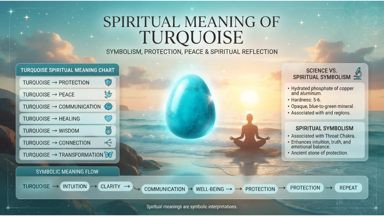
Spiritual Turquoise Color Meanings
Turquoise has a long history of cultural and spiritual significance, particularly because the turquoise mineral has been valued by many societies for centuries.
In modern spiritual symbolism, turquoise is sometimes associated with:
- Protection
- Healing
- Emotional balance
- Wisdom
- Peace
- Communication
- Spiritual growth
- Positive energy
- Connection with nature
These meanings should be understood as symbolic or traditional interpretations, not scientific claims. Different spiritual systems use colors and stones in different ways, and there is no single universal spiritual meaning of turquoise.
The natural turquoise gemstone has also been worn as jewelry and incorporated into cultural objects, which has contributed to its protective and meaningful associations.
Turquoise and Protection
One of the strongest traditional associations of turquoise as a gemstone is protection. Historical cultures valued turquoise objects and jewelry for reasons that could include beauty, status, spiritual belief, and perceived protective qualities.
Modern people may therefore choose turquoise jewelry as a personal symbol of safety, confidence, or positive intentions.
Turquoise and Healing
Turquoise is sometimes described in modern spiritual communities as a healing color or stone. This is a symbolic belief rather than a medically established effect.
It can nevertheless serve as a visual reminder of calmness, self-care, or emotional renewal.
Cultural Turquoise Color Meanings
Turquoise does not carry exactly the same message everywhere. Its meaning has developed through geography, religion, art, trade, fashion, and natural materials.
Turquoise in Ancient Cultures
The turquoise mineral has been valued for thousands of years. Archaeological evidence shows that turquoise was used in ancient Egypt, where it appeared in jewelry and decorative objects.
Its distinctive blue-green appearance made it especially attractive for ornamental work.
Turquoise in Persian Culture
Persian and broader Iranian traditions have a particularly strong historical relationship with turquoise. The stone became an important material in architecture, decorative arts, jewelry, and craft.
The famous blue-turquoise appearance of Persian architectural decoration demonstrates how closely the color can be connected with artistic heritage and place.
Turquoise in Indigenous North American Traditions
Turquoise has deep cultural importance among several Indigenous peoples of the American Southwest. It has been used in jewelry, art, and ceremonial or culturally meaningful objects.
However, it would be misleading to describe all Indigenous cultures as having one identical interpretation. Traditions differ between nations, communities, and historical periods.
Turquoise in Modern Western Culture
In modern Western design, turquoise often suggests beaches, tropical water, summer, relaxation, cleanliness, and contemporary style.
Its connection with swimming pools, coastal interiors, travel imagery, and resort design has strengthened these associations.
Turquoise in Global Design
Today, turquoise is widely used across international fashion, digital design, advertising, interiors, cosmetics, packaging, and entertainment. Its modern meaning is therefore increasingly shaped by global visual culture as well as local traditions.
Historical Turquoise Color Meanings
The history of turquoise is closely connected to the turquoise gemstone, which should not be confused with every modern shade of blue-green.
The gemstone has been prized across different civilizations because of its unusual color and relative rarity. Ancient Egyptian artifacts demonstrate its early importance, while Persian turquoise became particularly influential in decorative art and architecture.
Over time, the word turquoise also became the name of a color.
Modern turquoise therefore has two overlapping histories: one connected with a natural mineral and another connected with color theory, fashion, art, and modern design.
What Does Turquoise Say About Personality?
People who prefer turquoise are sometimes described as:
- Open-minded
- Creative
- Independent
- Calm
- Friendly
- Curious
- Emotionally expressive
- Drawn to nature
- Interested in originality
However, color preference does not determine personality.
Someone may choose turquoise simply because they like how it looks with their skin tone, home, clothing, website, or favorite objects. Personality associations are best treated as informal cultural observations rather than psychological diagnoses.
A person who chooses turquoise may enjoy its balance between the familiar calmness of blue and the freshness of green. That visual balance can be appealing to people who want something distinctive without choosing an extremely intense color.
Turquoise Color Meanings in Branding and Marketing
Turquoise can be a powerful branding color when its visual message matches the brand.
It can suggest:
- Freshness
- Clean design
- Innovation
- Approachability
- Wellness
- Technology
- Travel
- Water
- Youthfulness
- Creativity
However, color alone cannot make consumers trust a company. Typography, product quality, messaging, photography, layout, and cultural expectations all contribute to brand perception.
Turquoise for Technology Brands
Bright blue-green tones can make technology branding feel modern and energetic without relying on the traditional dark-blue corporate style.
Turquoise for Wellness
Soft turquoise can work well for wellness, spa, skincare, meditation, and lifestyle brands because it can visually suggest cleanliness and calm.
Turquoise for Travel
The Turquoise is naturally useful for travel and hospitality businesses connected with beaches, oceans, islands, and warm-weather destinations.
Turquoise Packaging
Turquoise packaging can stand out against common white, black, red, and blue packages. Its effectiveness depends on contrast and the product category.
For example, pale turquoise with white can feel clean and gentle, while deep turquoise with metallic accents can look more luxurious.
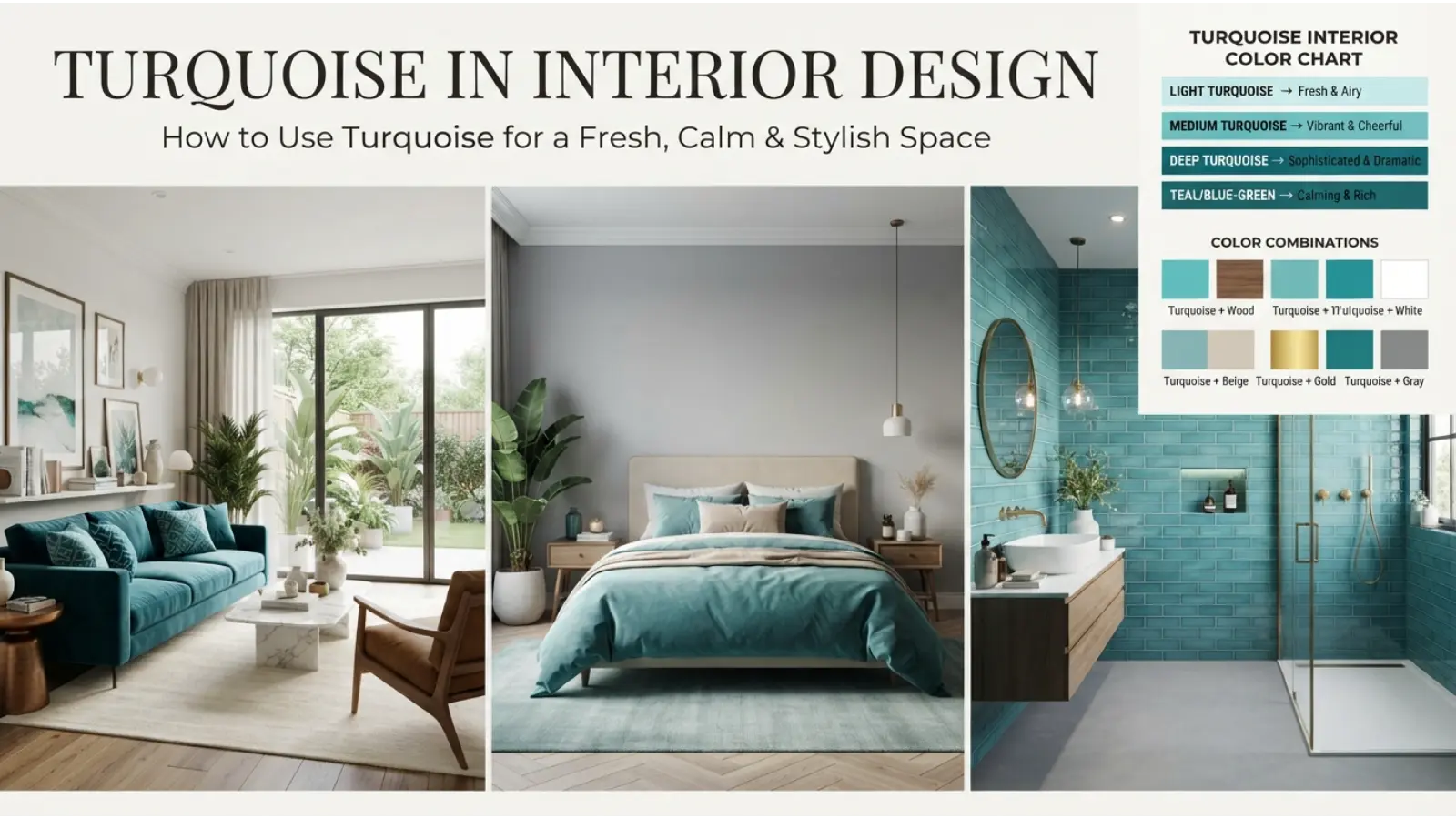
Turquoise in Interior Design
The Turquoise can dramatically change the character of a room because its appearance shifts with lighting.
Turquoise Living Room
A turquoise accent wall can become the visual focus of a living room. If a full wall feels too strong, use turquoise through cushions, curtains, artwork, rugs, or a single chair.
Pairing turquoise with warm neutrals can prevent the room from feeling too cold.
Turquoise Bedroom
Soft turquoise works particularly well when you want a bedroom to feel light and relaxed. Pale shades can be combined with white, cream, light wood, or soft gray.
Deep turquoise creates a richer and more dramatic effect.
Turquoise Kitchen
Turquoise cabinets, tiles, backsplashes, or small appliances can add personality to a kitchen.
White and turquoise create a clean combination, while natural wood makes the color feel warmer and more organic.
Turquoise Office
A small amount of turquoise can add visual energy to an office without overwhelming the space.
Try turquoise in desk accessories, artwork, a feature chair, or a digital display rather than covering the entire room.
Lighting Changes Turquoise
Lighting can significantly alter how turquoise appears.
Warm light can make it look greener or softer, while cool daylight can make it appear bluer and brighter. Therefore, always test a paint sample under the lighting conditions of the actual room.
Turquoise in Fashion
Turquoise clothing often creates a fresh, noticeable appearance. It can feel casual in light shades and sophisticated in darker versions.
Turquoise for Casual Style
T-shirts, sneakers, scarves, handbags, and casual accessories can use turquoise to add a bright accent to neutral clothing.
Turquoise for Formal Wear
Deeper turquoise can work in dresses, shirts, ties, jewelry, and evening accessories. Pairing it with restrained neutral colors can make the outfit look more polished.
Turquoise Jewelry
Turquoise jewelry has a particularly strong visual identity because the natural gemstone contains variations in color and sometimes visible matrix patterns.
Gold can make turquoise appear warmer and more luxurious, while silver can emphasize its cool, natural character.
Seasonal Use
Light turquoise often works well with spring and summer palettes, especially when combined with white, cream, coral, or natural beige.
Darker turquoise can also work during autumn and winter when paired with charcoal, brown, navy, or deep green.
Best Turquoise Color Combinations
Turquoise is flexible because it can move between cool, natural, tropical, modern, and luxurious styles.
| 🎨 Combination | Visual Effect | Best Uses |
|---|---|---|
| 🩵 Turquoise + White | Clean and fresh | Websites, bathrooms, fashion |
| 🩵 Turquoise + Navy | Calm and sophisticated | Branding, clothing |
| 🩵 Turquoise + Coral | Energetic and tropical | Travel, fashion |
| 🩵 Turquoise + Gold | Elegant and luxurious | Jewelry, interiors |
| 🩵 Turquoise + Beige | Warm and natural | Home design |
| 🩵 Turquoise + Gray | Modern and balanced | Offices, websites |
| 🩵 Turquoise + Black | Bold and dramatic | Fashion, branding |
| 🩵 Turquoise + Brown | Earthy and grounded | Interiors, crafts |
| 🩵 Turquoise + Green | Natural and refreshing | Wellness, nature themes |
| 🩵 Turquoise + Lavender | Soft and creative | Beauty, lifestyle |
Turquoise and White
This is one of the easiest combinations to use. White gives turquoise space to stand out while keeping the overall appearance clean.
Turquoise and Gold
Gold introduces warmth and richness. This pairing is especially effective for jewelry, decorative interiors, invitations, and luxury-oriented designs.
Turquoise and Coral
Coral sits toward the warm side of the color spectrum, creating strong contrast with turquoise. Together, they can create a lively tropical feeling.
Turquoise and Navy
Navy grounds turquoise and gives it a more mature appearance. This combination is useful for professional design where bright turquoise alone might feel too playful.
Why Turquoise Looks Different Under Different Conditions
A common mistake is assuming that turquoise always looks the same.
The perceived color changes according to:
Light source + surrounding colors + material + saturation + brightness + viewing conditions
A turquoise wall beside bright white may look more saturated. The same wall beside a strong green may appear bluer.
Glossy surfaces can also make turquoise look more vivid because reflected light increases its visual intensity. Matte materials generally produce a softer impression.
This is why designers test colors in the actual environment instead of relying only on a digital color sample.
Turquoise in Art and Photography
Artists can use turquoise to create associations with water, atmosphere, distance, fantasy, freshness, or emotional calm.
In photography, turquoise backgrounds can make warm skin tones and orange objects stand out because of color contrast.
Turquoise can also help create a cinematic or dreamlike appearance when used with carefully controlled lighting.
For nature photography, the color naturally fits ocean water, tropical environments, mineral formations, and bright skies.
Turquoise in Digital Design
Turquoise can work particularly well in websites, mobile interfaces, social media graphics, and presentations.
However, accessibility should come before aesthetics.
Light turquoise text on a white background may have poor contrast and become difficult to read. Darker turquoise is usually more practical for text, while lighter turquoise can work effectively as a background or accent.
A strong digital palette might use:
Dark turquoise → primary action or headings
Light turquoise → background areas
White → spacing and readability
Dark gray → body text
This creates hierarchy without making every element compete for attention.

Turquoise in Everyday Life
Turquoise appears in more places than people often realize.
You may see it in:
- Clothing
- Jewelry
- Cars
- Home décor
- Mobile apps
- Websites
- Sports equipment
- Packaging
- Cosmetics
- Artwork
- Travel advertisements
- Pool design
- Stationery
- Toys
- Accessories
Its popularity comes partly from its ability to look both familiar and distinctive.
Common Misconceptions About Turquoise
Turquoise Always Means Peace
Not necessarily. Turquoise can suggest peace, but it can also feel energetic, playful, tropical, modern, artificial, or luxurious depending on the shade and setting.
Turquoise Has One Spiritual Meaning
There is no universal spiritual definition. Different cultures and modern spiritual systems interpret turquoise differently.
People Who Like Turquoise Have a Specific Personality
Color preference cannot reliably diagnose personality. Associations can be interesting, but they should not be treated as psychological facts.
Turquoise and Aqua Are Exactly the Same
They overlap, but they are not always identical. Aqua is often used for lighter blue-green shades, while turquoise can describe a broader range that includes stronger, greener, and deeper tones.
Turquoise Is Only a Summer Color
Light turquoise is strongly associated with summer and tropical environments, but deeper turquoise can be used successfully throughout the year.
How Age and Culture Can Change Turquoise Meaning
People do not experience colors in isolation.
Children may associate bright turquoise with toys, cartoons, water, or playful objects. Adults may associate the same shade with travel, fashion, technology, wellness, or interior design.
Culture can change the interpretation even more. A color connected with a particular gemstone, national tradition, religious object, ceremony, or artistic movement may carry meanings that are unfamiliar to people elsewhere.
That is why claims such as “turquoise always means X” are usually too simple.
How Designers Use Turquoise Effectively
Good turquoise design depends on proportion.
A small turquoise accent can add energy without dominating a composition. A large turquoise area creates a much stronger emotional and visual statement.
For a sophisticated look, combine turquoise with restrained neutrals.
For a tropical look, introduce coral, sand, cream, or warm yellow.
A natural look, use turquoise with green, brown, stone, and wood.
For a modern look, combine turquoise with white, charcoal, gray, and clean geometric forms.
The same color can therefore produce completely different results through its surroundings.
Real-World Uses of Turquoise Color Meanings
Turquoise can serve different purposes depending on the field.
In business: it can create a modern and approachable identity.
In marketing: it can attract attention without the urgency commonly associated with strong reds.
Art: it can represent water, atmosphere, nature, fantasy, or emotional openness.
In photography: it can create contrast with warm colors and skin tones.
In home décor: it can add freshness and personality.
Fashion: it can become either a statement color or a subtle accent.
In sports: bright turquoise can provide strong visibility and a youthful visual identity.
In entertainment: turquoise can help create aquatic, futuristic, tropical, or fantasy-inspired worlds.
Turquoise Color Meanings vs. Blue vs. Green
Turquoise is often easier to understand when compared with its neighboring colors.
| Color | Common Visual Impression |
|---|---|
| 🔵 Blue | Calm, stable, dependable |
| 🟢 Green | Natural, fresh, balanced |
| 🩵 Turquoise | Calm, fresh, expressive |
| 🌊 Aqua | Light, watery, airy |
| 💚 Teal | Deeper, darker, more sophisticated |
These are broad associations, not fixed psychological rules. The exact shade can completely change the impression.
FAQ About Turquoise Color Meanings
What is the main meaning of turquoise?
Turquoise commonly represents calmness, freshness, balance, communication, renewal, and openness. Its exact meaning depends on cultural and visual context.
What does turquoise mean spiritually?
In modern spiritual symbolism, turquoise is often associated with protection, healing, wisdom, emotional balance, and spiritual growth. These are symbolic interpretations rather than scientifically proven effects.
Is turquoise a calming color?
Soft turquoise can create a calm and refreshing visual impression, especially when paired with white, cream, or other gentle colors.
What does turquoise symbolize in relationships?
Turquoise can symbolically suggest openness, communication, emotional balance, and honesty. However, it does not have one universally accepted relationship meaning.
What personality likes turquoise?
Turquoise is sometimes associated with creativity, independence, openness, curiosity, and a preference for originality. Color preference alone cannot determine someone’s personality.
Is turquoise a positive color?
Turquoise is commonly viewed positively because of its associations with water, nature, freshness, and calmness. However, very bright or poorly balanced turquoise can appear excessive or artificial.
What colors go well with turquoise?
White, navy, coral, gold, beige, gray, black, brown, green, and lavender can all work well with turquoise. The best choice depends on the mood you want to create.
What is the difference between turquoise and aqua?
Aqua is generally used for lighter blue-green colors, while turquoise can include a wider range of blue-green shades, including stronger and deeper versions.
Why does turquoise look different in different rooms?
Lighting, surrounding colors, surface texture, and the amount of blue or green in the specific shade can change how turquoise appears.
Is turquoise good for branding?
Yes. Turquoise can work well for technology, wellness, travel, lifestyle, beauty, and creative brands. Its success depends on the complete visual identity rather than color alone.
Conclusion
Turquoise is more than a mixture of blue and green. Its meaning comes from the interaction between color, nature, history, culture, materials, and personal experience.
At its most recognizable, turquoise suggests calmness, freshness, communication, renewal, balance, and openness. Its connection with the turquoise gemstone also gives it a rich historical and cultural dimension. Meanwhile, modern designers use the color to create everything from peaceful interiors to energetic fashion and contemporary brand identities.
The most useful way to understand turquoise is not to assign it one permanent definition. Instead, look at its shade, surrounding colors, lighting, cultural setting, and purpose. A pale turquoise bedroom can feel peaceful, a bright turquoise logo can feel energetic, and a deep turquoise dress can look sophisticated.
That flexibility is exactly what makes turquoise such an enduring and useful color.

Emma Wilson is a dedicated comparison writer and product researcher at ColorMystiic.com. She specializes in creating unbiased product comparisons, detailed reviews, and helpful buying guides. Her goal is to help readers make smarter purchasing decisions with confidence.