Colors Meanings communicate long before we say a word. A deep blue room can feel calm and dependable, while bright red can seem energetic, urgent, or passionate. However, color meaning is never as simple as assigning one emotion to each shade. Context, culture, personal experience, lighting, and even the exact shade can change the way a color is understood.
So, what are the colors meanings? In general, colors can carry emotional, symbolic, cultural, spiritual, and practical associations. Red is often connected with passion and energy, blue with calm and trust, green with nature and growth, yellow with optimism, purple with creativity and luxury, and white with cleanliness or simplicity. Nevertheless, these associations are not universal rules.
This guide explores the meanings behind major colors and explains how people use them in psychology, symbolism, culture, branding, interior design, fashion, art, and everyday life. Most importantly, it separates commonly observed associations from cultural or symbolic interpretations.
Quick Answer: What Are the Colors Meanings?
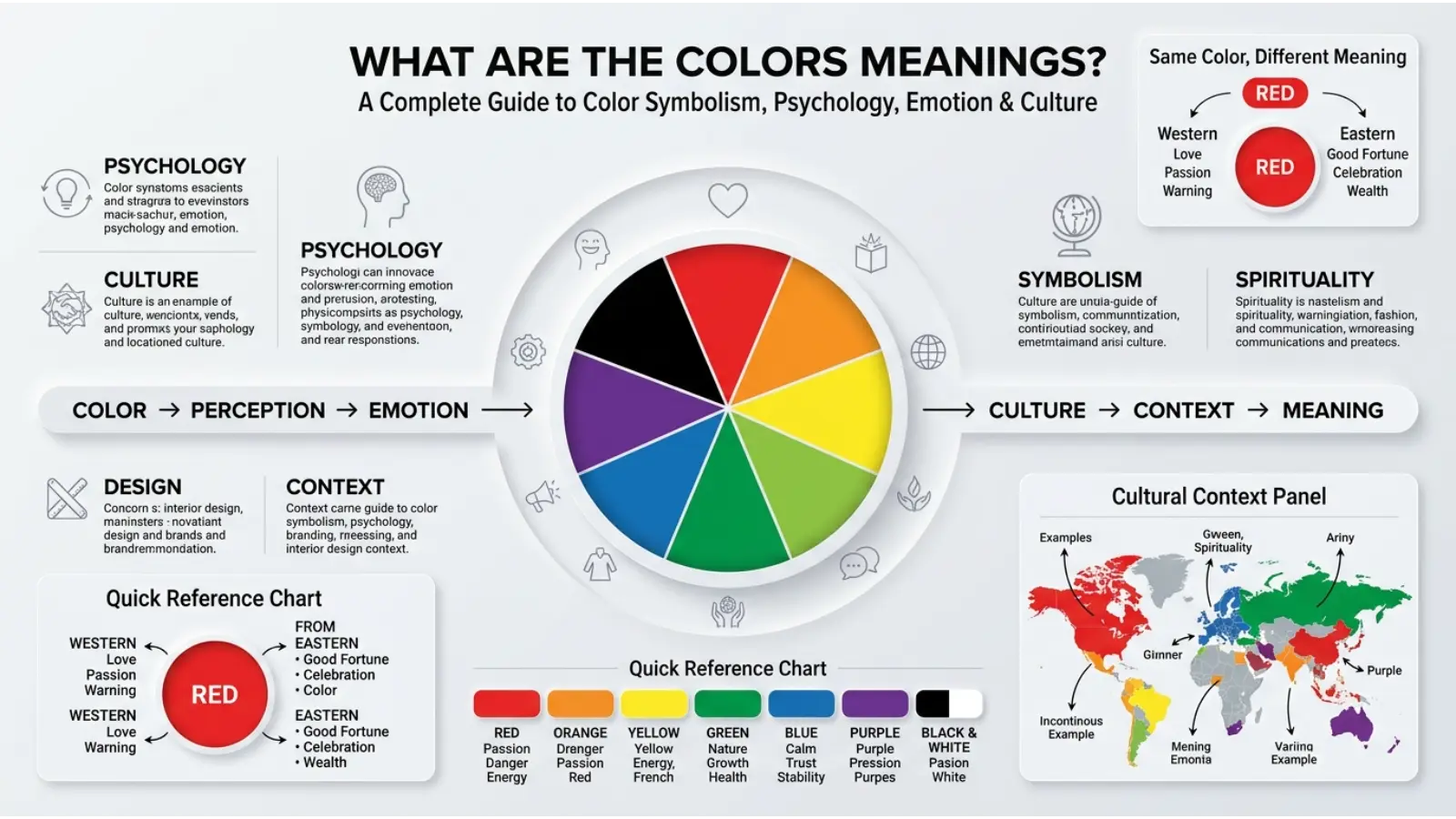
Color meanings are the emotions, ideas, symbols, and cultural associations people connect with different colors. Common associations include:
| Color | Common Meanings | Possible Negative Associations |
|---|---|---|
| 🔴 Red | Passion, energy, love, danger, action | Anger, aggression, warning |
| 🟠 Orange | Creativity, enthusiasm, warmth, friendliness | Impulsiveness, excess |
| 🟡 Yellow | Happiness, optimism, attention, energy | Caution, anxiety, jealousy |
| 🟢 Green | Nature, growth, health, renewal | Envy, inexperience |
| 🔵 Blue | Calm, trust, stability, reliability | Coldness, sadness, distance |
| 🟣 Purple | Creativity, mystery, luxury, imagination | Artificiality, extravagance |
| 🩷 Pink | Affection, softness, playfulness, compassion | Immaturity, over-sweetness |
| 🟤 Brown | Earthiness, stability, comfort, dependability | Dullness, heaviness |
| ⚫ Black | Power, elegance, sophistication, mystery | Mourning, fear, negativity |
| ⚪ White | Purity, simplicity, cleanliness, peace | Emptiness, sterility |
| 🩶 Gray | Neutrality, balance, professionalism | Detachment, dullness |
| 🩵 Teal | Calm, freshness, communication, balance | Emotional distance |
| 🩷 Magenta | Creativity, individuality, confidence | Intensity, artificiality |
| 🩵 Cyan | Freshness, clarity, technology | Coldness |
| 🟨 Gold | Wealth, achievement, prestige | Excess, vanity |
| 🩶 Silver | Modernity, technology, elegance | Coldness, impersonality |
The same color can communicate very different ideas depending on where, how, and why it appears.
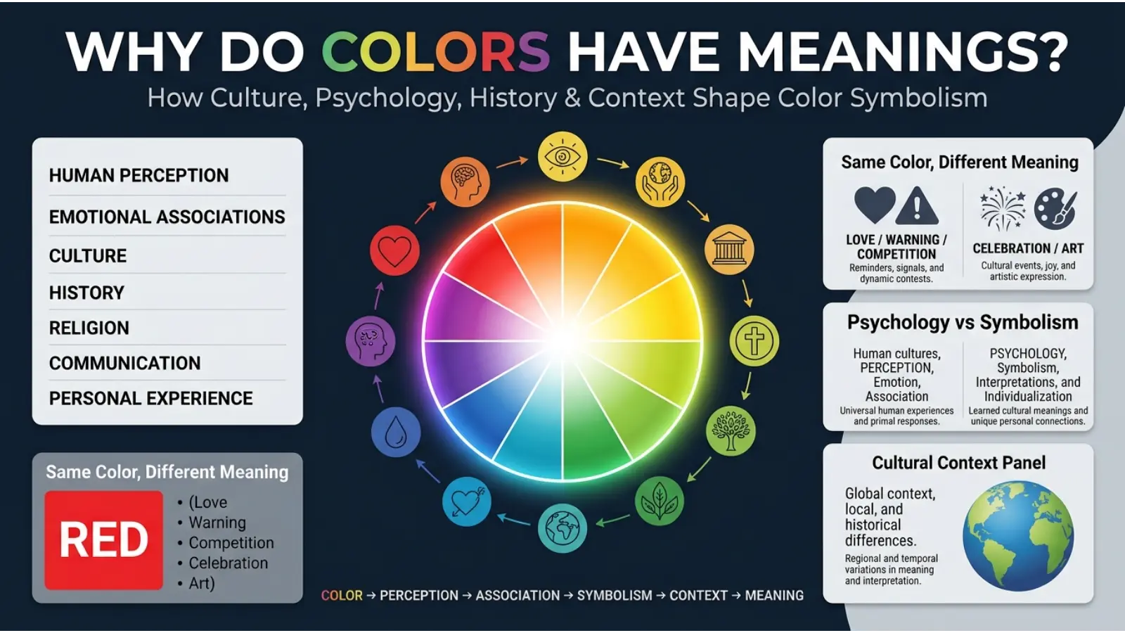
Why Do Colors Have Meanings?
Color meaning develops from several influences rather than one universal system. Human perception plays a role, but learned associations matter too. For example, people may associate green with plants and nature because they repeatedly see green in healthy vegetation.
Likewise, red can attract attention because it is visually strong and frequently appears in situations involving warnings, signals, heat, blood, food, or celebration. Over time, these repeated experiences can contribute to familiar associations.
Culture adds another layer. A color used for celebration in one society may have a completely different meaning in another. Furthermore, personal memories can give colors highly individual meanings.
For that reason, color symbolism works best when viewed as a flexible language rather than a dictionary with one correct definition for every shade.
The Meaning of Red 🔴
Red is one of the most visually powerful colors. It commonly suggests energy, passion, love, strength, excitement, urgency, and action.
Emotionally, red can suggest romance and desire. At the same time, it can represent anger, danger, aggression, or conflict. Therefore, the surrounding context is especially important.
Red in Design
Bright red creates a bold and energetic impression. Darker reds, such as burgundy and wine shades, often feel richer and more formal.
In branding, red can help a company appear energetic, confident, youthful, or exciting. However, excessive red can feel visually overwhelming, so designers often balance it with neutral colors.
The Meaning of Orange 🟠
Orange combines some qualities commonly associated with red and yellow. As a result, it often communicates warmth, enthusiasm, creativity, friendliness, confidence, and movement.
Bright orange can feel playful and youthful, while burnt orange tends to feel earthy and mature.
Orange works especially well when a design needs warmth without the intensity of strong red. Consequently, it appears frequently in food, entertainment, sports, children’s products, and creative industries.
The Meaning of Yellow 🟡
Yellow is strongly associated with sunlight, optimism, happiness, warmth, curiosity, and attention.
Because bright yellow is highly visible, it is useful for highlighting information. Nevertheless, large amounts of intense yellow can become tiring, particularly when surrounded by other highly saturated colors.
Soft yellow can create a gentle and welcoming atmosphere. By contrast, strong yellow can feel energetic and attention-seeking.
Yellow can also have negative associations, including caution, jealousy, or anxiety. These meanings vary considerably according to context and culture.
The Meaning of Green 🟢
Green is closely connected with nature, plants, growth, renewal, health, balance, and sustainability.
Its relationship with vegetation makes it especially useful when a brand or design wants to communicate natural qualities. Consequently, green appears often in environmental, wellness, gardening, food, and outdoor branding.
However, green is not always positive. Expressions involving envy or inexperience have also contributed to negative associations.
Dark forest green can feel traditional and sophisticated, whereas bright green can appear youthful, energetic, and modern.
The Meaning of Blue 🔵
Blue commonly represents calmness, trust, stability, reliability, communication, and depth.
Because blue is associated with sky and water, it can create a sense of openness and calm. As a result, many organizations use blue when they want to appear dependable or professional.
However, blue can also suggest sadness, emotional distance, or coldness. The exact shade makes a significant difference.
Light blue often feels fresh and peaceful. Navy blue, meanwhile, can communicate authority and formality.
The Meaning of Purple 🟣
Purple is frequently associated with creativity, imagination, mystery, spirituality, luxury, and individuality.
Historically, some purple dyes were difficult or expensive to produce, which contributed to associations with status and wealth in certain societies. Today, purple can still create a luxurious impression, although its meaning has become much broader.
Lavender generally feels softer and more peaceful than deep violet. Dark purple can appear dramatic and sophisticated, while bright purple can feel imaginative and playful.
The Meaning of Pink 🩷
Pink commonly communicates affection, tenderness, compassion, playfulness, romance, and softness.
Its meaning has changed across different periods and cultures. Modern Western culture often associates pink with femininity, although that association is cultural rather than a universal psychological rule.
Pale pink can feel delicate and peaceful, while hot pink creates a much stronger impression of confidence, energy, and individuality.
The Meaning of Brown 🟤
Brown is strongly connected with earth, wood, stability, comfort, simplicity, and reliability.
Because natural materials such as soil, bark, leather, and wood commonly contain brown tones, the color can create an organic and grounded feeling.
Brown is especially effective in rustic, traditional, natural, and handcrafted designs. However, very dark or muddy browns can appear heavy or dull when used without lighter supporting colors.
The Meaning of Black ⚫
Black often communicates power, sophistication, elegance, mystery, seriousness, and authority.
In fashion, black is popular because it can create a clean, formal, and versatile appearance. In branding, it can suggest premium quality or exclusivity.
At the same time, black has associations with mourning, fear, death, and darkness in many cultural settings. Therefore, its emotional effect depends strongly on context.
The Meaning of White ⚪
White commonly represents cleanliness, simplicity, purity, peace, openness, and minimalism.
Nevertheless, white does not mean the same thing everywhere. Cultural traditions can connect it with mourning as well as purity or celebration.
In interior design, white can make spaces appear brighter and more open. However, an entirely white room may feel sterile unless texture and warmer elements are introduced.
The Meaning of Gray 🩶
Gray represents neutrality, balance, professionalism, restraint, and sophistication.
Because gray sits between black and white, it often works as a balancing color. Designers use it to support brighter colors without competing with them.
Light gray can feel modern and calm, while charcoal gray can feel powerful and formal. Too much gray, however, may create an impression of dullness or emotional distance.
The Meaning of Teal 🩵
Teal combines qualities associated with blue and green. It can communicate calmness, freshness, balance, clarity, and modernity.
The color works particularly well in healthcare, technology, wellness, travel, and lifestyle design because it can feel both peaceful and energetic.
Darker teal tends to look sophisticated, while brighter teal can feel refreshing and youthful.
The Meaning of Gold 🟨
Gold commonly symbolizes wealth, achievement, prestige, success, celebration, and value.
Because gold is associated with precious metal, it has a strong connection with status and luxury. Consequently, designers often use it for premium packaging, awards, jewelry, invitations, and special events.
Gold should usually be used strategically. Too much metallic gold can make a design appear excessive, whereas small gold accents can create a refined effect.
The Meaning of Silver 🩶
Silver is often connected with technology, modernity, precision, elegance, sophistication, and innovation.
Its association with metal gives it a cool and engineered quality. Therefore, silver is common in technology products, automobiles, electronics, jewelry, and futuristic designs.
Unlike gold, silver often feels more restrained and contemporary.
Color Psychology: How Colors Affect Perception
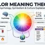
Color psychology examines how people respond to color and how color can influence perception, attention, emotion, and behavior. However, it should not be treated as a system that predicts exactly how every person will feel.
For example, one person may find blue relaxing because they associate it with the ocean. Another may dislike blue because it reminds them of an unpleasant experience. Consequently, personal experience can override general associations.
The strongest effects often occur when color works together with other visual elements such as shape, typography, lighting, imagery, and context.
Warm Colors
Red, orange, and yellow are generally described as warm colors. They can create a sense of energy, warmth, closeness, or visual activity.
Because they are visually noticeable, warm colors can be useful for emphasis and calls to action. However, saturation and brightness matter greatly.
Cool Colors
Blue, green, and many blue-purple shades are generally considered cool colors. They often create impressions of calmness, space, freshness, and stability.
Does Color Determine Personality?
No. A person’s favorite color does not reliably determine their personality.
People sometimes associate color preferences with traits such as creativity, confidence, calmness, or independence. These associations can be interesting, but they should not be treated as personality tests.
Preference can be influenced by age, culture, fashion, memories, environment, current trends, and personal experiences. Someone may choose black because they enjoy minimalist clothing, not because they have a particular personality type.
Therefore, color can suggest an impression, but it cannot provide a complete description of a person.
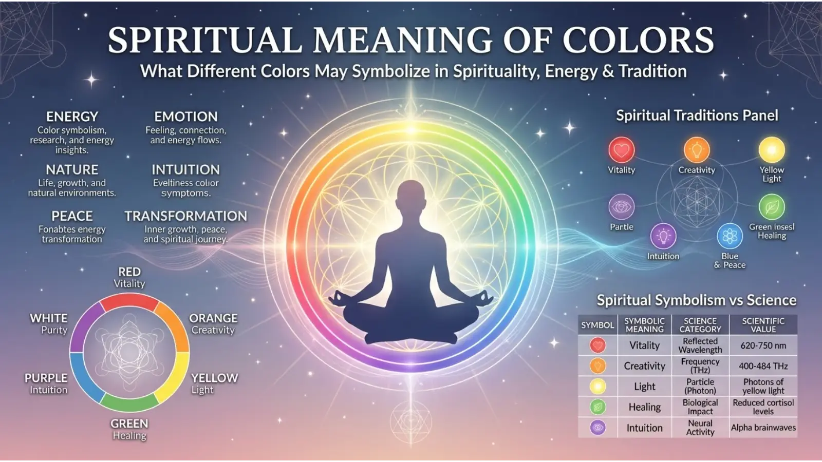
Spiritual Colors Meanings
Color symbolism appears in many spiritual and religious traditions. However, there is no single universal spiritual color system.
Red may symbolize vitality or sacrifice in some traditions. White can represent purity or peace. Green can suggest renewal or life.
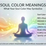
In modern spiritual practices, people may also assign personal meanings to colors during meditation, rituals, artwork, or personal reflection. Those meanings can be meaningful to the individual without being scientifically established facts.
Cultural Meaning of Colors
Culture can completely change how a color is understood.
Western Cultures
In many Western settings, white is commonly associated with weddings, cleanliness, and simplicity, while black may represent elegance or mourning.
Red can represent romance, danger, celebration, or urgency depending on the situation.
East Asian Cultures
Color symbolism across East Asian societies is diverse rather than uniform. Red, for example, has important associations with celebration, prosperity, and good fortune in several cultural contexts.
Middle Eastern and North African Contexts
Color symbolism varies significantly across countries, religions, and communities. Green can have important religious and cultural associations in some settings, while other colors can carry meanings connected with national identity, celebrations, or local traditions.
African Cultures
Africa contains hundreds of cultural communities, so there is no single African color symbolism system. Colors may communicate identity, status, spirituality, ceremonies, or political meanings depending on the society.
Latin American Cultures
Color meanings across Latin America also vary by country and tradition. Religious festivals, indigenous heritage, national symbols, and local customs can all influence how colors are understood.
The key lesson is simple: never assume that a color means the same thing everywhere.
Color in Branding and Marketing
Brands use color because visual identity influences first impressions and helps products become recognizable.
Green can support natural or environmental positioning. Red can create energy and visibility. Purple can help create a creative or premium impression.
However, color alone does not create a successful brand. Typography, logo design, product quality, messaging, audience expectations, and consistency all matter.
A successful brand chooses colors that fit its identity rather than simply selecting a color because it has a popular psychological meaning.
Color in Interior Design
Color can dramatically change how a room feels.
Living Room
Warm neutrals, soft greens, muted blues, and earthy browns can create comfortable environments.
Bedroom
Soft blue, muted green, lavender, warm beige, and other low-intensity colors can create a restful visual environment.
Office
Blue, gray, green, and neutral combinations can create a professional appearance. Small accents of yellow or orange can add visual energy without dominating the space.
Kitchen
White, cream, green, blue, wood tones, and warm neutrals are popular because they can create impressions ranging from clean and modern to warm and traditional.
Lighting must also be considered. A color can look completely different under warm bulbs, cool LEDs, daylight, or evening light.
Color in Fashion
Fashion uses color to create impressions of style, mood, formality, and personality.
Black can create a sleek or formal appearance. White can look clean and minimal. Red can become a strong focal point. Blue often works well in professional clothing, while earthy colors can create a relaxed and natural appearance.
Seasonal choices also influence color. Soft pastels may feel appropriate for spring-inspired looks, while deeper colors can create a richer autumn or winter palette.
Still, personal style matters more than fixed color rules. The same shade can look completely different depending on fabric, texture, lighting, skin undertone, accessories, and the surrounding colors.
Color Combinations That Work Well
Color becomes more interesting when several shades interact.
| Combination | Overall Impression |
|---|---|
| 🔵 Blue + ⚪ White | Clean, calm, professional |
| 🟢 Green + 🟤 Brown | Natural, earthy, grounded |
| 🟣 Purple + 🩷 Pink | Creative, playful, expressive |
| 🔴 Red + ⚫ Black | Bold, dramatic, powerful |
| 🟡 Yellow + 🔵 Blue | Energetic, friendly, balanced |
| 🟠 Orange + 🔵 Blue | Vibrant, energetic, contrasting |
| 🩵 Teal + ⚪ White | Fresh, modern, clean |
| 🟨 Gold + ⚫ Black | Luxury, prestige, drama |
| 🩶 Gray + 🔵 Blue | Professional, calm, modern |
| 🟢 Green + ⚪ Cream | Soft, natural, welcoming |
Complementary colors create stronger contrast, while analogous colors tend to produce smoother transitions. Meanwhile, neutral colors can help intense shades remain balanced.
How Lighting Changes Color Meaning
Lighting does more than change brightness. It can alter the apparent temperature and intensity of a color.
Warm lighting can make whites look creamier and reds or oranges appear richer. Cool lighting can make blues and greens appear stronger.
Natural daylight also changes throughout the day. Therefore, a paint color that looks perfect in a showroom may appear noticeably different inside a home.
Why the Same Color Can Feel Different
A color never exists completely alone.
A pale blue wall may feel peaceful when paired with white furniture. The same blue can feel colder when surrounded by dark gray.
Similarly, red can appear romantic when combined with soft pink and warm lighting, yet aggressive when paired with sharp black graphics and warning symbols.
This is called contextual perception: the surrounding environment changes how the viewer experiences a color.
Color Meanings in Art and Photography
Artists use color to guide attention, create atmosphere, establish contrast, and communicate symbolism.
A photographer may use blue tones to create a quiet mood or warm orange light to create intimacy. A painter may use complementary colors to make a subject stand out.
Modern digital editing has expanded these possibilities. Color grading can make the same scene appear nostalgic, dramatic, peaceful, futuristic, or unsettling.
Thus, color is not merely decoration. It can become part of the storytelling structure.
Color Meanings in Everyday Life
Color symbolism appears almost everywhere.
Traffic signals use color to communicate quickly. Clothing can suggest formality or celebration. Packaging can influence expectations about a product. Sports teams use color to create identity. Websites use color to guide attention.
Even small choices matter. A dark button may feel less prominent than a bright contrasting button. A warm restaurant interior can feel different from a stark white one.
These effects do not mean colors control behavior. Instead, color works as one part of a larger communication system.
Common Misconceptions About Color Meanings
Myth 1: Every Color Has One Universal Meaning
It does not. Meanings change across cultures, contexts, and individuals.
Myth 2: Favorite Colors Reveal Personality
Color preference may reflect taste or experience, but it cannot reliably diagnose personality.
Myth 3: Color Psychology Works the Same for Everyone
Human responses vary. Research can identify patterns, but individual reactions are not identical.
Myth 4: Spiritual Color Meanings Are Scientific Facts
Spiritual symbolism belongs to cultural, religious, or personal belief systems. It should not be presented as scientific evidence.
Myth 5: A Brand Can Choose Any Color and Automatically Influence Customers
Branding is more complicated. Color works together with design, messaging, product experience, culture, and audience expectations.
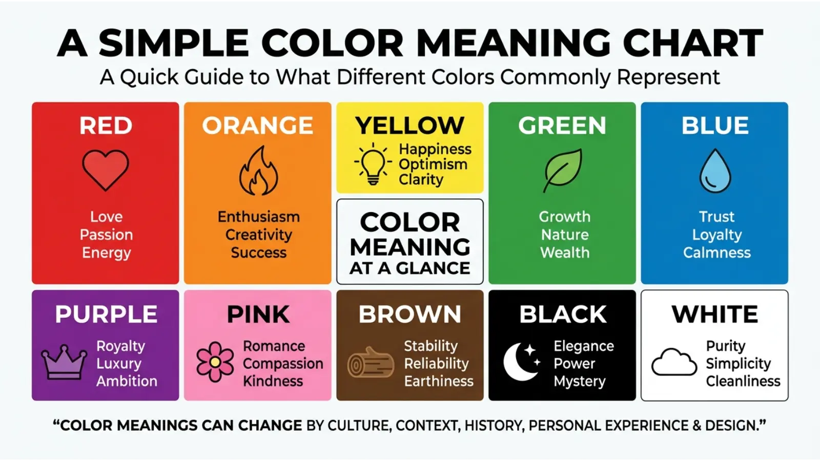
A Simple Color Meaning Chart
The following chart provides a quick reference:
🔴 RED → Passion • Energy • Love • Danger • Action
🟠 ORANGE → Creativity • Warmth • Enthusiasm • Friendship
🟡 YELLOW → Happiness • Optimism • Attention • Energy
🟢 GREEN → Nature • Growth • Health • Renewal • Balance
🔵 BLUE → Trust • Calm • Stability • Reliability • Communication
🟣 PURPLE → Creativity • Mystery • Luxury • Imagination
🩷 PINK → Affection • Compassion • Romance • Playfulness
🟤 BROWN → Earth • Comfort • Stability • Simplicity
⚫ BLACK → Power • Elegance • Mystery • Authority
⚪ WHITE → Purity • Simplicity • Peace • Cleanliness
🩶 GRAY → Neutrality • Balance • Professionalism • Restraint
🩵 TEAL → Freshness • Calm • Balance • Modernity
🟨 GOLD → Wealth • Achievement • Prestige • Celebration
🩶 SILVER → Technology • Modernity • Precision • Elegance
How to Choose a Color for Your Purpose
Start with the message you want people to receive.
If you want energy and urgency, warm colors may be useful. If you want calmness or reliability, cooler colors may provide a better starting point. For natural themes, greens and earth tones can fit naturally.
Next, consider your audience. A color that works beautifully for children’s products may not suit a financial institution.
Then consider cultural expectations. If your design will be used internationally, research the meanings relevant to each target market rather than relying on Western color symbolism.
Finally, test the actual color combination. A theoretical meaning is less useful than seeing the finished design.
Frequently Asked Questions
What are the colors meanings?
Color meanings are the emotions, ideas, symbols, and cultural associations connected with different colors. These meanings can vary according to context, culture, shade, and personal experience.
What color represents love?
Red is commonly associated with romantic love, passion, and desire. Pink can represent affection, tenderness, and caring. The meaning depends on cultural and personal context.
What color represents peace?
White, blue, and soft green are commonly associated with peace and calmness. Their effect depends on the shade and surrounding design.
What color represents happiness?
Yellow is widely associated with happiness, optimism, sunlight, and positive energy. Orange can also communicate warmth and enthusiasm.
What color represents trust?
Blue is frequently used to communicate trust, reliability, stability, and professionalism, particularly in business and institutional design.
What color represents growth?
Green is strongly associated with growth because of its connection with plants, nature, renewal, and life.
What color represents luxury?
Purple, black, gold, and sometimes deep blue can communicate luxury or prestige. However, typography, materials, and design quality also contribute to a premium impression.
Do colors affect emotions?
Colors can influence perception and emotional responses, but their effects are not identical for everyone. Context, culture, personal experience, brightness, saturation, and surrounding colors all matter.
Can color meanings change between cultures?
Yes. A color can have positive, negative, religious, ceremonial, or political meanings depending on the culture and situation.
Can colors determine someone’s personality?
No. Color preference alone cannot reliably determine personality. Personality is much more complex than a person’s preferred color.
Final Thoughts
So, what are the colors meanings? They are best understood as a combination of visual perception, learned associations, cultural symbolism, personal experience, and context.
Red may suggest passion or danger. Blue can communicate calmness or trust. Green often connects with nature and growth. Yellow can bring energy and optimism. Purple can suggest creativity and mystery. Black may feel powerful and elegant, while white can communicate simplicity and cleanliness.
Yet none of these meanings is a universal rule. The shade, setting, culture, lighting, surrounding colors, and purpose can completely change the message.
That flexibility is what makes color so useful. Whether you are designing a website, choosing clothing, decorating a room, creating a brand, making artwork, or simply wondering why a particular color affects you, looking beyond the basic definition can reveal a much richer visual language.

Emma Wilson is a dedicated comparison writer and product researcher at ColorMystiic.com. She specializes in creating unbiased product comparisons, detailed reviews, and helpful buying guides. Her goal is to help readers make smarter purchasing decisions with confidence.