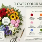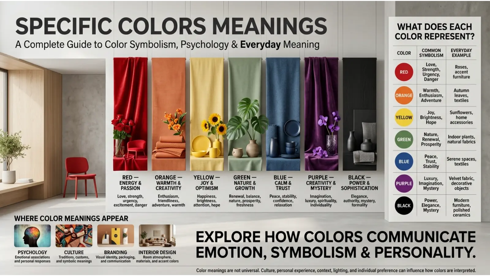
Colors communicate ideas, create moods, and influence how people interpret the world around them. From the calming appearance of blue to the energetic look of red, each color can carry different meanings depending on its shade, context, and cultural background. Understanding specific colors meanings can help you choose colors for clothing, home decoration, branding, artwork, and everyday life.
Some colors have widely recognized associations, while others mean different things in different cultures. This guide explores the meanings of individual colors, their symbolism, emotional associations, and practical uses so you can understand what each color may represent.
Quick Answer: What Do Specific Colors Meanings?
Specific colors have different symbolic and emotional associations. Red often represents passion and energy, blue suggests calmness and trust, green symbolizes nature and growth, yellow conveys optimism, and purple is associated with creativity and luxury. Black may represent elegance or mystery, while white can symbolize simplicity or purity. However, color meanings are not universal. They depend on cultural traditions, personal experiences, context, and how a color is used.
Specific Colors Meanings Chart
The following chart provides a quick overview of common color symbolism.
| Color | Common meaning | Emotional or symbolic association |
|---|---|---|
| 🔴 Red | Passion and energy | Love, courage, urgency |
| 🟠 Orange | Enthusiasm | Creativity, warmth, excitement |
| 🟡 Yellow | Optimism | Happiness, attention, hope |
| 🟢 Green | Growth and nature | Renewal, balance, harmony |
| 🔵 Blue | Calmness and trust | Peace, stability, confidence |
| 🩵 Light blue | Peacefulness | Openness, comfort, clarity |
| 🟣 Purple | Creativity and luxury | Mystery, imagination, royalty |
| 🩷 Pink | Affection | Tenderness, romance, compassion |
| ⚫ Black | Power and mystery | Elegance, seriousness, authority |
| ⚪ White | Simplicity and purity | Cleanliness, openness, peace |
| 🩶 Gray | Neutrality | Balance, subtlety, formality |
| 🟤 Brown | Stability | Earthiness, reliability, warmth |
| 🩷 Magenta | Individuality | Expression, boldness, creativity |
| 🩵 Turquoise | Freshness | Communication, clarity, renewal |
| 🟢 Olive green | Earthiness | Practicality, resilience, nature |
| 🟡 Gold | Achievement | Success, prestige, abundance |
| 🩶 Silver | Modernity | Sophistication, technology, refinement |
| 🟦 Navy blue | Authority | Professionalism, confidence, discipline |
| 🟩 Teal | Balance | Calmness, clarity, sophistication |
| 🟥 Maroon | Depth and strength | Tradition, confidence, richness |
These meanings are common interpretations, not fixed rules. The same color may communicate different ideas depending on its shade, surrounding colors, and cultural setting.
What Does Each Specific Colors Meanings?
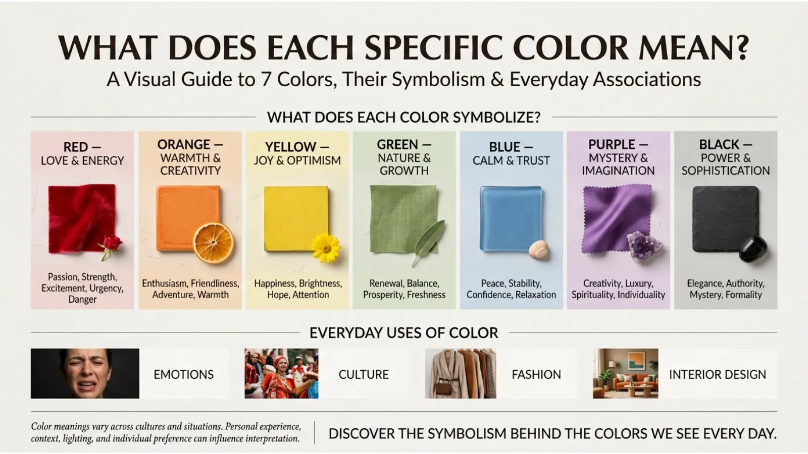
1. Red: Passion, Love, and Energy
Red is a powerful color that often attracts attention. It is commonly associated with passion, romance, courage, energy, and urgency.
In relationships, red can symbolize love and desire. In advertising and design, it may be used to make important information stand out or create a sense of excitement. Red also appears in warning signs because it is highly noticeable.
Common red color meanings:
- Love and romance
- Passion and desire
- Courage and confidence
- Energy and excitement
- Warning and urgency
Red can feel bold and dramatic, but its meaning depends on the situation. A red heart may represent love, while a red warning sign communicates danger.
2. Orange: Creativity, Warmth, and Enthusiasm
Orange combines the visual qualities of red and yellow. It is often associated with warmth, friendliness, creativity, and enthusiasm.
Brands may use orange to create an energetic or approachable appearance. In interior design, orange accents can make a space feel warmer and more lively.
Common orange color meanings:
- Enthusiasm and excitement
- Creativity and playfulness
- Warmth and friendliness
- Confidence and adventure
- Social energy
Bright orange can feel energetic, while muted terracotta shades often create a more natural and relaxed impression.
3. Yellow: Happiness, Hope, and Attention
Yellow is commonly connected with sunlight, optimism, happiness, and mental alertness. Its brightness can help important details stand out in a design.
In decoration, yellow accents may create a cheerful atmosphere. However, too much intense yellow can feel visually overwhelming to some people, especially when used over large areas.
Common yellow color meanings:
- Happiness and optimism
- Hope and positivity
- Attention and visibility
- Warmth and cheerfulness
- Curiosity and energy
Yellow can also communicate caution in signs and labels. Its meaning depends on where and how it appears.
4. Green: Nature, Growth, and Renewal
Green is strongly associated with plants, forests, and the natural environment. It often symbolizes growth, renewal, health, and balance.
Businesses may use green to communicate environmental awareness or a connection with nature. In home decoration, green can bring a natural feeling to a room.
Common green color meanings:
- Nature and environmental awareness
- Growth and renewal
- Balance and harmony
- Freshness and vitality
- Prosperity and abundance
Green does not always mean the same thing. Depending on the context, it can also suggest permission, safety, or financial success.
5. Blue: Trust, Peace, and Stability
Blue often symbolizes calmness, trust, reliability, and stability. Its association with the sky and water can give it a peaceful or refreshing appearance.
Many organizations use blue in their branding to communicate professionalism and dependability. Light blue may feel gentle and open, while dark blue often looks formal and authoritative.
Common blue color meanings:
- Trust and reliability
- Peace and relaxation
- Confidence and stability
- Wisdom and professionalism
- Security and dependability
Blue is not automatically calming for everyone. Personal experiences, lighting, and the surrounding design can change how it feels.
6. Light Blue: Openness and Tranquility
Light blue often represents peacefulness, clarity, friendliness, and openness.
In clothing, light blue can create a relaxed and approachable look. In interior spaces, it may help establish a light and airy visual style.
Common light blue meanings:
- Calmness and comfort
- Openness and communication
- Clarity and freshness
- Friendliness and trust
Light blue is often softer in appearance than navy or royal blue, making it useful when a design needs a less formal tone.
7. Purple: Royalty, Creativity, and Mystery
Purple has long been associated in some historical contexts with royalty and status. Today, it can also represent imagination, individuality, spirituality, and luxury.
Light purple and lavender often create a delicate or romantic impression. Deep purple can feel rich, dramatic, or sophisticated.
Common purple color meanings:
- Royalty and prestige
- Creativity and imagination
- Mystery and individuality
- Luxury and elegance
- Spiritual symbolism in some traditions
Purple can have different meanings across cultures and communities.
8. Pink: Love, Tenderness, and Compassion
Pink is commonly associated with affection, tenderness, romance, and compassion. Its lighter shades often create a soft appearance, while brighter pinks can feel bold and expressive.
Pink is frequently used in gifts, fashion, beauty products, and decorative designs. Its associations can also vary according to social conventions and personal experiences.
Common pink color meanings:
- Love and affection
- Tenderness and kindness
- Compassion and care
- Romance and sweetness
- Playfulness and expression
Pink is not limited to one gender or type of product. Its meaning changes with the design and context.
9. Black: Elegance, Power, and Mystery
Black is often associated with sophistication, authority, mystery, and formality. It is widely used in clothing, luxury branding, and minimalist design.
In some contexts, black can symbolize mourning, grief, or darkness. In others, it communicates strength and elegance.
Common black color meanings:
- Elegance and sophistication
- Power and authority
- Mystery and secrecy
- Formality and seriousness
- Mourning in some cultures
10. White: Purity, Simplicity, and Cleanliness
White often represents simplicity, cleanliness, openness, and purity. It is widely used in minimalist design because it creates visual space and allows other colors to stand out.
In some cultures, white is associated with weddings and celebration. In other traditions, it can be connected with mourning. This difference shows why cultural context matters.
Common white color meanings:
- Purity and simplicity
- Cleanliness and freshness
- Peace and openness
- Minimalism and clarity
- New beginnings in some contexts
White can also feel plain or stark when used without enough contrast or texture.
11. Gray: Neutrality, Balance, and Sophistication
Gray sits between black and white and is often associated with neutrality, subtlety, and professionalism. It works well in designs that need a restrained or understated appearance.
Light gray can feel soft and modern, while dark gray may appear serious and formal.
Common gray color meanings:
- Neutrality and balance
- Professionalism and formality
- Simplicity and restraint
- Sophistication and subtlety
Gray may also feel dull or distant in some settings. Pairing it with brighter colors can make a design more expressive.
12. Brown: Reliability, Earthiness, and Warmth
Brown is closely connected with soil, wood, and other natural materials. It often symbolizes reliability, practicality, warmth, and stability.
In interior design, brown can create a grounded and comfortable appearance. In branding, it may communicate craftsmanship or a natural identity.
Common brown color meanings:
- Stability and reliability
- Nature and earthiness
- Warmth and comfort
- Simplicity and practicality
- Tradition and craftsmanship
Brown can feel rustic or traditional, but modern designs can also use it for a refined, natural look.
13. Magenta: Boldness and Individuality
Magenta is a vivid color between red and purple. It is often associated with bold self-expression, creativity, and individuality.
Because it is visually striking, magenta works well in designs that need to feel energetic or distinctive.
Common magenta color meanings:
- Creativity and expression
- Boldness and confidence
- Originality and individuality
- Energy and vibrancy
14. Turquoise: Freshness, Clarity, and Communication
Turquoise combines blue and green. Its appearance often suggests freshness, water, openness, and calmness.
It is popular in jewelry, coastal design, and branding that aims to feel fresh or approachable.
Common turquoise color meanings:
- Freshness and renewal
- Communication and openness
- Calmness and clarity
- Water and natural beauty
- Balance between blue and green
Turquoise may appear brighter and more energetic than traditional blue, depending on its saturation.
15. Olive Green: Practicality and Nature
Olive green is a muted shade associated with plants, earthiness, practicality, and resilience. It is often used in natural, military-inspired, and outdoor designs.
Compared with bright green, olive green tends to create a more subdued and grounded impression.
Common olive green meanings:
- Nature and earthiness
- Practicality and resilience
- Simplicity and maturity
- Outdoor and rustic style
Its exact meaning depends on the setting. In clothing, olive green can be a versatile neutral, while in military contexts it may have specific functional associations.
16. Gold: Success, Wealth, and Achievement
Gold is commonly associated with wealth, achievement, prestige, and celebration. Its metallic appearance can suggest value and exclusivity.
It is often used for awards, premium products, festive decorations, and luxury branding.
Common gold color meanings:
- Wealth and prosperity
- Success and achievement
- Prestige and luxury
- Celebration and excellence
Gold can look elegant when used in moderation, but excessive use may make a design feel crowded or overly decorative.
17. Silver: Modernity and Refinement
Silver often symbolizes sophistication, modernity, technology, and refinement. Its metallic finish makes it popular in jewelry, electronics, and contemporary design.
Silver can feel cooler and more understated than gold, especially when used with black, white, or blue.
Common silver color meanings:
- Modernity and innovation
- Elegance and refinement
- Technology and precision
- Subtle luxury
Its symbolism depends on the material and context. A silver-colored surface does not necessarily contain actual silver.
18. Navy Blue: Authority and Professionalism
Navy blue is a dark shade of blue that often communicates authority, discipline, trust, and professionalism. It is common in business clothing, uniforms, and corporate identities.
Its darker tone gives it a more formal appearance than light blue.
Common navy blue meanings:
- Authority and discipline
- Professionalism
- Trust and dependability
- Confidence and stability
Navy blue is useful when a design needs to feel dependable without using black.
19. Teal: Balance and Sophistication
Teal combines blue and green, creating a color often associated with balance, clarity, calmness, and sophistication.
It can feel refreshing without being as bright as turquoise.
Common teal color meanings:
- Balance and harmony
- Calmness and clarity
- Sophistication
- Freshness and individuality
Lighter teal can feel playful, while deeper teal may appear elegant or serious.
20. Maroon: Strength, Tradition, and Richness
Maroon is a deep reddish-brown shade often associated with richness, confidence, tradition, and strength. It can feel more subdued and formal than bright red.
In clothing and branding, maroon is often used to create a mature or classic appearance.
Common maroon color meanings:
- Strength and confidence
- Tradition and heritage
- Richness and depth
- Formality and sophistication
Maroon works well with cream, gold, gray, and other muted shades when a design needs warmth without excessive brightness.
How Do Color Meanings Change by Context?
A color does not have only one meaning. The same shade can communicate different ideas depending on where it appears.
| Context | Example | Possible meaning |
|---|---|---|
| ❤️ Relationships | Red roses | Love or passion |
| 🏠 Interior design | Green walls | Nature or freshness |
| 👔 Clothing | Navy suit | Professionalism |
| 🏆 Awards | Gold medal | Achievement |
| 🎨 Art | Purple background | Mystery or imagination |
| 🌿 Environmental branding | Green logo | Nature or sustainability |
| ⚠️ Signs | Red warning | Danger or urgency |
| 💍 Weddings | White clothing in some cultures | Celebration or purity |
These are common associations, not universal rules. Local customs, personal preferences, and the purpose of a design can change the interpretation.
Can Colors Affect Emotions?
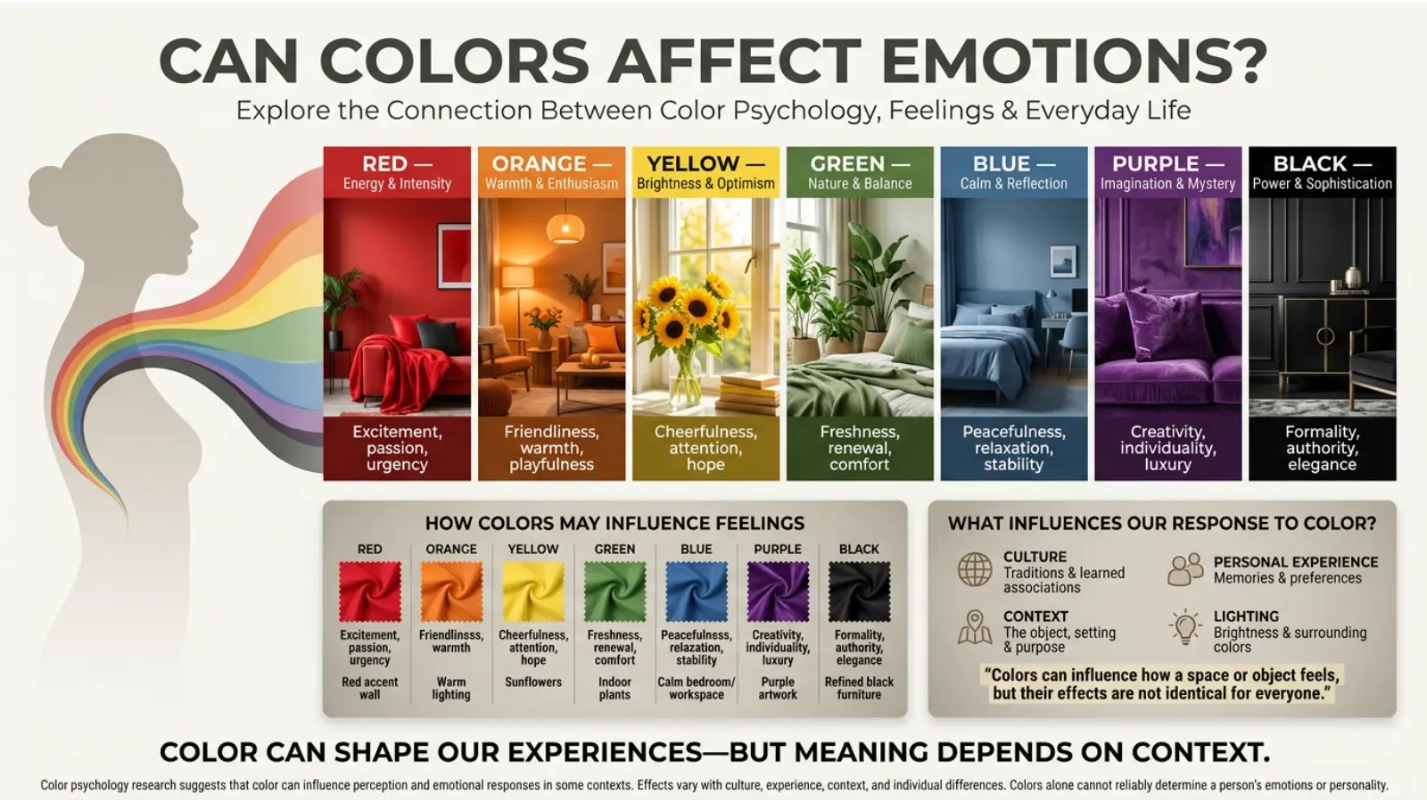
Colors can influence how people perceive a space, product, or message. Bright colors may attract attention, while softer shades can create a quieter visual impression. However, the emotional effects of color vary between people and situations.
For example, some people find blue relaxing, while others may associate it with sadness or a personal memory. Red can feel exciting in one setting and alarming in another.
It is more accurate to say that colors can influence perception and associations than to claim that every color produces the same emotional response in everyone.
How to Use Specific Colors Meanings in Everyday Life
Understanding color symbolism can help you make more intentional choices.
In Clothing and Fashion
Choose colors according to the impression you want to create. Navy blue may look professional, red may feel bold, and green can create a natural appearance. Personal style and comfort should matter more than rigid color rules.
In Home Decoration
Use colors to support the atmosphere you want in a room. Soft blues and greens may create a fresh appearance, while warm browns and muted oranges can make a space feel cozy. Lighting and furniture also influence the final effect.
In Branding and Marketing
Select colors that suit your brand’s personality and audience. Blue is often used to communicate trust, green can suggest an environmental connection, and gold may communicate premium positioning. Test color combinations rather than relying on symbolism alone.
In Art and Creative Projects
Use color contrasts to guide attention and establish mood. Red against a neutral background can create a focal point, while different shades of blue may create a quieter composition. Artists can also challenge traditional meanings to create original effects.
Frequently Asked Questions
1. What are the most common color meanings?
Red is commonly associated with passion and energy, blue with trust and calmness, green with nature and growth, yellow with optimism, and purple with creativity or luxury. These associations vary by context.
2. Which color represents happiness?
Yellow is frequently associated with happiness, sunshine, and optimism. Orange and light pink may also communicate cheerful or warm feelings in some contexts.
3. Which color symbolizes peace?
Blue and white are commonly associated with peace and calmness. Green can also suggest harmony and balance. These meanings are influenced by culture and personal experience.
4. What color represents love?
Red and pink are widely associated with love and affection. Red often suggests passion, while pink may communicate tenderness or gentle affection.
5. What color represents growth and new beginnings?
Green often symbolizes growth, renewal, and nature. White may represent new beginnings in some contexts, but its meaning varies across cultures.
6. What do black and white colors symbolize?
Black can represent elegance, power, mystery, or mourning. White can symbolize simplicity, cleanliness, purity, or celebration. Cultural traditions influence both colors’ meanings.
7. Do colors have the same meanings in every culture?
No. Some associations are widely recognized, but cultural traditions can give colors different or even contrasting meanings. Always consider the specific cultural and social context.
8. Can colors change a person’s mood?
Colors may influence perception and emotional associations, but their effects are not identical for everyone. Personal memories, surroundings, lighting, and individual preferences all play a role.
9. Which colors are best for branding?
There is no single best color for every brand. The right choice depends on the audience, product, industry, brand personality, and how the colors work together.
10. Are Specific Colors Meaningsmeanings scientifically proven?
Some research examines how color influences perception and behavior, but many popular symbolic meanings are cultural traditions rather than universal scientific facts. Avoid treating color symbolism as a reliable way to diagnose emotions or personality.
Conclusion
Specific color meanings offer a useful way to understand how colors communicate ideas in fashion, design, branding, art, and everyday life. Red often symbolizes passion, blue suggests trust, green represents growth, yellow conveys optimism, and purple is associated with creativity. Other colors, including black, white, brown, gray, turquoise, gold, and maroon, have their own common associations.
However, no color has one fixed meaning in every situation. Cultural background, personal experience, shade, and context all influence how people interpret colors. Use color symbolism as a guide for making thoughtful creative choices rather than as a strict set of rules.

Emma Wilson is a dedicated comparison writer and product researcher at ColorMystiic.com. She specializes in creating unbiased product comparisons, detailed reviews, and helpful buying guides. Her goal is to help readers make smarter purchasing decisions with confidence.