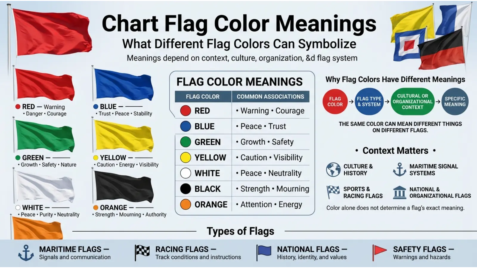
Colors on flags can communicate important messages quickly. They may represent warning, safety, identity, direction, status, achievement, or a specific category of information. When people search for chart flag color meanings, they often want to understand why different colors appear on flags, charts, maps, dashboards, graphs, and visual signaling systems.
However, a flag color does not always have one universal meaning. A red flag may represent danger in one system but symbolize courage or national history in another. Likewise, blue may suggest trust in branding while representing water, peace, or authority in a flag design. Context, culture, industry, and the purpose of the chart all influence interpretation.
This guide explains the symbolism, psychology, cultural meaning, practical uses, and visual impact of common chart flag colors.
Quick Answer: Chart flag colors are visual signals used to communicate information quickly. Red commonly suggests warning or urgency, green often represents safety or progress, yellow signals caution, blue suggests trust or information, while black and white can indicate contrast, status, or specific categories depending on the system.
What Are Chart Flag Colors?
Chart flag colors are colors used on flags, symbols, markers, labels, dashboards, maps, and visual charts to help people understand information at a glance.
The purpose is simple: color reduces the time needed to recognize important information. Instead of reading a long explanation, a person may immediately notice a red, yellow, or green flag.
For example, a business dashboard may use:
🟢 Green Flag = Performing well
🟡 Yellow Flag = Needs attention
🔴 Red Flag = Serious problem or urgent action
This system is widely understood because people often associate these colors with traffic signals and warning systems. Still, designers should never assume that every audience interprets colors in exactly the same way.
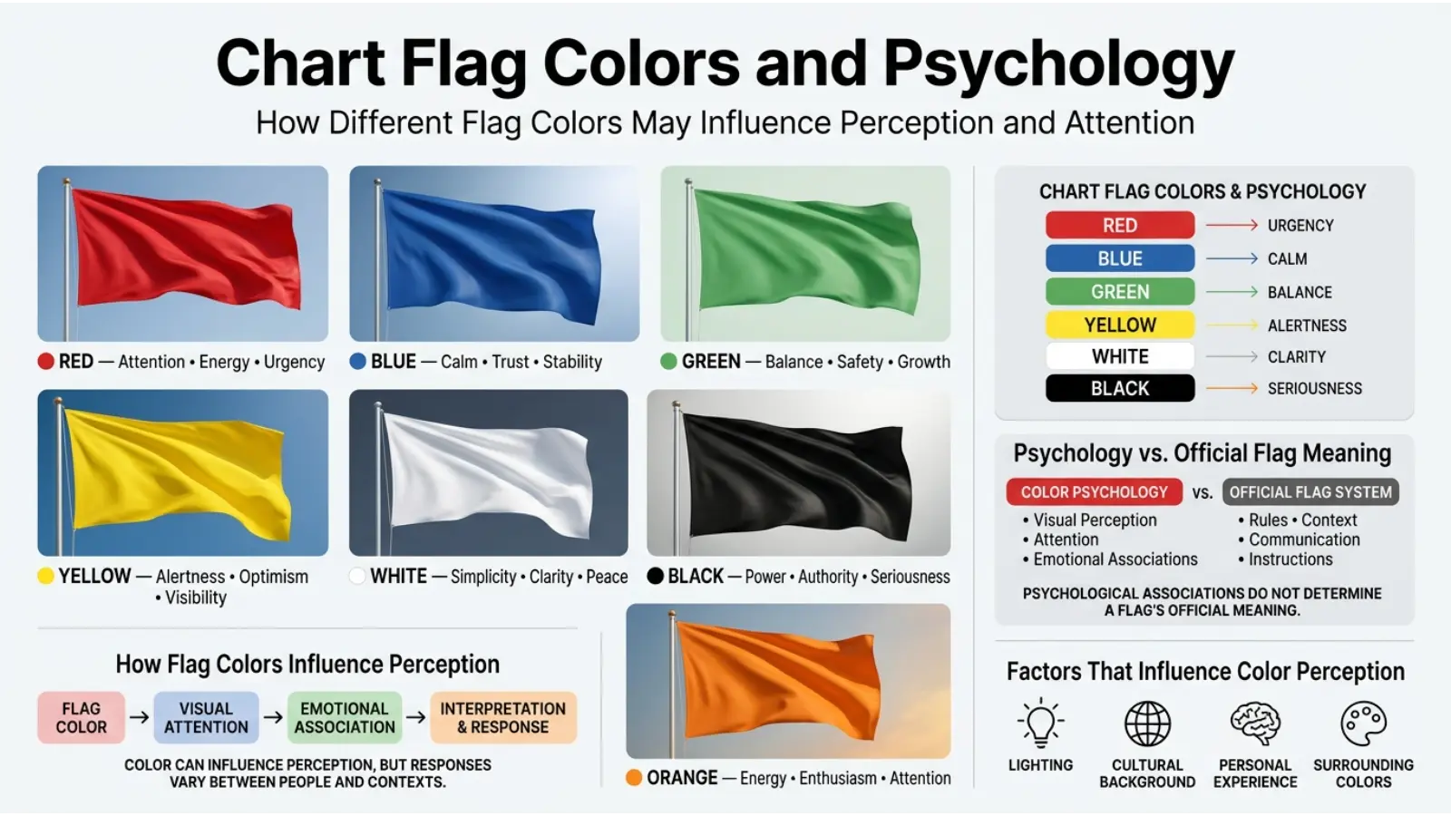
Chart Flag Color Meanings at a Glance
| Flag Color | Common Meaning | Emotional Association | Common Use |
|---|---|---|---|
| 🔴 Red | Warning, danger, urgency | Intensity, alertness | Problems and high-priority issues |
| 🟠 Orange | Attention, activity, caution | Energy, enthusiasm | Moderate warnings and active status |
| 🟡 Yellow | Caution, awareness | Optimism, alertness | Conditions requiring review |
| 🟢 Green | Safety, success, progress | Balance, growth | Approval and positive performance |
| 🔵 Blue | Trust, information, stability | Calm, confidence | General information and reliable status |
| 🟣 Purple | Importance, creativity, distinction | Imagination, mystery | Special categories or premium status |
| ⚫ Black | Seriousness, authority, restriction | Power, formality | Critical categories or strong contrast |
| ⚪ White | Clarity, neutrality, peace | Simplicity, openness | Empty, neutral, or default status |
These meanings are common patterns rather than universal rules. A chart should always include a legend when misunderstanding could create problems.
Red Flag Color Meaning
🔴 RED FLAG
Red is one of the strongest attention-grabbing colors. In charts and flag systems, it commonly signals danger, urgency, failure, prohibition, or a condition requiring immediate action.
The human visual system often notices red quickly, especially when it appears beside neutral colors. For that reason, designers frequently use it for alerts and critical information.
Common Red Flag Meanings
- Danger
- Warning
- Urgent action
- High risk
- Error
- Stop
- Poor performance
- Important attention required
However, red is not always negative. In national flags and cultural traditions, it can symbolize courage, sacrifice, strength, celebration, or good fortune.
Therefore, the meaning of a red chart flag depends heavily on its visual system.
The Psychology of Red
Red is commonly associated with high energy and emotional intensity. It can increase the sense of importance or urgency in a visual display.
In a chart, even a small amount of red can dominate attention. Consequently, using too much red may make information feel overwhelming.
A good design principle is to reserve red for genuinely important conditions. When every item is red, nothing appears especially urgent.
Green Flag Color Meaning
🟢 GREEN FLAG
Green usually represents positive conditions, safety, approval, growth, progress, or successful performance.
In chart systems, green is often used to indicate that something is working as expected.
Common Green Flag Meanings
- Success
- Safe condition
- Approval
- Progress
- Growth
- Good performance
- Completion
- Positive results
For example, a financial or business chart may use green to show growth or performance above expectations.
Still, designers should remember that not every culture or industry uses green in exactly the same way.
The Psychology of Green
Green is strongly associated with nature because it commonly appears in plants and vegetation. As a result, people often connect it with growth, renewal, balance, and restoration.
In visual communication, green usually feels less aggressive than red. Therefore, it can be useful for showing positive outcomes without demanding excessive attention.
Yellow Flag Color Meaning
🟡 YELLOW FLAG
Yellow usually communicates caution, awareness, attention, or a condition that should be monitored.
It often occupies the middle position between green and red.
Common Yellow Flag Meanings
- Caution
- Review needed
- Potential problem
- Temporary concern
- Awareness
- Moderate risk
For instance, a yellow chart flag may mean that a project is not failing but requires attention before the situation becomes more serious.
Why Yellow Works as a Warning Color
Yellow is visually noticeable, especially when paired with darker colors. Therefore, it can work effectively as an intermediate warning signal.
However, pale yellow can be difficult to read on a white background. Designers should use enough contrast to ensure that text, symbols, and flags remain visible.
Orange Flag Color Meaning
🟠 ORANGE FLAG
Orange often represents activity, increased attention, enthusiasm, or moderate urgency.
It can communicate a stronger message than yellow while appearing less severe than red.
Common Orange Flag Meanings
- Elevated concern
- Active condition
- Increased attention
- Moderate warning
- Energy
- Change in progress
Orange is useful when designers need more visual emphasis but do not want viewers to interpret the condition as an emergency.
The Psychology of Orange
Orange combines characteristics commonly associated with red and yellow. As a result, it can feel energetic, warm, active, and noticeable.
In charts, orange can be useful for highlighting items that are important but not critical.
Blue Flag Color Meaning
🔵 BLUE FLAG
Blue commonly represents trust, stability, information, calmness, and reliability.
Unlike red, blue generally creates a less urgent visual impression. Therefore, it is often used for neutral information or standard categories.
Common Blue Flag Meanings
- Information
- Trust
- Stability
- Reliability
- Authority
- Calm conditions
- Standard status
In some charts, blue does not indicate a positive or negative condition. Instead, it simply separates one category from another.
The Psychology of Blue
Blue is frequently associated with water and the sky. These associations can influence perceptions of calmness, openness, and stability.
However, color psychology should not be treated as a fixed rule. Individual experiences, culture, context, and surrounding colors can all change how blue is perceived.
Purple Flag Color Meaning
🟣 PURPLE FLAG
Purple is often used for distinction, creativity, importance, luxury, mystery, or special categories.
Because purple appears less frequently in standard warning systems, it can help a category stand apart from ordinary status colors.
Common Purple Flag Meanings
- Special status
- Creativity
- Distinction
- Premium category
- Mystery
- Imagination
- Unique information
Purple can be especially useful in charts where designers need an additional category that should not be confused with warning or approval signals.
Black Flag Color Meaning
⚫ BLACK FLAG
Black can communicate seriousness, authority, restriction, power, or finality. In some visual systems, it is also used simply because it creates strong contrast.
Common Black Flag Meanings
- Serious condition
- Restriction
- Authority
- Critical information
- Formal status
- Strong contrast
The meaning of a black flag can vary significantly. Historical and cultural contexts may give black additional symbolic meanings, so charts should clearly define what black represents.
White Flag Color Meaning
⚪ WHITE FLAG
White often represents neutrality, clarity, simplicity, openness, or an unmarked condition.
In some cultural and historical settings, a white flag is associated with surrender or negotiation. However, that specific meaning should not automatically be applied to every chart or visual flag.
Common White Flag Meanings in Charts
- Neutral
- Default
- No current status
- Empty category
- Clear condition
- General information
White is often more effective when used with borders, icons, or dark text because it can disappear against a light background.
How Chart Flag Colors Influence Perception
Colors influence which information people notice first. This is one reason why charts and dashboards often use color-coded flags.
Consider the following example:
| Project | Status Flag | Likely Interpretation |
|---|---|---|
| Project A | 🟢 Green | Performing well |
| Project B | 🟡 Yellow | Needs monitoring |
| Project C | 🔴 Red | Requires urgent attention |
Even before reading the details, viewers can quickly identify the item that appears most serious.
This visual speed is useful, but it also creates responsibility. Poor color choices can cause confusion or lead people to misunderstand the information.
Why Context Changes Chart Flag Color Meanings
A color has no completely fixed meaning by itself.
A red flag may mean:
- Danger in a safety chart
- Low performance in a business report
- Stop in a signaling system
- Courage in a national flag
- Celebration or good fortune in some cultural traditions
Therefore, the symbol’s purpose is just as important as the color itself.
The most effective charts provide a clear legend explaining what each flag color means.
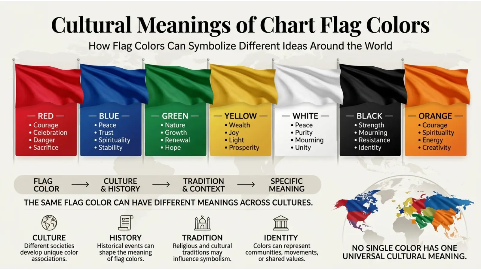
Cultural Chart Flag Color Meanings
Color interpretation differs across societies and traditions. Therefore, global charts should avoid assuming that one meaning applies everywhere.
Red in Different Cultural Contexts
Red can represent danger and warning in many modern systems. At the same time, it may symbolize celebration, prosperity, courage, or important historical events in different cultures.
Green in Different Cultural Contexts
Green is often associated with nature, growth, and renewal. However, it may also have religious, political, or cultural significance depending on the region.
White in Different Cultural Contexts
White may represent purity or peace in some societies. In other traditions, it can have associations with mourning or remembrance.
Yellow and Purple
Yellow and purple also have changing cultural meanings. The Yellow may symbolize happiness, warning, wealth, or religious significance, while purple has historically been connected with status and distinction in some contexts.
For international audiences, clear labels are more reliable than relying only on assumed color symbolism.
Historical Development of Flag Colors
Colors have been used in flags and symbols for centuries because they remain visible from a distance.
Historically, flag colors often represented communities, rulers, military groups, religious traditions, regions, or political movements. The meaning was usually connected to the people using the flag rather than to a universal color code.
Modern chart flags work differently. They are usually designed for quick communication and data organization.
For example, traffic-light-style systems developed widespread associations between red, yellow, and green. Over time, these colors became familiar shorthand for stop, caution, and proceed.
This is why modern dashboards frequently use similar color patterns.
Chart Flag Colors and Psychology
Color psychology can help explain why certain colors work well in visual communication. However, it should not be used to claim that every person responds identically.
Several factors influence color perception:
- Personal experience
- Cultural background
- Age
- Lighting
- Surrounding colors
- Screen quality
- The purpose of the information
For example, red may attract attention because of its visual intensity and learned association with warnings. Yet a person viewing red within a national flag may interpret it through history and identity instead.
Therefore, chart designers should combine color with words, icons, or symbols.
Do Chart Flag Colors Represent Personality?
People sometimes connect favorite colors with personality traits. For example, someone who prefers blue may be described as calm, while a person who likes red may be described as energetic.
These descriptions can be interesting, but color preference does not scientifically determine personality.
A person’s color choices can change depending on:
- Mood
- Fashion trends
- Environment
- Culture
- Age
- Personal experiences
Therefore, chart flag colors should not be used to make psychological judgments about individuals.
Chart Flag Colors in Branding and Marketing
Brands use color because it helps create recognition and visual consistency.
For example:
🔵 Blue can support a stable or professional visual identity.
🔴 Red can create stronger visual energy and attention.
🟢 Green can support themes related to nature, growth, or sustainability.
🟣 Purple can help a brand appear distinctive or imaginative.
However, successful branding depends on more than color. Typography, logo design, messaging, product quality, and customer experience also shape how people perceive a brand.
Why Marketers Use Flag-Style Colors
Flag-style status colors are useful because audiences can understand them quickly.
A marketing dashboard might use:
🟢 Strong campaign performance
🟡 Performance needs improvement
🔴 Campaign requires immediate review
This system allows teams to identify priorities without reading every number individually.
How to Use Chart Flag Colors Effectively
Choosing colors is only the first step. The system must also be easy to understand.
Use Colors Consistently
Do not use green for success in one section and failure in another.
Consistency helps viewers learn the visual language of the chart.
Add a Clear Legend
A legend explains the exact meaning of every flag.
For example:
🟢 Green: On target
🟡 Yellow: Monitor closely
🔴 Red: Action required
This removes unnecessary guessing.
Avoid Too Many Colors
A chart containing ten or fifteen flag colors can become confusing.
Use only the number of colors needed to communicate meaningful differences.
Use Text and Icons Alongside Color
Color alone may not work for everyone, particularly people with color vision differences.
Instead of showing only a red flag, consider adding:
🔴 Critical
This approach improves accessibility and clarity.
How Lighting and Screens Change Flag Colors
The appearance of a flag color can change depending on where it is viewed.
A color displayed on a bright computer screen may look different on:
- A smartphone
- A projector
- Printed paper
- A television
- A dark-mode dashboard
Lighting also changes perception. Yellow may appear brighter under strong light, while dark blue can become difficult to distinguish in low-light environments.
Therefore, designers should test chart colors in realistic viewing conditions.
Chart Flag Colors in Interior and Display Design
Although chart flags are mainly used for information, their colors can affect the overall appearance of a workspace or display.
For example, a control room filled with bright red alerts may feel stressful. Meanwhile, a dashboard dominated by calm blue may appear organized but may not create enough urgency for serious warnings.
A balanced design usually uses:
- Neutral colors for background information
- Strong colors for important status changes
- Limited red for serious conditions
- Clear contrast between text and background
This creates a visual hierarchy that helps people focus.

Chart Flag Colors in Fashion and Visual Style
Flag colors also influence fashion and visual identity.
Red can create a bold appearance, while blue often feels classic and dependable. Green may suggest freshness, and purple can create a distinctive look.
Color combinations matter because people do not see colors in isolation.
For example:
🔴 Red + ⚪ White = Strong contrast and high visibility
🔵 Blue + ⚪ White = Clean and balanced appearance
🟢 Green + 🟤 Earth tones = Natural visual feeling
🟣 Purple + ⚫ Black = Dramatic and distinctive style
🟡 Yellow + 🔵 Blue = Bright visual contrast
The same principles can help designers create readable charts and attractive flags.
Best Color Combinations for Chart Flags
Green, Yellow, and Red
🟢 → 🟡 → 🔴
This is one of the most familiar status systems.
It works well for:
- Performance dashboards
- Project tracking
- Risk assessment
- Progress monitoring
However, designers should not rely only on these colors because some viewers may have difficulty distinguishing them.
Blue and Orange
🔵 → 🟠
Blue and orange create noticeable contrast and can help separate two major categories.
This combination is useful when the chart does not require a simple good-versus-bad system.
Purple and Yellow
🟣 → 🟡
These colors can create strong visual separation. They are useful for highlighting different categories or special information.
Black and White
⚫ → ⚪
This combination provides strong contrast and can be effective for labels, borders, and simple chart structures.
Real-World Applications of Chart Flag Colors
Chart flag colors appear in many areas of everyday life.
Business
Companies use color flags to monitor:
- Sales performance
- Employee tasks
- Project deadlines
- Financial risks
- Customer satisfaction
Education
Teachers and schools may use colored flags to show:
- Student progress
- Assignment status
- Learning goals
- Attendance patterns
Healthcare and Safety
Visual color systems can help organize information and draw attention to priorities. However, professional safety and healthcare systems should follow established standards rather than relying on general color symbolism.
Sports
Sports often use flags and colors to communicate:
- Start and stop signals
- Warnings
- Penalties
- Team identity
- Event status
Technology
Software dashboards frequently use colored indicators for:
- System health
- Server status
- Errors
- Updates
- Security alerts
Art and Photography
Artists and photographers use color symbolism to guide attention and create emotional contrast.
A small red element in a mostly blue image can become a powerful focal point because of the difference in color temperature and visual intensity.
Common Misconceptions About Chart Flag Color Meanings
Misconception: Every Color Has One Universal Meaning
False. Color meanings depend on context, culture, industry, and design.
Misconception: Red Always Means Danger
Red often signals danger or urgency, but it can also represent celebration, strength, courage, or identity.
Misconception: Green Always Means Safe
Green is commonly associated with positive status, but specific systems may use it differently.
Misconception: Color Alone Is Enough
A chart should not depend entirely on color. Labels and symbols make information clearer and more accessible.
Misconception: Color Psychology Predicts Human Behavior
Color can influence perception and attention, but it does not control personality or guarantee that everyone will react in the same way.
How Age and Experience Affect Color Interpretation
People learn many color meanings through experience.
Children may learn red, yellow, and green through traffic signals, games, and school activities. Adults may connect the same colors with business performance, safety systems, or technology.
Professional experience also matters.
For example, a person working with financial charts may associate red with losses, while another person may primarily associate red with warning signs.
This shows why designers should make chart meanings clear instead of assuming universal understanding.
How Artists Use Flag Colors and Symbolism
Artists often use colors deliberately to create contrast and meaning.
A dark flag against a bright background can feel serious or dramatic. Meanwhile, a bright yellow flag may become a focal point because of its visual intensity.
Artists may also change traditional color meanings.
For example, red can represent love in one artwork and danger in another. The surrounding imagery determines the final interpretation.
This same principle applies to charts: context controls meaning.
Frequently Asked Questions About Chart Flag Color Meanings
What do chart flag colors mean?
Chart flag colors usually communicate status or categories. Red often means warning, yellow suggests caution, and green commonly represents a positive or safe condition.
What does a red flag mean on a chart?
A red flag often indicates danger, risk, poor performance, or an issue requiring immediate attention. The exact meaning depends on the chart’s legend.
What does a green flag mean on a chart?
A green flag commonly represents success, approval, safety, progress, or good performance.
What does a yellow flag mean?
A yellow flag usually suggests caution, monitoring, or a condition that requires attention but is not yet critical.
What does a blue flag mean?
Blue often represents information, stability, trust, or a neutral category. Its meaning can vary between systems.
Are chart flag color meanings universal?
No. While some color associations are widely recognized, meanings can differ by culture, industry, and purpose.
Why are red, yellow, and green commonly used in charts?
These colors are widely recognized through traffic signals and other status systems, making them useful for quick visual communication.
Can color alone communicate chart information?
Color can communicate information quickly, but it should ideally be combined with labels, icons, or patterns for better clarity and accessibility.
How do cultural differences affect flag colors?
Different cultures may connect the same color with different traditions, emotions, religious meanings, or historical events.
What is the best way to choose chart flag colors?
Choose colors based on the purpose of the chart, use strong contrast, keep meanings consistent, provide a legend, and avoid relying only on color.
Final Thoughts on Chart Flag Color Meanings
Understanding chart flag color meanings can make charts, dashboards, maps, and visual systems easier to read. Red, yellow, green, blue, purple, black, and white all carry common associations, yet their meaning changes with context.
The most effective use of color combines symbolism with practical communication. A red flag should clearly explain why action is needed. A green flag should consistently represent a positive condition. Yellow and orange can help viewers recognize developing concerns, while blue and other colors can organize information without creating unnecessary alarm.
Ultimately, colors work best when they support the message rather than replace it. By using clear labels, strong contrast, accessible design, and consistent color rules, chart flags can turn complex information into something people understand within seconds.

Emma Wilson is a dedicated comparison writer and product researcher at ColorMystiic.com. She specializes in creating unbiased product comparisons, detailed reviews, and helpful buying guides. Her goal is to help readers make smarter purchasing decisions with confidence.