Color is more than something we see. It can change how a room feels, shape the personality of a brand, influence how clothing is perceived, and carry different meanings across cultures and traditions. Color symbolism meanings are therefore not fixed rules. The same color can suggest peace in one setting, sadness in another, and celebration somewhere else.
People search for color meanings because they want to understand why certain colors feel powerful, calming, elegant, mysterious, joyful, or serious. Designers use color to guide attention. Artists use it to communicate ideas without words. Marketers use it to build recognition. People also use colors to express identity, mood, memories, and personal style.
This guide explains color symbolism in a simple but detailed way. It separates widely recognized associations from cultural and symbolic interpretations, while showing how context, lighting, history, age, and personal experience can change the way a color is understood.
Quick Answer: Color symbolism meanings describe the ideas, emotions, cultural associations, and psychological impressions connected with colors. Common associations include blue with calm and trust, red with energy and danger, green with nature and growth, yellow with happiness and attention, purple with royalty and imagination, white with cleanliness and simplicity, black with power and sophistication, and orange with warmth and enthusiasm. These meanings are not universal; context and culture can change them.
What Are Color Symbolism Meanings?
Color symbolism is the practice of connecting colors with ideas, emotions, values, events, or cultural beliefs.
For example, blue is often associated with calmness, reliability, and openness. Red can suggest energy, urgency, passion, or danger. Green commonly connects with nature, renewal, and health.
These associations do not mean that a color automatically creates a specific emotion. Human responses to color are influenced by many factors, including personal experience, surroundings, culture, brightness, saturation, and the object carrying the color.
A red sports car and a red emergency warning use the same basic color but communicate very different messages.
That difference is one of the most important ideas in color symbolism: meaning comes from color plus context.
The Most Common Color Meanings Chart
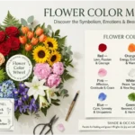
| Color | Common Positive Meanings | Possible Negative Meanings | Common Uses |
|---|---|---|---|
| Red | Passion, energy, courage, love | Danger, anger, urgency | Food, sports, warnings, entertainment |
| Orange | Warmth, enthusiasm, creativity | Restlessness, excess | Advertising, food, lifestyle brands |
| Yellow | Happiness, optimism, energy | Caution, anxiety | Signs, children’s products, packaging |
| Green | Nature, growth, renewal, balance | Jealousy, inexperience | Health, environmental design, finance |
| Blue | Trust, calm, stability, confidence | Coldness, distance | Technology, finance, healthcare |
| Purple | Creativity, luxury, mystery, spirituality | Excess, artificiality | Beauty, luxury, entertainment |
| Pink | Affection, softness, playfulness | Immaturity, excessive sweetness | Fashion, beauty, lifestyle |
| Brown | Earthiness, reliability, comfort | Dullness, heaviness | Furniture, food, outdoor products |
| Black | Power, elegance, sophistication | Mourning, secrecy, fear | Luxury, fashion, technology |
| White | Purity, simplicity, cleanliness | Emptiness, sterility | Healthcare, interiors, minimalism |
| Gray | Balance, neutrality, sophistication | Boredom, uncertainty | Architecture, technology, corporate design |
| Gold | Achievement, wealth, prestige | Excess, extravagance | Luxury, awards, premium products |
| Silver | Modernity, technology, refinement | Coldness, impersonality | Electronics, vehicles, futuristic design |
This chart is a starting point, not a universal dictionary. A color can communicate something completely different depending on where, how, and why it is used.
How Color Meaning Changes With Context
Imagine a bright yellow.
On a child’s toy, yellow may feel cheerful and energetic. On a road sign, the same yellow can communicate caution. In a traditional painting, it may represent sunlight, wealth, divinity, or another symbolic idea depending on the culture and historical period.
The physical color has not changed very much. The visual context has.
Three factors are especially important:
Hue
Hue is the basic color family, such as red, blue, green, or purple.
Saturation
Highly saturated colors often appear stronger and more energetic. Muted versions can feel softer, older, calmer, or more sophisticated.
Lightness
A pale blue can feel airy and peaceful, while a deep navy may appear formal, authoritative, and serious.
This explains why saying “blue means calm” is incomplete. A powder blue wall and a dark navy business suit may produce very different impressions.
Psychology of Color: What Science Can and Cannot Tell Us
Color psychology examines how people perceive and respond to color. Research supports the idea that color can influence perception and behavior in certain situations, but color effects are often dependent on context.
It would be misleading to claim that every person will experience the same emotional response to a particular color.
Color can affect judgments about products, environments, visual attention, and perceived qualities. However, responses are influenced by learned associations and cultural expectations as well as the visual properties of the color itself.
For example, people may learn to associate red with warnings because they repeatedly encounter red signs, signals, and alerts. This is different from claiming that red has one universal emotional effect on every human being.
Why Bright Colors Often Feel Stronger
Bright, highly saturated colors tend to attract visual attention.
That is one reason strong colors are useful for:
- Warning signs
- Buttons
- Sports uniforms
- Packaging
- Advertising
- Children’s products
- Promotional displays
However, too much visual intensity can become tiring. Designers often balance strong colors with neutral backgrounds.
Why Dark Colors Can Feel More Serious
Dark colors often create visual weight.
A dark navy suit may appear formal. A black package may appear premium. A charcoal office may feel sophisticated.
But darkness can also communicate sadness, secrecy, danger, or mourning in particular contexts.
The meaning depends on what the color is surrounding and what the audience expects.
Why Lighting Changes Color Meaning
Color does not exist visually in isolation.
A warm light can make cream, beige, orange, and red appear richer. Cool lighting can make whites and blues appear sharper and can change how some neutral colors look.
This matters in interior design and photography.
A paint color that looks soft and warm in daylight may appear noticeably different under artificial lighting.
Practical tip: Always test important colors under the lighting conditions where they will actually be used.
A Color Symbolism Meanings Associations
A useful way to understand color symbolism is to group colors according to broad visual and emotional tendencies.
| Color Family | Typical Visual Impression | Common Symbolic Associations |
|---|---|---|
| Warm colors | Active, energetic | Passion, warmth, excitement |
| Cool colors | Calm, spacious | Peace, stability, distance |
| Earth colors | Natural, grounded | Comfort, reliability, nature |
| Dark colors | Strong, dramatic | Power, mystery, seriousness |
| Light colors | Gentle, open | Purity, softness, simplicity |
| Metallic colors | Valuable, reflective | Wealth, technology, achievement |
These are broad patterns rather than psychological laws.
Spiritual Meaning of Colors
Colors appear in many spiritual, religious, ceremonial, and symbolic traditions. Their meanings differ widely, so spiritual interpretations should never be presented as if one system represents every belief.
In different traditions, colors may symbolize ideas such as:
- Transformation
- Protection
- Healing
- Wisdom
- Hope
- Balance
- Growth
- Purification
- Power
- Renewal
For example, white may symbolize purity in one religious or ceremonial context, while black may represent mourning or solemnity. In another setting, the same colors can have very different meanings.
Why Spiritual Color Meanings Differ
Spiritual symbolism is shaped by history, religious texts, rituals, local customs, natural surroundings, and community traditions.
A color associated with sacredness in one tradition may have no equivalent meaning in another.
For this reason, responsible color symbolism writing should distinguish between documented tradition and modern spiritual interpretation.

Cultural Meaning of Colors Around the World
There is no universal color dictionary shared equally by every society.
Western Cultural Associations
Modern Western cultures commonly connect certain colors with familiar ideas such as red for danger or romance, green for nature, blue for trust, and black for formality or mourning.
These associations are widespread but still depend on context.
East Asian Cultural Interpretations
Color symbolism across East Asian societies has developed through long histories of art, philosophy, religion, political systems, festivals, and social customs.
Red, for example, has held important positive associations in several East Asian traditions, including celebration and good fortune, although meanings vary between countries and situations.
White can also carry associations with mourning in some East Asian cultural contexts, showing why assuming that white always means happiness or purity would be inaccurate.
Middle Eastern Cultural Contexts
Color meanings in Middle Eastern societies are influenced by religious traditions, regional customs, national symbolism, architecture, clothing, and historical practices.
A color’s meaning may change depending on whether it appears in religious decoration, clothing, national imagery, advertising, or everyday objects.
African Cultural Traditions
Africa contains hundreds of cultural communities, languages, histories, and artistic traditions. There is therefore no single “African color meaning.”
Colors may have important meanings in textiles, ceremonies, art, status systems, spiritual traditions, and national identities.
A responsible interpretation should identify the specific culture rather than treating an entire continent as one symbolic system.
Latin American Cultural Contexts
Color symbolism in Latin America can be influenced by Indigenous traditions, Catholic traditions, colonial history, festivals, national identities, and modern popular culture.
Bright colors frequently play strong roles in celebrations, clothing, art, architecture, and festivals, but individual meanings vary greatly by location and tradition.

Historical Color Symbolism Meanings
Color meanings have changed throughout history partly because pigments themselves were once difficult to obtain.
Some colors were expensive because their pigments required rare minerals, plants, animals, or complex production methods. As a result, certain colors became connected with wealth, status, religion, or authority.
Purple is a classic historical example. Certain purple dyes were extremely difficult and costly to produce in the ancient Mediterranean world, helping the color develop strong associations with status and power.
As synthetic pigments became easier to manufacture, many colors became accessible to ordinary consumers. This changed the social meaning of color.
The history of color therefore shows that symbolism is not only psychological. Economics, technology, politics, religion, and fashion also shape meaning.
Personality and Color Preferences
People often ask what their favorite color says about their personality.
Color preference can provide interesting clues about taste and self-expression, but it cannot reliably diagnose personality.
Someone who prefers blue might enjoy its calm appearance. Another person might prefer it simply because it reminds them of the ocean, a favorite sports team, or a childhood memory.
Color preferences can also change with:
- Age
- Fashion
- Environment
- Culture
- Life experiences
- Social trends
- Personal identity
So personality-color charts are best treated as symbolic or entertainment-oriented interpretations, not psychological tests.
Common Personality Associations
| Preferred Color | Common Symbolic Personality Association |
|---|---|
| Blue | Calm, dependable, thoughtful |
| Red | Bold, energetic, passionate |
| Green | Balanced, natural, growth-oriented |
| Yellow | Optimistic, expressive, playful |
| Purple | Creative, imaginative, unconventional |
| Black | Independent, sophisticated, controlled |
| White | Organized, simple, clean-minded |
| Orange | Social, energetic, adventurous |
| Pink | Warm, affectionate, expressive |
| Brown | Practical, grounded, dependable |
These associations describe cultural impressions, not proven personality types.
Color Symbolism Meanings in Branding and Marketing
Color is one of the fastest visual signals in branding.
A customer may recognize a brand’s color palette before reading its name. Consistent color use can strengthen recognition and create a recognizable visual identity.
Businesses choose colors based on several factors:
- Target audience
- Industry expectations
- Brand personality
- Product category
- Cultural market
- Competitor colors
- Accessibility
- Packaging
- Digital display
Why Blue Is Common in Business
Blue is frequently used by organizations that want to communicate qualities such as reliability, stability, competence, or professionalism.
This makes it common in areas such as technology, finance, healthcare, and corporate services.
But blue is not automatically trustworthy. The surrounding design, typography, photography, messaging, and customer experience all contribute to that impression.
Why Green Appears in Environmental Branding
Green has an obvious visual connection with vegetation and landscapes.
Brands connected with nature, sustainability, agriculture, wellness, or organic products may use green because the association is easy to understand.
However, simply adding green to a package does not prove that a product is environmentally responsible. Consumers increasingly evaluate the actual claims behind environmental branding.
Why Black Often Signals Luxury
Black creates strong contrast and visual weight.
When paired with restrained typography, generous spacing, and high-quality materials, it can produce a premium appearance.
Luxury branding often uses black because it allows the product itself to become the focal point while creating a controlled, sophisticated visual system.
Color in Advertising
Advertising uses color to direct attention and establish emotional tone.
A bright orange sale label can stand out against a neutral background. A soft blue healthcare advertisement can create a quieter atmosphere. A black-and-gold design may communicate prestige.
The best advertising palettes do not simply choose colors because of their symbolic meaning. They consider:
- Visibility
- Contrast
- Audience expectations
- Product category
- Cultural meaning
- Brand consistency
- Accessibility
Color Symbolism Meanings in Interior Design
Color can dramatically change how a room appears.
Light colors can make a small space feel more open. Dark colors can add visual depth and intimacy. Warm colors can make a room feel energetic, while cooler colors can create a calmer atmosphere.
Living Room
Neutral walls combined with one strong accent color can create a balanced living room.
For example, beige with deep green can produce a natural feeling, while gray with navy can create a more formal appearance.
Bedroom
Soft blues, muted greens, warm neutrals, and gentle lavender shades are often chosen when people want a restful visual environment.
The goal is not to find a scientifically “sleep-inducing” color. Instead, choose colors that create a comfortable atmosphere for the people using the room.
Office
Blue, gray, green, and neutral palettes are common in offices because they can appear organized and professional.
Adding warmer accent colors can prevent a workspace from feeling visually cold.
Kitchen
White, cream, natural wood, green, blue, and warm neutral colors can work well in kitchens.
Strong red or orange accents can add energy but may become overwhelming if used across large surfaces.

Color Symbolism Meanings in Fashion
Fashion uses color as both decoration and communication.
A dark suit can appear formal. A bright outfit can feel energetic. Neutral clothing can look understated and versatile.
Color choices also interact with fabric texture, cut, lighting, skin contrast, accessories, and social setting.
Professional Clothing
Navy, charcoal, black, white, cream, and muted colors are often associated with professional dress.
A small amount of stronger color can add personality without dominating the outfit.
Casual Clothing
Casual fashion allows more freedom.
Bright colors, pastels, earth tones, and unusual combinations can communicate different moods and styles.
Formal Wear
Black remains strongly associated with formal clothing in many modern Western settings. However, cultural expectations vary, so formal color choices should always consider the event and location.
Color Combinations That Work Well
Good color combinations usually balance contrast, harmony, temperature, and visual weight.
| Combination | Overall Impression | Useful For |
|---|---|---|
| Blue + White | Clean, calm | Websites, healthcare, interiors |
| Green + Beige | Natural, grounded | Home design, wellness |
| Navy + Gold | Premium, traditional | Luxury branding |
| Black + White | Strong, timeless | Fashion, editorial design |
| Purple + Cream | Elegant, creative | Beauty, interiors |
| Orange + Navy | Energetic, balanced | Sports, marketing |
| Red + White | Bold, clear | Promotions, packaging |
| Gray + Yellow | Modern, energetic | Interiors, technology |
| Brown + Green | Earthy, natural | Outdoor and organic themes |
| Pink + Burgundy | Warm, expressive | Fashion and beauty |
The 60-30-10 Rule
A practical design guideline is to use approximately:
- 60% dominant color
- 30% secondary color
- 10% accent color
This is not a scientific law. It is simply a useful starting point for maintaining visual balance.
Real-Time Example: Color in a Modern Brand Design
Imagine a technology company launching a new cybersecurity service in August 2026.
The company could use a dark navy background, white text, and a bright cyan accent.
The navy establishes a serious and controlled visual foundation. White improves readability. Cyan provides a modern technological accent and draws attention to important buttons.
Notice that the meaning does not come from cyan alone. The combination creates the impression.
Now imagine the same cyan used with neon pink, huge typography, and animated graphics. The brand could feel younger and more entertainment-focused.
The color did not change. The visual context did.
This is why professional designers create a complete color system rather than selecting colors from a symbolism chart.
Color Symbolism Meanings in Art and Photography
Artists have used color symbolically for centuries.
A painter might use red to create visual tension, blue to create distance, or yellow to draw attention toward a particular object.
Photographers can use color grading to change the emotional atmosphere of an image.
Warm Color Grading
Warm orange and yellow tones can create impressions of:
- Nostalgia
- Sunset
- Comfort
- Energy
- Intimacy
Cool Color Grading
Blue and cyan tones can suggest:
- Night
- Distance
- Calmness
- Isolation
- Technology
These are creative conventions, not universal emotional laws.
Color Symbolism Meanings in Sports
Sports teams often use strong colors to create identity and recognition.
A team’s colors appear on uniforms, stadium graphics, merchandise, websites, and advertising.
Bright colors can improve visual recognition during fast action. Dark colors can create a powerful appearance, while combinations with strong contrast can make numbers and names easier to see.
Color can therefore serve both symbolic and practical purposes in sports.
Color in Entertainment and Fiction
Movies, television, games, and fantasy stories frequently use color as visual storytelling.
A character may gradually change from light colors to darker colors as the story becomes more dramatic. A fictional world may use a distinctive palette to separate one location or faction from another.
Fantasy settings can also create entirely new symbolic systems.
For example, a fictional story could decide that green represents magical healing while red represents destructive power.
That meaning is valid inside the fictional world, but it should not be presented as a universal real-world color meaning.
Color, Age, and Personal Experience
Color preferences are not identical across generations.
Children may be attracted to highly saturated colors. Adults may develop preferences influenced by fashion, professional environments, cultural expectations, or memories.
A person may also dislike a color because it reminds them of an unpleasant experience.
This is why color psychology should not assume that everyone reacts identically.
Color Accessibility Matters
A beautiful palette can still fail if people cannot read or distinguish it easily.
Designers should consider:
- Text contrast
- Color blindness
- Screen brightness
- Print quality
- Lighting
- Different devices
- Alternative visual cues
Do not communicate important information through color alone.
For example, instead of showing only a red symbol for “error” and green for “success,” combine color with text, icons, or shapes.
This makes the design more useful to a wider audience.
Common Misconceptions About Color Symbolism
Myth 1: Every Color Has One Universal Meaning
It does not.
Color meanings change between cultures, industries, historical periods, and situations.
Myth 2: Color Determines Personality
There is no simple rule saying that liking blue makes someone calm or liking red makes someone aggressive.
Color preference is influenced by many factors.
Myth 3: Red Always Means Love
Red can represent love and passion, but it can also communicate danger, anger, urgency, heat, or power.
Myth 4: White Always Means Purity
White is often associated with cleanliness or purity in some contexts, but it can also represent mourning, emptiness, simplicity, neutrality, or sterility.
Myth 5: Green Always Means Nature
Green strongly connects with vegetation, but it can also represent money, luck, illness, jealousy, sports teams, political movements, or fictional worlds.
Myth 6: Dark Colors Are Always Negative
Dark colors can communicate mystery or mourning, but they can also create elegance, sophistication, authority, and luxury.
How to Choose the Right Color for a Purpose
Instead of asking, “What does this color mean?” ask five better questions:
- Who will see it?
- Where will they see it?
- What emotion or idea should they notice first?
- What cultural expectations might affect interpretation?
- What other colors will appear beside it?
This approach produces more useful decisions than relying on a simple color-meaning list.
A Practical Color Selection Chart
| Goal | Colors to Consider | Why |
|---|---|---|
| Calm atmosphere | Soft blue, muted green | Visually quiet and spacious |
| Luxury | Black, gold, deep purple | Strong contrast and premium associations |
| Natural feeling | Green, brown, beige | Connections with earth and vegetation |
| Energy | Red, orange, bright yellow | High visual intensity |
| Professional appearance | Navy, charcoal, white | Structured and restrained |
| Clean appearance | White, light blue, soft gray | Minimal and open |
| Creativity | Purple, orange, turquoise | Distinctive and expressive |
| Warmth | Terracotta, orange, warm yellow | Visually warm palette |
| Modern technology | Blue, cyan, charcoal | Crisp digital appearance |
| Traditional feeling | Burgundy, navy, cream, gold | Rich and established visual language |
How Artists, Designers, and Marketers Use Contrast
Color symbolism becomes stronger when contrast is intentional.
Suppose a designer places a small yellow object inside a mostly dark-blue photograph.
The yellow object immediately attracts attention because of both color difference and brightness.
This demonstrates an important principle: color is not only about meaning; it is also about visual hierarchy.
Designers can use contrast to tell viewers where to look first.
Why the Same Color Looks Different Next to Other Colors
Colors influence the appearance of neighboring colors.
A gray placed beside blue may appear warmer or cooler depending on its surroundings. A yellow next to purple can look especially vivid because the colors create strong contrast.
This means a designer should evaluate colors together rather than judging each color separately.
A color that looks perfect on a sample card may look completely different when surrounded by the final palette.
The Role of Nature in Color Symbolism
Many color meanings develop from repeated experiences with the natural world.
Green is connected with plants because plants are visibly green in many environments.
Blue is associated with sky and water.
Brown connects with soil, wood, and natural materials.
Yellow may recall sunlight.
These connections can become symbolic over time.
Nature is therefore one of the foundations of many everyday color associations, although culture and history add additional layers of meaning.
Color and Emotional Memory
Personal memories can be stronger than general symbolism.
Someone might associate yellow with childhood because their childhood home had yellow walls. Another person may associate the same color with a stressful workplace.
This explains why a supposedly “happy” color can make one person uncomfortable.
Personal meaning is real even when it does not match a traditional color chart.
Color Symbolism in Everyday Life
You encounter color symbolism constantly.
At Home
Wall colors, furniture, curtains, bedding, and lighting shape the visual character of a room.
At Work
Logos, uniforms, presentation slides, websites, and office interiors communicate professionalism and identity.
While Shopping
Packaging color can help products stand out and may influence expectations about the product before it is opened.
On Social Media
Creators use consistent palettes to build recognizable visual identities.
In Photography
Color grading can make the same scene feel warm, dramatic, peaceful, nostalgic, or futuristic.
In Clothing
Outfit colors help communicate formality, personality, mood, and style.
FAQ: Color Symbolism Meanings
What are the most common color symbolism meanings?
Common associations include blue with calm and trust, red with passion and energy, green with nature and growth, yellow with optimism, purple with creativity and luxury, black with power and sophistication, and white with simplicity and cleanliness.
What color represents peace?
Blue and white are commonly associated with peace. Light blue often creates a calm visual impression, while white can suggest simplicity or harmony. The exact meaning depends on cultural and situational context.
What color represents love?
Red is one of the strongest modern symbols of romantic love and passion. Pink is also commonly associated with affection, tenderness, and romance.
What color represents success?
Gold is strongly associated with achievement, wealth, awards, and prestige. Green can also suggest growth and financial success in some contexts.
What color represents healing?
Green is often associated with renewal, nature, health, and restoration. Blue can also create associations with calmness and care. Spiritual interpretations vary among traditions.
What color represents power?
Black, red, deep purple, and dark blue can all communicate power in different settings. Black often feels authoritative, red energetic, purple prestigious, and navy controlled.
Why do different cultures give colors different meanings?
Color meanings develop from history, religion, environment, politics, ceremonies, clothing, art, language, and social customs. Because these experiences differ, color symbolism differs too.
Can colors actually change your mood?
Color can influence perception and emotional experience, but its effects are not identical for everyone. Context, personal experience, lighting, saturation, and culture all matter.
What color is best for a business logo?
There is no universally best business color. The right choice depends on the industry, audience, brand personality, competitors, accessibility, and desired visual impression.
Does my favorite color reveal my personality?
Not reliably. Color preference may reflect taste, memories, culture, fashion, and personal experiences. Personality cannot be accurately determined from a favorite color alone.
Final Thoughts on Color Symbolism Meanings
Color symbolism is most useful when treated as a flexible visual language rather than a strict set of rules.
Blue can feel peaceful or distant. Red can express love or danger. Green can suggest nature or money. Black can communicate mourning or luxury. White can represent purity or simplicity while carrying very different meanings in another cultural setting.
The strongest color choices come from understanding context, audience, contrast, culture, lighting, history, and purpose.
If you are choosing a color for a logo, room, outfit, painting, website, product, or photograph, do not ask only what the color means. Ask what you want people to notice, feel, remember, and understand.
That shift—from memorizing color meanings to understanding how color works—is what makes color symbolism genuinely useful in everyday life.

Emma Wilson is a dedicated comparison writer and product researcher at ColorMystiic.com. She specializes in creating unbiased product comparisons, detailed reviews, and helpful buying guides. Her goal is to help readers make smarter purchasing decisions with confidence.