Colors do more than make things look attractive. They help us recognize objects, express emotions, communicate ideas, and form impressions about people, products, and places. Understanding color theory meanings can help you choose the right shades for your home, clothing, artwork, website, or business.
However, a color does not carry one universal message. Its meaning can change with culture, personal experience, surrounding colors, and the situation in which it appears. By learning the basics of color theory alongside the symbolism and psychology of individual colors, you can make more thoughtful visual choices and understand why certain combinations feel calming, energetic, elegant, or dramatic.
Quick Answer: What Are Color Theory Meanings?
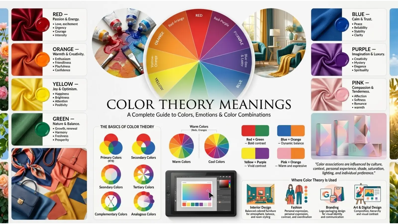
Color theory meanings describe the ways people interpret colors through visual relationships, emotional associations, cultural traditions, and symbolic uses. Red is often associated with passion and energy, blue with trust and calmness, green with nature and growth, and purple with creativity and mystery.
These associations can guide design and communication, but they are not universal rules. Color theory explains how colors work together, while color psychology and symbolism explore the impressions and meanings people connect with them.
What Is Color Theory?
Color theory is the study of how colors relate to one another and how people use them in art, design, photography, fashion, and visual communication. It includes the color wheel, color harmony, contrast, saturation, brightness, and the relationships between different hues.
For example, a designer may combine blue and orange because they sit opposite each other on a traditional color wheel. This complementary relationship creates contrast and helps important elements stand out.
However, color theory is not limited to matching shades. It also helps explain why a soft blue bedroom can feel different from a bright red restaurant interior, even before you consider the furniture or decoration.
Three related concepts are especially useful:
- Color theory: Explains how colors interact and how to combine them effectively.
- Color psychology: Examines how colors may influence perception, emotion, and behavior.
- Color symbolism: Explores the meanings people assign to colors through culture, history, religion, art, and personal experience.
Although these subjects overlap, they are not interchangeable. A color combination can be visually balanced without having a particular symbolic meaning.
Color Theory Meanings Chart
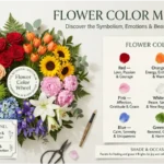
The following chart summarizes common color associations. These are general interpretations rather than fixed psychological facts.
| Color | Common Meanings | Possible Negative Associations | Typical Uses |
|---|---|---|---|
| 🔴 Red | Passion, energy, courage, love | Anger, danger, urgency | Warnings, promotions, bold designs |
| 🟠 Orange | Creativity, enthusiasm, warmth | Excess, restlessness | Entertainment, food, friendly branding |
| 🟡 Yellow | Happiness, optimism, attention | Caution, anxiety, instability | Highlights, signs, cheerful interiors |
| 🟢 Green | Nature, growth, renewal, balance | Envy, inexperience, stagnation | Sustainability, gardens, wellness branding |
| 🔵 Blue | Trust, calmness, stability | Coldness, sadness, distance | Business websites, offices, technology |
| 🟣 Purple | Imagination, luxury, mystery | Excess, artificiality, extravagance | Beauty, creative brands, decorative accents |
| 🩷 Pink | Tenderness, affection, playfulness | Immaturity, excessive sweetness | Beauty products, gifts, fashion |
| ⚫ Black | Power, elegance, sophistication | Grief, threat, heaviness | Formal clothing, luxury packaging, typography |
| ⚪ White | Simplicity, cleanliness, openness | Emptiness, sterility | Minimalist design, healthcare settings |
| 🩶 Gray | Neutrality, balance, restraint | Dullness, detachment | Corporate design, modern interiors |
| 🟤 Brown | Earthiness, reliability, comfort | Heaviness, plainness | Natural products, rustic decoration |
| 🩵 Turquoise | Freshness, clarity, tranquility | Immaturity, visual distraction | Coastal design, wellness, creative branding |
The same shade may communicate different ideas depending on its surroundings. For instance, a dark green can suggest tradition and stability, while a bright lime green may feel playful, youthful, or energetic.
The Psychology Behind Color Meanings
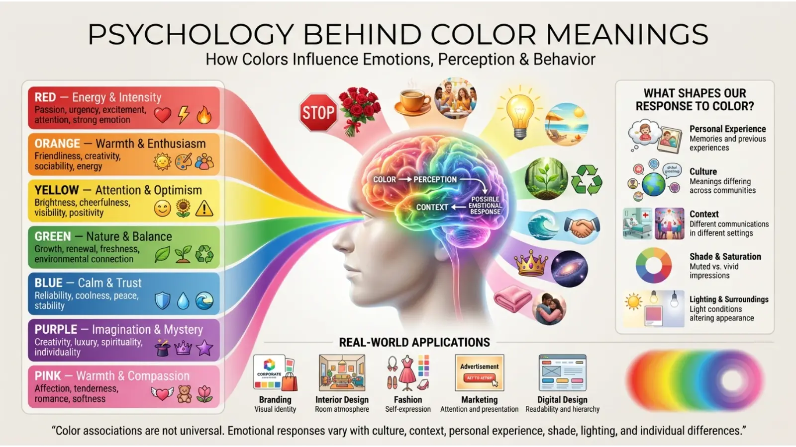
Color psychology explores how people respond to colors and how those responses may affect their impressions, choices, and feelings. However, color does not control human behavior in a simple or predictable way.
A person’s response may depend on past experiences, cultural background, age, context, and even the task they are performing. A bright yellow wall might feel cheerful to one person but overwhelming to another.
How Colors Influence Emotions
Colors can attract attention and create associations. Warm colors, such as red, orange, and yellow, are often described as energetic or stimulating. Cooler colors, including blue and some greens, are frequently associated with calmness or freshness.
These descriptions are useful starting points, not guaranteed emotional effects. A deep blue may feel peaceful in a bedroom but formal in a business presentation. Meanwhile, a muted red can feel elegant rather than aggressive.
Brightness and Saturation Matter
Hue is only one part of a color’s appearance. Two versions of the same hue can produce very different impressions.
- Bright, saturated colors often feel vivid, bold, and attention-grabbing.
- Muted colors tend to look softer, quieter, or more understated.
- Light colors can suggest openness, delicacy, or freshness.
- Dark colors often create depth, drama, seriousness, or visual weight.
Therefore, choosing a color based on its name alone is not enough. Consider its exact shade, the amount used, and the other colors around it.
What Science Says About Color Psychology
Research on color and human behavior suggests that color can influence perception in some situations. Nevertheless, findings depend on the setting, the task, the people involved, and the way researchers measure responses.
For example, red can carry different associations in sports, warning signs, celebrations, and romantic settings. It would be misleading to claim that red always makes people angry or that blue always makes people calm.
A practical approach is to use established design principles, understand the audience, and test colors in their intended setting rather than relying on universal psychological rules.
The Meaning of Each Major Color Theory Meanings
Red: Passion, Energy, and Urgency
Red is one of the most visually noticeable colors. It is commonly associated with love, excitement, courage, danger, and strong emotion.
In branding, red can create a bold impression and help important information stand out. In fashion, it may communicate confidence or drama. The nature, it appears in flowers, fruits, and warning displays.
However, red can also suggest anger or danger. Its meaning depends on how it is used. A red rose in a romantic setting communicates something different from a red warning light.
Practical tip: Use red for focal points, important messages, or energetic designs. Balance large areas of vivid red with neutral shades if you want a less intense appearance.
Orange: Creativity, Warmth, and Enthusiasm
Orange combines the warmth commonly associated with red and the brightness associated with yellow. It often communicates friendliness, playfulness, movement, and enthusiasm.
Designers may use orange to create an inviting atmosphere or make a call-to-action button more noticeable. In interiors, earthy orange tones can add warmth without the intensity of bright red.
On the other hand, excessive bright orange can become visually tiring. Muted terracotta and burnt orange offer a more relaxed alternative.
Practical tip: Pair orange with cream, navy, brown, or deep green to create contrast while maintaining a welcoming feel.
Yellow: Happiness, Optimism, and Attention
Yellow is commonly linked with sunshine, cheerfulness, hope, and mental alertness. Because bright yellow can stand out against many backgrounds, it is often used for warnings and visual highlights.
Its effect depends strongly on brightness and context. A pale yellow room may feel gentle and sunny, while a highly saturated yellow surface can become overwhelming when used across a large area.
Yellow can also represent caution, as seen in many signs and signals. Therefore, its meaning is not limited to happiness.
Practical tip: Use yellow for small highlights, decorative details, or cheerful accents. For text, check contrast carefully because yellow lettering can be difficult to read against white or pale backgrounds.
Green: Nature, Growth, and Renewal
Green is strongly connected with plants, forests, fresh produce, and the natural environment. As a result, it often symbolizes growth, health, renewal, sustainability, and balance.
Businesses may use green to communicate an association with nature or environmental responsibility. However, a green logo alone does not prove that a company follows sustainable practices.
Different shades create different impressions. Deep forest green may feel traditional and refined, while mint green can look fresh and gentle. Olive green often appears earthy and understated.
Practical tip: Combine green with cream, wood tones, beige, or muted blue for a natural look. Choose the shade according to whether you want a lively, calming, or sophisticated result.
Blue: Trust, Calmness, and Stability
Blue is often associated with the sky, water, reliability, and peacefulness. It is widely used in business identities, technology interfaces, financial services, and professional settings because it can communicate order and dependability.
However, blue can also suggest sadness, coldness, or emotional distance in particular contexts. A pale blue and a dark navy do not create the same impression.
In interior design, lighter blues may help a room feel airy, while navy can introduce depth and formality. The surrounding materials and lighting influence the final effect.
Practical tip: Use blue when you want a composed or professional visual identity. Add warmer accents if the overall design feels too cold.
Purple: Imagination, Luxury, and Mystery
Purple combines the visual characteristics of red and blue and is often associated with creativity, individuality, spirituality, and luxury.
Historically, certain purple dyes were expensive to produce, helping some shades become associated with wealth and status. Today, purple appears in beauty products, artistic identities, fantasy settings, and decorative designs.
Lavender usually feels softer and more delicate, while deep violet can appear dramatic or luxurious. Purple may also suggest mystery because it is often used in fantasy and supernatural imagery.
Practical tip: Pair purple with white, gray, silver, or muted gold. Use lighter lavender for a gentle appearance and deeper violet for a stronger visual statement.
Pink: Affection, Gentleness, and Playfulness
Pink is often associated with tenderness, romance, care, and youthful energy. Its interpretation has also been shaped by fashion, marketing, and changing social conventions.
Soft pink can feel delicate or soothing, while hot pink can look bold, energetic, and expressive. Pink is not naturally limited to one gender, age group, or personality type.
In branding, pink may suit beauty, confectionery, lifestyle, or creative products, depending on the audience and design. In fashion, it can be romantic, sporty, formal, or dramatic.
Practical tip: Combine pink with gray or navy for a balanced look, or use it with red for a more expressive palette.
Black: Power, Elegance, and Mystery
Black often represents sophistication, authority, formality, and strength. It is widely used in formal clothing, luxury packaging, photography, and modern graphic design.
At the same time, black may symbolize grief, fear, secrecy, or mourning in some settings. These associations can overlap, which is why black can feel elegant and serious at once.
In visual design, black provides strong contrast and helps other colors stand out. Yet too much black can make a space feel heavy if there is insufficient light or variation in texture.
Practical tip: Use black with white, cream, metallic accents, or natural materials to create contrast and visual depth.
White: Simplicity, Cleanliness, and Openness
White commonly symbolizes cleanliness, simplicity, peace, and fresh beginnings in many modern design settings. It is popular in minimalist interiors, product packaging, and uncluttered digital layouts.
However, white can also communicate emptiness or sterility. Cultural traditions may associate it with different ceremonies and life events, including mourning in some communities.
White is also affected by surrounding colors and lighting. A warm white can look creamy, while a cool white may appear crisp or slightly blue.
Practical tip: Combine white with natural textures, soft gray, wood, or carefully selected accent colors to prevent a room or design from feeling flat.
Gray: Neutrality, Balance, and Restraint
Gray sits between black and white and often communicates neutrality, professionalism, subtlety, and control. It works well in corporate branding, modern interiors, and backgrounds that should not compete with the main content.
Nevertheless, gray can appear dull or distant when used without contrast. Warm gray tends to feel softer than a cool gray with blue undertones.
Practical tip: Combine gray with one strong accent color, such as green, blue, orange, or pink, to add character without losing a clean appearance.
Brown: Earthiness, Comfort, and Reliability
Brown is associated with soil, tree bark, leather, wood, and other natural materials. It often suggests stability, craftsmanship, warmth, and practicality.
In packaging, brown paper and kraft materials can communicate a simple or rustic appearance. In interiors, brown wood tones add texture and warmth.
However, some shades may appear heavy or old-fashioned when paired with too many dark colors.
Practical tip: Combine brown with cream, sage green, muted blue, or warm white for a comfortable and grounded palette.
Turquoise: Freshness, Clarity, and Tranquility
Turquoise sits between blue and green. It is often associated with clear water, tropical landscapes, freshness, and communication.
Lighter turquoise may appear playful and airy, while deeper turquoise can look rich and sophisticated. The color is popular in coastal interiors, jewelry, wellness branding, and summer fashion.
Its associations can also vary across cultural and spiritual traditions, so a symbolic interpretation should be tied to the relevant context rather than treated as universal.
Practical tip: Pair turquoise with white, sand, coral, or navy to create a palette that feels fresh but remains visually balanced.
Understanding the Color Theory Meanings
The color wheel organizes hues in a circle and helps explain how different colors relate to one another. It is a basic tool for artists, designers, decorators, and anyone creating a coordinated palette.
Primary Colors
In a traditional art-based color model, red, yellow, and blue are commonly taught as the primary colors. They are used to explain how many other paint colors can be mixed.
However, primary colors depend on the system. Digital screens use red, green, and blue light, while printing commonly uses cyan, magenta, yellow, and black.
This distinction matters because mixing colored light is different from mixing paint or ink.
Secondary Colors
In the traditional red-yellow-blue model, secondary colors are created by combining two primary colors:
- Red + yellow = orange
- Yellow + blue = green
- Blue + red = purple
These mixtures provide a useful starting point for understanding basic color relationships.
Tertiary Colors
Tertiary colors are generally created by mixing a primary color with a neighboring secondary color. Examples include red-orange, yellow-orange, yellow-green, blue-green, blue-violet, and red-violet.
These intermediate shades help create more varied and natural-looking palettes.
Warm and Cool Colors
Warm colors usually include reds, oranges, and yellows. They may feel lively, welcoming, or visually close.
Cool colors generally include blues, greens, and blue-based purples. They may feel calm, spacious, or visually distant.
These descriptions are relative rather than absolute. A green with more yellow may appear warmer than a blue-green, while a red with a violet undertone may feel cooler than an orange-red.
Common Color Schemes and What They Communicate
Color harmony describes ways to combine colors so that they work together visually. The best scheme depends on the purpose of the design and the impression you want to create.
| Color Scheme | How It Works | Typical Visual Effect |
|---|---|---|
| Complementary | Uses colors opposite each other on the wheel | Strong contrast and energy |
| Analogous | Uses neighboring colors | Smooth, coordinated appearance |
| Triadic | Uses three colors spaced around the wheel | Balanced variety and vibrancy |
| Monochromatic | Uses different tints, tones, and shades of one hue | Cohesion and simplicity |
| Split-complementary | Combines one hue with two colors near its opposite | Contrast with more flexibility |
Complementary Colors
Complementary colors sit opposite each other on the color wheel. Examples include blue and orange or red and green.
Because they contrast strongly, they can make key elements stand out. However, using both colors at full intensity across equally large areas may create visual tension.
For a more balanced design, use one color as the main shade and the other as an accent.
Analogous Colors
Analogous colors sit next to each other on the color wheel. Blue, blue-green, and green form one example.
These colors often create a smooth visual transition because they share related hues. They are useful in landscapes, room decoration, illustrations, and brand palettes.
The main challenge is contrast. If the colors are too similar in brightness, text and important details may become difficult to distinguish.
Monochromatic Colors
A monochromatic palette uses variations of one hue, such as pale blue, medium blue, and navy.
This approach creates unity and is useful for minimalist websites, professional presentations, and coordinated interiors. To avoid a flat appearance, vary the brightness, saturation, texture, and scale of each color.
Triadic Colors
A triadic palette uses three hues spaced around the color wheel. In the traditional model, red, yellow, and blue form a familiar example.
Triadic schemes can look lively and balanced, but they need careful control. Using all three colors at equal strength may make a design feel busy.
Choose one dominant color, a supporting shade, and a smaller accent.
Spiritual Color Theory Meanings
Colors also appear in spiritual practices, meditation, rituals, art, and symbolic traditions. In these settings, they may represent personal growth, protection, wisdom, hope, energy, or balance.
These meanings are matters of belief and tradition rather than universally established scientific facts. Interpretations differ across religions, communities, historical periods, and individual practices.
| Color | Possible Spiritual Association |
|---|---|
| 🔴 Red | Vitality, courage, strength |
| 🟠 Orange | Creativity, enthusiasm, transformation |
| 🟡 Yellow | Hope, clarity, awareness |
| 🟢 Green | Renewal, growth, harmony |
| 🔵 Blue | Peace, truth, reflection |
| 🟣 Purple | Wisdom, contemplation, mystery |
| 🩷 Pink | Compassion, affection, kindness |
| ⚪ White | Purity, peace, new beginnings |
| ⚫ Black | Protection, mystery, endings |
These are broad examples, not a single spiritual system. For instance, white may signify purity in one context and mourning in another. Similarly, black may represent protection in a particular practice but grief in a different cultural setting.
When exploring spiritual color meanings, identify the tradition or belief system involved instead of assuming that every color has the same significance everywhere.
Cultural and Historical Meanings of Color Theory Meanings
Color meanings develop through history, materials, social customs, religious practices, political movements, and shared experiences. As a result, the same color can communicate different messages across communities.
Western Cultural Associations
In many Western contexts, white is commonly used in weddings, while black is associated with formal clothing and mourning. Red often appears in romantic imagery and warning signs.
These conventions are influential, but they are not universal across all Western communities. Personal preferences and changing social customs also affect interpretation.
East Asian Cultural Associations
In several East Asian traditions, red has strong associations with celebration, good fortune, or prosperity. White may be connected with mourning in some cultural settings.
However, East Asia includes many countries, communities, and distinct traditions. It would be inaccurate to assign one meaning to every person or ceremony across the region.
Middle Eastern and Islamic Contexts
Green has important associations in several Islamic historical and cultural settings, while other colors may carry local, national, or ceremonial meanings.
Nevertheless, there is no single color code that describes all Middle Eastern cultures or all Muslim communities. The meaning of a color depends on the specific context.
African Cultural Associations
Across African societies, colors can communicate identity, status, heritage, spirituality, or community membership. Their meanings vary widely by country, ethnic group, language, and historical period.
For example, colors used in a particular textile tradition may carry meanings that cannot be understood fully without knowing the design’s local history.
Latin American Cultural Associations
Colors in Latin America may reflect religious traditions, festivals, national identities, Indigenous heritage, and contemporary popular culture.
A color used for a celebration in one community may have a different role elsewhere. Regional context is essential when interpreting these symbols.
Why Cultural Context Matters
A color should never be interpreted in isolation when it forms part of a flag, traditional garment, religious object, or ceremony.
Before assigning a meaning, consider who uses the color, why it appears, and what it represents within that specific tradition. This approach avoids stereotypes and produces more accurate interpretations.
Color Theory in Branding and Marketing
Brands use color to create recognition, express their identity, and help customers understand the kind of experience they offer. A company might choose blue to communicate professionalism, green to emphasize a connection with nature, or black to create a premium appearance.
However, color alone does not build trust or determine purchasing decisions. Product quality, price, messaging, customer experience, and brand reputation matter as well.
Choosing Colors for a Brand
Start by defining the qualities your brand should communicate. Then select colors that support those qualities and suit the intended audience.
For example:
- A gardening business might use green with earthy brown accents.
- A technology company might choose blue with white for a clean interface.
- A creative studio might combine purple with coral for a more expressive identity.
- A luxury product might use black, cream, and restrained metallic details.
These are design possibilities, not rules. A technology company can use orange successfully if the shade and overall identity fit its goals.
Why Brand Consistency Matters
Repeated use of the same colors helps people recognize a brand across websites, packaging, advertisements, and social media.
A useful brand palette usually includes a dominant color, supporting colors, accent colors, and neutral shades. It should also remain readable and accessible across different devices and viewing conditions.
Test the palette in real applications before finalizing it. A combination that looks attractive on a large monitor may be difficult to read on a mobile screen.
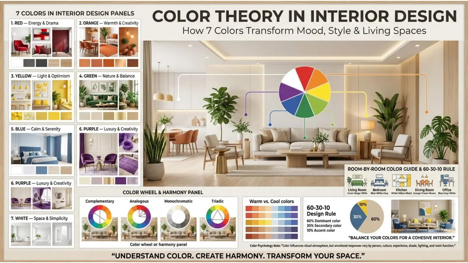
Color Theory in Interior Design
Color can influence how a room looks and how people interpret its atmosphere. However, the effect depends on room size, lighting, materials, furniture, and the amount of each color used.
Living Room
Neutral colors, such as warm white, beige, and gray, provide flexible backgrounds for furniture and decoration. Green or blue accents can introduce freshness, while orange or terracotta may add warmth.
If you have a small living room, consider how much natural light it receives before choosing a dark wall color. Dark shades can create depth and intimacy, but they may also make a poorly lit room feel heavier.
Bedroom
Soft blues, muted greens, lavender, and warm neutrals are popular bedroom choices because they can create a restful visual atmosphere.
Still, a color cannot guarantee better sleep. Room temperature, noise, light exposure, and personal comfort also matter.
Choose a palette that feels pleasant to you and avoid relying on a color’s reputation alone.
Kitchen
White, cream, gray, green, and earthy tones can all work well in kitchens. White may create a clean appearance, while wood and brown shades add warmth.
Consider practical details as well. Glossy surfaces reflect light differently from matte finishes, and some colors make dust, fingerprints, or stains more noticeable.
Home Office
Blue, green, gray, and warm neutral shades can create a composed working environment. A stronger accent color may help define the space without overwhelming it.
For computer-based work, lighting and screen glare are often more important than the wall color itself. Test the space during the hours when you normally work.
How Lighting Changes Color
A paint sample can look different under daylight, warm LED lighting, cool LED lighting, and evening illumination.
Before painting an entire room, place sample colors on the wall and observe them at different times of day. Also consider nearby flooring, curtains, furniture, and windows.
This simple test helps prevent expensive mistakes because the color you see on a small sample card may not match the appearance of the finished room.
Color Theory in Fashion and Personal Style
Clothing colors can influence the impression an outfit creates. A navy suit may appear formal, a bright orange jacket may feel expressive, and a cream outfit may look understated and elegant.
These impressions are shaped by garment design, fabric, fit, cultural expectations, and the occasion. No color automatically makes someone look professional or confident.
Choosing Colors for Different Occasions
For professional settings, navy, charcoal, white, and selected neutral tones can create a polished appearance. For casual wear, brighter colors may communicate playfulness or individuality.
Formal clothing can also use vivid shades successfully when the event and styling support them. The goal is not to follow strict color rules but to choose colors that suit the occasion.
Finding Complementary Outfit Colors
Try combinations such as:
- Navy and cream for a classic appearance.
- Green and beige for an earthy style.
- Purple and gray for a balanced, modern outfit.
- Red and black for a bold look.
- Turquoise and white for a fresh, relaxed combination.
The best combination also depends on the shade and fabric. A bright green satin garment will look different from a muted green cotton shirt.
Do Favorite Colors Reveal Personality?
People sometimes associate favorite colors with personality traits. Someone who prefers green may describe a connection with nature, while someone who likes red may enjoy bold visual choices.
However, color preference cannot reliably determine a person’s character, intelligence, emotional state, or future behavior. Preferences can change with fashion, experiences, culture, and personal taste.
Use favorite colors as a starting point for self-expression rather than as a personality test.
Color Theory in Art, Photography, and Digital Design
Artists and designers use color to direct attention, create depth, establish contrast, and communicate a mood. A successful palette supports the purpose of the image instead of simply including many attractive shades.
Creating a Focal Point
A focal point is the part of an image that attracts attention first. Contrast can help establish it.
For example, a small red flower in a predominantly green landscape may become visually prominent because red and green contrast strongly. A bright object against a muted background can achieve a similar effect.
This technique is useful in photography, posters, illustrations, and website design.
Using Color to Suggest Depth
In many landscape paintings and photographs, distant objects appear lighter, less detailed, or less saturated because of atmospheric conditions. Artists may use these visual patterns to create a sense of distance.
Cool colors are also sometimes used in backgrounds while warmer colors appear in the foreground. However, this is a design technique, not an absolute rule.
Digital Color and Accessibility
Digital screens commonly use the RGB model, which combines red, green, and blue light. Printed materials usually use a different color system, so colors may not reproduce exactly between a screen and a physical product.
Accessibility is equally important. Do not communicate essential information through color alone. For example, a chart should use labels, symbols, or patterns as well as colored sections so that people with color-vision differences can understand it.
Common Misconceptions About Color Theory
Every Color Has One Universal Meaning
This is incorrect. Colors can carry different meanings across cultures, situations, and personal experiences.
A color may symbolize celebration in one setting and mourning in another. Context is essential.
Blue Always Creates Calmness
Blue is often associated with calmness, but the effect is not guaranteed. Bright blue can look energetic, while a cold or overly dark blue may feel distant.
The surrounding colors, lighting, and purpose of the design influence the overall impression.
Favorite Colors Reveal Someone’s True Personality
There is no reliable universal method for determining personality from a favorite color. Preferences can reflect personal experiences, aesthetic taste, fashion, or cultural influences.
Color choices may express identity, but they should not be treated as a psychological diagnosis.
Complementary Colors Always Look Good Together
Complementary colors create strong contrast, but they do not automatically produce a successful design.
Two highly saturated complementary colors can compete for attention. Adjusting their brightness, saturation, and relative proportions often creates a more comfortable result.
White Makes Every Room Look Bigger
White can help a room feel open, particularly when it reflects available light. However, room proportions, window placement, ceiling height, furniture, and lighting also influence perceived space.
A well-lit room with carefully chosen darker colors may feel more spacious than a poorly lit white room.
How to Choose the Right Color Theory Meanings for Everyday Life
The most useful way to apply color theory is to begin with the purpose of your project. Instead of asking which color is best, ask what you want the color to accomplish.
Step 1: Identify Your Goal
Decide whether you want the design to feel welcoming, formal, energetic, peaceful, luxurious, or natural. This gives you a clear starting point.
Step 2: Choose a Main Color
Select a color that supports the desired impression and suits the audience. Remember that its exact shade matters as much as its general category.
Step 3: Add Supporting Colors
Use a color wheel to explore complementary, analogous, or monochromatic combinations. Choose supporting colors that make the main color easier to appreciate rather than competing with it.
Step 4: Check Contrast and Readability
For websites, signs, presentations, and printed materials, make sure text remains easy to read. Decorative appeal should never come at the cost of understanding.
Step 5: Test the Colors in Context
View the palette on the actual device, material, wall, or product where it will appear. Lighting and surrounding objects can change the impression considerably.
Step 6: Consider Your Audience
A color that feels familiar to one audience may communicate something different to another. Research local customs and test designs with the intended audience when the message is important.
Frequently Asked Questions About Color Theory Meanings
1. What are the basic color theory meanings?
Color theory meanings describe how colors relate to one another and the common emotions, ideas, or symbols people associate with them. Red is often linked with energy, blue with trust, green with nature, and purple with creativity, although these associations vary by context.
2. What are the three main components of color theory?
The main components commonly taught in introductory color theory are the color wheel, color harmony, and the properties of color. These help explain relationships between hues, successful color combinations, and differences in brightness and saturation.
3. Which color represents happiness?
Yellow is commonly associated with happiness, sunshine, and optimism. Orange and pink can also communicate cheerfulness or warmth. However, emotional responses depend on the shade, situation, and individual.
4. Which color represents trust and reliability?
Blue is frequently used to communicate trust, stability, and professionalism, particularly in corporate branding. Nevertheless, trust depends on more than color; honest communication and reliable service are much more important.
5. What is the difference between color theory and color psychology?
Color theory explains how colors relate, contrast, and combine in visual design. Color psychology explores how colors may affect perception, emotion, and behavior. Symbolism is another related field that examines cultural and historical meanings.
6. What are complementary Color Theory Meanings?
Complementary colors are opposite one another on a color wheel. Blue and orange are a common example in traditional color theory. Their contrast can make important elements stand out, especially when one color is used as the dominant shade.
7. How does color affect mood?
Color can influence visual impressions and emotional associations, but it does not affect everyone in the same way. Brightness, saturation, lighting, cultural background, and personal experience all help shape how a color is perceived.
8. Why do color meanings differ across cultures?
Cultural meanings develop through traditions, ceremonies, religion, history, art, and social customs. Because communities have different experiences and practices, the same color may represent different ideas in different settings.
9. What colors work best together?
Complementary colors create contrast, analogous colors produce a coordinated appearance, and monochromatic colors create unity. The best combination depends on the purpose of the design, the shades selected, and the amount of contrast required.
10. Can color theory improve branding and interior design?
Yes. Color theory helps designers select coordinated palettes, establish visual hierarchy, improve contrast, and create a consistent appearance. However, effective results also depend on lighting, materials, accessibility, audience preferences, and the overall quality of the design.
Conclusion: Using Color Theory Meaningfully
Color theory meanings provide a useful way to understand how colors interact and why people associate them with particular emotions, ideas, and symbols. From the energy often linked with red to the natural associations of green and the sophistication commonly connected with black, each color offers different possibilities for communication and design.
The key is to look beyond simple definitions. A color’s appearance changes with its shade, lighting, surroundings, cultural setting, and intended purpose. By understanding these factors, you can make more informed choices in art, branding, fashion, photography, and home decoration.
The next time a color catches your attention, consider not only what it traditionally represents but also how it works within its surroundings. That is where color theory becomes a practical tool rather than just a collection of meanings.

Emma Wilson is a dedicated comparison writer and product researcher at ColorMystiic.com. She specializes in creating unbiased product comparisons, detailed reviews, and helpful buying guides. Her goal is to help readers make smarter purchasing decisions with confidence.