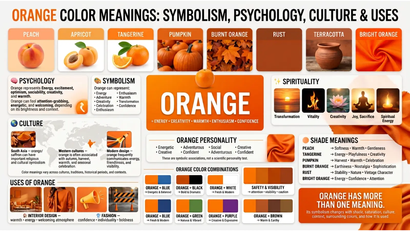
Orange is one of the most energetic colors in the visible spectrum. It sits between red and yellow, combining some of the warmth and intensity associated with red with the brightness and optimism often associated with yellow. Because of this position, orange color meanings can include energy, enthusiasm, creativity, warmth, confidence, friendliness, change, and attention.
People search for orange symbolism for many reasons. They may want to understand what orange says about a person’s personality, choose colors for a brand, decorate a room, select an outfit, interpret an artwork, or understand why orange feels exciting in one setting but overwhelming in another.
Color meaning is never universal. Culture, personal experience, age, lighting, saturation, and the colors surrounding orange can all change how it is perceived. A soft peach does not communicate exactly the same message as a vivid safety orange.
This guide explores the meaning of orange from psychological, cultural, historical, spiritual, branding, interior design, fashion, and everyday perspectives.
Quick Answer: Orange commonly symbolizes energy, enthusiasm, warmth, creativity, confidence, friendliness, adventure, and optimism. It can also suggest urgency, caution, impulsiveness, or excess when used too strongly. Its meaning depends heavily on shade, context, culture, and surrounding colors.
What Does the Orange Color Symbolize?
Orange is often associated with energy and enthusiasm because it has the visual warmth of red while retaining the brightness of yellow.
It can make a space, object, advertisement, or outfit feel more active and noticeable. This makes orange especially useful when the goal is to create a sense of movement or excitement.
Main orange symbolism chart
| Orange association | What it can communicate |
|---|---|
| Energy | Activity, movement, enthusiasm |
| Warmth | Comfort, friendliness, hospitality |
| Creativity | Imagination, experimentation, originality |
| Confidence | Boldness and willingness to stand out |
| Optimism | Cheerfulness and positive energy |
| Adventure | Exploration, freedom, excitement |
| Social connection | Friendliness and openness |
| Change | Transformation, autumn, new experiences |
| Attention | Visibility and visual emphasis |
| Caution | Warning or careful attention |
| Excess | Overstimulation when used heavily |
| Impulsiveness | Fast action or spontaneous behavior |
Orange is therefore a flexible symbolic color. A muted terracotta can feel grounded and mature, while bright orange can feel playful and energetic.
Positive meanings of orange
The most common positive associations include:
- Enthusiasm
- Joy
- Creativity
- Warmth
- Confidence
- Friendliness
- Adventure
- Motivation
- Sociability
- Optimism
- Playfulness
- Vitality
Orange can be particularly effective when a visual message needs to feel approachable rather than formal.
Negative meanings of orange
Orange can also have less positive associations.
Depending on context, it may suggest:
- Impulsiveness
- Restlessness
- Aggression
- Excess
- Immaturity
- Attention-seeking
- Danger or warning
- Overstimulation
These meanings usually come from context rather than from orange alone. A bright orange warning sign communicates something very different from an orange blanket in a cozy home.
Orange Color Meanings Psychology
Color psychology examines how people respond to color, but it is important to separate established observations from popular symbolism.
There is evidence that color can influence perception, attention, and emotional responses, yet color does not produce one fixed psychological reaction in every person. Personal experience and context matter.
Orange is visually warm and relatively high in energy, so it can attract attention more easily than many subdued colors.
How orange can affect mood
Orange is often perceived as:
- Warm
- Energetic
- Cheerful
- Friendly
- Active
- Exciting
- Informal
A small amount of orange can add liveliness to an otherwise neutral environment.
Large amounts of highly saturated orange, however, may feel intense or tiring to some people. This is one reason designers often balance bright orange with white, gray, black, cream, navy, or natural materials.
Orange and attention
Bright orange has strong visual presence. This makes it useful for elements that need to stand out.
For example, an orange button on a neutral website can draw attention without using the extreme visual intensity of some bright reds.
That does not mean orange automatically makes people click or buy. Design results depend on typography, placement, product quality, messaging, contrast, and the audience.
Orange and emotion
Orange is often connected with emotions that involve activation rather than stillness.
Think of the difference between:
Orange: excitement, movement, enthusiasm
Blue: calm, stability, coolness
Green: nature, balance, renewal
Gray: neutrality, restraint
Purple: imagination, luxury, mystery
These are broad associations rather than rules. A dark orange can feel calm and earthy, while a pale blue can feel lively depending on the complete design.
Why Different Shades of Orange Have Different Meanings
“Orange” is not one visual experience.
Hue, brightness, saturation, and surrounding colors can dramatically change its impression.
Orange shade meanings chart
| Orange shade | Common impression | Useful applications |
|---|---|---|
| Bright orange | Energy, excitement, boldness | Advertising, sports, youth brands |
| Tangerine | Cheerfulness, playfulness | Fashion, food, lifestyle design |
| Burnt orange | Warmth, maturity, nostalgia | Interiors, autumn themes, fashion |
| Terracotta | Earthiness, stability, comfort | Homes, architecture, ceramics |
| Peach | Softness, warmth, friendliness | Bedrooms, beauty, wellness |
| Coral orange | Freshness, sociability | Fashion, summer designs, branding |
| Amber | Warmth, richness, glow | Jewelry, lighting, premium design |
| Rust | Earthiness, history, ruggedness | Clothing, interiors, crafts |
| Pumpkin orange | Autumn, harvest, tradition | Seasonal decoration and food |
| Safety orange | Visibility, warning, practicality | Equipment, construction, outdoor use |
This is one of the most useful lessons in color psychology: the meaning of a color often comes from the exact version of that color rather than its basic color name.
Spiritual Orange Color Meanings
Orange has spiritual associations in several traditions, but these meanings are not universal.
In many modern spiritual systems, orange is associated with energy, creativity, transformation, vitality, desire, and emotional expression.
Orange is also commonly connected with the sacral chakra in modern chakra-based systems. In that framework, orange is linked with creativity, pleasure, emotional expression, relationships, and movement.
These chakra associations belong to a particular modern spiritual framework and should not be presented as scientific facts.
Orange and transformation
Orange can symbolize transformation because it is strongly associated with fire, sunsets, autumn leaves, and changing natural landscapes.
Its symbolism can therefore suggest moving from one stage to another.
Orange and creativity
Orange is frequently used in spiritual and artistic settings to represent creative energy.
This interpretation fits its broader cultural symbolism: orange often feels active rather than passive.
Orange and vitality
Bright orange can represent life force, enthusiasm, and physical energy in modern spiritual interpretations.
Again, this is symbolic rather than a medically established effect.

Orange Color Meanings Across Cultures
Color meanings change significantly between cultures.
A useful approach is to avoid saying that “orange means one thing everywhere.” Instead, ask where, when, and how the color is being used.
Orange in Western culture
In many Western contexts, orange is associated with:
- Autumn
- Halloween
- Pumpkins
- Harvest
- Energy
- Sports
- Safety
- Creativity
- Informal friendliness
The Orange is also strongly connected with autumn because leaves, pumpkins, sunsets, and seasonal decorations frequently feature warm orange tones.
Orange in South Asian traditions
Orange and closely related saffron tones have important cultural and religious associations in South Asia.
Saffron-colored clothing can carry meanings related to spirituality, sacrifice, renunciation, and religious identity in particular traditions.
This should not be simplified into the claim that every orange shade has the same religious meaning.
Orange in East Asian contexts
Orange can appear in celebrations, food, clothing, art, and decorative traditions across East Asia, but its meaning differs between countries and historical periods.
In some settings, orange can be connected with warmth, prosperity, celebration, or vitality. These interpretations should be considered alongside the specific cultural context rather than treated as universal rules.
Orange in modern global culture
Today, orange also carries meanings created by modern media and commercial design.
It appears in sports uniforms, emergency equipment, entertainment graphics, food packaging, technology interfaces, and social media branding.
As a result, modern viewers may associate orange with action, visibility, fun, or digital energy even when there is no traditional symbolic connection.
Historical Orange Color Meanings
Orange has an interesting history because naturally occurring orange pigments and dyes were not always easy to produce.
The color became more widely available as new pigments and dyes were developed.
The name “orange” itself is closely connected with the orange fruit. In English, the color name became established after the fruit’s name.
Before the color had a common dedicated name, people could describe orange-like shades using references to fire, copper, saffron, ochre, or other natural materials.
Orange in art
Artists have long used warm orange and orange-like pigments to depict:
- Fire
- Skin
- Light
- Sunset
- Autumn
- Earth
- Clothing
- Decorative objects
Orange can create strong visual contrast when placed beside blue because these colors sit opposite each other on traditional color wheels.
Orange and industrial history
Modern industrial pigments made bright orange easier to reproduce consistently.
That helped expand orange into advertising, packaging, safety equipment, transportation, fashion, and commercial printing.
Orange Personality Meaning
People sometimes use favorite colors as a way to describe personality.
Orange is commonly associated with people who are perceived as:
- Energetic
- Sociable
- Adventurous
- Creative
- Optimistic
- Spontaneous
- Confident
- Playful
- Open to new experiences
Someone who loves orange may enjoy bold environments, social activities, experimentation, or visual variety.
But there is an important limitation: favorite color does not scientifically determine personality.
A person may choose orange simply because they like its appearance, associate it with a positive memory, or find it attractive.
What does it mean if someone wears a lot of orange?
It may create an impression of confidence, playfulness, creativity, or willingness to stand out.
However, clothing choices are also influenced by culture, trends, occupation, weather, age, and personal style.
The safest interpretation is therefore about the impression created by the color, not a diagnosis of the person wearing it.
Orange Color Meanings in Branding and Marketing
Orange is a popular branding color because it can balance energy with approachability.
Red can feel more intense. Yellow can feel brighter. Orange sits between these visual extremes and can provide a warmer, more playful alternative.
Why businesses use orange
Brands may choose orange when they want to communicate:
- Energy
- Accessibility
- Creativity
- Youthfulness
- Speed
- Friendliness
- Adventure
- Value
Orange can work particularly well for brands that do not want to appear overly formal.
Orange in advertising
Bright orange can attract attention against neutral backgrounds.
For example, a company might use orange for:
- Calls to action
- Sale labels
- Product highlights
- App interface elements
- Promotional graphics
- Event materials
The key is contrast. Orange loses some of its impact when everything on the page is orange.
Orange and food branding
The Orange can be useful in food-related design because it can suggest warmth, flavor, freshness, citrus, spice, or appetite.
However, packaging color does not automatically create appetite. Product photography, typography, cultural expectations, and the actual food category also influence consumer perception.
Well-known brand use
Companies such as The Home Depot, Nickelodeon, and Fanta have used strong orange identities or orange prominently in their visual branding.
The reason each brand uses orange is not identical. Home improvement can benefit from visibility and energy, Nickelodeon has historically used orange as part of a playful identity, and Fanta uses orange strongly in connection with its citrus-oriented product identity.
The broader lesson is more useful than copying any particular brand: choose orange because it supports the personality of your brand, not simply because another company uses it.
Orange Color Meanings in Interior Design
Orange can make an interior feel warmer and more energetic.
The best approach is often to choose the intensity of orange according to the purpose of the room.
Orange living room
A burnt-orange sofa or terracotta accent wall can create a warm and welcoming atmosphere.
For a modern look, combine orange with:
- Cream
- Warm white
- Charcoal
- Natural wood
- Beige
- Deep green
Orange bedroom
Bright orange may be too stimulating for some people when used over large surfaces.
Instead, try softer versions such as:
- Peach
- Apricot
- Dusty orange
- Terracotta
- Muted coral
Use orange in cushions, blankets, artwork, curtains, or small furniture pieces if you want warmth without overwhelming the room.
Orange kitchen
Orange can work particularly well as an accent in kitchens.
Try orange with white cabinets, wood textures, black hardware, or warm gray surfaces.
A small amount of orange can make a neutral kitchen feel more lively.
Orange home office
Orange can add visual energy to a workspace.
A chair, artwork, desk accessory, or feature wall can provide stimulation without covering the entire room.
How lighting changes orange
Lighting is one of the most overlooked parts of color selection.
Warm bulbs can make orange appear deeper and more golden.
Cool daylight may make the same orange appear cleaner, brighter, or slightly less warm.
Always test paint or fabric samples in the actual room before making a large purchase.

Orange Color Meanings in Fashion
Orange can make an outfit feel confident, energetic, creative, and noticeable.
It is especially useful when someone wants one strong color rather than an entirely neutral outfit.
Wearing bright orange
Bright orange works well as a statement color.
Try it with:
- White
- Black
- Navy
- Denim
- Beige
- Cream
Wearing burnt orange
Burnt orange is easier to use in everyday clothing because its lower intensity gives it a more mature appearance.
It pairs naturally with:
- Brown
- Olive
- Cream
- Tan
- Navy
- Dark denim
Orange for professional clothing
Bright orange may not be appropriate for every professional environment.
For a conservative workplace, use orange as a small accent through a tie, scarf, blouse detail, pocket square, handbag, watch strap, or other accessory.
Muted rust and terracotta can provide warmth while appearing less visually dominant.
Orange Color Meanings Color Combinations
The best orange combinations depend on the mood you want.
Orange and blue
Orange and blue create strong contrast because they are complementary colors in traditional color-wheel systems.
Best for: sports, websites, posters, modern interiors, entertainment graphics.
Orange and white
White makes orange feel cleaner and brighter.
Best for: modern branding, summer fashion, kitchens, websites, packaging.
Orange and black
Black gives orange greater visual weight and drama.
Best for: Halloween, sports, technology, bold advertising, entertainment.
Orange and green
Orange with green creates a natural, earthy feeling when muted shades are used.
Best for: outdoor brands, botanical design, restaurants, interiors.
Orange and purple
Orange and purple can create a creative and unusual combination.
Best for: entertainment, artistic projects, fashion, youth-oriented graphics.
Orange and beige
Beige softens orange and creates a comfortable, natural palette.
Best for: interiors, lifestyle brands, cafés, clothing.
Orange and gray
Gray controls orange’s intensity and gives it a more modern appearance.
Best for: technology, offices, contemporary interiors, professional graphics.
Orange Color Combination Chart
| Orange + | Overall effect | Good for |
|---|---|---|
| Blue | Bold and energetic | Sports, digital design |
| White | Fresh and bright | Fashion, websites |
| Black | Dramatic and powerful | Entertainment, advertising |
| Green | Natural and lively | Outdoor brands, interiors |
| Purple | Creative and expressive | Art, fashion |
| Beige | Warm and comfortable | Home design |
| Gray | Modern and balanced | Business and technology |
| Navy | Professional but energetic | Branding, clothing |
| Brown | Earthy and traditional | Interiors, autumn fashion |
| Cream | Soft and welcoming | Lifestyle design |
Real-Time Example: Choosing Orange for a Brand in 2026
Imagine a small coffee shop redesigning its branding in 2026.
The owner wants the business to feel warm, social, modern, and energetic without looking like a fast-food chain.
Instead of covering the entire logo in bright orange, the designer chooses a muted burnt orange for the main accent and combines it with cream, dark brown, and natural wood.
The result communicates warmth and friendliness while the darker supporting colors make the brand feel more mature.
Now imagine the same business using bright orange everywhere: walls, logo, menus, furniture, website, packaging, and uniforms.
The color may become visually exhausting.
The lesson is practical: color meaning comes from proportion, shade, contrast, and context—not from the color name alone.
Orange Color Meanings in Daily Life
Orange appears in more places than people sometimes realize.
You can find it in:
- Traffic and safety equipment
- Construction clothing
- Sports uniforms
- Food packaging
- Autumn decoration
- Children’s products
- Art
- Photography
- Interior decoration
- Cosmetics
- Digital interfaces
- Transportation
- Outdoor equipment
Why safety orange is different
Safety orange is designed primarily for high visibility.
Its meaning is not simply “energy.” In a safety context, orange tells people to notice an object, person, barrier, or hazard-related area.
This demonstrates an important principle: context can completely change color meaning.
Orange in Art and Photography
Artists often use orange to represent warmth, fire, sunlight, autumn, emotion, or movement.
In photography, orange can become especially powerful during golden-hour lighting.
Orange and blue contrast in photography
A warm orange subject against a blue background creates strong color contrast.
This can help separate the subject visually from the environment.
Photographers and filmmakers may use warm-versus-cool color contrast to guide attention or create emotional differences between characters, locations, or moments.
The effect is not a universal emotional code. It is a visual storytelling technique whose meaning depends on the scene.
Orange in Sports and Entertainment
Orange is highly visible, making it useful for sports uniforms, team graphics, equipment, and promotional materials.
A team using orange may appear energetic and bold.
In entertainment, orange can suggest:
- Fun
- Adventure
- Action
- Youth
- Comedy
- Excitement
- Fantasy
Bright orange is particularly useful when a visual identity needs to compete for attention in a crowded environment.
Orange and Age
People do not always respond to orange in the same way at different ages.
Children’s products often use bright, saturated colors because they create a playful visual environment.
Teen and young-adult fashion may use vivid orange as a statement color.
Adults may prefer muted shades such as rust, terracotta, copper, or burnt orange in clothing and interiors.
This does not mean age determines color preference. It shows how design trends and cultural expectations can influence which shades feel appropriate in different settings.
Orange and Lighting: Why the Same Color Can Look Different
A paint sample can look completely different in a store and at home.
Three factors matter especially:
Natural daylight
Daylight can reveal the true balance of an orange more clearly, although its appearance still changes throughout the day.
Warm artificial light
Warm bulbs can push orange toward golden, red, or brown tones.
Cool artificial light
Cool lighting can make orange appear more vivid or slightly less warm.
Before choosing orange paint, clothing, fabric, or branding materials, evaluate the color under the lighting where it will actually be used.
Common Misconceptions About Orange Color Meaning
Myth 1: Orange always means happiness
Not necessarily.
Orange can communicate happiness and enthusiasm, but it can also represent warning, heat, urgency, or danger depending on context.
Myth 2: Orange makes everyone feel energetic
People respond differently to colors.
Personal experience, culture, saturation, surrounding colors, and lighting all matter.
Myth 3: People who love orange are naturally extroverted
Color preference cannot reliably determine personality.
Orange may create an extroverted impression, but that does not prove anything about the person who prefers it.
Myth 4: Orange always increases sales
There is no universal “sales color.”
Successful marketing depends on the product, audience, brand identity, design hierarchy, message, and context.
Myth 5: Every orange shade has the same symbolism
This is one of the biggest mistakes in color interpretation.
Peach, rust, terracotta, amber, neon orange, and safety orange can create very different impressions.
How to Choose the Right Orange
Start by deciding what you want people to feel.
For excitement: choose bright orange.
For friendliness: try tangerine or warm coral.
comfort: consider terracotta.
For maturity: choose burnt orange or rust.
For softness: use peach or apricot.
visibility: use a high-contrast safety orange where appropriate.
For luxury: consider copper, amber, or a restrained orange paired with dark neutrals.
The right orange is usually the one that supports the purpose of the design rather than the one that looks most impressive by itself.
Orange Color Meanings: Quick Reference Chart
| Area | Common orange association |
|---|---|
| Emotion | Enthusiasm and warmth |
| Psychology | Energy and attention |
| Personality | Sociability and adventure |
| Spiritual symbolism | Creativity and vitality |
| Nature | Sunsets, autumn, fire, fruit |
| Branding | Friendly energy and accessibility |
| Fashion | Confidence and boldness |
| Interior design | Warmth and liveliness |
| Art | Fire, light, movement, transformation |
| Safety | Visibility and caution |
| Food | Citrus, spice, warmth, flavor |
| Youth design | Playfulness and excitement |
Frequently Asked Questions About Orange Color Meanings
What does the color orange symbolize?
Orange commonly symbolizes energy, enthusiasm, warmth, creativity, confidence, friendliness, optimism, and adventure. In certain contexts it can also represent caution, urgency, or excess.
What does orange mean psychologically?
Orange is often perceived as warm, energetic, active, and socially inviting. However, psychological responses vary between individuals, and color alone cannot predict behavior or personality.
What does orange symbolize spiritually?
In modern spiritual interpretations, orange may represent creativity, vitality, emotional expression, transformation, and personal energy. Some chakra-based systems associate orange with the sacral chakra.
Is orange a positive or negative color?
It can be either. Bright orange may feel exciting and optimistic, while excessive or poorly balanced orange can feel overwhelming. Safety orange can also communicate caution rather than positivity.
What personality is associated with orange?
Orange is commonly associated with energetic, adventurous, creative, social, playful, and confident personalities. These are symbolic associations, not scientific personality tests.
What does wearing orange say about you?
Orange clothing can create an impression of confidence, creativity, energy, and willingness to stand out. The exact impression depends on the shade, outfit, setting, and styling.
Why is orange used in branding?
Businesses may use orange because it can appear energetic, friendly, approachable, creative, and highly visible. It is especially useful for brands that want an informal or youthful personality.
What colors go well with orange?
Orange pairs especially well with blue, white, black, navy, beige, cream, gray, green, brown, and purple. The best combination depends on the desired mood.
Is orange good for a bedroom?
Yes, but the shade matters. Soft peach, muted coral, terracotta, or burnt orange can create warmth without the intensity of highly saturated orange.
Why does orange look different under different lights?
Lighting changes the wavelengths reaching your eyes and therefore changes how a color appears. Warm bulbs can make orange look more golden or deep, while cooler light can change its apparent intensity.
Final Thoughts on Orange Color Meanings
Orange is much more than a bright version of red or yellow. Its symbolism comes from a combination of visual warmth, cultural associations, natural references, design traditions, and personal experience.
It can suggest energy, creativity, warmth, confidence, optimism, friendliness, adventure, and change. In another setting, the same color can signal caution, heat, urgency, or high visibility.
The shade matters just as much as the basic color. Terracotta can make a room feel grounded, peach can feel gentle, burnt orange can suggest maturity, and vivid orange can demand attention.
The most useful way to understand orange is therefore not to ask, “What does orange always mean?” Ask instead, “What is this particular orange communicating in this particular situation?”
That question helps explain why orange works differently in a logo, bedroom, sports uniform, painting, safety vest, or everyday outfit. Color meaning is strongest when symbolism, context, design, culture, and human perception are considered together.
Emma Wilson is a dedicated comparison writer and product researcher at ColorMystiic.com. She specializes in creating unbiased product comparisons, detailed reviews, and helpful buying guides. Her goal is to help readers make smarter purchasing decisions with confidence.