Colors are often used to communicate information faster than words. In an emergency, workplace, app, vehicle, hospital, or public space, a color can immediately signal danger, caution, safety, or the need for attention. That is why understanding alert color meanings can be useful in everyday life.
However, alert colors do not have one universal meaning in every situation. A red light on a traffic signal means something different from a red notification badge on a smartphone. Likewise, blue may represent mandatory action in workplace safety signs but can suggest calmness or information in digital design.
Alert colors work because people learn to connect certain colors with actions and emotions. Culture, experience, industry standards, lighting, and context can all change how a color is understood.
This guide explains the symbolism, psychology, practical use, cultural influence, design principles, and real-world meanings behind common alert colors.
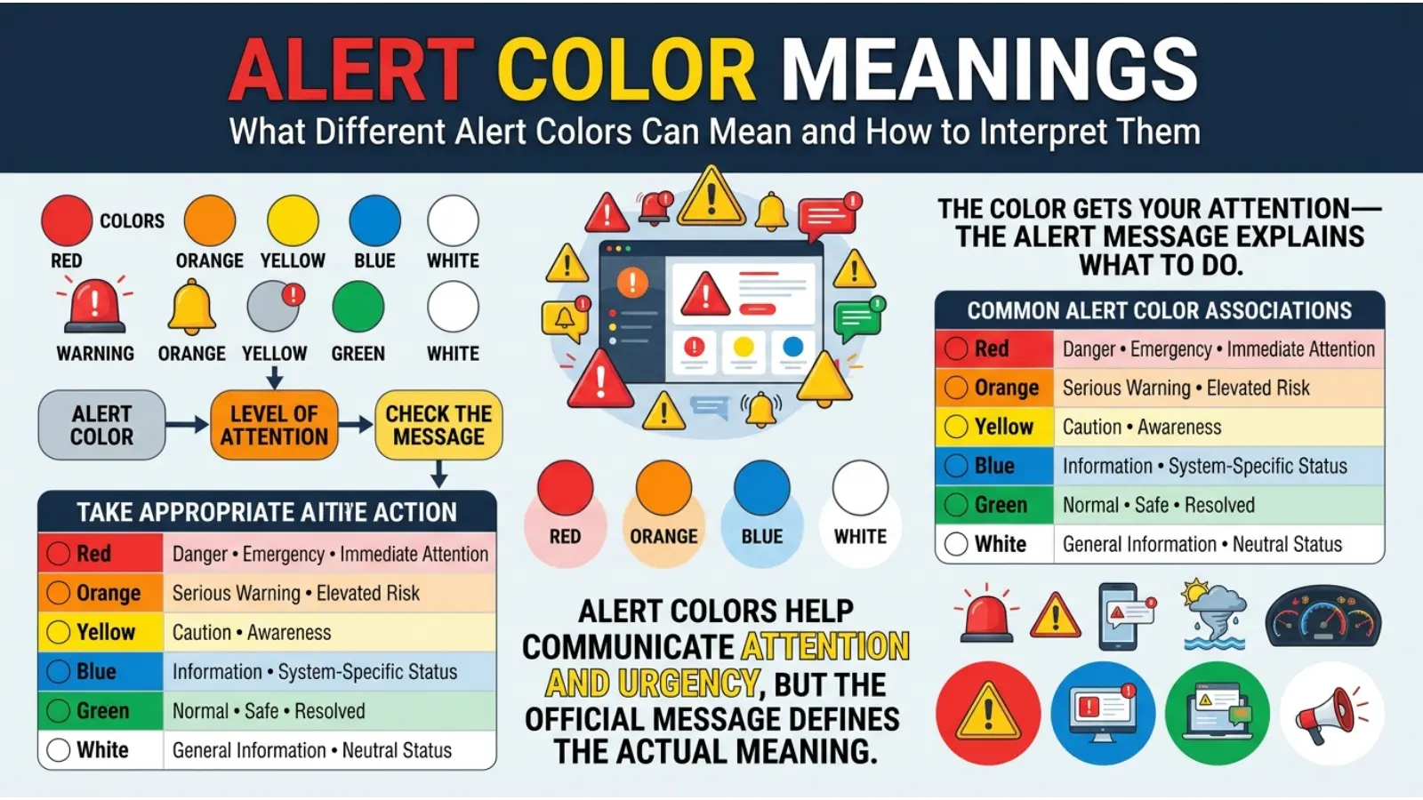
Quick Answer: Alert colors are visual signals used to communicate urgency or information quickly. Red usually signals danger or immediate action, yellow suggests caution, green indicates safety or normal conditions, blue often communicates instructions or information, and orange may warn of hazards or elevated risk. Their exact meaning depends on context and established standards.
What Do Alert Colors Symbolize?
Alert colors symbolize different levels of urgency, danger, safety, and required action. Their main purpose is not simply decoration. Instead, they help people understand a situation quickly.
The strongest alert colors usually attract attention because they contrast with their surroundings. Bright colors can be noticed faster, especially when combined with symbols, flashing lights, sounds, or written instructions.
Here is a simple overview:
| Alert Color | Common Meaning | Typical Action |
|---|---|---|
| 🔴 Red | Danger, emergency, stop | Act immediately |
| 🟠 Orange | Serious hazard, warning | Pay close attention |
| 🟡 Yellow | Caution, potential risk | Proceed carefully |
| 🟢 Green | Safe, normal, approved | Continue or proceed |
| 🔵 Blue | Information, instruction, required action | Follow guidance |
| ⚪ White | Neutral information or status | Read or observe |
| 🟣 Purple | Special status or uncommon alert category | Depends on the system |
| ⚫ Black | Severe warning, shutdown, or critical status | Context-dependent |
The meaning becomes clearer when color is combined with location, symbols, text, and user expectations.
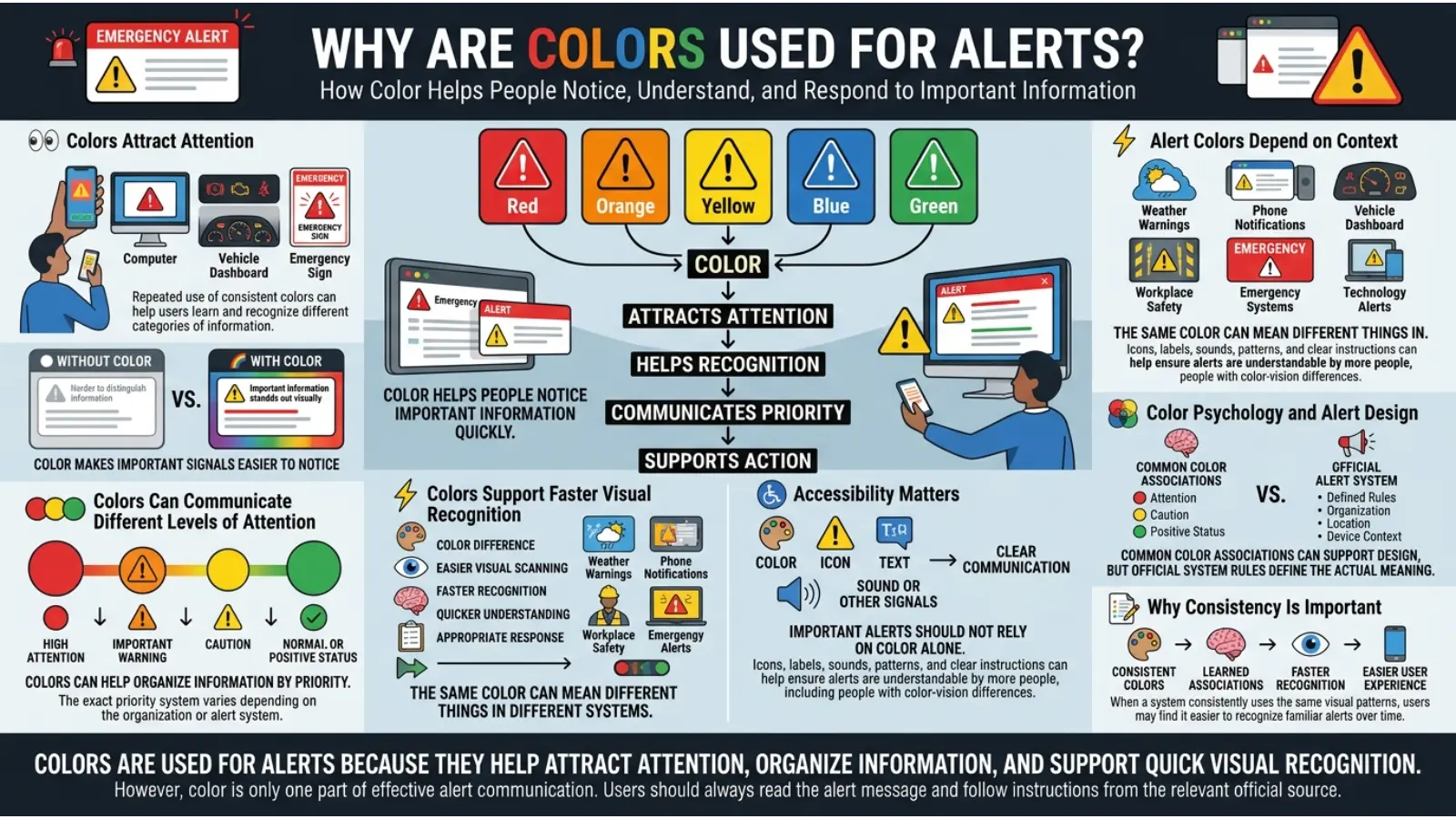
Why Are Colors Used for Alerts?
Human beings can often notice color differences before reading detailed text. This makes color useful when fast communication is needed.
For example, a driver may recognize a red brake light before consciously reading any information. Similarly, workers may quickly notice a yellow warning sign in an industrial environment.
Still, color alone should not carry critical safety information whenever possible. People can have color vision differences, poor lighting conditions can reduce visibility, and different cultures may interpret colors differently. Therefore, effective alert systems often combine color with shapes, icons, text, sound, or movement.
🔴 Red Alert Meaning
Red is one of the most widely recognized alert colors. It commonly represents danger, urgency, stopping, or immediate action.
Common Red Alert Meanings
🔴 Danger
🔴 Emergency
🔴 Stop
🔴 Critical warning
🔴 High priority
🔴 Immediate action required
Red often creates a strong visual impression because it is bold and highly noticeable in many environments.
Red in Everyday Alert Systems
You may see red used for:
- Fire alarms
- Emergency buttons
- Stop signs
- Traffic lights
- Critical system warnings
- Error messages
- Low battery indicators
- Emergency notifications
- Hazard labels
The Psychology of Red Alerts
Psychologically, red is often associated with intensity and heightened attention. Many people learn from childhood that red can signal stopping or danger.
However, red does not automatically cause the same emotional response in everyone. Context matters greatly. A red rose can represent love, while a red warning light may signal danger.
In alert systems, the learned meaning is often more important than the color itself.
When Designers Should Use Red
Red works best when something needs immediate attention.
For example:
- Critical errors
- Dangerous conditions
- Emergency controls
- Urgent notifications
- Actions that could cause serious consequences
Using too much red can reduce its effectiveness. If every notification appears red, users may eventually stop treating red as urgent.
🟠 Orange Alert Meaning
Orange usually represents a warning level between yellow caution and red danger.
It can suggest:
🟠 Significant risk
🟠 Hazard ahead
🟠 Increased attention required
🟠 Technical warning
🟠 Temporary problem
The Orange is commonly used when a situation is serious but does not necessarily require the same immediate response as a red emergency.
Orange in Safety Systems
Orange may appear in:
- Construction zones
- Road work signs
- Machine warnings
- Temporary hazards
- Technical dashboards
- Severe weather graphics
The Orange is visually energetic, which makes it useful for attracting attention without creating the same “stop immediately” association often linked with red.
🟡 Yellow Alert Meaning
Yellow is widely associated with caution.
A yellow alert often means that something requires attention, but the situation may not yet be dangerous.
Common Yellow Alert Meanings
🟡 Be careful
🟡 Potential hazard
🟡 Warning
🟡 Slow down
🟡 Monitor the situation
🟡 Attention needed
Yellow is especially useful for situations where people need to remain alert.
Yellow in Everyday Life
Common examples include:
- Traffic warning signs
- Wet floor signs
- Construction warnings
- Vehicle dashboard indicators
- Software notifications
- Weather alerts
Why Yellow Works as a Warning Color
Bright yellow is highly noticeable in many settings. When combined with black text or symbols, it can create strong visual contrast.
However, yellow may become difficult to read when lighting is extremely bright or when the background is also light. Designers should therefore consider contrast carefully.
🟢 Green Alert Meaning
Green is generally associated with safety, permission, successful operation, or normal conditions.
Common Green Meanings
🟢 Safe
🟢 Go
🟢 Approved
🟢 Normal
🟢 Successful
🟢 Available
The Green often communicates reassurance because people commonly connect it with nature, growth, and healthy conditions.
Green in Alert Systems
Green can appear in:
- Emergency exits
- Safe operating indicators
- Successful online transactions
- System status lights
- Traffic signals
- Approved actions
Still, green does not always mean “perfect.” In some systems, green simply means that a condition falls within an acceptable range.
🔵 Blue Alert Meaning
Blue has several meanings depending on the alert system.
Unlike red and yellow, blue is not always associated with danger. Instead, it often represents information, instructions, or required actions.
Common Blue Alert Meanings
🔵 Information
🔵 Instruction
🔵 Mandatory action
🔵 System notification
🔵 Technical status
In some workplace safety systems, blue signs can indicate that a specific action must be followed, such as wearing protective equipment.
Blue in Digital Alerts
Digital platforms often use blue for:
- Informational notifications
- Helpful messages
- Updates
- Guidance
- Links and interactive elements
Blue usually creates a less alarming feeling than red or orange, making it suitable for messages that require attention without causing unnecessary stress.
⚪ White Alert Meaning
White is often used for neutral information, status updates, or visual clarity.
Its meaning can include:
⚪ Information
⚪ Neutral status
⚪ Clean or inactive condition
⚪ General communication
White usually works best when paired with another color or symbol because white alone may not create a strong warning signal.
For example, white text on a dark background can improve readability, while a white indicator light may simply show that a device is active.
⚫ Black Alert Meaning
Black can communicate seriousness, severity, or a critical condition.
However, black alert meanings vary greatly depending on the system.
Possible meanings include:
⚫ Severe warning
⚫ Shutdown
⚫ Critical status
⚫ Restricted access
⚫ Serious conditions
Because black can be difficult to notice in dark environments, it is often combined with yellow, white, or orange for stronger contrast.
Black-and-yellow combinations are especially common when designers want to communicate physical hazards.
🟣 Purple Alert Meaning
Purple is less common in standard safety alerts, but it may appear in specialized systems.
Depending on the organization or application, purple may represent:
🟣 Special status
🟣 Unique category
🟣 Advanced notification
🟣 Medical or organizational coding
Unlike red, yellow, and green, purple does not have one widely recognized universal alert meaning.
Therefore, systems using purple should clearly explain what the color represents.
Alert Color Meaning Chart
| Color | Attention Level | Common Meaning | Emotional Impression |
|---|---|---|---|
| 🔴 Red | Very High | Danger or emergency | Urgent and intense |
| 🟠 Orange | High | Serious warning | Energetic and alert |
| 🟡 Yellow | Medium | Caution | Watchful and careful |
| 🟢 Green | Low | Safe or normal | Reassuring and positive |
| 🔵 Blue | Medium | Information or instruction | Calm and controlled |
| ⚪ White | Low | Neutral information | Clear and simple |
| 🟣 Purple | Varies | Special category | Unusual or distinctive |
| ⚫ Black | High | Severe or restricted | Serious and powerful |
The Psychology Behind Alert Color Meanings
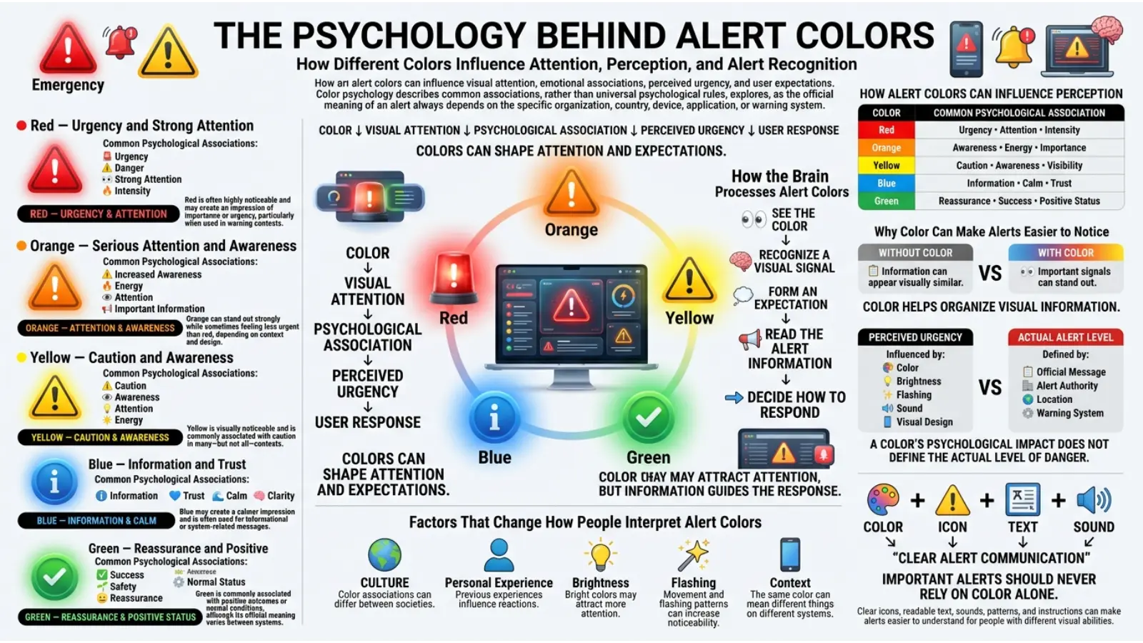
Alert colors influence perception because people develop associations through experience.
For example, many people repeatedly see:
- Red on stop signs
- Yellow on warning signs
- Green on traffic signals
Over time, these repeated experiences create learned expectations.
However, color psychology should not be oversimplified. A color does not automatically control human behavior in the same way for every person.
The meaning of an alert color depends on several factors:
Context
A red heart and a red emergency light communicate completely different messages.
Previous Experience
People who regularly work with machinery may understand industrial safety colors differently from someone unfamiliar with workplace warning systems.
Culture
Color traditions can vary across societies.
Brightness
A bright yellow can feel more energetic than a muted yellow.
Color Combinations
Red combined with white may create a different impression than red combined with black.
Movement
A flashing red light often feels more urgent than a stationary red light.
Why Context Changes Alert Color Meanings
The same color can communicate several meanings.
Consider green.
A green traffic light means proceed. The green checkmark often means success. A green emergency exit sign indicates a safe route.
The basic theme is generally positive or safe, but the exact message changes.
This is why effective alert systems do not depend entirely on color symbolism. Context provides the real meaning.
Alert Color Meanings in Traffic Signals
Traffic systems provide one of the clearest examples of learned alert color meanings.
🔴 Red: Stop.
🟡 Yellow: Prepare to stop or proceed with caution, depending on traffic rules and circumstances.
🟢 Green: Proceed when safe.
These meanings are widely recognized because traffic signals are standardized and repeated throughout daily life.
However, drivers should always follow local traffic laws rather than relying only on general color symbolism.
Alert Colors in Workplace Safety
Workplace safety often uses color to help employees recognize hazards and required actions.
Common categories may include:
🔴 Emergency equipment or serious danger
🟡 Physical hazards and caution
🟠 Temporary hazards or construction warnings
🔵 Mandatory instructions
🟢 Safety equipment and emergency exits
The exact meaning may depend on national regulations and workplace standards.
For this reason, employees should always follow official training and signage rather than assuming that every color has the same meaning in every workplace.
Alert Color Meanings in Technology
Technology uses colors to simplify complex information.
For example:
🔴 System failure
🟠 Serious issue
🟡 Warning
🟢 System working normally
🔵 Information
This color pattern is common in dashboards, websites, apps, and monitoring systems.
Why This System Works
The colors can create a visual hierarchy.
Red appears urgent.
Yellow suggests attention.
Green provides reassurance.
Blue communicates information without creating unnecessary alarm.
However, designers should not rely only on these colors. Icons and written labels improve accessibility.
Alert Color Meanings on Smartphones
Smartphone notifications often use color to communicate importance.
A red badge may indicate unread messages or pending notifications. However, this does not always mean danger.
This is an important example of how modern technology can change traditional alert meanings.
A red notification badge may simply mean:
- New message
- Unread email
- Missed activity
- Pending task
Therefore, urgency depends on the application and the type of notification.
Alert Color Meanings in Vehicle Dashboard Lights
Vehicle dashboard lights often use a familiar color system.
🔴 Red indicators may signal a serious issue that requires immediate attention.
🟡 Yellow or amber indicators often suggest that the vehicle needs inspection or maintenance soon.
🟢 Green or blue indicators may show that a system or feature is currently active.
However, dashboard symbols can vary by manufacturer. Always check the vehicle manual when an unfamiliar warning light appears.
Alert Color Meanings in Healthcare Settings
Hospitals and medical facilities may use colors for organization, equipment labels, patient information systems, or emergency codes.
However, healthcare color meanings are not always universal.
A specific color may mean one thing in one hospital and something different elsewhere.
Because of this, people should never make medical decisions based solely on the color of a screen, wristband, label, or monitor.
Professional interpretation and established protocols are essential.
Cultural Meaning of Alert Color Meanings
Color meanings are influenced by culture, history, religion, and social experience.
Red Across Cultures
Red may represent danger in many modern alert systems. However, it can also symbolize celebration, good fortune, love, power, or prosperity in different cultural settings.
Therefore, red is emotionally complex.
Yellow Across Cultures
Yellow can represent caution in safety systems, but it may also symbolize happiness, sunlight, wealth, or spirituality depending on the culture.
Green Across Cultures
Green is often associated with nature and growth. In some traditions, it also carries religious or cultural importance.
Blue Across Cultures
Blue may symbolize calmness, protection, trust, or spirituality in different societies.
When designing international alert systems, designers should consider cultural interpretation while still following established safety standards.
Historical Development of Alert Color Meanings
Modern alert colors developed through practical communication needs.
As transportation, industry, and technology became more complex, people needed faster ways to identify danger and important information.
Colors became useful because they could be recognized from a distance.
Traffic systems, industrial equipment, military communication, emergency services, and public signage gradually developed color conventions.
Over time, repeated use helped create strong public associations.
Today, many alert color meanings feel natural because people have learned them through years of experience.
Spiritual Meaning of Alert Color Meanings
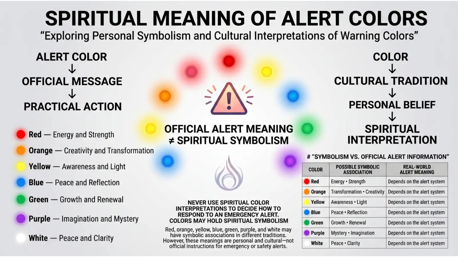
Alert colors do not automatically have spiritual meanings. However, colors themselves have symbolic interpretations in many spiritual and religious traditions.
For example:
🔴 Red may symbolize energy, sacrifice, strength, or transformation.
🟡 Yellow may symbolize wisdom, enlightenment, or hope.
🟢 Green may symbolize renewal, growth, or life.
🔵 Blue may symbolize peace, protection, or spiritual reflection.
These meanings vary significantly across traditions. Spiritual symbolism should therefore not be confused with official safety communication.
A red warning light is primarily a practical signal, even though red may have deeper symbolic meanings in some traditions.
Personality Associations With Alert Color Meanings
People sometimes associate color preferences with personality traits.
For example, someone who prefers red may be described as energetic, while someone who prefers blue may be described as calm.
However, color preference does not scientifically determine personality.
A person may choose colors based on:
- Mood
- Culture
- Fashion trends
- Personal memories
- Environment
- Age
- Professional needs
Therefore, alert colors should not be used to judge someone’s personality.
Alert Colors in Branding and Marketing
Brands use color to guide attention and influence how messages are perceived.
Red in Marketing
Red can create a sense of urgency and excitement.
It may be used for:
- Limited-time offers
- Sale announcements
- Important buttons
- High-priority messages
However, excessive red can make a design feel stressful or aggressive.
Yellow in Marketing
Yellow can attract attention and create an energetic appearance.
It is often used for:
- Promotions
- Important notices
- Attention-grabbing designs
Yet, poor contrast can make yellow text difficult to read.
Green in Marketing
Green often suggests:
- Growth
- Freshness
- Nature
- Progress
- Approval
It can be useful for positive messages and success indicators.
Blue in Marketing
Blue is frequently used when brands want to communicate:
- Trust
- Stability
- Professionalism
- Information
For alerts, blue can communicate importance without suggesting immediate danger.
How Designers Choose Alert Colors
Professional designers consider more than symbolism.
They also think about:
Visibility
Can people notice the color quickly?
Contrast
Can users clearly see the message against the background?
Accessibility
Can people with color vision differences understand the information?
Environment
Will the alert appear indoors, outdoors, at night, or in bright sunlight?
Urgency
Does the situation require immediate action or simple awareness?
Consistency
Does the same color mean the same thing throughout the system?
The best alert systems use consistent visual rules.
Alert Colors and Accessibility
Color should not be the only method used to communicate important information.
For example, a website should not show errors only in red.
Instead, an error message can include:
❌ An icon
⚠ A written explanation
🔴 A color signal
This helps more people understand the message.
Accessibility becomes especially important when users have:
- Color vision differences
- Low vision
- Poor screen quality
- Bright environmental lighting
Clear design benefits everyone.
How Lighting Changes Alert Color Appearance
Lighting can dramatically change how alert colors appear.
A red light may look darker in bright sunlight.
A yellow warning sign may appear washed out under certain lighting conditions.
Blue indicators may appear different depending on screen brightness.
For this reason, designers often test alert colors under real conditions.
Color selection should consider:
- Daylight
- Artificial light
- Screen brightness
- Weather
- Viewing distance
The same color can look surprisingly different depending on its environment.
Alert Colors in Interior Design
Alert colors are not usually used throughout an entire room, but their emotional qualities can influence interior design.
Red Accents
Red can add energy and visual focus.
However, too much intense red may make a space feel overwhelming.
Yellow Accents
Yellow can create a cheerful and energetic atmosphere.
It works well as an accent when balanced with neutral colors.
Green Spaces
Green often creates a natural and calming feeling.
Plants, green furniture, and soft green walls can create a connection with nature.
Blue Spaces
Blue can make a room feel calm and organized.
It is often suitable for spaces designed for focus or relaxation.
Interior design uses the emotional associations of alert colors differently from emergency systems.
A red sofa does not mean danger. Context completely changes the message.
Alert Colors in Fashion
Color also influences the impression created by clothing.
Wearing Red
Red can appear bold, energetic, confident, or dramatic.
Wearing Yellow
Yellow can create a bright and cheerful appearance.
Wearing Green
Green can feel fresh, balanced, or natural.
Wearing Blue
Blue often creates a calm, professional, or dependable impression.
Fashion meaning depends heavily on shade, clothing style, culture, and personal preference.
A bright red jacket creates a different impression from a dark burgundy suit.
Best Alert Color Combinations
Color combinations can improve clarity and visibility.
🔴 Red and White
This combination creates strong visual contrast and is often associated with urgent information.
⚫ Black and Yellow
Black and yellow can create a powerful warning appearance because of their high contrast.
🟢 Green and White
This combination often feels clean and safe. It works well for positive messages and directional information.
🔵 Blue and White
Blue and white can create a clear and professional appearance.
🟠 Orange and Black
Orange and black can communicate attention and caution, especially in temporary hazard environments.
The best combination depends on where and how the alert will be viewed.
Common Misconceptions About Alert Color Meanings
Myth: Red Always Means an Emergency
Not always.
A red notification badge may simply indicate unread activity.
Myth: Green Always Means Everything Is Perfect
Green usually indicates a safe or acceptable condition, but the exact meaning depends on the system.
Myth: Alert Colors Have Universal Meanings Everywhere
Different industries, countries, and organizations may use colors differently.
Myth: Color Alone Is Enough
Critical information should also include symbols, labels, or other communication methods.
Myth: Color Psychology Predicts Behavior
Colors may influence perception, but they do not control everyone in the same way.
Real-World Applications of Alert Colors
Alert colors appear throughout daily life.
Daily Life
People see alert colors on:
- Appliances
- Smartphones
- Vehicles
- Traffic signals
- Security systems
Business
Companies use colors to organize:
- Performance dashboards
- Risk levels
- Project status
- Employee notifications
Marketing
Marketers use color to guide attention toward:
- Sales
- Buttons
- Announcements
- Limited offers
Art and Photography
Artists use alert colors to create:
- Tension
- Focus
- Drama
- Emotional contrast
A bright red object in a muted photograph can immediately become the center of attention.
Sports
Sports events use colors for:
- Penalties
- Team identity
- Scoreboard alerts
- Safety equipment
Entertainment
Movies and video games often use alert colors to communicate danger before characters or players even receive written instructions.
A flashing red screen can suggest immediate danger, while green may indicate health, safety, or success.
Why Age Can Affect Alert Color Interpretation
Age and experience can influence how people understand alert colors.
Children may first learn color meanings through traffic lights, school signs, and games.
Adults may develop stronger associations through driving, work, technology, and emergency situations.
Older adults may also experience changes in vision that affect how colors are perceived.
Therefore, important alert systems should be easy to understand for people of different ages.
Why Designers Must Avoid Too Many Alert Colors
Using too many colors can confuse users.
Imagine a dashboard containing:
Red
Orange
Yellow
Green
Blue
Purple
Pink
Black
If every color has a different meaning, users may struggle to remember the system.
A better design usually uses a small number of clearly defined alert levels.
For example:
🔴 Critical
🟠 High risk
🟡 Warning
🟢 Normal
🔵 Information
Consistency makes alerts easier to understand.
How to Understand an Unknown Alert Color
If you see an unfamiliar alert color, do not assume its meaning.
Instead:
- Look for a symbol.
- Read any written message.
- Check the device manual.
- Review workplace instructions.
- Follow official safety guidance.
- Consider the environment where the color appears.
Context is more reliable than guessing based on general color symbolism.
Frequently Asked Questions About Alert Color Meanings
What does red mean in an alert?
Red commonly signals danger, urgency, stopping, or immediate action. However, the exact meaning depends on the specific system.
What does a yellow alert mean?
A yellow alert usually means caution. It often suggests that people should pay attention or proceed carefully.
What does orange mean in an alert?
Orange often represents a serious warning or elevated risk. It may indicate that a situation requires close attention.
Does green mean safe?
Green commonly represents safety, normal operation, approval, or permission. However, its exact meaning depends on the context.
What does blue mean in alert systems?
Blue often communicates information, instructions, or mandatory actions. In digital systems, it may simply indicate an informational message.
What is the most serious alert color?
Red is commonly used for the highest level of urgency or danger, although official systems may use different classifications.
Are alert color meanings universal?
No. While many meanings are widely recognized, industries, countries, and organizations can use different color systems.
Why is red used for danger?
Red has become strongly associated with stopping and danger through repeated use in traffic, emergency systems, and warning signs.
Can alert colors affect emotions?
Colors can influence attention and emotional perception, but responses vary depending on context, culture, experience, and individual differences.
Should alert systems use color alone?
No. Important alerts should also use text, icons, shapes, sounds, or other signals to improve clarity and accessibility.
Conclusion
Alert colors are powerful communication tools because they can help people recognize urgency, caution, safety, and information quickly. Red, orange, yellow, green, and blue each have widely recognized associations, yet their exact meanings always depend on context.
The most effective alert systems do more than choose bright colors. They use clear contrast, familiar symbols, readable text, and consistent visual rules. They also consider accessibility, lighting, culture, and the level of action required.
Understanding alert color meanings can help you interpret traffic signals, workplace warnings, technology notifications, vehicle indicators, safety signs, and everyday visual messages more accurately. The next time you see an alert color, look beyond the color itself. Consider where it appears, what information surrounds it, and what action the system expects you to take.

Emma Wilson is a dedicated comparison writer and product researcher at ColorMystiic.com. She specializes in creating unbiased product comparisons, detailed reviews, and helpful buying guides. Her goal is to help readers make smarter purchasing decisions with confidence.