Snapchat uses colors to make communication faster and easier to understand. A red icon, purple icon, or blue icon can tell you what type of Snap you received, sent, opened, or saved. However, many users search for Snapchat color meanings because the symbols can look confusing, especially when several colors appear in the Chat screen, Stories, Snap Map, or Friendship features.
Unlike traditional color symbolism, Snapchat colors usually have a practical purpose. The colors help users identify different types of content without opening every message. Still, color can also influence how people notice and react to notifications. For example, bright red may attract attention quickly, while blue is commonly associated with communication and conversation.
The meaning of Snapchat colors can change depending on where you see them. A red arrow in your Chat list does not necessarily mean the same thing as a red symbol in another Snapchat feature. Therefore, understanding the context is just as important as recognizing the color.
This guide explains the most common Snapchat color meanings, including red, purple, blue, gray, green, yellow, and other colors used throughout the platform. You will also learn how Snapchat uses color in communication, branding, design, psychology, and everyday user experience.
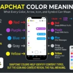
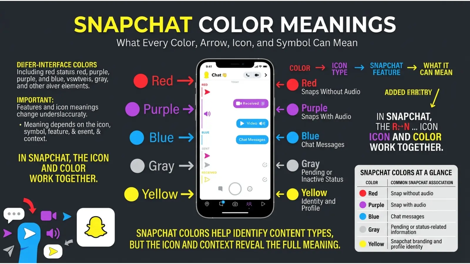
Quick Answer: Snapchat colors mainly show the type and status of content. Red usually relates to Snaps without audio, purple relates to Snaps with audio, blue represents Chat messages, and gray often indicates pending, expired, or unavailable communication. The exact meaning depends on the icon and where it appears in Snapchat.
What Do Snapchat Colors Mean?
Snapchat colors work as a visual language. Instead of reading a long explanation for every notification, users can quickly look at the color and symbol to understand what happened.
The most common color categories include:
| Snapchat Color | Common Meaning |
|---|---|
| 🔴 Red | Snap without audio |
| 🟣 Purple | Snap with audio |
| 🔵 Blue | Chat message |
| ⚪ Gray | Pending, expired, or unavailable content |
| 🟢 Green | Activity, availability, or certain feature indicators |
| 🟡 Yellow | Snapchat brand identity and profile-related elements |
However, the symbol beside the color matters. A filled arrow, outlined arrow, square, or other icon can show whether content was sent, received, opened, or replayed.
Therefore, you should never interpret a Snapchat color completely on its own.
Red Snapchat Color Meaning
Red is one of the most noticeable colors used in Snapchat. In the Chat section, red is commonly connected with Snaps that do not contain audio.
For example, a red arrow may indicate that you sent a Snap without sound. A red square may indicate that you received a Snap without audio.
The exact icon status can change depending on whether the Snap has been opened or remains unopened.
Why Does Snapchat Use Red?
Red naturally attracts attention because it is visually strong. In everyday life, red is often connected with urgency, action, energy, and importance.
Snapchat’s use of red helps users quickly distinguish silent visual Snaps from other forms of communication.
However, a red Snapchat icon does not automatically mean danger, anger, or an emergency. Its meaning is primarily functional within the app.
Purple Snapchat Color Meaning
Purple on Snapchat is generally connected with Snaps that include audio.
For example, a purple icon can indicate a photo or video Snap containing sound.
This distinction helps users understand the type of media before opening it.
Why Purple Works for Audio Snaps
Purple stands out clearly from both red and blue. Because Snapchat needs users to recognize several content types quickly, using visually different colors makes the system easier to scan.
Purple also carries broad symbolic associations with creativity, imagination, mystery, and originality in many modern color discussions. While those meanings are not necessarily the reason Snapchat selected purple, the color creates a strong visual contrast within the app’s notification system.
Blue Snapchat Color Meaning
Blue is mainly associated with Chat communication on Snapchat.
A blue icon commonly represents a text-based Chat message rather than a traditional photo or video Snap.
This makes communication easier to understand at a glance.
For example, if you see a blue Chat symbol, you can usually expect a message-based interaction rather than a visual Snap.
The Psychology Behind Blue Communication
Blue is widely associated with communication, calmness, trust, and reliability in modern branding and design. Many technology and social communication platforms use blue because it feels clear and familiar.
Snapchat uses blue in a practical way by separating Chat messages from red and purple Snaps.
Still, the psychological meaning of blue should not be confused with Snapchat’s official icon system. The app uses colors primarily for quick visual organization.
Gray Snapchat Color Meaning
Gray on Snapchat often indicates that something is pending, unavailable, expired, or no longer active.
For example, a gray icon may appear when:
- A friend request has not been accepted.
- A message or Snap is pending.
- Communication is unavailable.
- Certain content has expired.
- The system cannot currently display the usual communication status.
The exact meaning depends on the icon and situation.
Why Gray Represents an Inactive Status
Gray is less visually intense than red, purple, or blue. Therefore, it works well for showing a neutral or inactive condition.
In design, gray often communicates balance, neutrality, uncertainty, or reduced activity. Snapchat can use this visual quality to separate active communication from pending or unavailable communication.
Green Snapchat Color Meaning
Green can appear in different Snapchat features and may not have one universal meaning across the entire platform.
Depending on the feature, green can relate to activity, availability, privacy settings, location-related elements, or other interface indicators.
Because Snapchat regularly updates its features and interface, green symbols should always be interpreted according to the specific screen where they appear.
Why Green Is Useful in Digital Design
Green is easy to notice and is often associated with movement, growth, permission, activity, or positive status.
However, users should avoid assuming that every green symbol on Snapchat means someone is online. Interface colors can have feature-specific meanings.
Yellow Snapchat Color Meaning
Yellow is the most recognizable Snapchat brand color.
The bright yellow background and white ghost logo have become a major part of Snapchat’s visual identity.
Yellow naturally creates a feeling of energy and visibility. It is one of the easiest colors to notice, especially when surrounded by darker app icons.
The Branding Meaning of Snapchat Yellow
From a branding perspective, yellow helps Snapchat stand apart from many social media platforms that use blue, black, or white as their main visual identity.
Yellow can suggest:
- Energy
- Youthfulness
- Fun
- Optimism
- Creativity
- Attention
- Playfulness
The color fits Snapchat’s fast-moving and informal communication style.
However, branding colors do not always create identical emotional reactions in every person. Culture, personal experience, age, and visual preferences can influence how people respond to yellow.
Snapchat Arrow Color Meanings
Snapchat arrows are important because they show the status of communication.
The color tells you the general content category, while the arrow style helps explain what happened.
Red Arrow
A red arrow is generally associated with a Snap without audio.
Depending on whether the arrow is filled or outlined, the icon may indicate whether the Snap was sent, received, opened, or otherwise interacted with.
Purple Arrow
A purple arrow is generally associated with a Snap containing audio.
Again, the icon shape and appearance provide additional information about the communication status.
Blue Arrow
A blue arrow usually relates to a Chat message.
It helps separate written conversations from photo and video Snaps.
Gray Arrow
A gray arrow can indicate pending communication or another inactive status.
For example, the message may not have been delivered because the friendship status or connection is incomplete.
Snapchat Square Color Meanings
Snapchat squares can also help users understand received content.
The color generally identifies the type of communication.
Red Square
A red square commonly represents an unopened Snap without audio.
Purple Square
A purple square commonly represents an unopened Snap containing audio.
Blue Square
A blue square generally relates to an unopened Chat message.
Gray Square
A gray square can indicate unavailable, expired, pending, or otherwise inactive communication.
As with other Snapchat icons, the symbol should be considered together with the color.
Why Snapchat Uses Different Colors
Snapchat’s color system is an example of visual communication design.
Imagine opening your Chat screen and seeing only identical symbols. You would need to read every conversation to understand whether someone sent a photo, video, or message.
Colors reduce that effort.
The system allows your brain to notice differences quickly.
For example:
Red: Visual Snap without audio
Purple: Snap with audio
Blue: Chat communication
Gray: Pending or inactive status
This design approach is useful because people often process simple visual differences faster than long written explanations.
The Psychology of Snapchat Colors
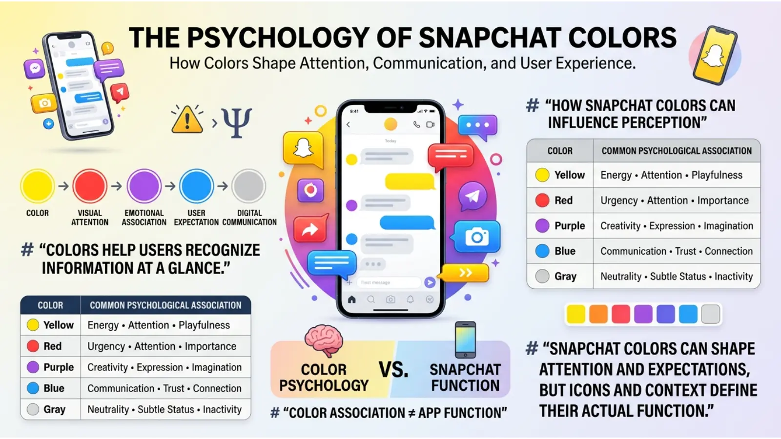
Snapchat color meanings are mainly based on app design, but color psychology can help explain why different colors are useful for organizing information.
Red and Attention
Red is highly noticeable. It can make information feel active, immediate, and visually important.
On Snapchat, red helps separate one type of Snap from other content categories.
Purple and Creativity
Purple is often associated with imagination and creativity in modern color symbolism.
Because it is visually different from red and blue, it also works well as a category color.
Blue and Communication
Blue is commonly used in communication and technology design. It can feel familiar and organized.
This makes it useful for identifying Chat messages.
Gray and Neutral Status
Gray is visually quieter. It can communicate inactivity, uncertainty, or an incomplete state without demanding immediate attention.
Yellow and Energy
Yellow is bright, energetic, and easy to recognize. Snapchat’s yellow branding helps create a playful and youthful visual identity.
Scientific research does not support the idea that every person experiences a color in exactly the same emotional way. Context, culture, personal memories, lighting, and design all affect perception.
Snapchat Colors Are Different From Traditional Color Symbolism
A common misunderstanding is assuming that every Snapchat color has a deep symbolic meaning.
For example, someone might think:
- Red means anger.
- Purple means romance.
- Blue means sadness.
- Gray means rejection.
In Snapchat’s interface, these interpretations are usually incorrect.
The colors primarily organize communication.
Traditional color symbolism may influence how users emotionally experience a color, but the app’s icon meanings are based mainly on function.
Therefore, context should always come first.
How Context Changes Snapchat Color Meanings
The same color can appear in different parts of Snapchat.
For this reason, a color’s location matters.
You might see colors in:
- Chat screens
- Snap notifications
- Profile pages
- Snapchat Stories
- Snap Map
- Friendship features
- Privacy settings
- Interface buttons
A blue symbol in the Chat area may have a different purpose from a blue element elsewhere in the app.
The best way to understand Snapchat color meanings is to look at three things together:
- The color
- The icon shape
- The location inside the app
This prevents many common misunderstandings.
Snapchat Color Meanings and Communication
Colors can make digital communication feel faster.
Instead of reading:
“Your friend sent you a video with audio.”
You may immediately recognize the category through a purple symbol.
This saves time, especially for users with many active conversations.
Color coding can also reduce visual confusion because each communication type has a recognizable identity.
However, Snapchat still relies on symbols and labels because colors alone may not be enough for every user.
How Snapchat Uses Color in Branding
Snapchat’s yellow identity is one of the strongest examples of color-based branding in social media.
The color creates instant recognition.
When people see a bright yellow icon with the familiar ghost symbol, many immediately associate it with Snapchat.
Why Yellow Helps Snapchat Stand Out
Many digital platforms use similar color palettes.
Therefore, a strong yellow identity gives Snapchat a distinctive position.
Yellow also works well because it:
- Grabs attention
- Feels energetic
- Looks playful
- Creates strong contrast
- Is easy to recognize
Brand colors become powerful when they remain consistent over time.
Snapchat’s yellow identity demonstrates how a single color can become strongly connected with a brand.
Color and User Experience on Snapchat
Good app design helps users understand information without reading unnecessary instructions.
Snapchat colors support this goal.
For example, color coding can help users quickly answer:
- Did I receive a Snap or a Chat?
- Does the Snap include audio?
- Has the content been opened?
- Is the message pending?
- Is the communication currently inactive?
This type of design is called visual hierarchy.
Visual hierarchy helps users notice important differences through size, position, shape, and color.
Snapchat uses several of these elements together.
How Lighting and Screen Settings Affect Snapchat Colors
The appearance of Snapchat colors can change depending on your device.
A purple icon may look more blue on one screen. Yellow may appear warmer or brighter on another device.
Several factors can affect color appearance:
- Screen brightness
- Dark mode settings
- Display quality
- Night mode or eye comfort settings
- Screen color calibration
- Ambient lighting
For example, using your phone under strong sunlight can make colors appear washed out.
Meanwhile, viewing the screen in a dark room may make bright colors look more intense.
Therefore, the visual appearance of a Snapchat color may change slightly, even though its function remains the same.
How Age and Culture Can Affect Color Interpretation
People do not interpret colors in exactly the same way.
Children, teenagers, and adults may develop different associations based on trends and life experiences.
Culture can also influence traditional color meanings.
For example, red may represent celebration in one cultural setting while suggesting warning or danger in another.
However, Snapchat’s functional color system reduces much of this confusion because the colors are connected to specific icons and actions.
The interface gives users practical context.
That is why app-based color meanings are usually more consistent than broad cultural symbolism.
Personality Associations With Snapchat Colors
People sometimes wonder whether their favorite Snapchat color reveals something about their personality.
There is no reliable scientific rule stating that liking a specific Snapchat color determines personality.
Still, popular color preference discussions often connect certain colors with general traits.
For example:
People drawn to red may enjoy energy, action, and strong visual stimulation.
People drawn to purple may associate themselves with creativity and individuality.
The People who prefer blue may appreciate calm, communication, and order.
People who like yellow may enjoy cheerful, energetic, and playful environments.
People who prefer gray may value simplicity and visual balance.
These are broad associations rather than personality tests.
A person’s color preference can change depending on mood, fashion, environment, culture, and personal experience.
Snapchat Colors in Modern Digital Culture
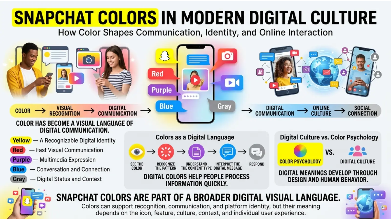
Snapchat has helped make color-coded communication familiar to millions of users.
Over time, people learn the system through repeated use.
Eventually, users may recognize a Snapchat color almost instantly.
This shows how technology can create new forms of color meaning.
Traditional color symbolism developed through history, culture, religion, art, and nature.
Digital color meanings can develop through interface design.
For example, within Snapchat, purple may immediately remind frequent users of a Snap with audio rather than its traditional symbolic associations.
This is an example of context changing color meaning.
Common Misconceptions About Snapchat Color Meanings
Red Does Not Automatically Mean Someone Is Angry
A red Snapchat icon is usually related to the type of Snap rather than the sender’s emotions.
Purple Does Not Automatically Mean Romance
Purple is generally used to identify Snaps with audio. It does not necessarily indicate a romantic message.
Blue Does Not Mean Someone Feels Sad
Blue is commonly connected with Chat communication inside Snapchat.
Gray Does Not Always Mean You Are Blocked
Gray can indicate several situations, including pending or unavailable communication. You should examine the icon and friendship status before making assumptions.
Every Snapchat Color Does Not Have One Universal Meaning
Colors can have different purposes in different Snapchat features.
The location and icon shape matter.
Real-World Applications of Snapchat Color Design
Snapchat’s color system offers useful lessons beyond social media.
Business and Marketing
Businesses can use color coding to help customers understand information quickly.
For example, different colors can separate:
- New orders
- Completed orders
- Pending tasks
- Important notifications
However, colors should always be supported by text or symbols for accessibility.
Website Design
Web designers can use color to guide visitors through a website.
For example:
- Blue for information
- Green for successful actions
- Gray for inactive buttons
- Red for warnings or important actions
The exact colors should match the brand and context.
Education
Teachers and students can use color coding to organize notes.
For example:
- Red for important information
- Blue for definitions
- Purple for examples
- Gray for additional details
The goal is not to follow universal meanings. Instead, consistency makes information easier to remember.
Photography and Art
Artists can use color symbolism to create emotional contrast.
A bright yellow subject against a gray background can feel energetic and noticeable.
Meanwhile, purple and blue lighting may create a more imaginative or atmospheric mood.
Context determines the final emotional effect.
Fashion
Snapchat-inspired color combinations can also appear in casual fashion.
Yellow can create a bold and energetic look.
Purple can add creativity and individuality.
Blue often creates a relaxed and dependable appearance.
Gray works well as a neutral background color that allows brighter shades to stand out.
Snapchat-Inspired Color Combinations
Although Snapchat colors are mainly functional, they can inspire attractive color combinations.
Yellow and Black
This combination creates strong contrast and high visibility.
It can work well in bold fashion, sports designs, and attention-grabbing graphics.
Purple and Yellow
Purple and yellow create a lively contrast because they sit opposite each other in many traditional color relationships.
This combination can feel creative and energetic.
Blue and White
Blue and white often create a clean and organized appearance.
This combination works well for communication-focused designs and professional layouts.
Gray and Yellow
Gray creates a neutral foundation, while yellow adds energy.
This combination can work well in modern interior design and branding.
Red and Gray
Red provides visual energy, while gray reduces intensity.
Together, they can create a bold but balanced appearance.
Why Designers Use Colors Like Snapchat Does
Designers often use different colors to create categories.
This is especially useful when users need to process information quickly.
A good color system should be:
- Easy to recognize
- Consistent
- Clearly separated
- Useful in different lighting conditions
- Supported by symbols or labels
- Accessible to different users
Snapchat’s system demonstrates an important design principle: color works best when it supports information rather than replacing it completely.
How to Remember Snapchat Color Meanings Easily
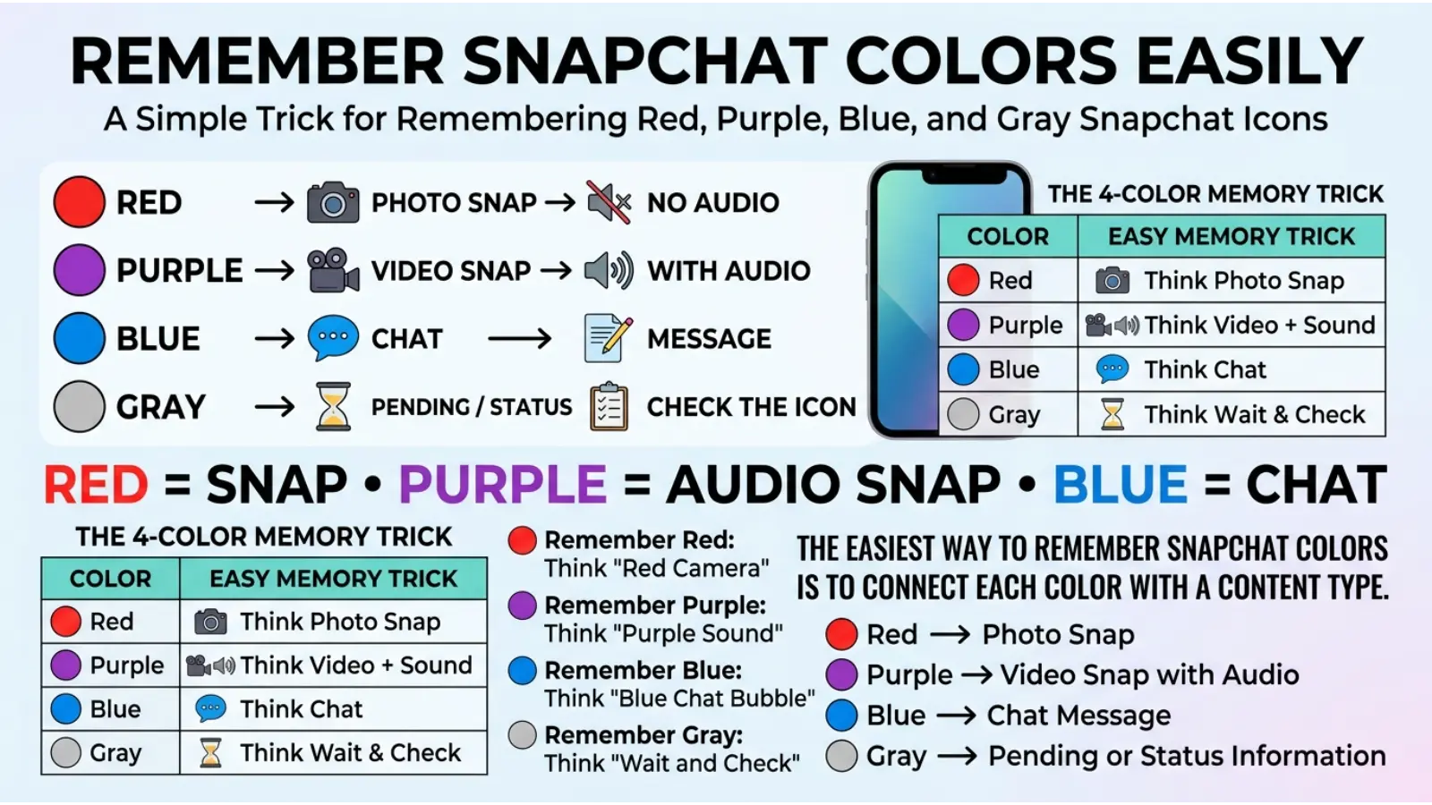
A simple way to remember common Snapchat colors is:
🔴 Red = Snap without sound
🟣 Purple = Snap with sound
🔵 Blue = Chat message
⚪ Gray = Pending or inactive status
🟡 Yellow = Snapchat’s main brand color
Remember that the icon shape can change the meaning.
For example, a square, arrow, or outlined symbol may indicate whether content was sent, received, opened, or viewed.
Frequently Asked Questions About Snapchat Color Meanings
What does red mean on Snapchat?
Red generally relates to a Snap without audio. The exact meaning depends on the icon shape and whether the Snap has been opened or received.
What does purple mean on Snapchat?
Purple usually indicates a Snap that includes audio.
What does blue mean on Snapchat?
Blue is commonly associated with Chat messages and text-based communication.
What does gray mean on Snapchat?
Gray can indicate pending communication, unavailable content, expired content, or another inactive status. Check the icon and situation for the exact meaning.
What does the yellow color mean on Snapchat?
Yellow is Snapchat’s primary brand color. It represents the platform’s recognizable visual identity and helps the app stand out.
Does a red Snapchat icon mean someone is angry?
No. A red Snapchat icon usually describes the type of Snap rather than the sender’s emotions.
Does gray on Snapchat mean someone blocked me?
Not necessarily. Gray can appear for several reasons, including pending friendship status or unavailable communication.
Why does Snapchat use different colors?
Snapchat uses colors to help users quickly identify different types of communication and understand message status without reading detailed information.
Can Snapchat color meanings change?
Yes. Snapchat can update its interface and introduce new features. Also, a color may have different meanings depending on where it appears in the app.
Do Snapchat colors have psychological meanings?
Colors can influence attention and perception, but Snapchat colors are primarily used as functional design tools. Traditional color psychology should not be confused with Snapchat’s official icon meanings.
Final Thoughts
Understanding Snapchat color meanings can make the app much easier to use. Red, purple, blue, and gray are not simply decorative choices. They help organize communication and show users what type of content they are viewing or receiving.
The most useful lesson is to look beyond the color alone. Always consider the icon shape, message status, and location inside Snapchat. A color may have a traditional symbolic meaning in art or culture, yet its meaning inside an app can be completely practical.
Snapchat also offers an interesting example of how digital technology creates new color associations. Over time, users learn that certain colors represent specific actions, messages, and experiences.
Once you understand the system, Snapchat’s colorful icons become less confusing and much more useful. The next time you see a red, purple, blue, or gray symbol, you can look at the full context and quickly understand what Snapchat is trying to tell you.

Emma Wilson is a dedicated comparison writer and product researcher at ColorMystiic.com. She specializes in creating unbiased product comparisons, detailed reviews, and helpful buying guides. Her goal is to help readers make smarter purchasing decisions with confidence.