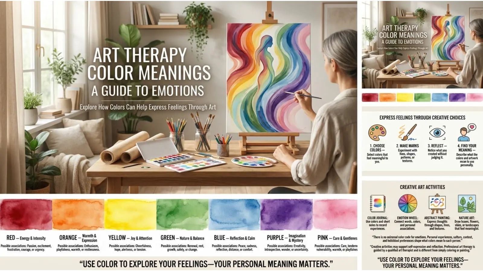
A painting can express feelings that are difficult to explain with words. Sometimes, a person reaches for blue when feeling sad, chooses red when feeling energetic, or uses green to represent comfort and hope. These choices can make art a useful way to explore emotions. Understanding art therapy color meanings helps people reflect on their feelings, personal experiences, and creative decisions.
However, colors do not have one universal meaning, and choosing a particular shade cannot reveal someone’s emotional state on its own. Personal memories, cultural background, and the situation all influence how colors are understood. This guide explores common color associations, the role of color in art therapy, and practical ways to use color for self-expression.
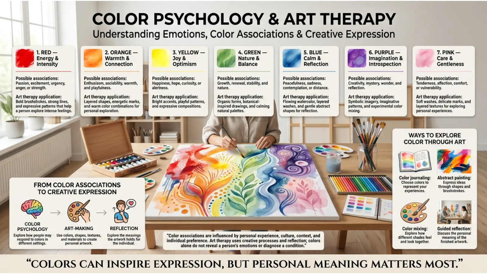
Quick Answer: Art therapy color meanings describe the emotions, memories, and ideas people may associate with colors during creative activities. Red may represent energy or anger, blue may suggest calmness or sadness, and green may symbolize growth or renewal. These meanings are personal rather than universal, and art therapists consider the individual’s experiences instead of interpreting colors using a fixed code.
What Is Art Therapy, and Why Do Colors Matter?
Art therapy is a form of psychotherapy that uses creative processes to support emotional expression, self-awareness, and personal exploration. It is provided by qualified art therapists who help people explore their artwork within a therapeutic relationship.
Color can play an important role because it offers another way to communicate. Someone who finds it difficult to describe an experience might use dark shades, bright shapes, or contrasting colors to represent how that experience feels.
However, art therapy is not simply coloring to feel better or assigning a psychological meaning to every shade. A trained therapist considers the person’s goals, feelings, circumstances, and interpretation of the artwork.
Color can also be used for personal reflection outside formal therapy. Drawing, painting, and coloring may help people slow down, notice their emotions, and explore ideas without needing to explain everything immediately.
Art Therapy Color Meanings Chart
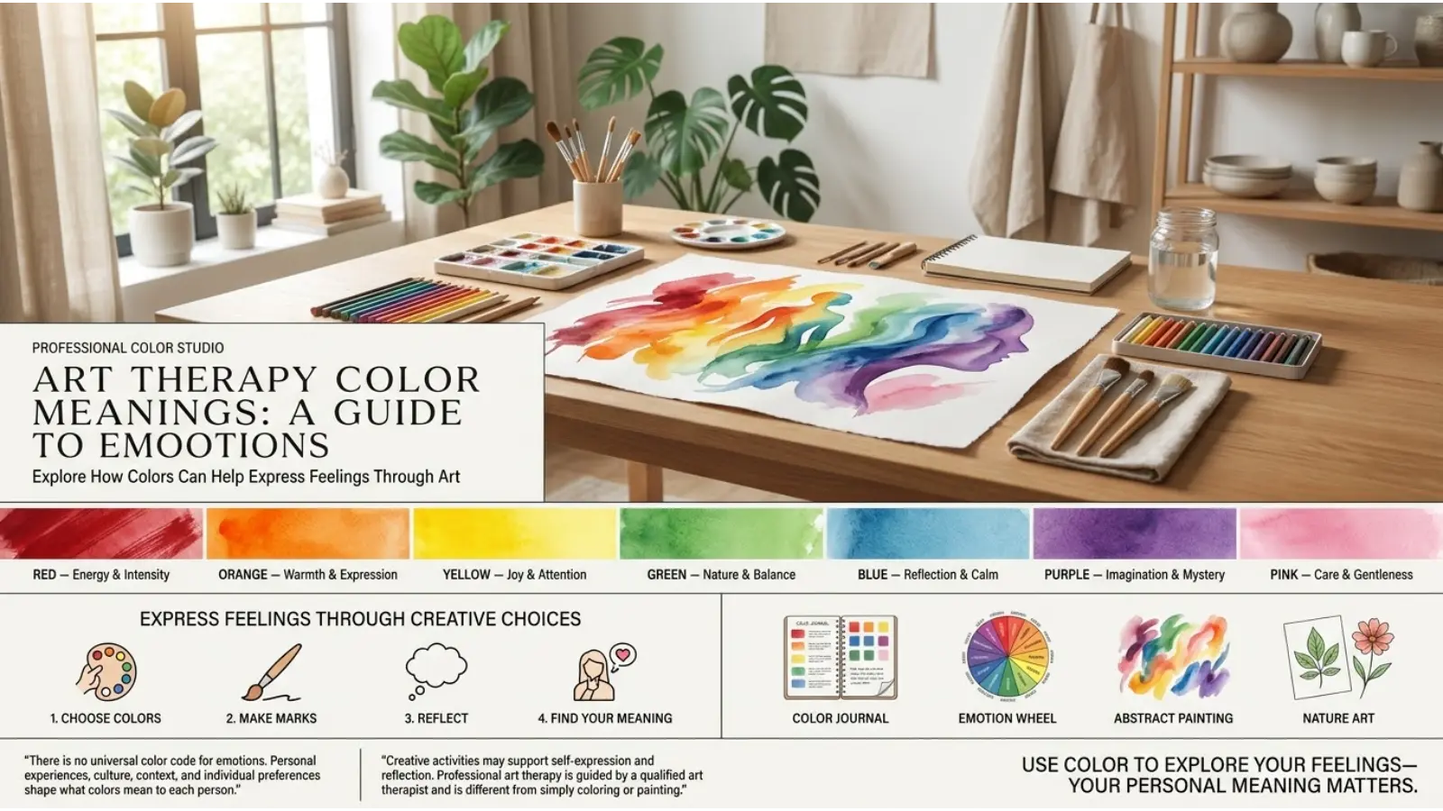
The following chart summarizes common associations people may have with different colors. These are starting points for reflection, not diagnostic rules or scientifically established meanings for every individual.
| Color | Common emotional associations | Possible artistic expression |
|---|---|---|
| Red | Energy, passion, anger, urgency | Strong feelings, action, intensity |
| Blue | Calmness, sadness, trust, distance | Quiet moments, reflection, loneliness |
| Yellow | Joy, hope, attention, nervous energy | Optimism, excitement, alertness |
| Green | Growth, balance, renewal, safety | Nature, recovery, fresh beginnings |
| Purple | Imagination, mystery, dignity | Dreams, identity, creativity |
| Orange | Warmth, enthusiasm, sociability | Playfulness, movement, confidence |
| Pink | Tenderness, affection, comfort | Care, connection, gentleness |
| Black | Strength, grief, mystery, protection | Boundaries, loss, contrast |
| White | Space, simplicity, peace, emptiness | Openness, clarity, new beginnings |
| Brown | Stability, earthiness, familiarity | Home, nature, grounding |
| Gray | Neutrality, uncertainty, restraint | Ambivalence, quietness, distance |
| Turquoise | Freshness, openness, calm | Renewal, communication, escape |
A color’s meaning depends on more than its name. Bright red may communicate excitement, while a muted red may feel traditional or restrained. Similarly, pale blue can feel airy and peaceful, whereas deep navy may suggest seriousness or sadness.
The surrounding colors also matter. Yellow beside black can appear bold and cautionary, while yellow beside pink may look cheerful and playful.
What Different Colors May Represent in Art Therapy
1. Red: Energy, Anger, and Passion
Red is often associated with strong emotions because it is visually prominent and frequently used to communicate urgency, excitement, danger, and passion.
In an artwork, someone might use red to represent confidence, frustration, love, or a difficult memory. Another person might choose it simply because it is their favorite color.
Red can be useful when exploring questions such as, “What does my anger feel like?” or “How would I draw the moment I felt powerful?”
Try using different shades of red rather than treating the color as a single emotional category. Soft red, bright scarlet, and deep burgundy can create very different visual impressions.
2. Blue: Calmness, Sadness, and Reflection
Blue is commonly linked with peace, trust, distance, and sadness. Its meaning often depends on the shade and the personal associations attached to it.
For example, a person might use light blue to represent a quiet morning, while dark blue might remind them of loneliness or a difficult period in life. Someone else may associate the same dark blue with security and confidence.
In creative reflection, try painting a place where you feel safe or drawing a blue shape that represents a feeling you cannot easily describe.
Remember that blue artwork does not automatically indicate sadness. The artist’s explanation is more meaningful than a general color association.
3. Yellow: Happiness, Hope, and Attention
Yellow often brings to mind sunlight, warmth, optimism, and energy. Because it attracts attention, it can also feel intense or overwhelming when used in large amounts or at high brightness.
In art, yellow might represent a happy memory, an idea that gives someone hope, or a moment of sudden awareness.
A useful exercise is to create two small drawings using yellow. In one, use it to represent comfort and happiness. In the other, use it to show tension or restlessness. Comparing them can reveal how composition, shade, and context change the impression of a color.
4. Green: Growth, Balance, and Renewal
Green is closely associated with plants, forests, springtime, and new growth. As a result, many people connect it with renewal, nature, balance, and recovery.
A person might paint green leaves to represent a fresh start or use green shapes to illustrate a place where they feel protected.
Green can also have less positive associations, including envy, illness, or discomfort, depending on the context and culture.
For personal reflection, draw something that represents growth in your life. It could be a tree, a growing plant, or an abstract shape. Consider what the color means to you rather than assuming that green always represents healing.
5. Purple: Imagination, Mystery, and Identity
Purple can suggest creativity, spirituality, mystery, luxury, or dignity. Its associations are influenced by personal taste, cultural traditions, and the setting in which it appears.
In artwork, purple might represent a dream, an imagined world, a private thought, or a part of someone’s identity that they are exploring.
Try combining purple with other colors to see how the mood changes. Purple and blue may create a quieter impression, while purple and orange can feel more energetic.
There is no single psychological meaning that applies to every purple drawing. The artist’s personal connection to the shade remains central.
6. Orange: Enthusiasm, Warmth, and Movement
Orange often communicates warmth, friendliness, activity, and enthusiasm. It combines the visual energy associated with red and the brightness associated with yellow, although individual reactions vary.
An artist might use orange to represent excitement, social connection, courage, or a desire for change.
On the other hand, a strong orange can feel overstimulating to some people, especially when it dominates a composition.
For a creative exercise, use orange to draw a moment when you felt energetic. Then try using a softer orange to represent a comfortable, peaceful experience.
7. Pink: Affection, Gentleness, and Comfort
Pink is commonly associated with tenderness, care, affection, and softness. In some settings, it can also represent confidence, playfulness, or bold self-expression.
Someone might use pink to draw a comforting memory or represent a relationship that makes them feel supported.
However, pink is not exclusively feminine, romantic, or gentle. Its meaning changes with cultural expectations, personal identity, and visual context.
Experiment with pale pink, coral pink, and hot pink. Notice whether each shade feels comforting, playful, energetic, or something entirely different to you.
8. Black: Grief, Strength, and Boundaries
Black can represent grief, fear, mystery, authority, elegance, or protection. Artists also use it to create contrast, define shapes, and draw attention to important details.
In an emotional drawing, black might communicate sadness or a desire for privacy. It might equally represent confidence, safety, or a strong personal boundary.
Using black does not automatically mean someone is depressed or distressed. Dark colors can serve practical, aesthetic, and symbolic purposes.
If you want to explore black creatively, consider drawing a boundary between two spaces. Ask yourself what each side represents and whether the boundary feels protective, restrictive, or reassuring.
9. White: Peace, Clarity, and New Beginnings
White often represents simplicity, openness, cleanliness, or peace. It can also communicate emptiness, distance, or loss, depending on the artist’s experience.
In visual art, white space gives other elements room to stand out. It can create balance without requiring additional shapes or details.
For a reflection exercise, leave part of a page blank and fill the rest with colors or symbols. Consider whether the empty area feels peaceful, unfinished, freeing, or uncomfortable.
White does not always symbolize innocence or purity. Those associations are shaped by cultural and personal experience.
10. Brown: Stability, Familiarity, and Grounding
Brown is often connected with soil, wood, natural materials, and familiar surroundings. These associations can make it useful for depicting stability, home, simplicity, or a connection to nature.
Someone might use brown to represent a childhood home, a favorite outdoor location, or a sense of being grounded.
However, brown may also evoke unpleasant memories or feelings of dullness for some people.
Try drawing a place where you feel settled. Use brown alongside green, blue, or other colors and consider how the combination changes the mood of the scene.
11. Gray: Uncertainty, Neutrality, and Quiet
Gray often sits between black and white in visual contrast. People may associate it with uncertainty, restraint, neutrality, seriousness, or quiet reflection.
An artist might use gray to represent a situation that feels unclear or a period when emotions seem difficult to identify.
Gray can also create a calm background that allows brighter colors to become more noticeable.
For self-reflection, draw a situation that feels uncertain using gray shapes. Then add another color to represent something you know, feel, or want to understand better.
12. Turquoise: Freshness, Openness, and Calm
Turquoise combines the visual qualities of blue and green. People may associate it with water, tropical landscapes, freshness, communication, and relaxation.
In artwork, turquoise can represent a peaceful place, a sense of freedom, or the desire to begin again.
Because turquoise ranges from blue-leaning to green-leaning shades, its effect changes with the mixture. A bright turquoise may feel lively, while a muted shade may seem more restful.
Use turquoise to create an imaginary landscape or a visual representation of a place where you can breathe comfortably. Then reflect on what the color means in that particular scene.
How Color Psychology Relates to Art Therapy
Color psychology explores how people perceive and respond to colors. Researchers study topics such as visual attention, emotional associations, and the influence of color on judgments and behavior.
However, color psychology does not provide a reliable universal dictionary in which each color represents one specific emotion. Findings can depend on the task, environment, individual differences, and cultural background.
Art therapy uses color within a wider process of creative expression. Rather than assuming that a red drawing means anger, a therapist may ask what the artist was thinking about while making it.
This distinction matters because the same visual choice can have different explanations. Someone may choose black because it matches their mood, while another person may use it because it creates a strong outline.
Color can be a starting point for a conversation, but it should not be used alone to diagnose a mental health condition or determine someone’s personality.
Why People Choose Certain Colors When Expressing Emotions
Color choices can be influenced by several factors. Understanding these influences helps people explore artwork without jumping to conclusions.
Personal memories: A particular color may remind someone of a person, home, school, celebration, or difficult experience. These associations can be stronger than general color symbolism.
Current mood: A person may feel drawn to bright colors when energetic or prefer muted colors when tired. However, mood does not always determine color choice.
Cultural background: Communities develop different associations through clothing, ceremonies, religion, art, and everyday practices. These associations are not identical across all members of a culture.
Practical preferences: People sometimes choose a color because it is available, easy to use, or visually appealing. Not every artistic decision carries emotional significance.
The purpose of the artwork: Someone creating a peaceful landscape may naturally select different colors from someone drawing a dramatic scene. The subject itself influences the palette.
Considering these factors makes color exploration more thoughtful. Instead of asking, “What does this color prove about me?” ask, “Why did this color feel right for this particular picture?”
Art Therapy Color Meanings Activities Using Color
You do not need expensive supplies to explore color through creative expression. Paper, pencils, crayons, markers, or paint can provide a starting point. The activities below are intended for personal reflection, not as substitutes for professional treatment.
Create an Emotion Color Wheel
Draw a circle and divide it into several sections. Assign each section an emotion, such as joy, anger, fear, calmness, sadness, or hope.
Choose a color for each emotion based on your own experience. You might use yellow for happiness, but you could choose blue instead if that color reminds you of joyful memories.
Once the wheel is complete, look for patterns. Are several emotions represented by similar shades? Do you use more than one color for complicated feelings?
There are no correct answers. The purpose is to discover how you personally connect color with emotion.
Draw Your Current Mood
Choose three colors that describe how you feel at the moment. Use them to create shapes, lines, patterns, or an abstract drawing.
You do not need to make a realistic picture. Instead, focus on the pressure of your pencil, the size of the shapes, and the way the colors interact.
Afterward, ask yourself what you notice. Did you use one color more than the others? Did your feelings change while you were drawing?
You do not have to force a positive interpretation. Simply noticing your experience can be useful.
Paint a Safe Place
Imagine a place where you feel comfortable. It might be a real location, a memory, or a place that exists only in your imagination.
Choose colors that represent the qualities you associate with safety. You might use green for trees, blue for open space, or warm colors for a familiar room.
After finishing, reflect on what makes the place feel safe. Is it privacy, light, nature, familiar objects, or the presence of someone you trust?
This activity can help you identify the conditions that support your sense of comfort.
Express a Difficult Feeling Through Shapes
Choose a feeling that you want to explore, then represent it using shapes and colors rather than words.
For example, frustration might become a series of sharp lines, while uncertainty might appear as overlapping shapes. Yet your drawing could look completely different, and that is fine.
Once you finish, describe the artwork in your own words. Consider which parts feel important and whether anything surprised you during the process.
If the activity brings up overwhelming emotions, pause and choose something more grounding. You can also seek support from a qualified mental health professional.
Create a Color Transformation Picture
Divide a page into two sections. In the first, use colors and shapes to represent how you feel about a challenge. In the second, show what support, change, or understanding might look like.
The goal is not to pretend that a difficult feeling has disappeared. Instead, the second image can explore what you would like to have more of, such as rest, confidence, connection, or clarity.
Compare the two sides and identify any differences in your choices. Treat these differences as prompts for reflection rather than proof of psychological change.
Does Art Therapy Use a Fixed Color Meaning System?
No. Professional art therapy does not rely on a universal color chart to interpret every person’s artwork.
A therapist may explore an individual’s color choices, but those choices are considered alongside the person’s words, experiences, goals, and wider circumstances.
For example, a drawing filled with dark colors could represent grief, a stormy landscape, a favorite artistic style, or a desire to create dramatic contrast. The colors alone cannot tell us which explanation is correct.
A fixed color code can also overlook personal and cultural differences. A color that represents celebration in one setting may be connected with mourning in another.
Therefore, the most useful approach is collaborative. The person who created the artwork has an important role in explaining what it means to them.
Cultural Differences in Color Meanings
Color associations vary across societies, historical periods, and individual communities. Even within one country, people may interpret the same shade differently because of family traditions, religious practices, age, and personal experience.
Red may be associated with love, danger, celebration, or good fortune, depending on the setting.
White can suggest weddings, cleanliness, peace, mourning, or spiritual ideas in different traditions.
Black may represent elegance, authority, grief, formality, or protection.
Green can evoke nature, renewal, prosperity, or religious and national symbolism.
These examples illustrate broad possibilities rather than rules for entire populations. Cultural meanings should be explored with care instead of being assigned to everyone from a particular background.
When creating art, consider asking yourself which associations come from your own life and which ones you learned through your community. This distinction can make your interpretation more personal and accurate.
Can Color Help Reduce Stress?
Creative activities may help some people relax, focus their attention, or express difficult experiences. Drawing, painting, and coloring can provide structured time away from everyday demands.
However, the effect depends on the person and the situation. A bright color may feel uplifting to one individual and overwhelming to another. Likewise, a dark palette may feel comforting rather than upsetting.
Color alone should not be treated as a cure for anxiety, depression, trauma, or other mental health conditions. Professional support may be helpful when distress affects daily life.
If you find coloring calming, choose materials and shades that feel comfortable to you. Focus on the process instead of trying to produce a perfect picture.
Using Color in Everyday Life
The ideas behind art therapy color meanings can also encourage more thoughtful choices in everyday settings.
At home: Notice which colors make a room feel comfortable, lively, or restful to you. Lighting, furniture, and personal memories can affect the overall impression.
At work or school: Use colors to organize notes, mark priorities, or make information easier to scan. These are practical functions rather than guarantees of improved concentration.
In clothing: Choose shades that suit the occasion and reflect how you want to present yourself. Color can influence first impressions, but it does not determine your character.
In creative hobbies: Experiment with different palettes to discover which combinations you enjoy. A sketchbook can become a record of changing interests and experiences.
In personal reflection: Give colors your own meanings in a journal or artwork. You might create a small chart showing the shades you associate with rest, confidence, connection, or hope.
The key is to treat color as a flexible tool. You can change your associations over time as your experiences and preferences develop.

Common Misconceptions About Art Therapy Color Meanings
Every color represents one specific emotion
This is a common misunderstanding. Although certain color associations appear frequently, no color has one fixed meaning for everyone.
Dark colors always indicate sadness
Dark shades can express many things, including strength, elegance, mystery, contrast, and personal preference. Their presence alone does not reveal someone’s emotional health.
Bright colors always indicate happiness
Bright colors may suggest joy or energy, but they can also communicate urgency, tension, or visual intensity. The context and artist’s interpretation matter.
A drawing can diagnose a mental health condition
A color choice or artwork cannot independently establish a diagnosis. Mental health assessment requires appropriate professional evaluation and consideration of broader evidence.
Art therapy is just coloring
Coloring can be part of a creative activity, but professional art therapy involves therapeutic goals, clinical judgment, and a relationship with a qualified practitioner.
Everyone benefits from the same color palette
People have different sensory preferences, cultural associations, and emotional responses. A useful palette is one that suits the individual and the purpose of the activity.
Frequently Asked Questions
1. What are art therapy color meanings?
Art therapy color meanings are the personal or commonly recognized associations between colors and emotions, memories, or experiences. They can help people explore feelings through art, but they are not universal psychological rules.
2. What color represents sadness in art therapy?
Blue, gray, and black are sometimes used to represent sadness. However, people may express sadness through any color, depending on their memories, culture, and artistic preferences.
3. What color represents healing in art therapy?
Green is often associated with growth and renewal, while blue may suggest calmness. These are symbolic associations, not evidence that a particular color can heal a medical or psychological condition.
4. Can colors reveal your emotions?
Colors may provide clues about how you want to express an experience, especially when you explain your choices. However, color selection alone cannot reliably reveal your feelings or mental health.
5. What is the best color for calming art activities?
There is no single best color for everyone. Some people enjoy blue, green, or muted shades, while others find warmer or brighter colors more comforting. Personal preference matters.
6. What does red mean in art therapy?
Red may represent energy, passion, anger, urgency, or love. Its meaning depends on the artist’s experiences and the way red appears in the artwork.
7. Why do art therapists ask about color choices?
Questions about color can help people describe their creative decisions, memories, and emotions. Therapists generally explore these choices with the person instead of assigning a fixed meaning.
8. Is art therapy the same as coloring for relaxation?
No. Coloring can be a relaxing hobby, but professional art therapy is a form of psychotherapy guided by a qualified art therapist. It may include drawing, painting, sculpture, and other creative processes.
9. Can I practice art therapy at home?
You can use drawing and painting for personal reflection at home. However, self-guided art activities are not the same as professional art therapy, particularly when working through trauma or severe emotional distress.
10. Do art therapy color meanings differ across cultures?
Yes. Colors can carry different social, religious, historical, and personal associations across communities. Even people from the same culture may interpret a color differently.
Conclusion
Art therapy color meanings offer a starting point for understanding how people express emotions through creative choices. Red may communicate energy, blue may suggest calmness or sadness, and green may bring to mind growth or renewal. Yet these associations are flexible, and no color can explain a person’s feelings by itself.
The real value of working with color lies in the opportunity to pause, create, and reflect. By experimenting with different shades and paying attention to personal responses, you can learn more about the images and ideas that matter to you.
Start with a simple drawing, choose colors that feel meaningful, and give yourself permission to explore without judgment. Your artwork does not need a universal interpretation to be valuable.

Emma Wilson is a dedicated comparison writer and product researcher at ColorMystiic.com. She specializes in creating unbiased product comparisons, detailed reviews, and helpful buying guides. Her goal is to help readers make smarter purchasing decisions with confidence.