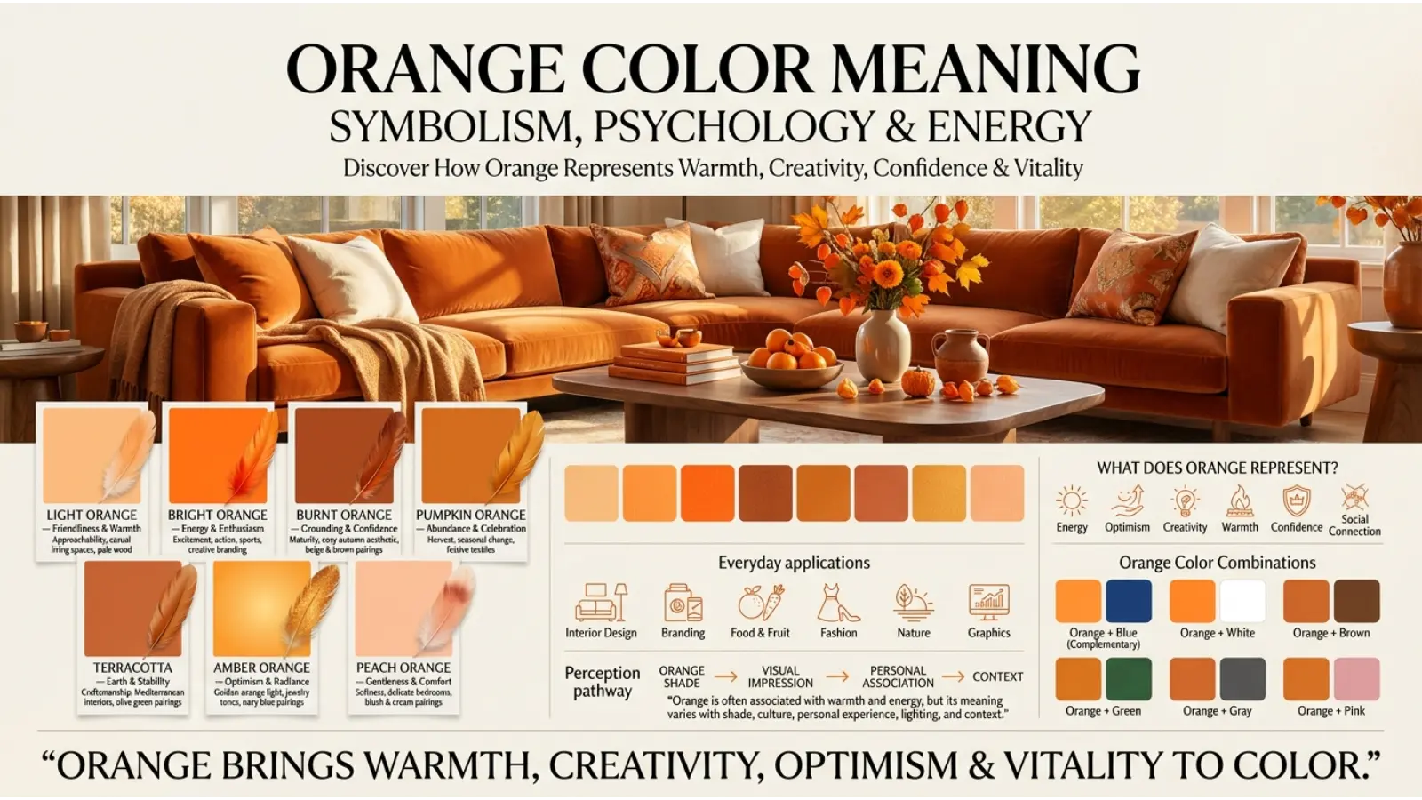
Orange Color Meaning is a warm, energetic color that brings to mind ripe fruit, autumn leaves, glowing sunsets, and flickering flames. It often represents enthusiasm, creativity, warmth, confidence, and adventure. Because it combines the energy of red with the brightness of yellow, orange can feel both exciting and welcoming.
People search for the orange color meaning to understand its emotional effects, spiritual symbolism, personality associations, and use in everyday life. However, its meaning depends on the shade, setting, and culture. Bright orange may suggest excitement, while burnt orange can feel earthy and traditional. In some settings, orange represents celebration or spirituality; in others, it serves as a warning or a sign of safety.
This guide explores orange symbolism, color psychology, spiritual interpretations, cultural meanings, and practical ways to use orange in clothing, branding, art, and interior design.
Quick Answer: What Does the Orange Color Mean?
The orange color meaning is commonly associated with energy, enthusiasm, creativity, warmth, optimism, and social connection. It can express confidence, adventure, and a playful spirit. Depending on the context, orange may also suggest caution, impulsiveness, excessive stimulation, or attention. Spiritually, it is often interpreted as a symbol of vitality, transformation, and creative energy, although meanings vary across traditions.
What Does Orange Symbolize?
Orange has a distinctive personality among colors. Red often communicates intensity, while yellow suggests brightness and cheerfulness. Orange brings these qualities together, creating a color that can feel lively without always appearing as forceful as red.
Its most common symbolic meanings include:
| Orange Symbolism | Common Interpretation |
|---|---|
| Energy | Activity, enthusiasm, and movement |
| Happiness | Joy, playfulness, and positivity |
| Creativity | Imagination, experimentation, and original ideas |
| Warmth | Comfort, friendliness, and hospitality |
| Confidence | Boldness, visibility, and self-expression |
| Adventure | Curiosity, exploration, and spontaneity |
| Abundance | Harvest, ripeness, and seasonal prosperity |
| Caution | Warning, visibility, and alertness |
| Excess | Overstimulation, impatience, or impulsiveness |
These associations are not universal rules. For example, orange can look cheerful on a summer poster but serious on a road-safety vest. Its meaning changes with its purpose, surrounding colors, and the expectations of the audience.
Positive Meanings of Orange
Orange is frequently linked with optimism and enthusiasm. Its brightness can make a design feel active, approachable, and full of life. As a result, people often use it to express celebration, friendliness, and a willingness to try something new.
The color also has a strong connection with creativity. An orange notebook, art studio, or accent wall may communicate a playful, experimental atmosphere. However, the color itself does not automatically make someone more creative; rather, it can help establish a particular visual mood.
Negative Meanings of Orange
Orange can become overwhelming when used in large amounts or at high intensity. Very bright shades may appear loud, restless, or visually tiring, particularly when combined with other saturated colors.
It can also suggest danger or caution because orange is widely used in safety equipment and warning signs. In certain situations, its association with impulsiveness or excessive excitement may be useful when discussing the less balanced side of its symbolism.
Psychology of the Orange Color Meaning
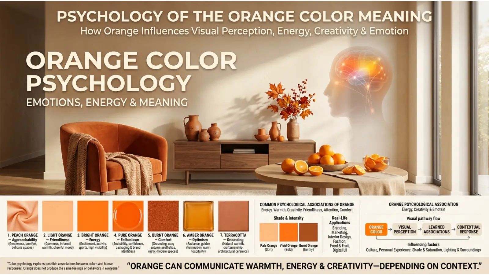
Color psychology explores how colors influence perception, emotion, and behavior. Orange is often described as stimulating, friendly, and attention-grabbing. Nevertheless, people’s reactions depend on personal experience, culture, lighting, and the situation in which they see it.
How Orange May Influence Emotions
Orange is visually warm and can create an impression of movement and excitement. A vivid orange advertisement may feel more energetic than a muted beige one, while a soft peach room may feel gentle and welcoming.
These impressions are influenced by learned associations as well as visual characteristics. For example, people who associate orange with sunsets, fruit, and autumn may respond differently from those who mainly encounter it on hazard signs.
Research on color and emotion suggests that color associations can be meaningful, but effects are not identical for everyone. It would be inaccurate to claim that orange always produces happiness, increases motivation, or changes behavior in a predictable way.
Orange and Mental Energy
Bright orange can help visual information stand out. Therefore, designers sometimes use it for buttons, highlights, labels, and promotional graphics. Its visibility can make an element easier to notice, although contrast, size, and placement also matter.
For a calmer environment, softer shades such as apricot and peach may be more suitable than intense orange. Meanwhile, burnt orange can create a grounded impression that feels less stimulating.
Orange Compared With Red and Yellow
Orange shares qualities with both neighboring colors, yet each has a different visual character.
- Red: Often associated with passion, urgency, strength, and intensity.
- Orange: Commonly associated with enthusiasm, sociability, creativity, and warmth.
- Yellow: Often associated with brightness, optimism, attention, and cheerfulness.
These are broad cultural associations rather than fixed psychological effects. Still, they provide a useful starting point when choosing colors for a project.
Spiritual Orange Color Meaning
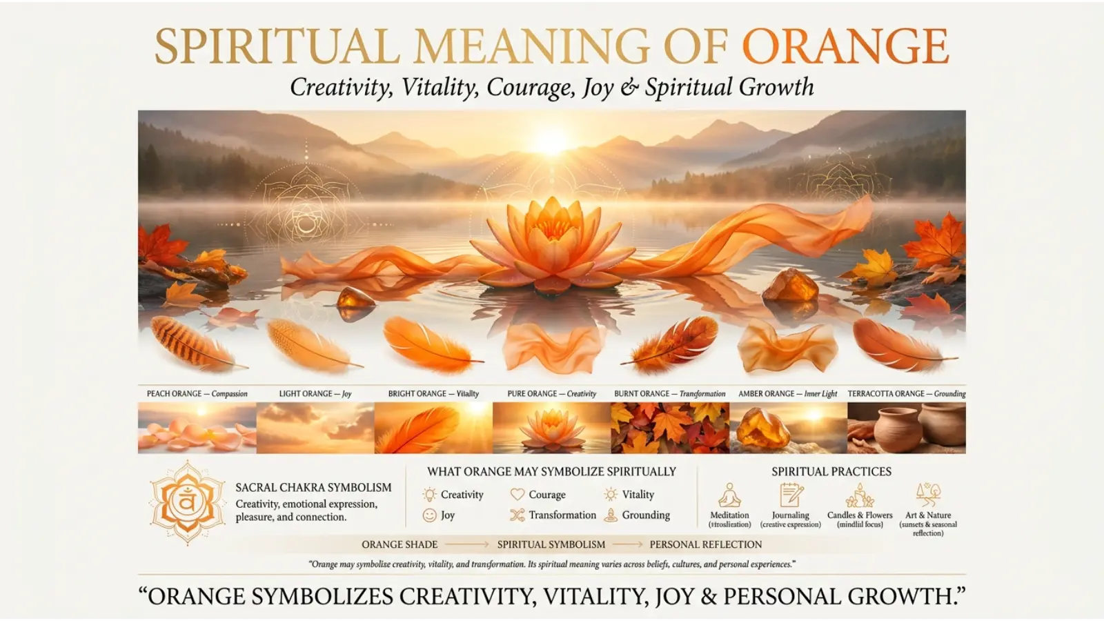
In spiritual and symbolic settings, orange is often associated with life energy, personal transformation, creativity, and emotional expression. Its connection with fire, sunlight, and ripening fruit makes it a natural symbol of change and vitality.
However, spiritual interpretations differ among religions, cultures, and modern spiritual practices. These meanings should be understood as beliefs or symbolic traditions, not as scientifically proven effects of color.
Orange as a Symbol of Energy and Vitality
Orange may represent the energy needed to begin a new project, explore an unfamiliar path, or express an idea. People who use color symbolism for reflection may choose orange when focusing on courage, motivation, and a more active approach to life.
Its association with vitality also comes from nature. Ripe oranges, autumn fruit, and warm sunlight can suggest nourishment, growth, and the continuation of life.
Orange and Transformation
The color can symbolize transition because it appears in sunsets, autumn foliage, and the changing colors of ripening fruit. In personal reflection, orange may serve as a reminder that growth often involves movement, experimentation, and leaving familiar habits behind.
This interpretation is symbolic rather than a universal spiritual teaching. Its relevance depends on the individual’s beliefs and experiences.
Orange and the Sacral Chakra
In some modern chakra systems, orange is associated with the sacral chakra, which is linked with creativity, pleasure, emotional expression, and relationships. This is a spiritual framework, not a scientifically established energy system.
Within this tradition, orange may represent a desire to reconnect with creative interests, explore emotions, or develop a healthier relationship with enjoyment. Interpretations and practices differ across teachers and traditions.
Orange in Religious Clothing and Practice
Orange and saffron-colored garments have important roles in several religious communities, particularly in South Asian traditions.
In Hindu traditions, saffron or ochre clothing may be associated with renunciation, spiritual discipline, and devotion. In Buddhist communities, robes in shades of saffron, orange, brown, or maroon can identify monastic traditions, although robe colors vary by region and school.
These meanings arise from religious histories and practices.
Cultural Orange Color Meaning Around the World
The meaning of orange changes across cultures because colors become associated with local traditions, historical events, religious practices, and everyday objects.
Orange in Western Cultures
In many Western settings, orange is associated with autumn, pumpkins, Halloween decorations, harvest celebrations, and changing leaves. These associations can make the color feel seasonal, playful, and warm.
Orange is also widely used for roadwork signs, construction clothing, and safety equipment. In these contexts, it communicates visibility and caution rather than celebration.
Orange in South Asian Cultures
Orange and saffron have significant religious and cultural associations in South Asia. Saffron-colored clothing can symbolize devotion, sacrifice, renunciation, or spiritual commitment in particular traditions.
Orange also appears in festivals, decorative fabrics, flowers, and ceremonial settings. Its meaning depends on the occasion, community, and specific shade.
Orange in East Asian Cultures
Orange appears in food, clothing, seasonal imagery, and celebrations across East Asia, but it does not have one shared meaning throughout the region.
In Japan, orange can evoke autumn foliage and traditional seasonal imagery. In China and other East Asian societies, interpretations depend on the setting and may overlap with broader associations involving gold, red, prosperity, or celebration. It is better to examine individual customs than assume orange has a universal regional meaning.
Orange in African Cultures
Across Africa, orange appears in textiles, beadwork, art, clothing, and ceremonial objects. Its meaning can vary substantially between ethnic groups, countries, and individual communities.
Depending on the context, an orange shade may evoke the earth, fruit, warmth, vitality, or artistic expression. Specific symbolic meanings should be connected to documented local practices rather than attributed to an entire continent.
Orange in Modern Global Culture
Modern media and advertising have helped establish orange as a color of excitement, entertainment, affordability, and youthful energy. It is common in sports graphics, promotional campaigns, digital interfaces, and products aimed at active audiences.
At the same time, international road-safety conventions and workplace practices have strengthened its association with warnings and visibility. This practical meaning can be more important than traditional symbolism in public spaces.
Historical Orange Color Meaning
Orange became a distinct and widely recognized color term later than some basic color names in several European languages. The English word developed from the name of the orange fruit, which entered Europe through trade.
Before the fruit’s name became common in English, people could describe similar shades using terms such as yellow-red. Orange pigments and orange-like colors, however, existed long before the modern English color name.
Historically, orange pigments were used in painting, decoration, textiles, and other visual arts. The exact materials varied by region and period.
The color’s history also reflects changing technology. Printing, industrial dyes, plastics, reflective fabrics, and digital displays have made orange easier to reproduce in vivid and consistent shades. Consequently, orange now serves artistic, commercial, decorative, and safety-related purposes.
Orange Color Personality: What Does It Say About You?
People who prefer orange are sometimes described as outgoing, energetic, adventurous, friendly, or imaginative. These traits reflect common cultural impressions of the color, not a reliable personality assessment.
Someone may prefer orange because it reminds them of a favorite sports team, a childhood memory, a cultural tradition, or a beautiful sunset. Another person may simply enjoy its brightness.
Common Personality Associations
- Sociability: Orange can suggest openness, friendliness, and a desire to connect with others.
- Adventure: Its energetic appearance may communicate curiosity and enthusiasm for new experiences.
- Creativity: Orange is often used to represent experimentation and imaginative thinking.
- Confidence: Wearing bright orange can create a bold visual impression.
- Playfulness: The color may feel informal, youthful, and fun.
The Less Balanced Side of Orange
In symbolic descriptions, excessive orange may be associated with impatience, impulsiveness, attention-seeking, or a dislike of routine. These are interpretive associations rather than conclusions that can be drawn from someone’s color preference.
Liking orange does not prove that a person is extroverted, reckless, or creative. Personality is complex and shaped by many factors, including experience, environment, and individual temperament.
Orange Color Meaning in Branding and Marketing
Orange is useful in branding because it can be bright, noticeable, and approachable. Companies may use it to create a lively identity or distinguish their products from competitors.
Its effectiveness depends on the audience, product, design, and surrounding colors. A successful orange brand does more than select a color; it builds a consistent visual identity that supports the company’s message.
Why Brands Use Orange
Orange can communicate several qualities:
- Energy: Suitable for sports, fitness, entertainment, and active lifestyles.
- Approachability: Can create a friendly, informal brand personality.
- Creativity: Works well for businesses that want to appear imaginative or unconventional.
- Visibility: Helps important visual elements stand out when contrast is sufficient.
- Value: May support a playful, accessible, or promotional identity.
For example, Nickelodeon has used orange prominently to support its playful entertainment identity. Home Depot uses orange as a recognizable part of its retail branding, helping its visual identity stand out in a practical shopping environment.
These examples illustrate branding choices, not proof that orange alone creates customer trust or increases sales.
Orange in Advertising and Packaging
Orange can draw attention to promotional messages, product labels, and calls to action. However, a bright color is not automatically effective. The message must be clear, the product relevant, and the design easy to understand.
For packaging, orange can work especially well when a brand wants to communicate flavor, freshness, excitement, or boldness. It may be less suitable as the dominant color for a product that needs to convey quiet luxury or restraint, although sophisticated designs can use muted orange successfully.
When Should a Business Avoid Orange?
A business may choose another color if orange conflicts with its desired identity. For instance, a brand built around calm simplicity might prefer muted neutrals, while a company seeking a traditional luxury image may use orange only as a small accent.
Nevertheless, no industry must avoid orange completely. Typography, materials, layout, and the exact shade can change how the color is perceived.
Orange Color Meaning in Interior Design
Orange can make an interior feel warm, welcoming, and lively. Yet the best approach depends on the room’s purpose, natural light, and the intensity of the chosen shade.
Because vivid orange can dominate a space, many decorators use it as an accent rather than covering every wall in the same bright tone.
Orange in the Living Room
An orange cushion, rug, artwork, or accent chair can bring energy to a living room without overwhelming the space. Burnt orange and terracotta often work well with cream walls, wooden furniture, and natural textures.
For a modern look, combine a controlled amount of orange with charcoal, beige, or soft white. If the room already contains bold patterns, use orange in smaller areas to maintain visual balance.
Orange in the Bedroom
Soft peach, muted apricot, and dusty terracotta can create a warm, comfortable atmosphere. These shades are generally easier to live with than highly saturated orange across a large wall.
If you prefer bright orange, consider using it in bedding, artwork, or decorative accessories. This makes the room easier to update when your tastes change.
Orange in the Kitchen and Dining Area
Orange can complement food-related spaces because it appears naturally in fruits, spices, vegetables, and cooked ingredients. An orange backsplash, kitchen accessory, or dining-room accent can make a space feel lively.
However, lighting matters. Warm bulbs may make orange surfaces appear richer or more yellow, while cooler light can make the same paint look less warm. Always test a sample under the lighting you plan to use.
Orange in the Home Office
A small orange accent can give a workspace a more energetic appearance. Consider an orange desk accessory, chair, notebook, or artwork instead of using an intense shade across every surface.
Color alone will not guarantee better concentration or productivity. Comfortable lighting, a suitable desk, low distraction, and good organization are more direct factors to consider.
How Lighting Changes Orange
Orange can look dramatically different throughout the day. Natural daylight may reveal its true balance of red and yellow, while warm indoor lighting can make it look deeper and richer.
Artificial lighting with a different color temperature may shift its appearance. Therefore, compare paint samples in morning light, afternoon light, and evening conditions before choosing a final shade.
Orange Color Meaning in Fashion and Personal Style
Orange is a confident fashion choice because it attracts attention and can make a simple outfit feel more expressive. It appears in casual clothing, sportswear, traditional garments, formal accessories, and seasonal collections.
The key is choosing a shade that suits the occasion and deciding how much visual attention you want the outfit to receive.
What Does Wearing Orange Communicate?
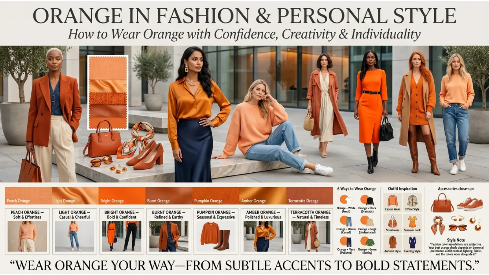
Bright orange can create an impression of confidence, energy, and playfulness. Muted orange may look relaxed, earthy, and understated. Burnt orange often suits autumn-inspired outfits, while peach can feel softer and more delicate.
These are style impressions rather than reliable judgments about the wearer’s character. A person’s clothing choices may reflect personal taste, practical needs, cultural traditions, or workplace expectations.
Orange for Casual and Formal Wear
For casual outfits, orange works well in T-shirts, hoodies, sneakers, jackets, and accessories. Pairing a bright orange item with neutral clothing can create a clear focal point.
For formal occasions, consider rust, copper, terracotta, or muted orange in a tie, scarf, pocket square, dress, or handbag. These shades can provide warmth without appearing as visually intense as neon orange.
In professional environments, follow the workplace dress code. A small orange accessory may be more suitable than a vivid orange suit in a conservative setting.
Seasonal Uses of Orange
Orange is strongly associated with autumn in many places because of changing leaves and harvest imagery. Burnt orange, rust, and terracotta fit naturally into fall clothing.
Brighter orange also works in spring and summer, particularly in lightweight fabrics, swimwear, and casual accessories. There is no fixed seasonal rule, so fabric, shade, and personal preference matter more than the calendar.
Best Color Combinations With Orange
Orange can be paired with neutrals, cool colors, and other warm shades. The right combination depends on whether you want a bold contrast, a natural atmosphere, or a balanced design.
| Color Combination | Overall Effect | Best Uses |
|---|---|---|
| Orange and white | Fresh, bright, clean | Websites, summer clothing, kitchens |
| Orange and navy blue | Strong contrast, balanced | Branding, uniforms, posters |
| Orange and gray | Modern, controlled | Offices, packaging, digital design |
| Orange and black | Bold, dramatic | Sports graphics, Halloween designs |
| Orange and green | Natural, lively | Botanical art, food branding, interiors |
| Orange and brown | Warm, earthy | Rustic decor, autumn fashion |
| Orange and purple | Expressive, creative | Artwork, playful graphics, fashion |
| Orange and cream | Soft, welcoming | Bedrooms, living rooms, lifestyle brands |
| Orange and teal | Vibrant, contemporary | Posters, websites, interior accents |
| Orange and yellow | Sunny, energetic | Summer campaigns, children’s designs |
Orange and Blue
Orange and blue create a strong contrast because they sit opposite each other on a traditional color wheel. This pairing can help important elements stand out.
For example, a website might use dark blue as its main background or brand color and orange for selected buttons. Make sure text remains readable and that the orange accent does not compete with every other element.
Orange and Green
Orange and green can create a natural impression because both colors appear together in fruit, leaves, gardens, and landscapes. The combination works well in food packaging, botanical illustrations, and nature-inspired interiors.
For a more refined result, pair terracotta with sage green rather than combining two highly saturated shades.
Orange and Purple
Orange and purple offer a more dramatic, artistic combination. Bright versions can feel playful or theatrical, while burnt orange and muted plum create a richer, more mature appearance.
Use one color as the main shade and the other as an accent when you want the design to feel intentional rather than crowded.
Orange in Art, Photography, and Visual Communication
Artists use orange to suggest warmth, draw attention, and create contrast. In a landscape, orange light may communicate sunset or fire. In a portrait, an orange background can make a subject feel more vivid, depending on skin tones, lighting, and surrounding colors.
Orange in Painting
Orange can suggest sunlight, heat, movement, autumn, or intense emotion. Artists may use it to create a focal point or contrast with cooler blues and greens.
Its effect depends on the surrounding palette. A small orange object in a blue painting may attract the eye, while a canvas dominated by orange can create a more immersive sense of warmth.
Orange in Photography
Orange light is common in sunset photography, candlelit scenes, and warm indoor portraits. Photographers may use it to create a cozy or nostalgic atmosphere.
However, excessive orange in skin tones can make a photograph look unnatural. White balance, exposure, and the light source should be adjusted according to the intended result.
Orange in Graphic Design
In graphic design, orange can help distinguish headings, icons, highlights, and action buttons. Yet accessibility matters: bright orange text on white may have insufficient contrast for comfortable reading.
For websites and applications, check text contrast rather than assuming a visually strong color is automatically accessible. Use labels, shapes, or icons alongside color whenever the information needs to be understood by people with different forms of color vision.
Orange Color Meaning in Sports, Entertainment, and Safety
Orange is widely used where visibility and a strong visual identity matter.
In sports, orange uniforms and equipment can help teams establish a recognizable appearance. The color may also appear in balls, cones, training markers, and court equipment because it can be noticeable against many backgrounds.
In entertainment, orange can suggest excitement, comedy, fantasy, danger, or adventure. Its meaning depends on the genre and visual setting. A glowing orange sky might signal a peaceful sunset in one scene and a dangerous fire in another.
In safety settings, orange is used for high-visibility clothing, cones, barriers, and certain warning signs. This practical use is different from symbolic interpretations of happiness or creativity. The precise meaning of a safety color depends on the relevant regulations and location.
Common Misconceptions About Orange
Orange Always Makes People Happy
Orange is often associated with positive emotions, but it does not guarantee happiness. Some people may find vivid orange tiring or associate it with warning signs, uncomfortable memories, or particular cultural experiences.
People Who Love Orange Have the Same Personality
Color preferences cannot reliably determine someone’s personality. An orange-loving person may be quiet, outgoing, practical, creative, or any combination of traits.
Orange Has One Universal Spiritual Meaning
Spiritual interpretations vary between religions and belief systems. Saffron clothing in a religious tradition, an orange chakra symbol in a modern spiritual practice, and an orange candle in a personal ritual do not necessarily share the same meaning.
Dark Orange Is Simply a Less Powerful Version of Bright Orange
Dark orange often feels more earthy, mature, and subdued than vivid orange. It can create a different mood rather than merely a weaker version of the same effect.
Orange Is Unsuitable for Professional Design
Orange can work in professional settings when its shade, placement, and purpose are carefully chosen. Burnt orange may suit an editorial brand, while a bright orange accent can help a business interface feel clear and active.
Frequently Asked Questions About Orange Color Meaning
1. What is the main meaning of the orange color?
Orange commonly represents energy, enthusiasm, creativity, warmth, and optimism. It can also communicate caution or visibility in safety-related settings.
2. What does orange mean spiritually?
In some spiritual interpretations, orange symbolizes vitality, transformation, creativity, and emotional expression. In certain modern chakra systems, it is linked with the sacral chakra. Meanings vary across traditions.
3. What emotions are associated with orange?
Orange is often associated with excitement, joy, warmth, curiosity, and enthusiasm. However, very bright orange may also feel intense or overwhelming to some people.
4. What does liking orange say about your personality?
Orange preference is commonly linked with adventurousness, friendliness, confidence, and creativity. These are symbolic associations, not proven personality traits, and color preference alone cannot define a person.
5. Is orange a positive or negative color?
Orange can communicate both positive and negative ideas. It may represent happiness, energy, and creativity, but it can also suggest caution, excess, or visual intensity. Context determines which meaning is most relevant.
6. What does orange mean in different cultures?
Orange may symbolize autumn, harvest, celebration, or visibility in different settings. Saffron and orange garments also have important religious meanings in parts of South Asia. Interpretations vary by community and tradition.
7. Why is orange used in branding?
Brands often use orange to create an energetic, approachable, bold, or memorable visual identity. Its effectiveness depends on the product, audience, design, and overall brand message.
8. What colors go best with orange?
Orange pairs well with navy blue, white, gray, cream, brown, green, and teal. Blue provides strong contrast, while brown and cream create a warmer, more natural palette.
9. What does wearing orange mean?
Wearing orange can communicate confidence, enthusiasm, playfulness, or a preference for bold style. In religious and cultural settings, orange or saffron clothing may have more specific traditional meanings.
10. Does orange affect mood?
Colors can influence perception and emotional associations, but their effects vary. Orange may feel stimulating or warm to some people, yet it does not reliably create a particular mood in everyone.
Conclusion: Understanding the Orange Color Meaning
Orange stands out because it combines warmth with energy. It can suggest creativity, enthusiasm, confidence, celebration, and connection, while its use in safety equipment gives it a practical association with visibility and caution.
Its meaning becomes clearer when you consider the shade and setting. Bright orange can make a design feel lively, burnt orange can create an earthy atmosphere, and peach can offer a softer appearance. Cultural traditions may also give orange a deeper religious or historical significance.
When using orange in your clothing, home, artwork, or brand, think about the impression you want to create and the people who will experience it. Rather than treating color symbolism as a fixed set of rules, use it as a starting point for thoughtful choices and personal expression.
Emma Wilson is a dedicated comparison writer and product researcher at ColorMystiic.com. She specializes in creating unbiased product comparisons, detailed reviews, and helpful buying guides. Her goal is to help readers make smarter purchasing decisions with confidence.