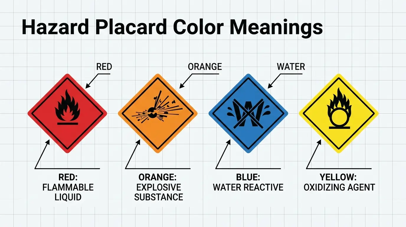
When people see a placard, the first thing they usually read is the message. However, the Placard Color Meanings can influence how that message feels before anyone reads the words. A red sign may look urgent, while blue can appear calm or trustworthy. White can feel neutral and direct, whereas black may create a serious or powerful impression.
The meaning of a placard color is not universal. Instead, it depends on the purpose of the sign, the surrounding colors, the culture, the event, and even the lighting. A protest placard, election sign, business notice, safety sign, and school poster can use the same color for very different reasons.
This guide explains placard color meanings, including their psychological associations, cultural context, practical uses, design choices, and common mistakes. It also shows how to choose the right color when you want a placard to attract attention and communicate clearly.
Quick Answer: What Do Placard Color Meanings?
Placard color meanings depend on context, but common associations include:
| Placard Color | Common Meaning | Typical Impression | Useful For |
|---|---|---|---|
| Red | Urgency, danger, action | Strong, powerful | Warnings, campaigns, urgent messages |
| Blue | Trust, calm, information | Reliable, organized | Information, public notices, institutions |
| Yellow | Attention, energy, caution | Bright, noticeable | Warnings, promotions, directions |
| Green | Safety, nature, approval | Fresh, positive | Environmental messages, safety, community events |
| Orange | Energy, visibility, enthusiasm | Friendly, active | Events, construction, calls to action |
| Purple | Creativity, dignity, individuality | Distinctive, expressive | Awareness campaigns, arts, identity |
| Pink | Care, compassion, playfulness | Warm, approachable | Social campaigns, community messages |
| Black | Authority, seriousness, protest | Powerful, formal | Political messages, memorials, luxury events |
| White | Simplicity, peace, neutrality | Clean, clear | General information, formal notices |
| Brown | Earth, stability, tradition | Natural, grounded | Heritage, farming, environmental themes |
| Gray | Neutrality, practicality | Reserved, professional | Corporate and technical information |
The key point is that there is no single official dictionary of placard colors. Meaning comes from the combination of color, words, symbols, setting, and audience.
What Are Placard Color Meanings?
A placard is a sign, board, card, or display used to communicate information quickly. People use placards at protests, demonstrations, elections, schools, workplaces, sporting events, businesses, public gatherings, and awareness campaigns.
Because a placard is usually designed to be understood from a distance, color has an important visual role.
For example, a large red placard with short white lettering can immediately feel urgent. A blue placard with clean typography may feel more informational. Meanwhile, a bright yellow sign can stand out in a crowded environment.
Therefore, color does not work alone. Contrast, typography, size, symbols, and wording all change the way a placard is perceived.
Why Color Matters on a Placard
Color helps people notice, categorize, and emotionally interpret a visual message.
For example:
- Bright colors can increase visual attention.
- Strong contrast can make words easier to see.
- Dark colors can create a serious appearance.
- Natural colors can suggest environmental or community themes.
- Soft colors can make a message feel less aggressive.
- Familiar color conventions can help people understand a sign quickly.
However, color psychology should not be treated as a guaranteed formula. People do not all respond to colors in exactly the same way.
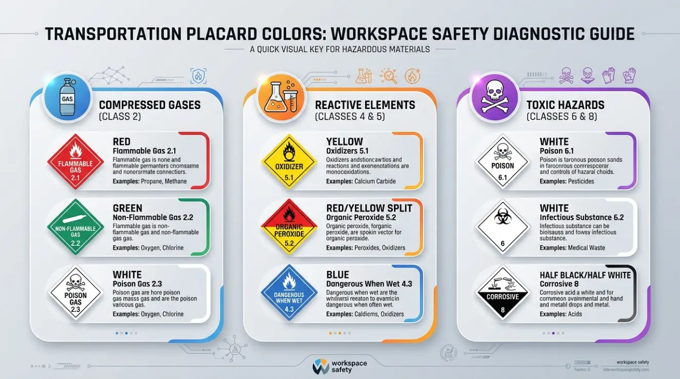
Red Placard Color Meaning: Urgency, Power, and Action
Red is one of the strongest choices for a placard when the goal is to demand attention.
It is commonly associated with danger, urgency, warning, energy, passion, and action. Consequently, red can make a short message feel immediate and forceful.
Red is often useful for protest signs, emergency notices, political campaigns, sales messages, and warnings.
Positive Meaning of Red
Red can communicate:
- Courage
- Strength
- Passion
- Energy
- Determination
- Leadership
- Action
Negative Meaning of Red
Depending on the setting, red may also suggest:
- Danger
- Anger
- Conflict
- Aggression
- Stop
- Emergency
For that reason, red works best when the message needs emotional or visual intensity.
Blue Placard Color Meaning: Trust, Calm, and Information
Blue often gives a placard a more stable and controlled appearance.
It is commonly associated with trust, calmness, reliability, professionalism, and communication. As a result, blue can work particularly well for informational signs and institutional messages.
A dark blue placard may look formal and authoritative. On the other hand, a light blue version can appear more relaxed and approachable.
Best Uses for Blue Placards
Blue can be effective for:
- Public information
- Educational events
- Community notices
- Professional organizations
- Health-related communication
- Institutional announcements
- Directional information
Blue is especially useful when you want people to pause and read rather than react emotionally.
Yellow Placard Color Meaning: Attention, Caution, and Energy
Yellow is highly visible and can make a placard stand out quickly.
It is often associated with attention, optimism, caution, energy, and friendliness. Therefore, yellow can be useful when visibility is more important than creating a formal appearance.
Yellow is common in warning and caution systems because it creates strong visual separation from many backgrounds.
Designing With Yellow
Yellow usually works best with a dark text color.
For example:
Yellow background + black lettering
can provide strong contrast and quick readability.
However, pale yellow text on a white background is difficult to read. Thus, choosing a bright color is not enough; contrast must also be considered.
Green Placard Color Meaning: Nature, Safety, and Growth
Green commonly represents nature, renewal, safety, health, growth, and environmental themes.
Consequently, green is a natural choice for placards about recycling, conservation, gardening, sustainability, parks, and community projects.
Green can also have positive meanings in everyday communication, including approval or permission in some systems.
However, green does not always mean environmentalism. A green political or commercial placard may simply use the color for identity or visual distinction.
When to Choose Green
Choose green when your message involves:
- Nature
- Sustainability
- Community
- Growth
- Agriculture
- Environmental awareness
- Safety
- Freshness
Orange Placard Color Meaning: Energy, Visibility, and Enthusiasm
Orange combines some of the visual energy associated with red and the brightness associated with yellow.
It can communicate activity, enthusiasm, warmth, movement, and visibility.
For this reason, orange is useful for event advertisements, temporary notices, construction-related communication, youth activities, and promotional placards.
Orange often feels less aggressive than red while still attracting attention.
Purple Placard Color Meaning: Creativity, Identity, and Dignity
Purple can make a placard feel distinctive because it is less common than basic primary colors.
It is often associated with creativity, imagination, dignity, individuality, mystery, and luxury. In some historical and cultural contexts, purple has also been connected with status and royalty.
As a result, purple can be effective for artistic events, awareness campaigns, cultural activities, and messages that need a memorable visual identity.
The exact meaning, however, depends heavily on the message and audience.
Pink Placard Color Meaning: Care, Compassion, and Expression
Pink can communicate warmth, care, compassion, playfulness, or softness.
Its meaning has also changed over time and varies between cultures. Therefore, it should not be treated as a universally feminine color.
Pink placards can work well for:
- Community campaigns
- Charity events
- Social awareness
- Youth activities
- Creative events
- Messages about care and support
A deeper pink can create a stronger visual presence, while a pale pink may feel gentler.
Black Placard Color Meaning: Power, Seriousness, and Protest
Black creates a strong visual impression.
It is commonly associated with authority, seriousness, elegance, mourning, resistance, mystery, and power. Consequently, black placards can be highly effective for political statements, protests, memorial events, and formal communication.
Black also provides excellent contrast with lighter lettering.
For example, white lettering on a black placard is usually easy to recognize from a distance.
Nevertheless, too much black can make a message feel heavy or intimidating. The emotional effect should therefore match the purpose of the placard.
White Placard Color Meaning: Peace, Neutrality, and Simplicity
White is often associated with cleanliness, simplicity, peace, openness, and neutrality.
Because white creates a relatively uncluttered background, it is especially useful when the words themselves need to be the main focus.
White placards are common in formal communication because they provide flexibility. Almost any strong text color can be placed against a white background.
However, white can also symbolize mourning or other ideas in certain cultures. This is one reason cultural context matters when designing public messages.
Brown Placard Color Meaning: Nature, Tradition, and Stability
Brown is connected with earth, wood, agriculture, tradition, and natural materials.
It can give a placard a grounded and dependable appearance.
Brown works particularly well for:
- Farming events
- Heritage festivals
- Historical exhibitions
- Handmade products
- Environmental projects
- Rustic businesses
Although brown usually attracts less immediate attention than yellow or red, that can be an advantage when you want a calm and natural visual identity.
Gray Placard Color Meaning: Neutrality and Professionalism
Gray is visually restrained.
It can suggest neutrality, practicality, maturity, technology, and professionalism. Consequently, gray is useful when a placard needs to appear serious without using the emotional intensity of black.
However, gray can become dull if there is not enough contrast or visual variety.
Pairing gray with one stronger accent color can make the message clearer and more memorable.
Placard Color Psychology: How Color Changes Perception
Color psychology is often discussed as if every color produces one fixed emotional response. Real human perception is more complicated.
Research on color and emotion shows that color preferences and emotional associations can be influenced by personal experience, culture, context, brightness, saturation, and the object being viewed.
Therefore, saying “red always makes people angry” would be too simplistic.
Instead, think of color as a visual cue that interacts with the rest of the message.
Hue, Brightness, and Saturation Matter
Two placards can use the same basic color but create very different impressions.
For example:
- Bright red can feel energetic.
- Dark red can feel formal or dramatic.
- Pale red can feel softer.
- Navy blue can appear authoritative.
- Sky blue can appear relaxed.
- Neon yellow can feel energetic.
- Muted yellow can feel vintage or understated.
Thus, the color name alone does not tell the entire story.
Context Changes Color Meaning
Imagine a red placard at a birthday party.
It may suggest celebration and excitement.
Now imagine the same red placard at an emergency site.
The meaning changes immediately.
The surrounding environment teaches the viewer how to interpret the color.
Cultural Placard Color Meanings
There is no worldwide color language that gives every placard color one universal meaning.
Instead, color symbolism develops through history, religion, politics, social customs, commercial systems, and everyday experience.
Western Contexts
In many Western settings:
- Red can suggest danger, urgency, love, or political action.
- Blue often suggests trust and professionalism.
- Green is frequently connected with nature and environmental ideas.
- White can suggest simplicity or peace.
- Black can communicate authority, mourning, or sophistication.
These are broad tendencies rather than strict rules.
East Asian Contexts
Several East Asian cultures have long traditions of color symbolism, but meanings differ from country to country.
For example, red has important positive associations in Chinese cultural traditions, including celebration and good fortune. White can have different associations than it commonly has in many Western contexts.
Therefore, a placard designed for an international audience should not assume that Western meanings apply everywhere.
Middle Eastern and Other Cultural Contexts
Color meanings can also vary across Middle Eastern, African, Latin American, Indigenous, and other cultural traditions.
Religious symbols, national colors, historical events, and local customs may influence interpretation.
For this reason, organizations creating international campaigns should test their visual choices with people who understand the target culture.
Historical Development of Placard Colors
Placards became particularly important as tools for public communication during political movements, demonstrations, elections, advertising campaigns, and community organizing.
Historically, many signs were designed around practical limitations.
Before modern digital printing, available paper, paint, ink, and printing methods affected color choices. A color could be chosen not only because of symbolism but also because it was inexpensive, visible, or easy to reproduce.
Later, modern printing, photography, television, and digital media expanded the range of available colors.
Today, color can also become part of a movement’s visual identity. A particular combination may help people recognize a campaign before they read its name.
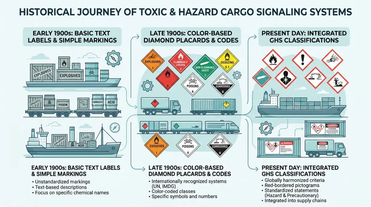
Placard Color Meanings in Protest and Political Communication
Placards are especially important in public demonstrations because viewers often have only a few seconds to understand them.
A protest placard usually needs three things:
- Strong visibility
- Simple wording
- Clear emotional direction
Red may communicate urgency. Black can create seriousness or resistance. White can make a short statement feel direct. Bright colors can help a sign stand out among hundreds of people.
However, the wording remains more important than the color.
A beautifully designed placard with an unclear message will still be ineffective.
Example
Consider two signs:
RED:
“ACT NOW”
PALE GRAY:
“ACT NOW”
The words are identical, but the first version may feel more urgent because of the visual intensity of the red.
That does not mean every viewer will experience the same reaction. It means the color contributes to the overall communication.
Placard Colors in Branding and Marketing
Businesses often use color to create recognizable visual identities.
A company may choose a color because it fits its personality, industry, audience, or existing brand system.
For placards, consistency is particularly useful.
If a business regularly uses blue, white, and a specific accent color, using those same colors on event placards can make the signs immediately recognizable.
How Marketers Use Placard Colors
Marketers may use:
Red for urgency and strong calls to action.
Yellow for visibility and promotional energy.
Blue for trust and professionalism.
Green for environmental or natural positioning.
Purple for creativity or premium positioning.
Black for sophistication and authority.
Orange for energy and enthusiasm.
The important lesson is that marketers do not choose colors in isolation. They consider the product, audience, typography, imagery, placement, and brand identity together.
Placard Colors in Interior and Event Design
Although placards are usually temporary signs, their colors can affect the atmosphere of an event or room.
For example, a community workshop may use soft blue and green signs to create a calm informational environment.
A children’s event may use bright yellow, orange, pink, and blue to create energy.
A formal conference may use white, black, navy, or gray for a more professional appearance.
Practical Design Tip
If your placard will be displayed indoors, check it under the actual lighting.
Warm indoor lighting can make some colors appear more yellow or muted. Cool lighting can make colors appear sharper or bluer.
Therefore, always test the final printed placard instead of judging the design only on a computer screen.
Placard Color Meanings in Fashion and Personal Expression
Placards can also become part of clothing and personal expression during events.
Someone carrying a black sign with bold white lettering may create a serious and dramatic appearance.
A colorful sign can feel playful and energetic.
A green sign can reinforce an environmental message.
A purple sign may make an awareness message visually distinctive.
In this situation, the placard becomes part of the person’s overall visual presentation.
Consequently, clothing colors, background colors, and sign colors should work together rather than compete.
Best Placard Color Combinations
Color combinations can improve both readability and emotional impact.
Red and White
This combination is highly noticeable and creates strong contrast.
Best for: urgent messages, campaigns, announcements, and calls to action.
Blue and White
Blue with white lettering or white with blue lettering usually creates a clean and trustworthy appearance.
Best for: information, education, institutions, and professional events.
Black and Yellow
This combination creates strong visual contrast.
Best for: warnings, attention-focused messages, and signs that must be noticed quickly.
Green and White
Green and white create a fresh, clean appearance.
Best for: environmental, health, gardening, and community themes.
Purple and White
Purple with white can look distinctive without becoming visually overwhelming.
Best for: creative events, cultural campaigns, and awareness messages.
Orange and Black
Orange provides energy while black supplies strong contrast.
Best for: events, temporary notices, sports, and high-visibility communication.
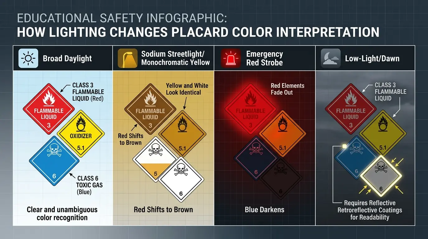
How Lighting Changes Placard Color Meaning
Lighting can change how a placard appears.
A color printed in daylight may look different under fluorescent, LED, or warm incandescent lighting.
For example, a dark blue placard can appear almost black in poor lighting. Likewise, a pale color may lose its visibility when placed in a brightly lit outdoor area.
Therefore:
- Test outdoor placards in daylight.
- Test indoor signs under the actual room lighting.
- Avoid very low-contrast combinations.
- Check readability from several distances.
- Consider how the color looks in photographs.
This last point matters because many modern placards are photographed and shared online.
Age, Experience, and Personal Preference
People do not interpret colors in exactly the same way.
Children may respond strongly to bright, saturated colors. Adults may interpret the same colors through personal, professional, cultural, or political experience.
A person’s previous experiences can also influence their response.
For example, someone who associates green with environmental campaigns may immediately interpret a green placard as ecological. Another person may simply see green as a pleasant background color.
Therefore, color preference does not determine personality, and color associations should never be treated as a psychological diagnosis.
Real-Time Example: Choosing a Placard for an Event in 2026
Imagine a community group preparing a public recycling campaign on August 8, 2026.
The organizers want people walking past the event to notice the message quickly.
They consider three designs:
Design A: Dark blue background with white text
Design B: Bright green background with white text
Design C: Yellow background with black text
The blue version looks professional, but it does not strongly communicate the environmental theme.
The green version immediately supports the recycling message and creates a natural association.
The yellow version has excellent visibility, especially from a distance, but it communicates attention more strongly than environmental identity.
A practical solution could therefore be a green main placard with a yellow accent and dark lettering.
This example shows why there is no single “best” placard color. The correct choice depends on the message, audience, environment, and communication goal.
How to Choose the Right Placard Color
Start with the purpose rather than the color.
Step 1: Define the Message
Ask what you want people to understand.
Is the message:
- Urgent?
- Informational?
- Celebratory?
- Environmental?
- Political?
- Professional?
- Educational?
- Emotional?
Step 2: Choose the Emotional Direction
Next, decide how the placard should feel.
For urgency, consider red or yellow.
For trust, consider blue.
The environmental themes, consider green.
For seriousness, consider black or dark blue.
For creativity, consider purple or orange.
Step 3: Check Contrast
A beautiful color combination is useless if people cannot read it.
Use strong contrast between the background and lettering.
Step 4: Consider Distance
A placard viewed from ten feet away can use more detail than one viewed from fifty feet away.
The farther away the audience, the simpler the design should become.
Step 5: Test It in Context
Hold the sign where it will actually be used.
Check it during the expected time of day.
Then ask someone unfamiliar with the design what they notice first.
That simple test can reveal problems that are easy to miss during design.
Common Misconceptions About Placard Color Meanings
Myth 1: Every color has one universal meaning
Not true.
Color meanings change according to culture, context, industry, history, and personal experience.
Myth 2: Red always means anger
Red can represent anger, but it can also communicate love, celebration, courage, urgency, energy, or importance.
Myth 3: Blue always makes people feel calm
Blue is often associated with calmness and trust, but a dark blue political placard may feel serious and authoritative instead.
Myth 4: Bright colors are always better
Brightness can increase visibility, but excessive brightness may reduce readability or make a formal message feel inappropriate.
Myth 5: Color alone controls behavior
Color can influence perception, but it is only one part of communication.
Words, images, context, culture, and personal experience also matter.
Real-World Uses of Placard Color Meanings
Placard colors are useful in many areas of everyday life.
Schools
Schools can use blue for information, green for environmental programs, and bright colors for student activities.
Businesses
Companies can match placards to their existing brand colors to strengthen recognition.
Public Events
Event organizers can use different colors to separate entrances, information points, activities, and restricted areas.
Political Campaigns
Campaigns may use a consistent color system to build visual recognition.
Protests
Demonstrators may choose high-contrast colors to make short messages visible in crowded spaces.
Sports
Teams and supporters can use team colors to create group identity and visual unity.
Art
Artists can use placards as symbolic objects, choosing colors to reinforce the emotional meaning of their work.
Photography
Strong placard colors can become powerful visual focal points, especially when photographed against neutral backgrounds.
Placard Color Meaning Chart: A Practical Guide
| Color | Main Associations | Emotional Effect | Recommended Use |
|---|---|---|---|
| Red | Action, danger, passion | Strong and urgent | Calls to action |
| Blue | Trust, stability, information | Calm and reliable | Public information |
| Yellow | Attention, caution, optimism | Energetic | High visibility |
| Green | Nature, growth, safety | Fresh and positive | Environmental themes |
| Orange | Energy, activity, warmth | Friendly and lively | Events and promotions |
| Purple | Creativity, dignity, identity | Distinctive | Arts and awareness |
| Pink | Care, compassion, expression | Warm and approachable | Community campaigns |
| Black | Power, seriousness, resistance | Dramatic | Protests and formal messages |
| White | Peace, simplicity, neutrality | Clean and direct | General information |
| Brown | Earth, tradition, stability | Grounded | Heritage and natural themes |
| Gray | Neutrality, professionalism | Reserved | Business and technical signs |
FAQ About Placard Color Meanings
What is the most attention-grabbing placard color?
Bright yellow, red, and orange can attract strong visual attention. However, visibility also depends on contrast, size, lighting, and the surrounding environment.
What color is best for a protest placard?
There is no universal best color. Red can create urgency, black can create seriousness, and high-contrast combinations can improve visibility. The message should determine the final choice.
What does a red placard mean?
Red commonly suggests urgency, danger, action, passion, strength, or importance. Its exact meaning depends on the surrounding message.
What does a blue placard symbolize?
Blue often suggests trust, calmness, stability, professionalism, and information. It is frequently suitable for institutional or educational messages.
What does a green placard represent?
Green commonly represents nature, growth, renewal, safety, and environmental themes. It can also have completely different meanings depending on the context.
Does placard color have a universal meaning?
No. Color symbolism varies across cultures, historical periods, industries, and situations.
Why are some placards black and white?
Black and white provide strong contrast and make words easy to recognize. They can also create a serious, formal, minimalist, or protest-oriented appearance.
What color should I use for an informational placard?
Blue and white are often effective because they create a clean and organized appearance. However, readability and contrast should come before symbolism.
Can placard colors influence emotions?
Colors can contribute to emotional impressions, but they do not produce identical psychological reactions in everyone. Context and personal experience matter.
How do I make a placard easy to read?
Use strong color contrast, large lettering, short wording, simple typography, and enough empty space. Then test the sign from the distance at which people will actually see it.
Final Thoughts on Placard Color Meanings
Placard color meanings are best understood as visual signals rather than fixed rules. Red may create urgency, blue may suggest trust, green may support an environmental message, and black may communicate seriousness. Yet the same color can take on another meaning when the context changes.
The strongest placard design starts with a clear purpose. After that, choose a color that supports the message, create enough contrast for easy reading, and consider the culture and environment in which the sign will appear.
Ultimately, color works together with words, symbols, typography, lighting, and human experience. When these elements support one another, even a simple placard can communicate an idea quickly, clearly, and memorably.

Emma Wilson is a dedicated comparison writer and product researcher at ColorMystiic.com. She specializes in creating unbiased product comparisons, detailed reviews, and helpful buying guides. Her goal is to help readers make smarter purchasing decisions with confidence.